Data-handling project to investigate the relationship between height and weight of 30 random students of years 10 and 11.
Mayfield High School
Introduction
Mayfield High school is a secondary school for pupils age 11-16. I will be doing a data-handling project and have been asked to investigate the relationship between height and weight of 30 random students of year 10 and 11. This includes boys and girls.
Hypothesis
My hypothesis is that the taller the students the heavier the person will weight. My reasons for choosing this is because I hear a lot of people saying that this statement is correct and want to find out myself. I have also thought a few things, which can affect the relationship between height and weight. This includes gender and age. Over my investigation I will be finding new hypothesises for the weight and height relationships.
Plan
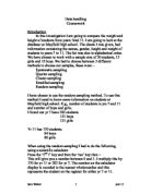
What I will be doing is I will collect 30 random pupils including boys and girls. 30 Is a reasonable amount because too much will cause my graphs very difficult to work on. I will make sure my random 30 are not biased because I will use the Rand button on my calculator. Here are the results I have been returned:
Females Males
Height (m)
Weight (kg)
Year
Height (m)
Weight (kg)
Year
.62
48
0
.90
70
0
.75
57
0
.70
57
0
.53
65
0
.75
56
0
.56
45
0
.63
40
0
.60
66
0
.72
54
0
.67
52
1
.82
57
0
.60
54
1
.65
55
0
.61
54
1
.80
72
0
.62
51
1
.55
72
0
.65
54
1
.71
57
1
.69
54
1
.85
73
1
.62
52
1
.88
75
1
.55
54
1
.51
40
1
.65
58
1
.82
52
1
.94
80
1
.65
47
1
As you see, this graph needs a more useful presentation, so I chose to put this information into height and weight frequency tables. This will help because it shows the information much more clearly and enables me to convert it into tables with less hassle.
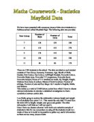
Weight frequency tables
Girls
Weight w in kg
Frequency
Cumulative Frequency
30 < w < 40
0
0
40 < w < 50
2
2
50 < w < 60
7
9
60 < w < 70
2
1
70 < w < 80
0
1
80 < w < 90
0
1
Boys
Weight w in kg
Frequency
Cumulative Frequency
30 < w < 40
0
0
40 < w < 50
3
3
50 < w < 60
0
3
60 < w < 70
0
3
70 < w < 80
5
8
80 < w < 90
9
90 < w < 100
0
9
As mentioned before, I used these frequency tables because it will make graphs much easier to produce than if I tried to produce some from the first table. In my height and weight columns of the tables, 1.50 < h < 1.60, all this means is any value greater or equal to 1.50 but lower than 1.60 will be recorded. This rule goes the same with the weight column. I am now going to present this information into a graph so I can compare the results. I will use histograms because it is continuous ...
This is a preview of the whole essay
0
9
As mentioned before, I used these frequency tables because it will make graphs much easier to produce than if I tried to produce some from the first table. In my height and weight columns of the tables, 1.50 < h < 1.60, all this means is any value greater or equal to 1.50 but lower than 1.60 will be recorded. This rule goes the same with the weight column. I am now going to present this information into a graph so I can compare the results. I will use histograms because it is continuous data. From here I will make another hypothesis that "boys will generally weigh more than girls".
Here are my first graphs of the results I have been returned. As soon as looking at it, you can compare the boys and girls weights. Boy's obviously fits into higher categories than girls. I realised that if I plot these on the same graph it would make the comparison a bit clearer. Unfortunately if I used it on a histogram it won't be very clear so I figured it would be useful if I used a frequency polygon graph.
On the sight of seeing this graph, you can already see a comparison. The first difference I can tell is that boys generally weigh more than girls. This is because as you can see, there are boys that weighed 70-90 kg but there were girls that only weighed 60-70 kg max. Unfortunately this doesn't prove my original hypothesis true so I'll have to carry on my investigation further. I will now produce the mean, range, median and modal. Using stem and leaf diagrams I presume it will be much easier to work them out because a frequency for the group can be quite inaccurate.
Girls' Boys'
Stem
Leaf
Frequency
Stem
Leaf
Frequency
30 kg
0
30 kg
0
40 kg
5,8
2
40 kg
0,0,7
3
50 kg
,2,4,4,4,4,7
7
50 kg
2,2,4,4,5,6,7,7,7,8
0
60 kg
5,6
2
60 kg
0
70 kg
0
70 kg
0,2,2,3,5
5
80 kg
0
80 kg
0
90 kg
0
90 kg
0
As mentioned before I will show the mean, median, modal (not mode because I am using grouped data) and range.
Weight (kg)
Mean
Median
Modal Class
Range
Girls'
60 kg
54 kg
50-60 kg
1 kg
Boys'
62 kg
57 kg
50-60 kg
40 kg
As you see, my hypothesis partly proves to be correct. The average male has a greater weight than girls. The mean proves to be 2 kg above girls and 3 kg above girls as the median. What I also found out is that more boys are in the modal class of 50-60 kg than girls (3 more boy's).
Height frequency tables
Girls
Height h in Metres
Frequency
Cumulative Frequency
.40 < h < 1.50
0
0
.50 < h < 1.60
2
2
.60 < h < 1.70
8
0
.70 < h < 1.80
1
.80 < h < 1.90
0
1
.90 < h < 2
0
1
Boys
Height h in Metres
Frequency
Cumulative Frequency
.40 < h < 1.50
0
0
.50 < h < 1.60
3
3
.60 < h < 1.70
5
8
.70 < h < 1.80
4
2
.80 < h < 1.90
5
7
.90 < h < 2
2
9
I will now use these tables so I can simply plot these results on a graph. Again I will use histograms because it is continuous data. I will convert the metres of height into cm because it will look much neater and easier for you to understand. I will now make another hypothesis that "Boy's will generally be taller than girls".
As you can see there is a good connection with these graphs and my third hypothesis mentioned earlier. Boys fit into higher categories than girls. I will now plot this data into a frequency polygon graph just like what I did with weight.
You can perfectly see that there is a great force for my hypothesis. Girls have a higher frequency for the modal class of 160-170 but boys are in the higher categories like 170-200 kg group. I will now do the averages at this part of my investigation. But firstly the stem and leaf diagram come first.
Girls' Boys'
Stem
Leaf
Frequency
Stem
Leaf
Frequency
40 cm
0
40 cm
0
50 cm
3,6
2
50 cm
,5,5
3
60 cm
0,0,1,2,2,5,7,9
8
60 cm
2,3,5,5,5
5
70 cm
5
70 cm
0,1,2,5
4
80 cm
0
80 cm
0,2,2,5,8
5
90 cm
0
90 cm
0,4
2
200 cm
0
200 cm
0
As mentioned before I will show the mean, median, modal (not mode because I am using grouped data) and range.
Height (cm)
Mean
Median
Modal Class
Range
Girls'
63 cm
62 cm
60-170 cm
22 cm
Boys'
72 cm
71 cm
60-170, 180-190 cm
43 cm
As you see, my hypothesis that boys will have a greater height has not failed. The mean is for boys are highly above the mean for girls. This goes for the median and the range. The modal class also says it all. Boys have two modal classes, which are not lower than girls. Using averages helped me prove a lot to my hypothesis that boys are taller than girls. I will now show the quartiles for both of the factors. To easily show this I will construct cumulative frequency graphs. I will use the box and whisker diagrams to help find out the quartiles. As I am not familiar with creating cumulative frequency graphs on a PC, I will have to hand write them on a different sheet what will then be attached to this. I will start of with weight and then height.
Now I will get back to my original hypothesis and exactly find out the relationship. The original but strongest graph to use is the scatter diagram. This relates the two data sets and gives you a clear analysis on how they relate. After completing the scatter diagram I will use a line of best fit. If it goes in a straight line going upwards I presume my hypothesis will happen as expected.
In the boy's results graph, I can see a strong positive correlation. The scatter diagram is the main evidence for finding my original hypothesis. As you see there is a great positive correlation in my scatter diagram. All of the results are very close to the line meaning that these are good results. Unfortunately I got some points that don't exactly close in with the line. We call this anomolous results and this could be caused by:
. Overweight
2. Underweight
There are more boys that have a higher weight and height than girls as you can see.
Th girls graph has totally amazed me. There is no positive correlation and does the opposite. But after all I picked random people and with luck I may have chose the wrong sort of people I was looking for. But there are some points, which I circled to show the points, which do match my hypothesis.
Here I have obtained the equations of the lines of best fit. This would be written as y=mx+c. So for example the y would represent say the height and the x for the weight.
Boys = y = 0.7205x + 129.6
Girls = y = -0.1107x + 168.77
Now the use of this is to make an approximate answer to either height or weight if you know one of them. So say there is a boy who has a height of 163 cm. What you need to do is minus that answer from 129.6 and divide by the 0.7205. This how it goes:
y = 0.7205x + 129.6, so then x = y-129.6.
0.7205
x = 163-129.6
0.7205
x = 46.35 = 46 (rounded up).
I can see why I got 42 because on my graph if I look from 42 on the x axis then move up to 160, this is where the line intercepts.
This can be done with girls as well. Say if I had a girl with a height of 163. Here is how it goes:
X = 163-168.77
-0.1107
x = 52.12 = 52 (rounded up).
Throughout my conclusion I have made up a lot of summaries. I did answer my entire hypothesises, which proved mostly to be true. My hypothesis's included:
"Taller the pupil, the heavier they weigh".
"Boys will generally weigh more than girls".
"Boy's will generally be taller than girls".
In general all of them are correct. Obviously there were some anomolous points, which cannot be changed. But these are factors that I cannot help. People are overweight and underweight so height does not take much effect. I have made a successful approach to trying all the useful graphs that I needed throughout this project.
I realise I could have made my project more accurate and reliable. If I used more pupils such as 100 I could have precise information and conclusions. But the reason I didn't do this is because it would take me a very long time and I haven't got the time to do this.
The girls scatter diagram was my only problem throughout this whole investigation. But if everything else was successful I'm thinking that it was because I got unlucky and maybe chose some underweight or overweight pupils. This is the problem with the investigation.
If I tried the investigation again I would plan it more carefully and choose more pupils. I would make more hypotheses and more graphs. This would help me gain more accurate results. But despite all of this I reckon I have acquired successful results and answered all my hypothesises.
Yasser Kamel Maths Coursework
1