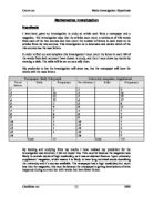
(13-1 number of letters = 12)
Average (mean):
Frequency divide total no of letters
(96 divide 13 = 7)
Median:
Numbers set out from lowest to highest and the middle number is the median, e.g.
1, 1, 1, 2, 2, 4, 7, 7, 8, 9, 15, 16, 23 = 7 is the median
Mode:
This is the value that occurs most frequently. E.g. ‘1, 1, 1,’ 2, 3, 3, 4, 5, 6, 6, 7 = ‘1’ is the mode form the example.
I am going to investigate further by providing different graphs from each of the results. I will discuss in detail about each graph of the results and use this to help me explain my conclusion to overcome this problem.
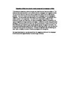
The first graph I have created using the results is a standard bar chart, which I will describe it on the following pages after the graph.
The bar chart that I have set out shows clearly that my hypothesis was incorrect. Looking from the graph and table, the results show that there are more letters in the magazine than the newspaper article.
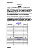
Below I have taken data from the tally chart table from the newspaper and magazine sources that I have collected and expressed it in a cumulative frequency table and graph overleaf.
Newspaper
From the data above, I can see that the most letters are in between 3-4.
The information that I have gathered from the graph is written below:
Upper quartile: (7.2, 72)
Median: (3.8, 48)
Lower quartile: (2.6, 24)
I have also set out a cumulative frequency table below for the university magazine data from the tally chart table. I did the same thing for the magazine as I did for the newspaper to work out the data.
Magazine
From the table above, I can see again that most letters are between 3-4, which is very much similar and the same for the newspaper.
The information that I have gathered from the graph is written below:
Upper quartile: (6.6, 75)
Median: (4.2, 50)
Lower quartile: (2.8, 25)
Looking at both of the cumulative frequency graphs for the newspaper and the magazine, I could see that from both of the graphs, they almost have the same lower quartile, median and upper quartile against each other. But the magazine still has the higher lower quartile, median and upper quartile reading, which adds to more evidence that my hypothesis was incorrect.
Overleaf I have drawn a scatter graph, to show and compare both sources of data. Looking at the scatter graph, I can see clearly that the graphs do not look similar in most of the areas, even though the data from the two sources look almost the same, but both of the graphs have their highest peak at 3 numbers of letters.
I have decided to investigate even further to see if I can make my hypothesis correct. By investigating further, I will have to collect further evidence and present it. By collecting further evidence, I will choose and select another source about an article on a different newspaper and magazine.
This time I have selected an article from the Times newspaper and an article from a Playstation 2 magazine.
Below I have done a tally chart for both of the sources. The newspaper articles talks about educational and governmental issues and the magazine talks about a new computer football game. I believe my hypothesis will this time be correct, predicting that the newspaper will have the words with the most letters.
After studying my results I have realised that my prediction from the previous investigation on the newspaper and magazine is correct, because this time the results show the newspaper has the words with the most letters with my further investigation.
I have also realised that the newspaper may have the words with the most letters, but it’s range, average (mean), median and mode are actually very much similar and the same. Below is an example of this:
The first graph I have created is a bar chart overleaf. The bar chat graph clearly shows that the newspaper has the words with the most letters, compared to the magazine. I have also done a bar chart and scatter comparison graph. I did this to show clearly the comparison and difference between the two sources.
Looking at the bar charts, the comparison bar chart and the scatter graph results show clearly the difference between the two sources, the Playstation 2 magazine is with the highest frequency/peak at 4 number of letters and the times newspaper at 2 number of letters. But the newspaper shows within the graphs that it contains the highest frequency score in most number of letters.
The next graphs I have done are on a cumulative frequency graph, which is the same I did for the previous investigation. I have set out a table below of a cumulative frequency table using the data from the two sources I wanted to investigate further.
Newspaper: The Times
From the data above, I can see that the most letters are in between 3-4.
The information that I have gathered from the graph is written below:
Upper quartile: (7.4, 77.25-77.5)
Median: (4.2, 51.5)
Lower quartile: (2.6, 26.25)
Playstation 2 magazine
From the data above, I can see that the most letters are in between 3-4.
The information that I have gathered from the graph is written below:
Upper quartile: (5.2, 72)
Median: (3.4, 48)
Lower quartile: (2.6, 24)
Looking from the table I realised that where there are the most letters within both of the tables, the two tables have the most letters in between 3-4 letters. Looking from the two cumulative frequency graphs I can see that they both do not look identical, as the playstation 2 magazine graph, is more curved and short than the times newspaper graph, which is more higher and less curved as it is the one with the most letters, which proves my hypothesis is correct.
Conclusion
I have found out that for both of the sources in the first investigation, the results were quite similar, so was for the further investigation. The magazine had the most letters than the newspaper in the first investigation and scored higher in the range, median, average (mean) and mode, but this was very much the same for each of the sources I did in the further investigation.
My hypothesis for the first investigation was incorrect, but maybe because the university magazine supplement was targeted at mature students, people so it would have likely to contain words with a high vocabulary. But in my further investigation my hypothesis turned out to be correct, which I predicted from the first investigation I did.
My further investigation showed me that I was actually correct about my hypothesis, by looking at and examining the results of my data that I have collected and created.
Comparing both of the investigations I would say that the first investigation was more difficult to solve as I did not expect my hypothesis to be incorrect and I would have to think why is this. I think the second investigation was much easier as I knew what I had to do, to solve the problem that was created for me in the first investigation. And that was to further investigate, which lead me to prove my hypothesis is actually correct after all.
________________________________________________________________________
Candidate no: [