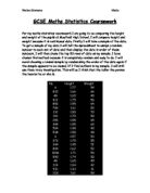
The Population: 1182
The sample size: 60
At a first glance at the statistics, there are several anomalous results. The unreliability of the data can be proven by looking at these; many values are missing and in some cases there appears to be two people with the same name. I will ignore these rows, as they may be genuine errors, to increase the precision and accuracy of my investigation. The only problems I can oversee are those which are included in the secondary data. As I did not collect the statistics myself, I am left unaware as to whether or not they are reliable. I should be able to use all of the data, however, if there are any anomalous results I will discount them as they will disrupt and affect the pattern of the data. I will know if a result is anomalous if it does not fit the pattern of the rest of the data, if I do come across an anomalous piece of data, I shall choose another piece of data using random sampling.
I will use categorical qualitative data to show the gender of the students, as ‘female/male’ is non-numerical. I will use continuous qualitative data for height and weight because they can both be measured and can be any value within a given range.
I will collect a suitable amount of data and then carry out statistical calculations on my sample of data, drawing relevant graphs including box plots from cumulative frequency graphs, from which I will identify any outliers, histograms, from where I will construct distribution curves, and scatter plots. I will investigate the data in my sample and the graphs, stating whether it supported my hypotheses or not. I hope they will show me the overall trend of the relationship between weight and height. Specifically, the box plots should hopefully show me any miss calculations, outliers or anonymous results within the data provided.
The more calculations used will, in my opinion, enhance the reliability and understanding of the investigation and results, I will calculate the distribution, standard deviation and variance. I will also calculate Spearman’s rank correlation coefficient, which will allow me to discover effortlessly the potency of correlation within a data set of two variables, and whether this correlation is positive or negative.
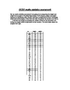
I have used a sample of 60 for my investigation to ensure that the pattern is easy to analyse and small enough to avoid errors. As well as this, it is more specific than using a census- I collected my data by using systematic sampling. I picked a random number on the calculator by using the =rand()*(number of people in year group) button, which gave me the number 6, I therefore picked every 6th student from the sample until I was left with 30 pupils of each gender.
This is my final sample:
Hypothesis 1:
I used Microsoft Excel to create two scatter graphs showing the relationship between height and weight for both females and males.
Ignoring the anomaly which appears on the scatter graph for females, stating a female 1.03M tall is 45KG, the lightest female weighing in at 30KG is 1.42KG. The first point on the male scatter graph shows us someone who is 1.24M tall weighing in at 43KG. It can be assumed that both these students are in KS3, (years 7-9), due to them being lighter and shorter than most others on the graph. Earlier I mentioned that in years 7-9 females will generally be taller than males- this is because females tend to grow faster than males during the early stages of development. Males will, however, eventually grow taller and so in years 10-11 it can be assumed the number of males taller than females will be greater; this can be proven by looking at the tallest of each sex. The tallest male is 1.83M and the tallest female is 1.72M, demonstrating the fact that males do eventually grow taller than females. This, despite it being on a small scale, can show us females are generally taller than males in the earlier stages of development.
It is evident; from looking at both of these scatter graphs, there is neither a strong positive or negative correlation. Perhaps this is because my sample size was simply not large enough or there is in fact no correlation between height and weight. This may be attributable to not involving external factors which may have influenced the results, and overall the correlation, of these two scatter graphs, for example the dietary habits or quantity of exercise that the students do. This will, undoubtedly, affect the students’ weight regardless of their height and/or gender and so almost certainly will affect the correlation on the scatter graphs. Although neither graph has a strong correlation, the relationship between weight and height for males is notably stronger than that of the females’ and shows a weak positive correlation. I expected the relationship between height and weight to show me a rising trend, although it does, the trends are very weak, probably due to external factors.
To draw a line of best fit I needed to calculate the mean of all the points by adding all the data leaving me with the final calculations:
94.38/60= 1.573
1521/30= 50.7
(MALES)
46.82/30= 1.56
1437/30= 47.9
(FEMALES)
Tables for Cumulative Frequency Graphs
Females
Males
With the cumulative frequency graph displaying weight, the female’s data produces an almost perfect S-shape curve, whereas the male’s data has, what seems to be, an anomaly (the third point allocated at the weight of 45KG and cumulative frequency of 9) which affects its shape. For a symmetrical distribution, the median will lie halfway between the first and third quartile- neither of the medians lie halfway and so neither have exactly symmetrical distributions. The female’s median, however, is extremely close to being halfway between the two quartiles showing us a more symmetrical distribution than that of the males; this may explain the almost perfect curve on the frequency graph which the points plotted for females produce.
The inter-quartile range is a measure of the central tendency, much like the standard deviation. The advantage of the inter-quartile range over the standard deviation, however, is that the inter-quartile range includes half of the points regardless of the shape of the distribution. The smaller the inter-quartile range, the more consistent the data is. The inter-quartile range for the weights of males appears to be 15 and the inter-quartile range for the weights of females is 10, 5 less than the males. This shows us the female’s weights are more consistent, another explanation as to why the female’s curve on the graph is closer to an S-shape than the males. Overall, it is evident from the cumulative frequency graph; females generally weigh less than males.
Neither curves on the graph displaying height are perfect- nor near perfect, S-shape curves and neither median lies halfway between the first and third quartile, and so neither males nor females have symmetrical distributions. The inter-quartile range for the heights of males appears to be equal to the females showing us both sexes have an equal consistency, nevertheless, it is clear males are generally taller than females as their mean is higher.
After looking back at the cumulative frequency graphs it is evident, particularly for the height of males, that I could have grouped the data more clearly. The third and fourth row in the group of male heights show a frequency of 0, which has an effect on the S-shape of the curve on my graph, and possibly having an effect on the lower quartile. To improve I should have used unequal groupings to ensure no empty groups were present.
Box plots are an informative way to display a range of numerical data. It can show many things about a data set, like the lowest term in the set, the highest term in the set, the median, the upper quartile, and the lower quartile. Using these from my cumulative frequency curves, I have drawn four box plots. Outliers are not present in every box plot drawn, except one where there is an extreme value which deviates significantly from the rest of the sample. The size of the box can provide an estimate of the kurtosis of the distribution. A thin box relative to the whiskers indicates that a very high number of cases are contained within a very small segment of the sample indicating a distribution with a thinner peak whereas a wider box is indicative of a wider peak and so, the wider the box, the more U-shaped the distribution becomes.
Looking at the box plots representing height, we can see the box plot for females is slightly more negatively skewed than that of the males, showing that most of the data are smaller values, proving females generally weigh less than males. The medians lie at the same point- 1.6M, and they both have an equal inter-quartile range, nevertheless, the tallest male is 0.5M taller than the tallest female. As both boxes are of equal size both distributions are equally U-shaped. The box represents the middle 50% of the data sample- half of all cases are contained within it. The 50% of data within the box for the males ranges between 1.55M and 1.7M whereas for the females it ranges between 1.5M and 1.65M, showing us females are generally shorter than males.
Looking at the box plots for weight, we see that half the female's weights are between 45 and 55KG whereas half the men's weights lie between 45 and 60KG. The highest value for females is 70KG (ignoring the outlier) and for males: 75KG, the median for the males’ weight is 5KG higher than that of the females. The lowest value which appears on the box plot for males is 30KG and the highest is 75KG, giving us a range of 45KG. Looking at the same pieces of data for the females, we can work out that the range is in fact 5KG less than that of the males. It is evident that the distribution of the female’s box plot has a thinner peak than the males attributable to the simple fact that the box of the female’s weight is far thinner than the males’. The distribution for the weight of males is, therefore, more U-shaped.
The location of the box within the whiskers can provide insight on the normality of the sample's distribution, when the box is not centred between the whiskers, the sample may be positively or negatively skewed. If the box is shifted significantly to the low end, it is positively skewed; if the box is shifted significantly to the high end, it is negatively skewed, however, none of the four box plots are shifted significantly to either the high end or the low end. Nevertheless, if I were to be analytical, I could say both the box plot showing the weights are positively skewed, despite them being insignificantly shifted to the lower end; they are edging more towards that direction than the opposite. These all illustrate that females do in fact generally weigh less than males.
An outlier appears on the box plot showing the weights of females, this may be the result of an error in measurement, in which case it will distort the interpretation of the data, having undue influence on many summary statistics- for example: the , however, if the outlier is a genuine result, it is important because it may perhaps indicate an extreme of behaviour or may have been affected by external behaviour, for example, dietary habits. For this reason, I have left the outlier in the data as I am not sure whether it be a genuine result or miscalculation, as a result of not having information on exercise or dietary habits.
To conclude, it is construable that my hypothesis was in fact correct. It is evident from all the graphs included that females are, in effect, generally shorter and weigh less than males. Whether this is attributable to, as studies show, the varied skeletons of the opposed sexes or the dissimilar hormones produced in both female and male bodies, it is known females are generally shorter and weigh less than males. When the average male and female both reach the age of 20 it is said ‘females are generally 10 percent shorter than males and 20 per cent lighter’ and between the ages of 11 and 16 ‘males appear to generally be 15 percent taller and heavier than the female sex’. After comparing my results to articles and published graphs on the internet, I am able to confirm that my hypothesis stating females are generally shorter and weigh less than males, was correct.
Hypothesis 2:
After calculating the frequency density for the male and female heights and weights, I created four histograms; the advantage of a histogram is that it shows the shape of the distribution for a large set of data and so was therefore able to show me the shape of the distributions for male and female heights and weights, however, when using histograms it is more difficult to compare two or more data sets as we are unable to read exact values as the data is grouped into categories. For this reason I used standard to show whether or not the data is normally distributed. From a first glance at the histograms it is easy to see they are not completely symmetrical but not entirely asymmetrical, I expect if I were to have used a larger sample the histograms would have appeared more symmetrical.
Tables in which I used to create the histograms
Females
Males
From looking at the histograms, it is clear only two of these encompass curves which are appropriate to super impose normal distribution curves, and so for this reason I will not calculate the normal distribution. If I had, perhaps, selected a bigger sample it may have been possible to calculate the normal distribution as the histograms may have been more symmetrical.
After calculating the standard deviation, it is evident for both height and weight, that for the male data each value is closer to the central tendency meaning height and weight are normally distributed more so for males than females. Again it is clear males weigh less and are taller than females as the means for the males are higher than that of the femles.
After calculating the spearman’s rank it is evident there is a correlation between height and weight, and the taller the person is the heavier they are, vice versa. There is a weak positive correlation between height and weight for females and a moderate positive correlation for males as it is slightly stronger.
The height and weight of a person is affected by their age and gender. I assumed that in years 7-9 girls will generally be taller than boys- due to the fact girls tend to grow faster than boys during the early stages of development. Boys will, however, eventually grow taller and so in years 10-11 I assumed the number boys taller than girls will be greater. I was correct. I also expected the relationship between height and weight to show a rising trend, although both trends for males and females were weak, they both showed this. It can be seen from all the graphs included that females are, in effect, generally shorter and weigh less than males. Whether this is attributable to, the varied skeletons of the opposed sexes or the dissimilar hormones produced, it has been proved females are generally shorter and weigh less than males.