Maths Coursework
Introduction and Hypothesis
For my investigation, I am going to see if there is a similarity between the number of hours watched of television per week and their personal IQ for year 10's and 11's in key stage 4. I am trying to prove that the less television they watch, the higher their IQ will be as TV time means less time for school work. I downloaded the data from the Internet (from edexcel) and I copied the information on to the Excel spreadsheet.
Method
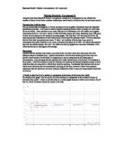
Firstly, I will create a graph (scatter graph) to see if there is a difference between the number of hours watched of television per week and their personal IQ of both males and females together. The formula for the line of best fit (trend line) will identify if there is any relationship. The closer the integer in front of the 'x' is to zero, the less there is any correlation.
I will then split up the data into males and females and repeat the process drawing scatter graphs for each and comparing the slopes hence the relationship.
At this stage, I would like to look at the distribution of males and females in these years. As it is easier to compare the data visually, I will use the function facility on the spreadsheet to calculate the maximum, the minimum, the lower and upper quartiles and the median. I will use these values to draw box plots.
Introduction and Hypothesis
For my investigation, I am going to see if there is a similarity between the number of hours watched of television per week and their personal IQ for year 10's and 11's in key stage 4. I am trying to prove that the less television they watch, the higher their IQ will be as TV time means less time for school work. I downloaded the data from the Internet (from edexcel) and I copied the information on to the Excel spreadsheet.
Method
Firstly, I will create a graph (scatter graph) to see if there is a difference between the number of hours watched of television per week and their personal IQ of both males and females together. The formula for the line of best fit (trend line) will identify if there is any relationship. The closer the integer in front of the 'x' is to zero, the less there is any correlation.
I will then split up the data into males and females and repeat the process drawing scatter graphs for each and comparing the slopes hence the relationship.
At this stage, I would like to look at the distribution of males and females in these years. As it is easier to compare the data visually, I will use the function facility on the spreadsheet to calculate the maximum, the minimum, the lower and upper quartiles and the median. I will use these values to draw box plots.