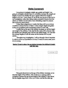
1.61 - 1.65.
Tally Chart for Weight
The mode which appears the most, is situated at interval 56 - 60 as this has the highest frequency. Using the frequency from both tables, I will now find the mean of height and weight (separately).
Mean of Height
I'm going to find the mid-point, and to do this, I have to add both intervals from the height and weight tables and then divide it by two.
Next I have to find the fx, and for this, I will multiply the mid-point by the frequency as Mean = Sum of fx / Sum of frequency
Total: 30 Total: 50.1
Mean of Height: 50.1 = 1.67 m
30
Mean of Weight
Total: 30 Total: 1645
Mean of Weight: 1645 = 54.8 kg
30
I will now draw up a cumulative frequency table before producing a cumulative graph from the data I have gathered. I will be able to find out the median, the upper quartile, lower quartile and inter-quartile range using the cumulative frequency graph. I will draw up two separate tables, one for height and another for weight.
Cumulative Frequency table for Height.
Cumulative Frequency table for Weight.
Using my graphs, I was able to find out the upper quartile, median and lower quartile. The results are as below:
To find the Lower Quartile, the following formulae can be used:
1/4 total number of frequency =
1/4 30 = 7.5
To find the Median, the following formulae can be used :
1/2 total number of frequency =
1/2 30 = 15
To find the Upper Quartile, the following formulae can be used :
3 ( 1/4 total number of frequency ) =
3 ( 1/4 30 ) = 22.5
To find the Interquartile range, the following formulae can be used:
Upper Quartile Lower Quartile = Interquartile Range
15 - 5 = 10
According to my scatter graph, there is a positive correlation between height and weight. This suggests that the taller the person is, the heavier they will be.
The line of best fit suggests that somebody who's around 1.71m tall, will be around 60 kg .
I will now use the information I gathered from the cumulative frequency curves to draw box and whisker diagrams, showing the minimum and maximum values, the median, and the upper and lower quartiles.
Box-and-Whisker diagram for Height
Box-and-Whisker diagram for Weight
In the next part of my coursework, as I have suggested in my plan, that height and weight are both affected by gender; I will therefore extend my line of enquiry to investigate how the correlation between height and weight is affected by gender. I will now test the hypothesis, that of ; " There will be a better correlation between height and weight if we investigate males and females separately."
I will now collect 30 samples of girls and boys separately, using the same method as before (Random Sampling), and record their height and weight in the table below:
Having done those two graphs, I can now say that the evidence supports the prediction I made earlier: " There will be a better correlation between height and weight if we investigate males and females separately."
The line of best fit on the graphs, show that a girl who is 1.70m tall, would weight approximately 55kg, whereas a boy of the same height would weigh about 60kg.
I will now find the equations of my lines of best fit from the graphs, by finding their gradients and the intercept on the y-axis.
Y will be representing height in metres, and X will be representing weight.
Boys: y = 60 x + 1.54
Girls: y = 55 x + 1.39
Mixed: y = 61 x + 1.58
These equations could be used to make predictions of weight, if you already know the height, and vice versa. For example, to predict the weight of a girl who is 1.65m tall:
Y = 55 x + 1.39
X = y - 1.39
55
If y = 1.65 then:
X = 1.65 - 1.39 = 1.62
55
Although the line of best fit, is the best estimation of relationship between height and weight, there are exceptional values in my data ( for example: the girl who is 1.61m tall, and weighs 74kg. ) which don't fit in the general trend/pattern.
I will now draw up a cumulative frequency table and graph for height using the 30 samples of girls and boys I have gathered.
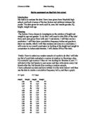
I will now put the data I gathered into two tally charts ( height and weight ) to find the frequency which I will use to get the mean and the mode of the information. I will do this seperately for boys and girls.
The Boys' Tally Chart for Height
The intervals where the most frequency appears is where the mode lies. In this table, 7 is the highest frequency therefore the mode lies between the interval
1.71 - 1.75.
Thr Boys' Tally Chart for Weight
The mode which appears the most, is situated at interval 56 - 60 as this has the highest frequency of 12.
I will now put the data I gathered into two tally charts ( height and weight ) for the girls this time; to find the frequency which I will use to get the mean and the mode of the information.
The Girls' Tally Chart for Height
The intervals where the most frequency appears is where the mode lies. In this table, 10 is the highest frequency therefore the mode lies between the interval
1.61 - 1.65.
Thr Girls' Tally Chart for Weight
The mode which appears the most, is situated at interval 51 - 55
as this has the highest frequency of 13.
The Boys' Mean of Height
I'm going to find the mid-point, and to do this, I have to add both intervals from the height and weight tables and then divide it by two.
Next I have to find the fx, and for this, I will multiply the mid-point by the frequency as Mean = Sum of fx / Sum of frequency
Total: 30 Total: 50.96
Mean of Height: 50.96 = 1.7m
30
The Boys' Mean of Weight
Total: 30 Total: 1752
Mean of Weight: 1752 = 58.4 kg
30
The Girls' Mean of Height
I'm going to find the mid-point, and to do this, I have to add both intervals from the height and weight tables and then divide it by two.
Next I have to find the fx, and for this, I will multiply the mid-point by the frequency as Mean = Sum of fx / Sum of frequency
Total: 30 Total: 49.4
Mean of Height: 49.4 = 1.6 m
30
The Girls' Mean of Weight
Total: 30 Total: 1595
Mean of Weight: 1595 = 53.2 kg
30
Analysis & Conclusion
In general, there is a positive correlation between height and weight. People who are taller will weigh more.
The points on the scatter diagram for the girls are less dispersed about the line of best fit than those for the boys. This suggests that the correlation is better for girls than boys; and also that girls' heights are less predictable.
The points on the scatter diagram for boys and girls are as much dispersed as for that of the boys' scatter diagram. This suggests that when girls' data is considered separately, the correlation between height and weight is better than when mixed together with the boys.
The scatter diagrams can be used to give reasonable estimates of height and weight. This can be done by either reading from the graph or by using equations of lines of best fit.
My cumulative frequency curves suggest that, in general, boys weigh much more than girls, and they're also taller as well.
The median height and weight for boys are higher than the girls'.
From the box plots ( box and whisker diagrams ), we can say that boys are taller than girls, as well as being heavier. By investigating boys and girls separately, we can get a much narrower conclusion on boys' and girls' heights and weights.
My prediction was based on general trends, in both samples, there were some individuals who fell out of the general trend.
In conclusion, I would say that, it's quite obvious without doing necessary back-up investigation that; boys in general are slightly taller and heavier than most girls, however, as I have mentioned above, there were a few results which fell out of the general trend, although those didn't particularly affect my investigation much.
Bibliography: Edexcel GCSE Mathematics. (Higher)