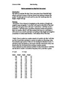
Height
As you can see the first three intervals and the last interval have very low frequencies compared to the other intervals. So therefore it will not show up clearly on the histograms. So therefore it will be more sensible to combine the first three intervals together and to combine the last interval with the penultimate interval.
Here are the frequencies after the combining of intervals
I am now going to think of an alternative way to have frequency densities which are decimals. So I need to find standard intervals.
A sensible standard interval for this data would be 10cm
(Please refer to the graph on page 14)
From looking at the histogram for frequency density against height you can see that there are;
5 people that are between 110 – 140cm tall.
10 people that are between 140 – 150cn tall.
23 people that are between 150 – 160 cm tall.
12 people that are between 160 – 180 cm tall.
As you can see the first two intervals and the first two intervals and the last two intervals have very low frequencies and so therefore will now show up clearly on the histograms. So it will be sensible to combine the first two intervals with the third interval and to combine the last two intervals together. I will not be necessary to combine the last two intervals with the third to last interval because together the have a high enough value.
Here are the frequencies after the combining of intervals
I am now going to think of an alternative way to have frequency densities which are decimals. So I need to find standard intervals.
A sensible standard interval for this data would be 5kg
(Please refer to the graph on page 17)
From looking at the histogram for frequency density against weight you can see that there are;
10 people who weigh between 25 – 40kg.
12 people who weigh between 40 – 45kg.
10 people who weigh between 45 – 50kg.
13 people who weigh between 50 – 55kg.
5 people who weigh between 55 – 65kg.
50 – 55kg has the largest area and so therefore is the most popular group.
I will now do cumulative frequency for my data. This will enable me to compare my different sets of data. Here is the cumulative for the height for boy, girls and mixed population.
I will now use this data to do a cumulative frequency graph.
(Please refer to the graph on page 19)
If I wanted to estimate the number of boys who had a height between 140 – 160cm. The cumulative frequency curve for boys shows me that 1 boy in the sample had a height up to 140cm and 19 boys had a height up to 160cm. This means that 19 – 1 = 18 boys had a height between 140 – 160cm. So I can estimate that 18 out of 25 or 72% of boys will be between 140 – 160cm tall. So if I were to select a boy at random from the school, my data suggests that the probability of him having a height between 140 – 160cm is 0.72.
If I wanted to estimate the number of girls who had a height between 150 – 170cm. The cumulative frequency curve for the girls shows me that 7 girls in the sample have a height up to 150cm and 24 have a height up to 170cm. This means that 24 – 7 = 17 girls have a height between 150 – 170cm. So I can estimate that 17 out of 25 or 68% of girls in the school will be between 150 – 170cm tall. So if I select a girl at random from the school, my data suggests that the probability of her having a height between 150 – 170cm is 0.68.
Here is the cumulative frequency for the weight for the boys, girls and mixed population.
I will now use this data to do a cumulative frequency graph.
(Please refer to the graph on page 22).
If I wanted to estimate the number of boys who were weighed between 40 – 50kg. The cumulative frequency curve for boys tells us that 7 boys in the sample had a weight up to 40kg and 21 boys had a weight up to 55kg. This means that 21 – 7 = 14 boys had a weight between 40 – 55kg. So I can estimate that 14 out of 25 56% of boys will weigh between 40 – 55kg. So if I select a boy at random from the school, my data suggests that the probability of him having a weight between 40 – 55kg is 0.56.
If I wanted to estimate the number of girls that weighed between 50 – 60kg. The cumulative frequency curve for girls tells us that 16 girls in the sample weighed up to 50kg and 25 girls weighed up to 60kg. This means that 25 – 16 = 9 girls weighed between 50 – 60kg. So I can estimate that 9 out of 25 or 36% of girls will be between 50 – 60kg. So if I select a girl at random from the school my data suggests the probability of her having a weight of between 50 – 60kg is 0.36.
I will now draw a box-and-whisker diagram to show the minimum and maximum values, the upper and lower quartiles and the medians for my data. (Please refer to the box-and-whisker diagram on page 20).
The box-and-whisker diagram shows that the girls interquartile range is 4cm less than the boys interquartile range. This suggests that the boys weights were more spread out than the girls weights. The median for the girls is 47kg. The cumulative frequency curve shows that 14 boys have a weight less than the median for the girls. So whilst in general girls weigh more than boys, we have evidence to suggest that 11 out of 25 or 44% f the boys have a weight greater than the median for the girls.
I am now going to establish the standard deviation for height and weight, for the boys and girls of my sample. I am trying to find out whether the data for the boys or girls is more concentrated about their mean.
I am hypothesising that the boys will have a smaller standard deviation than the girls for height; this is because I think girls are more developed in year 7 at an average age of 11 than boys. So I feel boys will all roughly be developed the same amount and will have a smaller standard deviation from the mean. If this is the case it would mean the range of boys heights around the mean will be more concentrated about the mean.
Standard Deviation = √73.64
= 8.6 (to 1 d.p)
The average deviation from the mean is 8.6. 95% of the results lie within two standard deviations of the mean.
So 2 × standard deviation = 8.6 × 2 = 17.2
Mean – (2 × standard deviation) =
154 – 17.2 = 136.8
Mean + (2 × standard deviation) =
154 + 17.2 = 171.2
This means 95% of the boys heights are between 136.8 – 171.2cm.
5% of boys are either taller or shorter than this range.
Variance = 4118 = 164.72
25
Standard Deviation = √164.72
= 12.8 (to 1 d.p)
The average deviation from the mean is 12.8. 95% of the results lie within two standard deviations of the mean.
2 × standard deviation = 12.8 × 2 = 25.6
Mean – (2 × standard deviation) =
151 – 25.6 = 125.4
Mean + (2 × standard deviation) =
151 + 25.6 = 176.6
This means 95% of the boys heights are between 125.4 – 176.6cm.
5% of boys are either taller or shorter than this range.
My hypothesis was correct, the standard deviation for the boys was smaller than that of the girls. Meaning the range of boys heights is more concentrated about the mean. So according to my data it is apparent that boys are more evenly developed in terms of height than girls. But this may be due to pure chance. I may get different results with a larger or different sample of children.
Now for the standard deviation for weight, for boys and girls. After taking everything into consideration I have decided than I cannot actually make an accurate hypothesis for weight. This is because weight is determined due to the individual’s type of living, for example, the amount one eats or the amount of exercise one does. Weight is unlike height which can be determined due to ones genetic make-up. However I am going to hypothesise that because boys are more into sport than girls, that their weight will be more concentrated about the mean due to fitness levels and so this means boys will have a smaller standard deviation than the girls.
Variance = 2646 = 105.84
25
Standard Deviation = √105.84
= 10.3 (to 1 d.p)
The average deviation from the mean is 10.3. 95% of the results lie within two standard deviations of the mean.
So 2 × standard deviation = 10.3 × 2 = 20.6
Mean – (2 × standard deviation) =
45 – 20.6 = 24.4
Mean + (2 × standard deviation) =
45 + 20.6 = 65.6
This means 95% of the boys heights are between 24.4 – 65.6kg.
5% of boys are either weigh less or more than this range.
The average weight for girls is;
Variance = 753 = 30.32
25
Standard Deviation = √30.32
= 5.5 (to 1 d.p)
The average deviation from the mean is 5.5. 95% of the results lie within two standard deviations of the mean.
So 2 × standard deviation = 5.5 × 2 = 11
Mean – (2 × standard deviation) =
46 – 11 = 35
Mean + (2 × standard deviation) =
46 + 11 = 57
This means 95% of the boys heights are between 35 – 57kg.
5% of girls are either weigh less or more than this range.
After doing standard deviations I have found out that my hypothesis was incorrect. The standard deviation for the girls is smaller than the standard deviation of the boys, which means the boys weights are less concentrated about the mean than girls. I was never really confident that my hypothesis would be correct because it was a guess and I didn’t have much plausible evidence to back it up. If I were to extend my data or use different random data id still only get results based on chance and I so still I feel that the results would be inconclusive.
I now feel that I have established a thorough investigation for my sample of year 7 students. I am sure I have covered all relative issues for height and weight and am able to make detailed observations for my data. I now feel I can extend my investigation by investigating year 11 student from the same school. I will again get a random sample of 50 students, 25 boys and 25 girls. I will again be comparing height and weight and as I try to find things like averages and deviation from the mean I will be observing the differences from the year 7 students. Like year 7 there is also information around 170 year 11 students, and because the every third boy and girl, starting with the third boy and girl method proved so successful for year 7 I will be using the same method to gain my random sample for the year 11 students.
Here is more useful representation of the data for year 11. Here are the frequency table for height and weight separated into boys and girls. The height and weight is continuous data.
For my data for year 11 I have had to make a few changes to my frequency table. For weight I have had to do 10kg intervals instead of 5kg intervals which I did for year 7. This is because the range of weights for year 11 students is far wider and so this new interval is much more appropriate. For the height of year 11 I have kept the 10cm intervals but I now I have put intervals ranging from 130cm – 200cm, this fits my data much better.
I will now put the information from my frequency tables into stem and leaf diagrams so that I can find the mean, modal class interval (because it is continuous data), median and range for the height and weight for the boys and girls.
Stem and leaf diagram for height
Boys Girls
The mean height of the boys is higher than the mean height for the girls. The modal class interval is the same for both boys and girls. The median for the boys is higher than the girls, also the range of the girls 0.46m and is extremely close to the boys range of 0.45m. The evidence from the sample suggests that 5 out of 25 or 20% of boys have a height that is between 150 – 160cm, and 15 out of 25 or 60% of girls have a height between 160 – 170cm. The frequency table shows that more girls than boys have a height less than 160cm, but more boys than girls have a height more than 170cm. These results are based on a random sample of 25 boys and 25 girls from year 11. To confirm my results I could extend my sample or try a completely new sample and compare the results.
Stem and leaf diagram for weight
Boys Girls
The mean height of the boys is higher than the mean height for the girls. The modal class interval for boys is 50 – 60kg whereas the modal class interval for girls is 40 – 50kg. The median for the boys is higher than the girls by 10, which means the girls weights have a lot more smaller value than the boys weights. The range of the boys 0.58 and is extremely higher than the girls range which is 0.28, this is because for boys the highest weight for the boys is 93kg which is 27kg higher than the girls highest weight which is 66kg. The evidence from the sample suggests that 4 out of 25 or 16% of boys have a weight that is between 60 – 70kg, and 10 out of 25 or 40% of girls have a weight between 50 – 60kg. The frequency table shows that more girls than boys have a weight less than 60kg, but more boys than girls have a weight more than 60kg. These results are based on a random sample of 25 boys and 25 girls from year 11. To confirm my results I could extend my sample or try a completely new sample and compare the results.
Now for year 11 I want to find out if like the year 7 students if there is a relationship between height and weight. When doing scatter graphs for year 7 I found there was positive correlation for the data meaning that there is some kind of relationship between height and weight for most students. However there was the odd “freak” student who disrupted the trend of my line of best fit. This is the reason why I am curious to see weather there is a relationship between height and weight for year 11 students.
For my hypothesis I have to consider more factors before making my decision. I must take into account that by year 11, students are likely to be at all different stages of growth and puberty. But however I am still going to hypothesise that the taller you are the more you likely to weigh because I still think that whatever height you are in year 11 it is still going to have an impact on the amount you weigh. From doing scatter graphs for year 7 students I have learnt that separating boys and girls gives you much better correlation and so I will have clearer information on whether there is any relationship between height and weight. So this time for year 11 student I will not waste time by doing a scatter graph for the mixed population, I feel this will be a waste of time. So I will only investigate to fin d a relationship for height and weight for boys and girls separately.
(Please refer to the scatter graph on page 33).
As you can see for boys there is strong positive correlation indicating that there is a lot of relationship between height and weight, meaning for boys the taller you are the more you are likely to weigh. There was one freak result I obtained and that was the boy who was 192cm tall but only weighed 45kg. When drawing my line of best I did not consider this boy because it is a freak and very rare result and including him would change my line of best fit to an unnatural positioning on my scatter graph. My line of best fit suggests that a boy who is 180cm tall will weigh 70 kg and a boy who weighs 50kg will be 162cm tall.
For the girls as you can see there is weaker positive correlation. Meaning that there is still a relationship between the height and weight of the girls but the relationship is not as strong as the boys. My evidence for girls suggests your height may contribute to how much you weigh. Yet again there was 1 freak result that I did not consider when drawing the line of best fit for girls, and this was a girl who was 136cm tall and who weighed 55kg. My line of best fit suggests that a girl who is 165cm tall will weigh 54kg and a girl who weighs 70kg will be 177cm tall.
I will know find the equation of the lines for boys and girls so I can make prediction for height and weight.
(Please refer to the graph on page 35).
Boys
Gradient = 1
Intercept = 134
y = mx + c
y = 1x + 134
x = y – 134
1
So if a boy is 170cm tall the equation of the line would suggest
If y = 170 then
x = 170 – 134 = 36 = 36 (36 + 30 = 66)
1 1
The first value on graph is 30, so 30 + 36 = 66kg
So the equation of my line of best fit for boys suggests that a boy who is 170cm tall will weigh 66kg.
Girls
Gradient = 0.8
Intercept = 140
y = mx + c
y = 0.8x + 140
x = y – 140
0.8
So if a girl is 164cm tall the equation of the line would suggest
If y = 164cm then
X = 164 – 140 = 24 = 30 (30 + 30 = 60)
0.8 0.8
The first value on my graph is 30, so 30 + 30 = 60
So the equation of my line of best for girls suggests that a girl who is 164cm tall will weigh 60kg.
I know feel I should make comparisons between the year 7 and year 11 students. I feel this will give me information on how much change occurs in five years. I will be doing standard deviation to find out whether how much the deviation of height and weight from the mean changes as you progress from year 7 to year 11. From doing this investigation I have established that better and clearer results are obtained when boys and girls are separated. So for the standard deviation I will not investigate year 7 to year 11 using the mixed group for each year. I will instead be comparing year 7 boys to year 11 boys and the year 7 girls to the year 11 girls.
I am hypothesising that the boys and girls in year 7 will have smaller standard deviations than the boys and girls in year 11 for height and weight. The reason for this hypothesis is that by year 11 boys and girls are all at different stages of growth and puberty and so the range on heights and weights will more, and so therefore the deviation about the mean will be less concentrated. Whereas in year 7 boys and girls are more a less at the same stage in puberty and growth and so their height and weight will be more similar than the boys and girls in year 11. So therefore the deviation of the range of heights and weights will be more concentrated about the mean.
Here are the standard deviations for the boys and girls, heights and weights in year 7 I obtained earlier in my investigation.
Here are the standard deviations for the height and weight of boys in year 7.
Variance = 2646 = 105.84
25
Standard Deviation = √105.84
= 10.3 (to 1 d.p)
The average deviation from the mean is 10.3
Here are the standard deviations for the height and weight of boys in year 11.
The average height for boys in year 11 is;
Variance = 3288 = 131.52
25
Standard Deviation = √131.52
= 11.5 (to 1 d.p)
The average deviation from the mean is 11.5. 95% of the results lie within two standard deviations of the mean.
So 2 × standard deviation = 11.5 × 2 = 23
Mean – (2 × standard deviation) =
170 – 23 = 147
Mean + (2 × standard deviation) =
170 + 23 = 193
This means 95% of the boys heights are between 147 – 193cm.
5% of boys are either taller or shorter than this range.
Variance = 3629 = 145.16
25
Standard Deviation = √145.16
= 12 (to 2 sig fig)
The average deviation from the mean is 12. 95% of the results lie within two standard deviations of the mean.
So 2 × standard deviation = 12 × 2 = 24
Mean – (2 × standard deviation) =
59 – 24 = 35
Mean + (2 × standard deviation) =
59 + 24 = 83
This means 95% of the boys heights are between 35 – 83kg.
5% of boys are either weigh less or more than this range.
After finding the standard deviation for year 11 boys, height and weight and comparing it to the standard deviation of the year 7 boys height and weight which I already had, I can confirm that my prediction that year 7 boys will have a smaller standard deviation than the year 11 boys for height and weight. The standard deviation for height, for the year 7 boys was 8.6 and for year 11 was 11.5 that is a difference of 2.9. This confirms that the height of year 7 boys is more concentrated about the mean. The standard deviation for weight, for boys in year 7 was 10.3 and for year 11 was 12 that is a difference of 1.7. This confirms that the weight of year 7 boys is more concentrated about the mean.
Due to the results I got from the boys in year 7 and 11, I will keep the same hypothesis, as I am confident the same applies for girls too.
Here are the standard deviations for the height and weight of girls in year 7.
Variance = 4118 = 164.72
25
Standard Deviation = √164.72
= 12.8 (to 1 d.p)
The average deviation from the mean is 12.8.
Variance = 753 = 30.32
25
Standard Deviation = √30.32
= 5.5 (to 1 d.p)
The average deviation from the mean is 5.5.
Variance = 1947 = 77.88
25
Standard Deviation = √77.88
= 8.8 (to 1 d.p)
The average deviation from the mean is 8.8. 95% of the results lie within two standard deviations of the mean.
2 × standard deviation = 8.8 × 2 = 17.6
Mean – (2 × standard deviation) =
162 – 17.6 = 144.4
Mean + (2 × standard deviation) =
162 + 17.6 = 179.6
This means 95% of the boys heights are between 144.4 – 179.6cm.
5% of boys are either taller or shorter than this range.
Variance = 1446 = 57.84
25
Standard Deviation = √57.84
= 7.6 (to 1 d.p)
The average deviation from the mean is 7.6. 95% of the results lie within two standard deviations of the mean.
So 2 × standard deviation = 7.6 × 2 = 15.2
Mean – (2 × standard deviation) =
51 – 15.2 = 35.8
Mean + (2 × standard deviation) =
51 + 15.2 = 66.2
This means 95% of the boys heights are between 35.8 – 66.2kg.
5% of girls are either weigh less or more than this range.
After finding the standard deviation for the year 11 girls, height and weight and comparing it to the year 7 girls, height and weight which I already I can say that my hypothesis was not fully correct. For weight, I can confirm that year 7 girls had a smaller standard deviation than the girls in year 11. The standard deviation for the year 7 girls was 5.5 and for year 11 girls it was 7.6, which is a difference of 2.1. This confirms that the weight of year 7 girls is more concentrated around the mean than weight of year 11 girls. However for height year 11 girls had a smaller standard deviation than the year 7 girls. The standard deviation for the year 7 girls was 12.8 and for year 11 it was 8.8, which is a difference of 4. However I think this is the case purely due to the chance of the random sample. I am sure with another random sample, I would I proven myself correct. I think this because 3 out 4 of my hypothesises were correct and this one that wasn’t should have been due to the fact that for everything else (boys height, weight and girls weight), year 7 students have a smaller standard deviations than the year 11 students).
Conclusion
The plan I constructed I felt made my investigation make sense and so allowed me to get good results that I could compare to each other and find relationships and significances within my data for height and weight for the years 7 and 11. I think it was vital that I used random sampling to find the 25 boys and 25 girls for each year because this was the only way I could be sure my results would be fair and unbiased. But even with random sampling I could not fully trust any results or conclusion I obtained with different mathematical methods because of the fact that I got those results from a random sample of the year and so therefore those results I obtained may only be down to chance. This means I could never say what I found out related to the whole year, but even so I think I got a rough idea of what was happening.
I then decided to see whether there is any relationship between the heights and weights of the year 7 students. I hypothesised that the taller you are the more you are likely to weigh. The reason for this hypothesis was that it seemed to be pretty obvious that the taller you are the more you are likely to weigh in most cases, but still I had to prove this and so I drew scatter graphs for height and weight and then I looked for correlation. For my first scatter graph I used boys and girls together. When analysing my results they indicated that there was positive correlation, however it was not very strong correlation. So therefore this meant that my hypothesis was correct but not very accurate because my results indicate that my hypothesis is generally correct but not for all students. I then hypothesised that separating boy and girls would produce stronger correlation, and my results indicated that my new hypothesis was correct because for boys and girls I found there to be stronger correlation than there had been before. Even with these results I can not be sure that they are accurate because they come from a random sample of students and so therefore the results may be down to chance.
For the frequency density of 7 year students I found for height and weight that I had to combine the lower and higher intervals together in order to make there frequencies large enough to plot on a histogram. This indicates that before any combining of intervals was made that the most popular intervals were in the middle intervals of my data.
For the averages of the year 11 students I found that there was much more difference between boys and girls for height and weight, this indicates that for year 11 there is a much different variety of results compared to year 7 students.
Overall I feel I have conducted a very successful investigation which has answered the accuracy of most of my hypothesises, however there have been some unexpected results which I am sure are down to the chance of the random sample. So therefore with another sample I may get different results.