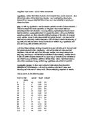
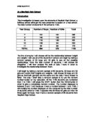
Now, to get my 100 sets of data, I will use selective sampling. This will give me 100 sets of data, both boys and girls from the whole school, but in proportion to how many boys and girls there are. Following this page is the working out of how I found how many people I would need to chose from each year group.
These tables show enough data to be displayed on a scatter graph. The scatter graph is on the following page.
Comments:
From my scatter graph showing heights against weights of 51 boys and 49 girls, I can say that height does affect weight. As nearly all of the heights increase, the weight increases as well. There are some tall and light people, and short and heavy people, which proves that my hypothesis isn’t 100% accurate. Some people don’t follow my theory, and they have been included in the graph to show my theory was wrong.
There wasn’t a strong correlation on my graph, as the weight axis wasn’t as spread out (31-86… 55 difference) whereas the height axis was a lot more varied (119-203… 84 difference). This spread the graph wider, making the results show a more horizontal correlation.
Hypothesis 2 – Are boys taller than girls?
Introduction:
For this hypothesis I shall plot a Cumulative Frequency polygon. From these I will then be able to draw two Box-plots, which will show us if boys are taller than girls. This is not to say all boys are taller than girls. We will be looking at the Quartiles, Q1, Q2, and Q3 to see if the majority of boys are taller.
I will gather all the boys’ height data from the previous pages, and put it into a table and tally how many boys are in certain groups of height. Then, if the groups bunch up in the middle, with high tallies in the middle, and low tallies near the ends, I will split the middle groups up, as to spread out the data and create more even sized groups. At the end of these rearranged tables I will put another column titled ‘Cumulative Frequency (CF)’. In this I shall put the cumulative frequency of all the data.
Once all the boys data has been collected, tallied and rearranged, I will repeat it with the girls’ data for heights.
After CF polygons have been drawn, I shall find the quartiles and produce a box-plot. I shall also draw up a histogram showing my results, using the rearranged table groups.
Heights:
Boys – min. 132 max. 203
Girls – min. 119 max. 180
Boys – Rewritten Groups
Girls – Rewritten Groups
Comments:
From these results I can say that some boys are taller than girls, but not all.
The CF Polygons are quite different in shape. The boys’ Polygon has a less steep incline than the girls. This shows the data is more spread out and there are more spread out data than the girls.
The positions of the quartiles are near the middle of the scale, and the Q2 of each box-plot is very close to each other. The boys’ Q1 and Q3 are further spread out, leading to a larger Inter-Quartile Range. The girls’ left hand ‘whisker’ on the box-plot extends further left than the boys, showing that there was at least one girl who was shorter than the shortest boy. And the same appears on the right hand side. The boys’ right hand whisker extends further right than the girls one, showing us that there was at least one boy taller than the tallest girl.
Hypothesis 3 – Are boys heavier than girls?
Introduction:
For this hypothesis, I will be repeating all the steps taken in the previous investigation, but using weight data instead. I will try to discover if boys are heavier than girls, or if my theory is wrong.
I will display all my results in the same way as the previous hypothesis; tables, which will then be rearranged, CF polygons, box-plots and finally histograms.
Weights:
Boys – min. 31 max. 86
Girls – min. 35 max. 62
Boys – Rewritten Groups
Girls – Rewritten Groups