Help the aged letter - A critical analysis.
Help The Aged Letter- A Critical Analysis
In this essay I intend to thoroughly analyse all aspects of the first page of the letter. I am going to work my way through the letter, firstly commenting on the graphology, and then language, although in some places these will obviously overlap.
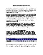
In the top right hand corner, we see the logo. It shows a sun setting and is a bright image. It is eye catching and uses connotations to represent happiness, and the sun itself represents life. The logo is saying that although the sun is setting and that the end may be near, there is still happiness and brightness, and prosperity. The logo is very basic and clear and I think this has been done to make it instantly recognisable and distinguishable.
In the other corner, there is what is designed to look like a part of a letter or note that has been torn out, with rough edges. Because it looks like lined paper and the font is designed to make it look handwritten, the reader gets the impression that it is a genuine part of a letter that has been torn out. However my criticism of this is that I believe they have selected the wrong font. The letter is supposed to be from a 78-year-old woman, yet the font looks like a younger persons handwriting and also the font looks somewhat cheerful. I feel something like Lucida Calligraphy would have been a more appropriate font, although it perhaps looks a little overdone, it is nearer to an elderly woman's handwriting.
Use of the word "loneliest" in the torn out letter clip is good because it is a superlative emphatic adjective and emphasises the degree of loneliness and adds to emotional impact to the reader. The style of the clip that has been torn out is both conversational and personal, with the use of phrases such as "really hard" and "for me". I think it has been put at the top of the page to draw the reader to the top, so that they start there and work their way down the page. The torn out clip has been put there to make the reader feel both guilty and sorry for the person who wrote it. It makes the reader want to read on to get the rest of the story and perhaps find out how they can help.
Below the logo is the name of the charity- Help The Aged. This is designed to be politically correct, with use of the word "aged" instead of perhaps "old". It is an imperative in the fact that it is like an order, Help the aged. Just below this are the address and various contact details for the charity. This is done in a conventional style and tells the reader this is a large reputable charity and is well established, based in London. It also tells the reader they are an up to date charity, with email, a website and fax.
The first line "Right now people like Maud are dreading Christmas. Your £14 will mean they won't have to spend it alone" is like a heading to the letter. Use of the words "Right Now" tells the reader that this is urgent, that this is something happening now and that they must act. Again political correctness comes into play with use of the phrase "older people" which has clearly been chosen specifically. The name Maud has also been carefully chosen. It is a typical old woman's name, with authenticity and although perhaps dull in the eyes of a ...
This is a preview of the whole essay
The first line "Right now people like Maud are dreading Christmas. Your £14 will mean they won't have to spend it alone" is like a heading to the letter. Use of the words "Right Now" tells the reader that this is urgent, that this is something happening now and that they must act. Again political correctness comes into play with use of the phrase "older people" which has clearly been chosen specifically. The name Maud has also been carefully chosen. It is a typical old woman's name, with authenticity and although perhaps dull in the eyes of a young reader, it represents a generation. For example if they had chosen the name Alicia, it would have not sounded right because this is about older people and they generally don't have those kind of names. But even with older generation names, selection would still have to be careful. They have chosen a very drab, dull and lifeless name. They could still have chosen an older name such as Rosemary but have not as this would sound too bright and cheerful.
The use of "are dreading" is very dramatic, powerful and emotive auxiliary verb.
With "Your £14" it is direct and 2nd person possessive, it is talking directly to the reader and telling them how their £14 will help. The word "will" is a definite auxiliary, it's saying there is no question about it and it will definitely happen. Because they have said "they", it tells the reader that they aren't just talking about one person but many. "Alone" is use of an adjective to show isolationism and again adds to emotional impact.
The top line or heading is in bold font so that the reader naturally looks at it first. As with the torn out letter, it takes the reader to the top of the page so that they work their way down in order.
Something I have noticed is the recipient is referred to as a "friend" in the statement "Dear Friend". It makes the reader sound positive from the writer's opinion and makes a direct link between the sender and the receiver.
The first sentence, "What does Christmas mean to you?" is interrogative and direct with use of the word "you". It is also a rhetorical question and is answered for you in the next line. It invites the reader to make a response. I think it is answered instantly for you in the next line so that the reader does not have time to think of the bad or negative images of Christmas, such as Christmas shopping and the dispersed families. In the next line, the use of the 1st person plural pro-noun "us" is used to give solidarity between the reader and sender- as if the sender is talking to you directly, as previously in "Dear Friend".
With the examples, they are literally piling up positive mental images for the reader, 3 nouns of which are plural and one of which is abstract. "Family and friends" has been put in because it is a collocated set phrase, and one compliments the other. It makes the reader think of their family and friends, adding to the positive images.
There is then a gap of one line before the next paragraph begins. "But" is a contrastive conjunction, it is preparing the reader for something that will totally destroy all the positive images that have built up in their head in the previous line. The word "tragic", in the next sentence is a very dramatic adjective, again they are trying to emphasise the emotions and emote the reader. For the first time it tells the reader that the torn out letter above was actually written by "Maud". They described her words as tragic and I think they are almost trying to shock the reader, make them think how awful it must be for "Maud".
After the reader has created the positive mental image of what Christmas is like for them, the writer tells the reader what it's like for Maud. Four abstract nouns are used to contrast the four positive adjectives used previously to describe Christmas. They are somewhat extreme contrasts, as this adds to the emotional impact. Instead of the positive connotation previously ("family and friends"), negative connotations are used. Words such as loneliness generate sympathy and perhaps even guilt as we begin to feel sorry for Maud. Also it is worth pointing out that repetition has been used, with four positive examples and then four negative.
Again the text is broken up by a one-line gap. This has been done to break up the text so that it does not look like so much reading and also so one can skip to a paragraph easily. The sentences are fairly short and not too complex so that readers of all abilities can read the letter without too much difficulty.
The next line is in italics. This is to make u pay extra special attention to the sentence and when you read it, it is supposed to shock you, the fact that Maud has now spent 7 Christmases alone. It is also designed to again make the reader feel both guilty and sympathetic. With the adverbs "every" and "completely", they have intensified things.
In the next paragraph we see the second example of repetition. The word "no-one" is used four times in just one paragraph. It has been done to reinforce the loneliness of Maud. There is also some mild use of alliteration with "traditional turkey".
To the right of this paragraph is a picture of Maud. It is clear that it has been carefully selected. The old lady looks perhaps a bit bored and wistful. She is positioned in the dark looking out into the light; as though she is stuck inside on her own in the dark while everyone else is outside in the light. It also looks as though she is maybe looking for friends and the fact she is alone again represents her loneliness. She looks respectable and almost genteel suggesting to the reader that things like this shouldn't happen to such people.
In the next paragraph, it starts as though the writer of a letter is telling you a story about what "Maud" has said, and she is put across to the reader as somewhat pathetic and feeble however, if u remove words such as "few sprigs" and "strands", it sounds perfectly normal. They have used these words which are plural nouns, to make the reader again feel guilty and compare their decorations to hers, and in comparison, for most people, their house would appear lavishly decorated. The words "sprigs" and "strands" represent sparseness and absence. Again they focus on her loneliness with adjective and abstract nouns like "lonely" and "despair".
In the following paragraph, Maud is furthermore put across as lonely, desperate and isolated. The opening line "As the world around her celebrates", is included as it makes her sound left out of all the fun and celebrations.
I think the paragraph is very exaggerated, with adjectives such as "tortured" and "staring at four walls", are added in as they are emotive to the reader. When it says "I simply cannot imagine", it reminds the reader that this is a personal letter being written by a real person, it is a 1st person pronoun and the adverb "simply" intensifies things. The tag question "Can You?" again personalises the letter, making the reader think.
The next paragraph is in italics to make it stand out. I think this has mainly done so that if the reader is just scanning through, they will notice the different type font and focus in on it, wondering why it's in a different font. Again, as with the last lines of the previous paragraph, it is written in first person, to personalize the letter and make it feel as though the writer is talking directly to the reader. I think the use of the word "gift" is an interesting one. It is both positive and sympathetic, something given out of generosity, selfless and voluntary. The figure of 400,000 is included to shock the reader and make them think that "Maud" is not the only one who will spend Christmas like this. "Struggle" has been included to again emote the reader, along with "tragedy". In the last sentence, the modal auxiliary "could" is fairly general, it is not saying that your "gift" will definitely stop this "tragedy", but it "could".
The last paragraph is the first mention of Help the Aged. It is very much made up of statement sentence's, explaining why they need the money. It has changed the tone of the letter- until now it has been a sob story, nagging at the reader's conscience and emotions. However now it is explaining why and how they need to help people like Maud.
Overall the letter is very technical with a wide use of semantics to persuade the reader to part with their money. It uses both visual and textual techniques to draw the reader in and once it has gained their attention, it tries to keep them interested.