I plan to get my data of the spreadsheet which the school supplied and rearrange the order of the students in year groups and gender groups like all year 7 males then year 7 females in order etc. I plan to plot my results on a scatter graph which will show me that if the people I have chosen have either good correlation or bad correlation but also I will use cumulative frequency graphs to help draw my conclusion if really the more taller you are the more you weigh but also I will be relating each graph from one another and making out what I see when I compare all the graphs.
I am going to sample in a fair way so that I don’t get unbiased data, so the method I plan to use is random sampling in which the data has pupil number up to 1900 or so and to make sure that I am not cheating in any by selecting any old pupil but I will use my scientific calculator use the mode button go to fix put it up to 4 decimal places and press shift and random and it will automatically choose number and all I have to is choose the year group and wait for the correct number to come and choose for example if I needed 4 girls in year 7 I would press shift and random and say if the number came to 0.876 which mean 876 relating to pupil and number and if that number Is not a number of a year 7 girl then I go on to the next one till get my selected students I need and if you get repeats u leave it out and go and find another one. I will be selecting students by using 2.5% sample say if there was 151 boys in year 7 I would use 2.5% divide it by 100 then times it by 151 and when you get the answer you round it up and use that number to select how many boy sand girls you want from each year group because the data handling sheet says there is 1200 people in the school but according to the spread sheet there is only 1183 people so I have used 2.5% sample so I use altogether 30 pupils to help prove my hypothesis. When I have collected all my students altogether of 30 I will put the data on scatter graph like if I chose 7 boys and 6 girls in year 7 I will plot them on graph paper and draw a line of best fit to see the trend and go onto next year group etc and finally at the end have all 30 pupils selected on one graph comparing them and seeing of my hypothesis Is true or not and also use my cumulative frequency diagram to help draw out my conclusions.
I predict that the taller you are the more the person is likely to weigh because many aspects help me chose that is right because if a person was 6ft tall and only weighed 35 kg it would not be right because they wouldn’t survive properly but wouldn’t be able to hold themselves off so I predict that the taller you are the more you re likely to weigh.
I have got all my information all from key stage 3 and 4 students.
I will record and present my data on a scatter graph which I will use weight and height data to transfer on to a scatter graph and I will comment on the trend, line of best fit and comment on the correlation but also the patterns on the graph.
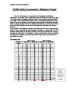
604 579 1183
2.5% of each boys and girls in each year is(rounded up):
Year 7-Boys:4
Girls:3
Year 8-Boys:4
Girls:3
Year 9-Boys:3
Girls:4
Year 10-Boys:3
Girls:2
Year 11-Boys:2
Girls:2
What to do:
1: Set up the problem:
aim
Hypothesis- You may have more than one… related the same line of enquiry
Explain how you collect you data. What is your sample size what type of sampling are you using?
Selective, stratified or random.
Show all your working …..list your data.
Analyze The data
1:scatter graphs
Correctly labbeled
Correct scale used
Line of best fit.(use the mean)
Comment on your graph
-does this show that your hypothesis is correct?
Can you use the equation to find missing values etc.
Equation of line of best fit: Y=mx+c
Cumalitive frequency graph .box plot to compare data.
These Are the Students I have selected through random sampling.
0562
0416
0724
0714
0695
0480
0767
0603
0737
0562
0354
0505
0617
0480
0631
0052
0603
0142
0763
0399
0559
0804
0035
0302
1145
0968
1151
0928
0956
0831
1014
0949
0926
Mayfield High School- Coursework- Conclusion
I am comparing 30 selected students at random from Mayfield High School and relating their height to their weight. I predicted that the taller you are the more you are likely to weigh in the end which came true and my graphs and results showed us that the taller you are the more likely you are to weigh a lot.
In my coursework I used a sampling method and didn’t just collect any old data but use the calculator to pick my random school number with the function by clicking shift and random. The method I used for sampling was random selection. The scatter diagrams I drew was the key factor to prove that the taller you are the more you weigh because as I already I have mentioned that my hypothesis was right and to make it understandable was the scatter graphs because all of them mainly had good correlation and showed the odd anomaly but showed the direct line going from height to weight positively which showed that my hypothesis was right. Also gradually as I went up year group by year group I started getting more positive results and hardly any negative results, which was good and showed that my hypothesis was true and correct.
My results was very useful as I have already mentioned using my scatter graphs as my main factor proving that my hypothesis was right but also I knew my experiment wasn’t perfect but If I had to do it again I would add more hypothesis to see if it is really true the relation between height and weight. In order also to make my work more accurate I will use more accurate numbers and also different sampling methods to see if then if my hypothesis comes out correct but also I will use the column of how they travel and how long is it from school to home because this factor could change figures around because if students were short and weighed a lot an travelled to school by car that means they get no exercise so which could change the aspect about relating height to weight because if they get too much or too little exercise it coluld al change the figures which could make a difference which I will have to investigate next time to improve my work but overly done well but also I have said what I can do next time to improve it.