Predictions
My prediction is that the boys will be taller than the girls all the way through. The prediction was made without close examination of the table, and purely because it seems the obvious outcome. I predict that the whiskers on the boys’ diagram will be longer than those on the girls’ and that there will be a skew to the right, as boys grow taller in a shorter time than girls. I think that the whiskers will be quite short on the girls, and that the box will be shorter as there will be a smaller range and interquartile range.
Results
A Table Showing the Important Values when Comparing the Heights of the Male and Female Students at Mayfield High in a Cumulative Frequency Graph and Box Plot
A Cumulative Frequency Diagram Comparing the Heights of the Male and Female Students at Mayfield High (Using a sample of 100 students)
This cumulative frequency graph and box plots prove my theories correct, but not to the extent I had imagined. Most of the way, the boys’ line is further to the right, indicating that the boys were taller than the girls, but never by more than seven or eight centimetres all the way through. I thought this might suggest that my sample of boys were of a little lower height than average, or that my sample of girls were taller than the average. I researched this, using height charts on the Internet.
3. Global Comparison
Notes
The reason I have put white males and females is because in doing my research I found that in many cases black males and especially black females are a few centimetres taller than white males and females. I am assuming here (wanting to opt for one or the other) that the majority of students in the school are white.
The school year cut-off is the 1st September. Therefore the students in each year are not all of one age, but for example, year seven students are either 11 or 12. As the data was collected in July, I have put the students as the higher of the two ages (eg. 12) because most of students will have had their birthdays.
I used the average values from ALL the data across the years, not just a sample.
I took the median rather than the mean as the average as it excludes any outlying (anomalous) values (for example if one student is especially tall or short for their year).
Conclusions formed from the table
In the male table the Mayfield average is close to the given average. However, the samples taken from years 10 and 11 produced the same median, implying that the boys didn’t actually grow between year 10 and year 11. It would seem that this was just due to the boys in the current year 11 being shorter on average in comparison to the international values than the boys in year 10. As I had predicted, the median height of the boys ended up 4cm below the national average.
In the female table, the medians were even more varied. The year 10 and year 11 medians are the same, and the year nine median is less than the year eight median, implying that the girls somehow shrunk between the two years. This is also due to the current years being either taller than average (eg. years seven and eight) or shorter than average (eg. 11 and nine).
In both groups, however, the medians stay within 3cm of the national average throughout the whole course of the school.
4. Comparisons between years
I am going to use box and whisker diagrams to try and prove the hypothesis ‘the difference in height between boys in years seven and those in year 11 is greater than the difference in height between girls from the same years’.
Method
First I collected the relevant data, the heights of boys and girls in years seven and 11. As there were only four different sets involved I decided to use all the data in this investigation, rather than sampling. I sorted the data into stem and leaf diagrams for easy reference and then calculated the important values for creating box and whisker diagrams - the maximum and minimum values, the upper and lower quartiles and the median.
Results
Box and Whisker Diagrams to Compare the Heights of Year Seven and Year 11 boys and Year Seven and Year 11 girls
Conclusions formed from the diagrams
First of all, there are a few dubious values to be commented on. The minimum value for year 11 girls is only 103cm, which seems an extremely unlikely height for a 15/16 year old girl, especially as the international average height for that age is 163cm. The maximum height for year 11 boys is 206cm, which is also very unlikely, as the international average height for that age is 174cm. Four boys (out of a total of 84) claim to have a height of 200cm or more. After my research for investigation 3 it is clear that few 16 year old boys are likely to be taller than around 190cm and so I think that these values are not true.
As my diagrams show, the median value for boys in year 11 is 15cm higher than those in year seven, and the interquartile ranges don’t even overlap. The median value for girls, however, is only 9cm lower in year 7, and the interquartile ranges of the two years overlap by 3cm. This proves my hypothesis that ‘the difference in height between boys in years seven and those in year 11 is greater than the difference in height between girls from the same years’.
EVALUATION AND LIMITATIONS
My enquiries were obviously limited to the students of Mayfield High. When comparing the height of the students in Mayfield school (investigation one) and students nationally we would have to take into account how there were unequal numbers of boys and girls, and unequal numbers in each form throughout the school, (for example 282 in year seven but only 170 in year 11) which might have biased the data. In investigation two I used equal numbers of boys and girls but there were still unequal numbers of different aged students. To ensure an entirely accurate comparison the data would need to be the same size between the different years. For a national comparison the data would need to be collected on a wider scale; different schools in various different locations around the country and a greater number of students.
In my research for investigation three I found many different height charts and tables for the different ages. I judged the ones I eventually used (see appendix) to be the most accurate and to display the most data (percentile lines as well as an average line).
Accuracy is also a problem as no one checked to ensure the students’ data was accurate and some of them misunderstood the question or simply submitted clearly incorrect data (for example the girl in year 10 who put her height as 4.65m).
APPENDIX
Notes
All the original data was in metres (ie. 1.55) but when displaying it as a histogram I decided to change it to centimetres (ie. 155) for convenience. It is in centimetres in every instance except in the appendix where it appears in its original unaltered form.
- Table to show the number of boys and girls from each form when generating a stratified sample of 100.
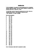
An example to show how I sampled to draw a histogram
I numbered the students from one to 151 and then generated 13 random numbers from between one and 151 and sorted them into numerical order.
1
2 1 7
3
4 4
5
6 0 2
7 5 8
8
9 7
10
11 4
12
13 3 7
14 1
15 0 Key – 6 0 = 60
I copied the heights of these 13 students. I then did the same for the girls and the other four years. I sorted the results into groups of class width five or 10 and put them in a table. I used these results to work out the frequency density and draw a histogram.
The data I used in drawing my histogram
A Table to show the Classes of Heights of the Students at Mayfield High and their Frequency Densities
2. The GIRLS data I used in drawing a cumulative frequency graph and box plot. It shows year and height.
The BOYS data I used in drawing a cumulative frequency graph and box plot. It shows year and height.
3. The height charts I used when making a global comparison using my data
The thickest red line in the middle is the average. It shows that 50% are taller than the line and 50% are shorter. The other four lines are also percentile lines. For example, the one labelled 95 means that 95% of the population are shorter than that line.
(from )
4. The GIRLS data used when comparing year seven and year 11
The BOYS data used when comparing the heights of year seven and year 11
Stem and Leaf diagrams summarising this data
7G
11 9
12 055
13 001226
14 112222223355566777888888888899
15 0000001111222222223333344455666667788889999999
16 0000000111122222222233333344445556
17 023335559
18 00
11G
10 3
11
12
13 37
14
15 02222234555566678899
16 00000011122222223333333355555555778888889999
17 00001222233345568
18 03
7B
13 0566
14 0111222233345556777778888899999
15 00000000011112222222222223333333344444445555555555566777888899999
16 00000000111112222222223333445555555557778889
17 0123345
11B
13 2
14
15 0112225778
16 01122222223455555777778888899
17 000112223345567889
18 00000112234455668
19 12467
20 0036
A table displaying the values I used in drawing my stem and leaf diagrams