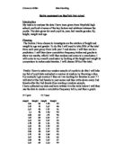
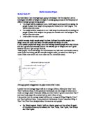
Scatter Graph to show the correlation between the children’s weight and their age
This graph shows that as the age of the children increase, so too does their weight. Again, this shows a positive correlation between the two. This relationship would be expected as I have found out that as children get older, they also get taller; therefore, as they get taller they should also get heavier as their body mass increases.
However, on this graph there are a few abnormal results. The graph states that there are two children at the ages of twelve and thirteen that weigh around 120kg. I kept this data in the graph as I felt that it is a feasible weight for a child at this age, depending on what lifestyle they may have.
The correlation of the age and weight corresponds nicely with my original hypothesis. To take my investigation another step further, I am going to see whether my thoughts are correct in thinking that as height increases, so too does weight.
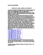
Scatter graph to show the correlation between the children’s height and weight
#
As I expected, this scatter graph shows that as the children’s weight increases, their height does as well, meaning there is a strong positive correlation between the weight and heights of the children in the school. The graph has a correlation co efficiency of 0.4712 which is 47% which shows a strong correlation.
It also shows how most people are between the heights of 1.5m and 1.8m, they are also mainly between the weights of 40kg and 75kg. The correlation between the two would be expected as, as the heights of children increase, ultimately so too will their body mass, and therefore their weight should increase. However, as always there are some exceptions showed by this graph. The graph states that a person of two metres tall only ways thirty five kilograms. I believe that this data could still be legitimate, so therefore I did not delete it from my enquiries.
So far, I have proved my hypothesis to be correct, by proving that there is positive correlation between age, weight and height amongst the school as a whole. I will now try to prove the second part of my hypothesis which is that the boys and the girls will be about the same height on average.
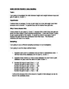
This is a box plot comparing the height of the boys to the height of the girls.
This compares the different heights between the males and females at the school. It shows that unsurprisingly, the males have the tallest person and the females have the smallest person. However the mean of the two are much the same. This information backs up my hypothesis, as I predicted the males and females would have around the same average height. The males mean (average height) is 1.64 and the females mean (average height) is 1.6, this shows that, although it’s not by much, the boys average a slightly taller height than the girls, but ultimately their average heights are the same. As I expected, this box plot shows that the males have the tallest member of the school by quite a substantial way; (0.15 metres taller than the females) and the females have the shortest member of the school a whole 0.19 metres shorter than the nearest boy. The interquartile range of the girls is much smaller than that of the boys. This could illustrate that the girls do not have as wide a spread of heights as the males do.
In conclusion I found out that both the boys and girls means are very similar, showing their average height to be similar. I also found out that the males hold the tallest member of the school and the females hold the shortest member of the school.
This is a box plot comparing the weight of the boys to the weight of the girls.
This box plot is used to compare the different weights in the school between the males and the females. As I predicted, the males have by far the heaviest member of the school (by 30kg) and the females have by far the lightest member of the school (by 25kg). However, much the same as the box plot to compare heights, the mean of both the males and the female’s weights are more of less equal. The males mean of weight is 47kg, where as the females mean of weight is 52kg, showing that the females are on average slightly heavier than the boys. The interquartile range of the males is small showing that their weights are not as widely spread as the females. The male’s lower quartile starts at 45kg, the same as the females, but the males upper quartile range finishes at 53kg where as the females finishes at 60.
In conclusion, this graph shows that the boys have the heaviest member of the school and the girls have the lightest member of the school. It also shows that the boys and girls are on average the same weight; however the girl’s interquartile range is larger than that of the boys.
Conclusion
In conclusion, I found that my hypothesis was mainly correct. I set out to find if there was any correlation between the age, weight and height of the pupils and whether their gender had anything to do with their weight or height.
I firstly found that there was a clear correlation between height and age. The correlation was positive showing that as age increased, so to does the child’s height. Secondly I investigated whether age had any correlation with weight. After plotting a scatter graph of age against weight, it was clear yet again that there was a positive correlation between the two, meaning that as age increases, so too does a child’s weigh. After finding out the linked between age and weight, and age and height, I predicted that age and weight should have a direct positive correlation. My prediction here was correct as the graph show there to be a positive correlation between weight and height, meaning that as the height increases, so too does the weight. In order to investigate my second hypothesis (to see whether gender has anything to do with weight and height) I had to draw some box plots. The first box plot compared the different genders with height. This proved my hypothesis to be correct as it showed that boys have the tallest member of the school and the females have the shortest member of the school, but the average height of both the males and the females are very similar. The second box plot compared the two different genders and the weights of the pupils. Again this proved my hypothesis to be true as the heaviest member of the school was a boy and the lightest member of the school was a girl. What took me by surprise though was that both the males and females average weight were again very similar.
Evaluation
My assumptions have successfully been proven correct. Every scatter graph I plotted was positively correlation, generally showing that as height increases so too does their weight.
During this coursework, I found that there was a lot of false data. It was hard to base an investigation around data that was false or incorrect. To help my investigation, and therefore get better results, I deleted any data that I deemed to be false so that I did not get big anomalies when I came to plotting my graphs.
There are many methods of improving this investigation; an obvious method would be to employ further statistics, which would enhance my investigation and make it much more interesting. I feel standard deviation should have been used as well as the box plots, as it would have given me a measure of spread of data and I could have drawn more specific comparisons from it.
I could have also furthered this investigation by adding another variable, such as favourite sport. I would have drawn up hypothesis that people that are taller and heavier are more likely to enjoy physical sports; where as smaller people would be more prone to enjoying racket and non-contact sports. It would have made the investigation more interesting trying to draw conclusions to these extra variables.
This further investigation would allow me to draw up more concrete views about my chosen variables, as well as giving me the chance to make more interesting contrasting comparisons.
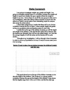
Maths Coursework
Comparing age, height, weight and gender.
By Bill Hewitt