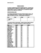
Random Student Averages
Mean values:
- Height 154.4 cm
- Weight 72.3 kg
Height Values (cm) smallest value first:
130,141,142,148,150,150,150,152,154,154,156,157,159,159,159,160,160,160,161, 161,162,162,163,165,168,169,174,180,182,186.
Weight Values (kg) smallest value first:
34,35,35,36,37,39,39,41,42,42,43,45,45,45,46,48,49,49,50,50,50,54,54,56,58,60,61, 64,66,70.
Modal Class: Height: 150 ≤ h < 160, 160 ≤ h < 170
Weight: 40 ≤ w < 50
As you can see these are the data I collected and put into a graph. It shows the averages, median, upper and lower quartiles as well as the modal classes.
Random Girls and Boys
Firstly I should collect 30 random samples of data from a table, since there are 604 boys and 579 girls (all together 1183 pupils), we should…
-
604 Boys ∴ Random X 604 = Generated Number.
579 Girls ∴ Random X 579 = Generated Number.
- When you get this Generated Number you look this up in the relevant table, which will give you a name, height and weight of the males and females.
- Then do this 30 times and provide it in two tables…
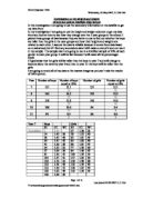
Female Values
These are the female values that I took from multiplying 579 by a random number, otherwise easier on the calculator by the random key!!!
The next part of the exercise is to find the male values, much the same process as finding the female values; you just multiply the random number by number of males present on the sheet.
Male Values
These are the male values present by multiplying 604 by a random number, which is considerably easier if you use the calculator’s random key.
As you may of noticed you also get these results, which are needed to get us going onto the next area of working.
The female values prove that in the area of height, the highest is 180cm and the lowest is 120cm and the heaviest weight in kg was 67kg while the lightest female is weighed in at 38kg.
The same very much applies to the male rule, in the area of height the highest is 200cm and the shortest is 134cm, and in the area of mass the heaviest was 90kg while at a measly 35kg it proved to be the lightest.
So now we have found the height and weight values of both the males and the females. The next area that we must delve into now is the process of tallying the data into an easy-to-read graph, but first we must tally the data…
Firstly the females…
As you can see (obviously you can…duh!), it shows the tally of the female weights and heights, of 30 random females.
Now for the males…
As you can see, it shows the tally of the male weights and heights, of 30 random males.
Here is the tally for both males and females, including the all-important cumulative frequency…
And also the weights of both the males and females including the cumulative frequency…
Now if we were to make histogram out of all these data values then you would be able to see the true comparisons between the males and the females.
Now you can see the data values plotted on these histograms, which enables us to look at the comparisons very easily. Both the males and female possess the same height factors, which is identified on these graphs. However, by some unforeseen act of nature, the females just happen to be heavier, in the region of 40kg to 60kg. Which is very surprising…
The next area we must look at now is the height and weight comparisons between the males and female, this must be done as before by using the ‘scatter diagram’.
This also must be done for the males…
As you can very well see the female trend shows distinct positive correlation, noticeable by the rising pattern that emerges. However the male correlation is far harder to conclude, I mention this because it shows little or no correlation, thus in par with my knowledge I justify it as weak ‘positive correlation’. The fact that the males have hardly noticeable correlation probably comes from the area that maybe the height is considerably less distributed than the weight, thus the trend shows very clearly that weight is far more spaced out than the height. The females however show a very clear contrast to that of the males, the higher the height the more evenly balanced it becomes, since as you may notice that the females show little or too much of weight but more of the height factor. While males remain equally distributed…
Now as you can see the graph above show height and weight in both the male and female values, this therefore allows me to make a distinct line of best fit thus allowing me later on to make a accurate judgement of the graphs intercepts, like for example…
Y = MX + C
This equation is very useful as it allows me to look at the graph and say if this guy is this height then his weight will be…and the same applies for the girls.
So now I must find the Y = MX + C side of my work, I shall be firstly be finding the fitting equation for the first graph called “Height Vs. Weight in Females”, I shall make my answer concise and easy to read to the reader…who is YOU!!!
Height Vs. Weight In Females
Y = MX + C
- M = Vertical / Horizontal.
M = 5 / 13
M = 0.38
Therefore M in this case is 0.38…now we must find the rest of the equation
- Y = 0.38 X + C. Now obviously this just doesn’t answer our question (what was it again?). So therefore we must look on the line for a Y and X data to put in. So lets use 170 as Y and 37 as X…
170 = 0.38 X 37 + C
Then just multiply the equation…
170 = 14.06 + C
- Excellent now we must find the C value so…
170 = 14.06 + C … we just transfer the ’14.06’ to the other side and…
170 – 14.06 = C
So just do the rest…
155.94 = C
- So therefore Y = 0.38 X 37 + 155.94. Long isn’t it!!!!
Height Vs. Weight in Males
Y = MX + C
- M = Vertical / Horizontal.
M = 10 / 16
M = 0.62
Therefore M in this case is 0.62…now we must find the rest of the equation
- Y = 0.62 X + C. Now obviously this just doesn’t answer our question (what was it again?). So therefore we must look on the line for a Y and X data to put in. So lets use 150 as Y and 50 as X…
150 = 0.38 X 50 + C
Then just multiply the equation…
150 = 31 + C
- Excellent now we must find the C value so…
150 = 31 + C … we just transfer the ’31’ to the other side and…
150 – 31 = C
So just do the rest…
119 = C
So therefore Y = 0.62 X 50 + 119. Long isn’t it!!!!
Height Vs. Weight in Male & Females
Y = MX + C
- M = Vertical / Horizontal.
M = 10 / 20
M = 0.5
Therefore M in this case is 0.5…now we must find the rest of the equation
- Y = 0.5 X + C. Now obviously this just doesn’t answer our question (what was it again?). So therefore we must look on the line for a Y and X data to put in. So lets use 170 as Y and 60 as X…
170 = 0.38 X 60 + C
Then just multiply the equation…
170 = 30 + C
- Excellent now we must find the C value so…
170 = 30 + C … we just transfer the ’30’ to the other side and…
170 – 14.06 = C
So just do the rest…
140 = C
So therefore Y = 0.5 X 60 + 140. Long isn’t it!!!!
That sorts the Y = MX + C problem, but what is it for…well it helps us find an equation for a straight-line graph or in case a ‘line-on–a-graph’, but it can also help when drawing a straight-line graph. Very useful, and you may agree too…
Now, I must find out the mean, median mode of these data values, since it is this area that will help us make the graphs later on in this work. Now, obviously the mean is the average data of any sequence of numbers, the median is the middle data, but for those who want to go further there are these GREAT terms called lower and upper quartiles, and last but not least there is the mode, which is the number or sequence which occurs the most, but for now I’ll be looking for the modal class.
Here is what I collected together while you were reading…
Female Student Averages
Mean Values:
Height Values (cm) smallest value first:
120,133,141,150,151,152,152,154,155,155,155,156,157,160,160,160,162,162,162, 165,165,167,168,169,170,170,171,173,175,180.
Weight Values (kg) smallest value first:
38,40,40,42,45,45,45,46,47,48,48,50,50,50,50,51,51,51,51,54,57,57,58,58,60,60,60, 60,60,67.
Modal Classes: Height: 160 ≤ h < 170
Weight: 50 ≤ h < 60
Male Student Changes
Mean Values:
Height Values (cm) smallest first:
134,144,150,150,152,153,155,156,157,158,160,160,162,165,167,170,172,173,174, 177,177,179,180,180,189,192,193,197,200.
Weight Values (kg) smallest first:
32,34,35,37,38,40,42,44,45,45,46,49,49,50,50,52,55,57,57,62,64,64,68,70,72,72,72, 84,86,90.
Modal Classes: Height: 150 ≤ h < 160
Weight: 40 ≤ w < 50
Like the above data represents, it is the data for averages, upper and lower quartiles, median data and the most famously acclaimed modal data. This data will be extremely useful in the Box plot area, which will look at the upper and lower quartiles and the median data. Just for anyone who forgot a box plot is when you use a box to represent upper and lower quartiles and ‘whiskers’ to show lowest and highest data. Very complicated but believe me it isn’t!!!
However to be fair it would be best to put this in one table which is easy to read and therefore makes it easy for me to use later…the graph and box plot you will see is below…
(However I did not add the modal data since it is easier to read first hand, rather than in a graph with loads of data!!!!)
Before we do the box plot diagrams, we had better get on with the cumulative frequency diagrams. These amazing ‘diagrams’ have the ability to allow us to make easy use of the lower and upper quartiles as well as the median. But the cumulative frequency refers to the ‘running total’ of data being added, really easy, as you may yet see now…
Remember earlier on the running total stuff well here it goes…
Now obviously the data above show the cumulative frequency, this will help us keep track of the weight and height, as it progressively gets larger and higher, very much so that it will help us to find a trend in the data…oh, and the graph above also show the median, upper quartile and lower quartile of the combined data of males and females.
Now lets analyse this data, because it seems very fascinating. Lets begin by looking at the height cumulative frequency diagram. Well, we can see that both the male and female trend is very proportionate to one another, apart from the fact that allows us to see that males are higher in the regions of 140 to 150 cm. But the female trend shows it in a light, which makes us think, “Can females be really that high?” The answer remains in this case that females are considerably taller than males, in the part of 160 to 190 cm. The combined trend show us that males and females given in one perspective can have a drastic effect, as you can see the trend sharply rose at the point of 140 to 150 cm, obviously showing that males and females were numerously high around this region. This then, as with all the trends even out at a proportionate rate until it reaches the maximum height.
As with all the cumulative frequency diagrams there is also the weight factor which in this area is as important as the height. With a VERY GOOD REASON. As you can see from the graph the female trend seemed to stop in the regions of 60 kg, this proposes to us that the weight ended simply because it reached its highest value. On the other hand the male values continued to a much later weight in the area of 90kg, obviously stating that it too also had a maximum weight, much like the females abrupt low value. Meanwhile if you look at the trend, the female are considerably heavier in one region of weight, compared to the boys, which show a lower trend. The female’s rise steeply, showing the large numbers, while the males remain evenly distributed in frequency as the weight rises. The combined value shows the trend, which I was explaining above, in more detailed fashion, the cumulative frequency rose steeply in almost the same fashion as the females and from there on evened out.
This whereby shows the weight and height distribution in both males and females.
Now I shall be making my ‘Box Plot’ diagrams…