Hypothesis
The following hypotheses have been made, to predict the outcome of this investigation:
- The weight will increase in proportion to the height, which means the taller students will weigh more than the shorter ones. This is because as someone grows taller, their body grows, especially their bones, which means there would be an increase in the mass of the bones, so the weight would also have to increase.
- During the time between years 7 and 9, the girls will be taller and heavier than the boys. This is because girls reach puberty at around 11 or 12 years, which corresponds with year 7, and will therefore have their growth spurts during the next few years. The changes will tend to slow down after year 9 or 10, because girls start to become more worried about their weight, and possibly their height, and so they will try and lose weight, which would mean boys would be generally bigger.
- During the time between years 10 and 11, the boys will have increased in size and weight, and will now generally be taller and heavier than the girls. This is because boys reach puberty at around 13 or 14 years, which corresponds with year 9, so they will have their growth spurts after this time. Also, it is common knowledge that generally, men are usually taller than women, and so if girls reach puberty before boys, then there must be a time when the boys begin to overtake the girls in height and weight. This is also because the girls will become more conscious of their weights, and try to lose weight.
Investigation Plan
- Collected stratified sample
- Construct scatter graphs to show any correlation between height and weight
- Use the Spearman’s Rank Correlation Coefficient to confirm any doubtful scatter graphs
- Construct box and whisker diagrams showing the Body Mass Index, to compare the spread of data
- Construct stem and leaf plots to confirm any anomalies found from the box and whisker diagrams
- Calculate mean, median and mode of each sample.
- Calculate interquartile range to show the spread of all the data
Data Collection and Stratified Sampling
As mentioned earlier, 2366 datum points were provided, but as this amount of data would be too much to plot, and would be difficult to interpret effectively, I have decided to take a stratified sample of all the data.
I have chosen to take a stratified sample rather than a purely random sample, as in random sampling, any collection of data is possible, whereas in stratified sampling, the sample accurately represents the whole population, as it is in proportion to it. We are given the following figures:
This gives a total of 1183 students, and I have decided to take a sample of 250 students, to represent them. So to obtain the number of students needed in this sample from each year group, the following calculation is done:
250 * number of students
1183 in Year group
For each individual calculation, please refer to Appendix 1, but to demonstrate this calculation, if we take Year 7 as an example:
250 * 282 = 59.6
1183
This means that 59.6 (60) of the pupils in the sample should be from Year 7. To obtain the number of girls, and the number of boys from each year, the following calculation is done:
Number of Boys/Girls * Number required for sample
Total Number of Students
Again, for each individual calculation, please refer to Appendix 1, but as an example, we take the number of boys required from Year 7:
151 * 60 = 32.1
282
This means that 32.1 (32) boys should be taken from Year 7. After making all these calculations, I obtained the following numbers for each sub-sample:
To make sure this investigation is fair, the data that will be chosen will have to be randomly picked from all the data. To obtain a completely random set of results, the random number generator on will be used, which provides a random sequence of numbers within a given field. This field is determined by two numbers, which in this case, would be the number of the cell, on the excel document providing all the data, that corresponds with the sub-sample in question. So for example, for the girls in Year 7, the numbers 2 and 132 would be entered, and then from the sequence generated, the first 28 numbers would be taken, as this is the number of datum points needed, and the corresponding datum points for each number on the sequence would be taken as part of the sample. This method ensures that a completely random sample is taken. The final sample, with the mean, mode, median and interquartile range is displayed in Appendix 2.
Scatter Graphs
A scatter graph plots all the datum points onto a graph, and then after adding a line of best fit, any correlation can be seen easily. However, this is not very accurate, as the line of best fit is an average of all the points but does not go through all the points. But it does give a general idea as to whether there is a correlation or not.
For this investigation, the height and weight of each student for each sub-sample will be plotted, and a line of best fit will be drawn in. The height will be plotted on the x-axis, and the weight on the y-axis. From these scatter graphs, three different types of correlation should become obvious:
Positive Correlation - this can be seen when the line of best fit increases upwards, towards the right. This occurs when the data has a general trend of moving in this manner, and means that there is a relationship between the height and weight, which is that as the height increases, so does the weight.
Negative Correlation - this can be seen when the line of best fit increases downwards, towards the right. This occurs when the data has a general trend of moving down in this manner and means that there is a relationship between the height and the weight, which is that as the height increases, the weight decreases.
No Correlation - When the points are randomly scattered all over the graph, the line of best fit would be very unreliable, and it is unlikely that there is a relationship between the height and the weight
Spearman’s Rank Correlation Coefficient
The Spearman’s Rank Correlation Coefficient is used to establish the strength of a correlation between any two variables. It is based on the following equation:
It involves the following factors: rs = correlation coefficient
∑ = sum of all the squared differences
d = difference between the ranks
n = number of ranks being used
In order to find the coefficient, both sets of data must be ranked, and the difference of each pair calculated. Then the differences (d) should be squared. The sum of these squared differences (∑) must be found and multiplied by 6. This should then be divided by (the number of ranks cubed – the number of ranks). The resulting figure should be subtracted from 1, and this figure is the correlation coefficient. d2
Very vaguely, if the correlation coefficient is -1, there is a perfect negative correlation, if it falls between -1 and -0.5, there is a strong negative correlation, if it falls between -0.5 and 0, there is a weak negative correlation if it is 0, there is no correlation, if it falls between 0 and 0.5, there is a weak positive correlation, if it falls between 0.5 and 1, there is a strong positive correlation and if it is 1, there is a perfect positive correlation.
In this investigation, this process will be used to verify any line of best fits that do not clearly give any sort of correlation from the scatter graphs. This correlation will be useful to determine whether there is a relationship between the height and weight of any student.
Box and Whisker Diagrams
A box and whisker diagram provides a visual presentation of each of the four quarters of the population of each sub-sample. Vertical lines mark the quartiles and the median, and these are joined to make a box containing the middle half of the data. From the quartiles, horizontal lines, or ‘whiskers’, are drawn to each extreme (i.e. the smallest and largest points).
For this investigation, box and whisker diagrams will be used to compare the range of distribution of the Body Mass Index between girls and boys in each year, and also to compare how the range differs between each year.
Box and whisker diagrams are useful because they make anomalies quite obvious, as the whiskers should be extending to a pattern, and if they are not, then we can be sure that there is an anomaly in the data. If anomalies are suspected to be present, then a stem and leaf plot can be constructed to confirm these anomalies.
Stem and Leaf Plots
A stem and leaf plot is a method of presenting data that uses the actual data itself, and does not take averages or ranges, so it is an accurate representation of the data.
Each datum point has significant parts which decide how the data will be plotted. In this investigation, the weights’ most significant part is the tenth of the number. So, for example, to plot 53 kg, 5 would be taken as the significant part and added to the stem, a vertical scale, as it represents 50, and then 3, as the leaf, is added to the branch defined by the 5 in the stem. This is then read off as 53. As the heights are in decimal places, and stem and leaf plots cannot be made with decimals, each datum point will be multiplied by 100, to convert it into a whole number. These will then be plotted in exactly the same manner as the weights. So, for example, if 1.15m was to be plotted, it would be multiplied by 100 to give 115, and then 11, as the tenth of the number, will be the most significant part, and 5 will be the leaf on the branch defined by the 11.
Stem and leaf plots will be useful in this investigation to confirm any suspected anomalies found from the box and whisker diagrams. Stem and leaf plots are ideal because each exact point can be easily picked off, as any big differences, such as a weight of 110kg, when the next weight down is 54kg, can easily be seen.
Body Mass Index (BMI)
The Body Mass Index (BMI) is the relationship between weight and height that is associated with body fat and health risk. It is a good representation of the combined heights and weights. It is calculated by using the equation:
Weight (kg)
Height2 (m)
In this investigation, it will be used to compare this relationship between girls and boys in each year group, which will illustrate the differences between them. The data will be constructed into box and whisker diagrams, so that the inner 50% of the students can be compared between each other.
Mean
The arithmetic mean is the sum of all the sample values divided by the sample size. It is useful as an estimate of the expected values for any specific group. To work it out, the excel function =mean(A1:10) is used, where “A1:A10” represents the position of the source data. In this investigation, the mean can be used to obtain a single figure to represent each sub-sample, to make comparison easier.
Median
The median is the middle item of data, and is found using the excel function =median(A1:A10). In this investigation, the median will be used to construct box and whisker diagrams, which will allow a comparison between boys and girls in different year groups.
Mode
The mode is the single most frequently occurring datum point. So it shows the most popular size. To calculate it, the excel function =mode(A1:A10) is used, where “A1:A10” represent the position of the source data. In this investigation, the mode will be used just like the mean; to obtain a single figure to represent each sub-sample.
Interquartile Range
The interquartile range is a very effective measure of dispersion, or spread as it is the range of the middle half of the data. It is found by calculating the difference between the lower and upper quartiles, which are the data points positioned halfway between the extremes and the median. The excel function, =quartile(A1:A10,1), where 1 represents the lower quartile, and 3 would represent the upper quartile. The lower quartile is then subtracted from the upper quartile.
In this investigation, the interquartile range will be used to construct box and whisker diagrams that will allow comparison between boys and girls in different year groups.
RESULTS
As mentioned earlier, the data obtained from taking the stratified sample, along with the mean, median, mode, quartiles and standard deviation are displayed in Appendix 2. Various forms of presentation have been used, where appropriate, to express parts of this data.
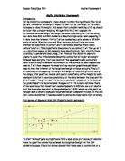
Scatter Graphs 1 and 2 have been used as they show a positive correlation between height and weight. Scatter Graphs 3 and 4 have been used in together with each other, as Scatter Graph 3 does show a positive correlation between height and weight, but after consulting the stem and leaf plot comparing students in Year 8, and the associated box and whisker diagram, Scatter Graph 4 displays how anomalies can affect the line of best fit, as the various anomalies have been removed from Graph 3, and the graph has been re-plotted, and the Spearman’s Rank Correlation Coefficient has been used to discover whether there actually is a correlation between height and weight in the boys in Year 8, as the points were still quite widely scattered on the graph. Scatter Graph 5 has been included to confirm the findings of the relationship between height and weight.
Boxplot 1 has been included to compare the Body Mass Index of all the students in their various years. Boxplots 2 and 3 have been included to display the change in Body Mass Index for boys and girls separately. Line Graphs 1 and 2 have been included to confirm the findings about the difference in the relationship between girls and boys with age. Boxplots 4 and 5 have been included to display the distribution of heights and weights for all the students. They will be used to find any other anomalous results.
Stem and Leaf Plots 1 and 2 have been included to confirm the anomalies in Scatter Graph 3, but Stem and Leaf Plot 2 has also been included to display the limits of using stem and leaf plots. Stem and Leaf Plots 3 and 4 have been included to single out anomalies displayed by the box and whisker diagrams.
Maths Coursework - Mayfield High School