In this investigation, we are studying the relationship between height and weight at Mayfield High School
GCSE Statistics Coursework
Paul Nicoll
In this investigation, we are studying the relationship between height and weight at Mayfield High School. There are several lines of enquiry I will look at and assess:
* The relationship between girls and boys in different years- with regards to both height and weight.
* How boys' heights and weights compare in different years.
* How girls' heights and weight compare in different years.
When I look at the conjectures, I will have to take into account defects that could affect my data and my conclusions. The clearest example of a defect in this investigation is adolescence, where processes such as growth spurts and weight problems caused by hormones may affect the data. As a result of this, the affected data may in turn influence the mean and standard deviation of the sets of information.
Predictions
I predict that my calculations will show the following about my hypothesis:
* That boys will generally have a greater height mean and weight mean than girls.
* That boys will have greater standard deviations for height and weight than girls.
* That as the pupil gets older, the weight and height increases.
Sampling
In order to carry out this investigation, the data needs to be sampled. With 1183 sets of data available, it is necessary to work with a smaller number of samples, as this enables a more manageable group of figures to manipulate. This may also be useful because a general error with the data will be less emphasised by a smaller data set. Furthermore, because the selected sample is over one tenth of the size of the full data set, any trends that I notice in my sample should be the same as those in the rest of the data. I will be using 120 samples- 60 boys and 60 girls. I will use the same number for both genders to avoid any bias towards either boys or girls.
There are two ways I can select my samples: through random sampling or stratified sampling. I can randomly select my samples by reading off of a list and choosing certain people. This could give a good spread of names, but there is a weakness with this method because random selection may pick an inaccurate data sample. The alternative is to use stratified sampling. This is when I calculate how many people to select from each year group and then calculate a specific interval to pick my data within the groups. This is the better option, as I can pick my samples at regular intervals, e.g. every 6th person, which should give a better spread of data.
To calculate how many boys from each year I will select, I will use the formula below:
(Number of boys in year / total number of boys) x 60
Note: The 60 represents the number of samples I wish to use.
Putting this formula into effect, we find out how many boys from each year to take, shown below:
Year
Number of Boys in Year
Number of Boys to use in sampling
7
51
5
8
45
4
9
18
2
0
06
1
1
84
8
604 60
An example of the formula and how I calculated the sample size for Year 7 is shown below:
(Number of boys in year / total number of boys) x 60= sample size in Year 7
Therefore (151/604) x 60 = sample size in Year 7
0.25 x 60 = 15 boys from Year 7
To calculate how many girls from each year to select, I will use the same formula as above:
(Number of girls in year / total number of girls) x 60
Year
Number of Girls in Year
Number of girls to use in sampling
7
31
3
8
25
3
9
43
5
0
94
0
1
86
9
579 60
An example of the formula and how I calculated how many girls from Year 10 were to be sampled is shown below:
(Number of girls in year / total number of girls) x 60= sample size in Year 11
Therefore (131/579) x 60 = sample size in Year 11
0.15 [To 2 d.p.] x 60 = 9 girls from Year 11
The used formula works, as it leaves us with 60 samples for the boys and 60 samples for the girls, shown beneath each table. Now I have worked out how many samples I shall take from each year, I can pick the 120 individual samples.
To work out the interval between our samples, I have to divide the number of boys/girls in the year by the sample number. The intervals are shown in the table below:
Year
Boys/Girls
No. in Year
Sample Size
Interval
7
Boys
51
5
0
7
Girls
31
3
0
8
Boys
45
4
0
8
Girls
25
3
9
9
Boys
18
2
9
9
Girls
...
This is a preview of the whole essay
To work out the interval between our samples, I have to divide the number of boys/girls in the year by the sample number. The intervals are shown in the table below:
Year
Boys/Girls
No. in Year
Sample Size
Interval
7
Boys
51
5
0
7
Girls
31
3
0
8
Boys
45
4
0
8
Girls
25
3
9
9
Boys
18
2
9
9
Girls
43
5
9
0
Boys
06
1
9
0
Girls
94
0
9
1
Boys
84
8
0
1
Girls
86
9
9
Now I can sample the data, and the list of samples can be seen on pages 4, 5 and 6.
Mean
Now that the sample has been obtained, calculations can now be performed on the data. Firstly, I need to collect the mean height and the mean weight for the following:
* The individual year groups for the boys
* The individual year groups for the girls
* The whole year groups (Boys and girls)
* The whole sample
To find the mean, we use the formula ?x/n . Below are the mean heights for our sample:
Year
Gender
Mean Height (m)
Mean Weight (kg)
7
Boys
.53
45.43
7
Girls
.52
43.31
7
B&G
.52
44.45
8
Boys
.63
48.1
8
Girls
.63
48.52
8
B&G
.63
49.00
9
Boys
.71
58.92
9
Girls
.53
49.2
9
B&G
.61
53.52
10
Boys
.70
59.45
10
Girls
.65
52.1
10
B&G
.68
55.95
11
Boys
.79
61.25
11
Girls
.66
50.56
11
B&G
.72
55.59
All Years
B&G
.62
51
All Years
Boys
.65
53.425
All Years
Girls
.59
48.56667
As we can see from our means, the boys have a greater mean height than the girls, and they also have a greater mean weight. With regards to the means of the overall sample, we can see that the boys have larger mean heights and weights than the mean, but the girls have smaller height and weight means.
Standard Deviation
Standard deviation measures the spread of data from a mean, and as that is what we are looking to see, it is a very practical technique to utilize. In this case, we wish to measure the standard deviation of the data from the height mean, and also from the weight mean. To work out the standard deviation of the height, we use the formula below:
Sx= ? (1/n ? (xi -x)2)
The 'n' refers to the number of people used in the sample, i.e. 120. The 'x' refers to the height, as the height is positioned on the x-axis on the scatter graph (See page 15).
To work out the standard deviation of the weight, we use the formula below:
Sy= ? (1/n ? (yi -y)2)
This time, the 'y' refers to our weight, as the weight is positioned on the y-axis on the scatter graph.
The standard deviations for all years are shown in the table below:
Year
Gender
S.D. of Height
S.D. of Weight
7
Boys
0.063
7.36
7
Girls
0.1
8.75
7
B&G
0.1
8.75
8
Boys
0.10169
0.89
8
Girls
0.09
5.92
8
B&G
0.0875
5.92
9
Boys
0.1
3.12
9
Girls
0.18
8.89
9
B&G
0.18
8.89
10
Boys
0.09
9.64
10
Girls
0.11
6.76
10
B&G
0.11
6.76
11
Boys
0.139905
1.71
11
Girls
0.04
7.9
11
B&G
0.04
7.9
All Years
B&G
0.1357029
0.86402623
All Years
Boys
0.130775
2.53633
All Years
Girls
0.133509
8.349385
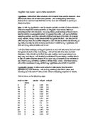
As we can see from the table, the standard deviation of heights for all boy years is smaller than the standard deviation of heights for all girl years, which illustrates that that the girls have a larger spread of data than the boys. Also, the standard deviation for the boys' weights is much greater than the girls', demonstrating a larger spread of weights.
Cumulative Frequency, Percentiles, Box and Whisker, and Stem and Leaf Diagrams
Height
In order to find the cumulative frequency of the overall height and the overall weight, a stem and leaf diagram for both is needed. Stem and leaf diagrams list data in order, and allow a cumulative frequency to be calculated, as well as a median average (Note: Median can only be calculated in an ordered stem and leaf diagram, where the terms are listed in order). Due to the number of people in our sample being 120, I expect the cumulative frequency to add up to 120. If it does not, then an error has occurred. Below is the stem and leaf diagram for the height:
Stem
Leaf
Frequency
Cumulative Frequency
.0
6
.1
0
.2
0
2
.3
569
3
5
.4
79798582283
4
9
.5
821349219600767650818277
24
43
.6
88533225725043056785157
272020295050588042058
44
87
.7
6200120255058063225528
22
09
.8
200705123
9
18
.9
2
19
2.0
6
20
Key: 1.0| 6 means 1.06m
From this unordered stem and leaf, we can clearly see the cumulative frequency adds up to 120, therefore our diagram is correct. From here, we can draw a cumulative frequency curve, shown below:
From the graph, we can see a sharp increase between 1.50m and 1.70m. This illustrates that the frequency of heights within that area is the greatest, and therefore the majority of people are between 1.50 and 1.70m tall.
As is shown on the graph, we can work out percentiles. Percentiles are fractions of the cumulative frequency. On the cumulative frequency, we can work out the Upper Quartile, the Lower Quartile and Median. We find the Upper Quartile by multiplying the total cumulative frequency number by 3/4, as we want to find the term that is 3/4 of the total, so we can read a value from the x axis. Therefore, 120 x 3/4 = 90 , which means we read across from the 90th value. Similarly, we find the Lower Quartile by multiplying the total cumulative frequency number by 1/4 , as we want to find the term that is 1/4 of the total, enabling us to read across the graph. Therefore, 120 x 1/4 = 30 , which means we read across from the 30th value. We find the median by taking the middle term, the 60th, and reading across. Therefore, from reading across from our graph, we find out the following:
Upper Quartile (UQ) = 1.70m
Lower Quartile (LQ) =1.535m
Median = 1.625m
We can also find out the Interquartile Range (IQR) by subtracting the LQ from the UQ. So, in this case, the IQR = UQ - LQ = 1.70 - 1.535 = 0.165m.
Now that we know the UQ and the LQ of the height, we are now able to draw the box and whisker diagram, which is another technique to show the spread of data. On the box and whisker, we only mark the UQ, the LQ and the median, shown below:
The box is not very wide, therefore we can tell that the spread of data is concentrated mainly in the 1.60m region. The lines, or 'whiskers', shows the extremes the data is collected from- there are people with heights in the 1.00's, and in the 2.00's, so there is still a significant width to the data.
Weight
We can now do the same for the weight. Below is the stem and leaf diagram for the overall weight of the sample:
Stem
Leaf
Frequency
Cumulative Frequency
2
96
2
2
3
28707858
8
0
4
58350575003130475401986
66435629089288098055525528
49
59
5
0 1.5 020026312425053 1542500474494264246
36
95
6
72492487030400076
7
12
7
541202
6
18
8
4
19
9
0
20
Key: 2|9 means 29kg.
Once again, the cumulative frequency adds up to 120, so our figures are right. We can see that the region with the largest frequency is the 40-50kg area, where 49 people lie. Now we can draw the cumulative frequency curve, shown below:
Like the stem and leaf diagram, the cumulative frequency proves that the largest frequency occurs between 40 and 50kg, shown by the sharp increase.
Also shown on the graph are the LQ, UQ and Median values of the weight. These values are:
UQ = 58kg
LQ = 43.5kg
Median = 49.5kg
We are now capable of calculating the IQR for the weight:
IQR = UQ - LQ = 58 - 43.5 = 14.5kg.
As the IQR is 14.5kg, we can tell that the spread of data is concentrated mainly between the two quartiles. We can show this on a box and whisker diagram:
The box is quite large, and therefore shows the main concentration of weights is between 43 and 58kg. The whiskers show that there are weights that stretch to as little as 26kg, and as high as 90kg.
Histograms
Height
Histograms are used to illustrate how compact sets of data are when placed into groups. They measure the frequency density of data, and therefore it is a good idea to use them in this investigation, as we want to see how dense our data is. To work out the frequency density, we have to firstly group our data, and gain a frequency, secondly work out the width of the group, and lastly divide the frequency by the width.
Firstly we will find the frequency density of the overall sample heights. This is shown in the table below:
Group (m)
Frequency
Width of Group
Freq Density
.00 - 1.40
5
40
0.125
.41 - 1.60
47
20
2.35
.61 - 1.70
40
0
4
.71 - 1.80
9
0
.9
.81 - 2.10
9
30
0.3
As is shown by the table, the group 1.61-1.70 has the largest frequency density, which shows that the data is concentrated the most in this group.
We can transfer this information to a histogram- the graph used for displaying frequency densities. The histogram for the overall height is shown below:
Weight
For the weight, we use the same method. The frequency densities of the overall weight can be seen below:
Group (kg)
Frequency
Group Width
Frequency Density
20 - 40
8
20
0.9
41 - 50
48
0
4.8
51 - 60
34
0
3.4
61 - 70
3
0
.3
71 - 90
7
20
0.35
The group 41-50kg has the largest frequency density, showing that the data is most compact there, i.e. the most data lies in that group. This is reflected by the graph below:
Product Moment Correlation Coefficient
The Product Moment Correlation Coefficient (PMCC), measures linear correlation for a set of data. When using PMCC, the letter r is used, meaning the correlation coefficient. The value of r always lies between -1 and +1, +1 meaning perfect positive correlation, i.e. on a graph- when one value increases by 1, the other increases by 1. -1 means perfect negative correlation, i.e. when one value increases by 1, the other decreases by 1. Standard deviation is always a part of PMCC, as the equation for measuring the correlation coefficient involves the formula for S.D.:
r= sxy / sxsy
Which is the same as:
r= (? (xi - x)(yi-y)) / ?(? (xi - x)2) (? (yi - y)2)
Note: 'x' refers to the x-axis value- the height, and the 'y' refers to the y-axis value- the weight.
This appears to be a very complicated equation, but it is quite easy to work out the correlation coefficient from here.
x = ?xi / n = 194.49 / 120 = 1.62m (2 d.p.)
y = ?yi / n = 6119.5 / 120 = 51kg
sx= ?1/n (? (xi - x)2) = ?1/120 x 2.218 = 0.14
sy= ?1/n (? (yi - y)2) = ?1/120 x 14163.5 = 10.86
sxy= 1/n (? (xi - x)(yi-y)) = 1/120 x 77.455 = 0.65
r = sxy / sxsy = 0.65 / (0.14 x 10.86) = 0.65 / 1.5204 = 0.43 (2 d.p.)
So the Correlation coefficient of my sample is 0.43, which shows there is a strong positive linear correlation between height and weight.
Scatter Graph and Line of Best Fit
Shown on the next page (15) is a scatter graph that shows the relationship between height and weight. I know from my PMCC calculation that the correlation coefficient of this data is 0.43, which shows there is a strong positive linear correlation, which is true on the scatter graph. However, the plain scatter graph does not emphasise trends particularly, and therefore we can add a line of best fit to see if there are any trends, and if so, how strong they are. In this case, I expect a trend of increases in weight when there is an increase in height.
On page 17 is the same scatter graph as the previous page, except that there is now a line of best fit. As we can see, the line almost evenly splits the data, so the line is accurately drawn.
We can work the equation of the line out by using the formula for a linear graph, y=mx + c. Carrying on the line, we can see that the line crosses the y-axis at around -5, therefore -5 is our y-intercept. We can substitute y for the weight mean, and x for the height mean, as these are the two averages. These averages are the most reliable figures to use, as some points on the scatter graph are too far away from the line of best fit, and the means lie on the line. Therefore, we can rearrange the formula and work out the equation of the line:
y=mx + c
51 = m1.62 -5 (+5)
56 = m1.62 (/1.62)
34.57 = m
Therefore, the formula for the line of best fit is y= 34.57x -5
Observations and Analysis
From the calculations, I have established that:
* Weight increases, on the whole, with height.
* The older the year group is, the larger the mean and standard deviations are for height and weight.
* Boys generally have larger means (Both height and weight) than girls.
* Boys, in some years, have larger standard deviations in both height and weight, showing a larger spread of data, than girls.
As my predictions suggested, boys do have larger means and standard deviations than girls. Also, the pupil's height and weight increase, just like I predicted. Therefore, my calculations have matched my predictions, proving the validity of the data.
Apart from the boys vs. girls and height vs. weight hypothesis, I also set out to examine the relationship between boys in different years, and girls in different years. Now my data has been gathered, I can study these relationships closely.
The year groups from the boys' data I will use are Year 7 and Year 11. If we focus on the means, we see that the Year 11 mean height is 26cm larger than the Year 7 mean. Then, if we take the mean weights, we see that the Year 11 mean is around 16kg greater than Year 7. This is down to my mentioned defect- adolescence. Year 11 boys may have had numerous growth spurts, leading to larger heights, and as a result of these, weight may be affected. Year 7 boys, on the other hand, would not have entered adolescence, therefore growth spurts and possible weight problems may not occur. This in
turn would mean there are a greater number of shorter people, and therefore the mean height, and weight, would be lower.
Looking at the standard deviations, we can conclude that, due to larger S.D.'s in both height and weight, the Year 11 boys have a larger spread of data than the Year 7 boys. This, like the means, could be down to adolescence- as the Year 7s may not have started going through puberty, the boys would have a closer height spread than Year 11s.
If we take the same approach to the Year 7 and Year 11 girls, we find the same results occur. The Year 11 girls have larger means than the Year 7s, but an interesting difference between this comparison of girls and the comparison of boys, is that the Year 7 girls have larger standard deviations than the Year 11s. This could be due to one or two girls in Year 7 being larger, or smaller, than the rest of the year, which would raise the S.D. of the year group.
As is shown on the scatter graph, there are a few points that do not fit with the general trend, as they are very far from the line of best fit, and the rest of the data. This may be down to an error with the data collection, where the wrong figure was noted, or it may be a real error. As this is real life data, there may be errors, or it may simply be a case of a very large person.
There is a very large weakness with this investigation, however, and that is that we are limited by this data. We have taken this information from one school in the UK, and therefore it is not representative of the whole population. We have only looked at one area, when we should also look to other places. This would result in our calculations, and our conclusions, being more accurate, and more reliable than if we were just going by this data. I would expect the same conclusions to be reached with other data across the country; therefore the probability of this happening across the country would be high.
GCSE Statistics Coursework
Paul Nicoll