Mileage
The first thing I will look at is mileage. The major flaw I had with my original introduction, was that I merely plotted current price against the factor I looked at. While this is fine for looking at basic trends, we can see that it does not take into account the fact that an expensive car which has done a high mileage can have a similar price to that of a cheap car which has done a low mileage.
To solve this problem, we can look at the difference in price between the new and old car, in relation to the original price. For example, if a car cost £10,000, and after 5 years cost £5,000 the difference in price is £5,000. If we divide this by the original price we get 0.5 or 50%. This means that overall, the car has depreciated by 50% in it’s price.
To calculate overall depreciation we use the formula:
Original Price – Current Price x 100 = Depreciation (%)
Original Price
With this formula, we can more easily see how different factors affect car price without it being biased by the original price of the car. This is one of the best ways of looking at car prices since it takes into account both the current price and original price, and converts it into a number that is easy to understand, for example if a car depreciates by 30%, we can clearly see that simply, the current price is 70% of what it used to be.
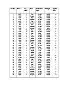
I have found some extra research from web sites on 50 different Ford cars. The same models have been used in a number of instances, but their mileages or ages are different.
From this information, we can put the depreciation on the Y axis and the mileage on the X axis, and form a graph to look at the relationship between the amount the price depreciates and the mileage of that car.
We can clearly see from this that a better picture is painted of the relationship. Mileage and depreciation show a strong positive correlation and there appear to be almost no anomalous results in our table. This not only shows that working with depreciation gives better results than just working with current price, but also reinforces the conclusion that as the mileage increases, the car will decrease more and more in price.
Age
In a similar way to mileage, I will investigate the correlation between depreciation and mileage. I have taken another sample of Ford cars, this time based on price, and put them into a graph:
From this we can construct a graph, which looks incredibly similar to that of mileage. The line of best fit (trend line) is almost at exactly the same as that of mileage so there is not only an obvious positive correlation with price. This means that as the age increases, the price depreciates more and more, meaning that the overall price will go down.
Age and Mileage
To examine closer the possible similarities between the mileage and the age of the car I have taken 50 cars from my original data to compare their mileage and age as shown below:
Here we can clearly see there is a positive correlation between mileage and price. However, there appear to be many anomalous, or freak, results. The reason for this is due to the fact every car owner does not do the same number of miles per year; while some may only drive 200 miles in a year others may use the car constantly. This means that we cannot hope to get a perfect correlation, but it does show us a clear link between the two.
We can see from the graph that every year around 6100 miles is done, which is slightly lower than expected.
We can take the relationship further by saying that rather than mileage and age being factors with a correlation, we can say that age actually has little to do with price depreciation, and it is actually mileage which reduces the price of the car. We know this as there is a wide spread of results for each age, and mileage correlates almost perfectly with price, so this means that mileage will increase by an average amount each year, and this will affect price, rather than age.
This means that a two year old car which has done a low mileage may be worth the same amount as a two year old car which has done a high mileage,
From this we can now draw further conclusions that mileage and age are clearly linked, and now we can try to work out a formula that combines both mileage and age, as there appears to be a correlation.
Examining make and price depreciation per year
If we take the formula for overall price depreciation, and divide it by the number of years that the car has been used for, we get the percentage price depreciation per year – in other words, the amount the car depreciates every year.
This is very useful as it does not so much give an indication of the mileage or age of the car, but more of the value of the car itself from the original price. Here I have taken around 90 of the cars from the given list, all different makes, and found the depreciation per year for each. Only makes with more than 1 car in the list were chosen so a trend line can be made.
From this information, we can plot a graph that shows the different makes, with original price against percentage depreciation per year:
Because for some cases we only had 2 or 3 values for each make, a trend line was not helpful as the result appeared anomalous, due to the fact
From this we can see a number of interesting things. The bottom two lines, the pink and yellow trend lines, are for BMW and Rover, usually the higher range cars. We see that they depreciate by much less in relation to their original price per year, showing that the more expensive cars depreciate less per year than cheaper cars; for example Fiat, with one of the steepest trend lines, is usually a cheaper brand so reinforces this. Similar trends are shown with Pergeot, having the steepest line, and a middle of the range car appears to be a Ford, which is also in line with previous ideas.
This information backs up the brief study done on car depreciation earlier in the preliminary stages of the project; we saw that a Porche depreciated very little from it’s original value as it was so expensive, and here we see that a BMW will depreciate very little from it’s original price per year as well.
Looking at cumulative frequency – from given data
Vauxhall
We can now look at cumulative frequency, to examine medians and quartiles in our work. For this we can use our original data to examine this in a graph. I have chosen to look at Vauxhall cars as we have a large number of them in data. Since we are using cumulative frequency graphs, the amount of data we have in the sample is not as important.
From this information we can put the depreciations into a cumulative frequency table - in this case x is the depreciation. Cumulative frequency is calculated by putting the numbers into groups as normal but adding previous numbers onto it so the number accumulates.
We can then put this into a graph by plotting price depreciation against the cumulative frequency as shown below:
We see the usual cumulative frequency “S” shape here, although not as strong as I would have hoped, and we can also find out the median and interquartile range from this information. To find the median we take the middle cumulative frequency (7) and follow the graph down to see what the median is. From the graph we can see:
Median = 60%
Q1 = 48%
Q3 = 74%
Interquartile Range = 26%
This tells us that the median price depreciation for these Vauxhall cars is around 60%.
Fiat
Based on previous information, a lower price ranged car would be a Fiat. This would be ideal to compare to a Vauxhall, which is not top of the range, but from previous graphs shows it depreciates less than others.
From this we can construct a graph as follows:
From this we can see:
Median = 57%
Q1 = 44%
Q3 = 78%
Interquartile range = 34%
From this we can see that Fiat cars have both a lower price depreciation and lower range, meaning that they have a smaller spread of cars, and the median depreciation is lower.
Re-examining my Hypothesis
At this point I will re visit my original hypothesis and now compare them to the information I now have.
Mileage
I originally said, “As mileage increases, the price of the car will decrease.”
After looking at a selection of Ford cars, I saw this to be true, as there was a clear positive correlation between the mileage and price. This proves this part of my hypothesis correct.
Age
I originally said, “As age of the car increases, the price of the car will also decrease”
After looking at previous analysis, we can not only say this, but also that mileage and age correlate closely and whilst mileage increases due to age, the mileage plays more of an important price of the car rather than the age.
Make
I originally said, “The make of the car will carry higher or lower prices depending on the make; some makes will cause prices to be higher, others will cause prices to be lower.”
We have not only found this to be true, but also that significantly more expensive cars will generally depreciate in price much less than other cars.
Producing a Model
Finally, in this project, I wish to produce a model which can predict the price of a car at different ages. After this, I will be able to compare my results and see how well they correlate.
For this I have used the Ford Mondeo car; this is for a number of reasons. Firstly, the information for this car was easily available from peers and the internet. Secondly, this appears to be a relatively mid range car; not being a luxury or budget car to either extreme.
Ford Mondeo Cars
From this information we can make a graph comparing the depreciation to age as we have done previously:
From this we see the usual trend of depreciation and age. However, since we have so much data in the graph which is relatively well correlated, we can now use the equation of the trend line as a basis for predicting prices:
y = 0.2526x – 8.6857
This is too accurate for our needs so we can simplify this formula to
y = 0.25x – 8.7
This can be turned into:
y = x/4 – 8.7
And finally:
x = 4y + 34.8
To test out our equation we can take a sample of our data and use our equation to use the age to predict the depreciation, and hence the price. However, the data must be in a same proportions we had in our original sample, so we will take a stratified sample; half the number of each age will be used. Since we are picked at random, we can call this a random stratified sample.
I have taken this information and put it into a table, and added a formula that should calculate the depreciation of the car:
We can now put in the values, and to compare this to the real depreciation, we can examine correlation – while a correlation of 1 is perfect, a correlation of 0 means no correlation at all. I am hoping to get a correlation near to 1, since most the points on the graph are near to the trend line. To get the correlation I have used the formula “=CORREL(E2:E26,F2:F26)”
By using the correlation function, we can see that the correlation is 0.96888002. This is very near 1, only 0.031119976 from perfect. We can clearly see from this that my predictions were good. However, this correlation is not so much an indicator of my prediction, but merely showing the correlation between the line on the graph (which I have used to base my predictions on) and the points on the graph.
Evaluation
In conclusion, given the time constraints I had, I believe that I have been relatively successful in investigating my hypotheses. I have looked into make, age, mileage and also predicted ages of cars (which would almost definitely correlate well with mileage in addition, as the two are linked). Given more time, I could have done investigations into engine size and other such specifications of cars. I could have also represented my data in other forms, such as box plots, etc, and used standard deviation and skewness in my project.