According to height most students are grouped in the 1.2m to 1.6m ranges although the males are more spread out, and since there are more males that are taller the mean may not show that average girls are taller and the these taller boys will bring the total mean height up. In weight the males are also more varied and spread out. All females are in between the 40 kg and 60 kg ranges. But males vary between the 25 kg and 70 kg range.
Cumulative Frequency
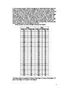
I have produced the following tables from my selected data and I have calculated the cumulative frequency so that I can represent this information on cumulative frequency graphs.
Frequency Tables
Conclusion from cumulative frequency graphs (previous page):
In the cumulative frequency graphs for height I can see that the males and females graphs are quite parallel. I calculated the interquartile range from these graphs and results show that the interquartile range for year 7 males is 152.2m and females is 150.75m, the smallest range indicates that much of the data is concentrated about the median. This shows that year 7 males’ height varies a lot.
In the Cumulative Frequency graphs for weight I cans see that the females have a tighter range, most of the females are in the middle half of the graph. There is more variation on the males weight; again this shows that the female’s interquartile range is smaller.
Box Plots
I have decided to draw box plots to show the interquartile ranges better:
Conclusion from box plots (next page):
The cumulative frequency graph representing height shows us that year 7 females have a higher median, and this tells us that on average females are taller than males.
The females also have a larger gap between that upper quartile and lower quartile ranges this shows that they have more varied height range, whilst the males have a smaller gap. The box plot for weight shows that the interquartile range is bigger for the male students. The median for both the males and females is very similar this shows that males averagely weigh the same amount as the females, although they have a bigger upper quartile so they have a more varied scale.
Standard Deviation
Using the Excel formula =STDEV (D4:D33) which was given to us by our maths teacher, I calculated the standard deviation of my data.
For year 7 males height the standard deviation is: 0.085cm to 3 decimal places.
For year 7 females height the standard deviation is: 0.106cm to 3 decimal places.
The females have a higher standard deviation shows the spread of the values from their mean, therefore the less reliable the data. The standard deviation shows that the males data was closer together and more accurate.
For year 7 boys weight the standard deviation is: 7.79kg to 3 decimal places.
For year 7 boys the standard deviation is: 5.47kg to 3 decimal places.
The males again have a lower standard deviation than the females it is fair to say that my random sampling of males was more reliable than my random sample of female.
Year 11
Scatter graphs
From these graphs I can see that the females have poor correlation, the males have better correlation. In both of the graphs the majority of students are in the 1.4 to 2 ranges though the males are more spread out.
The weight scatter graph shows that the females are more close together, widely held within the boundaries of 40 and 60 kg. This scatter graph is even more compact than the year 7 results. The male students are a lot more varied. As I have stated in my prediction the males are heavier by year 11.
I have again produced frequency tables so that I could draw my cumulative frequency graphs to show the following data:
Frequency graphs
Conclusion from Cumulative Frequency graphs (previous page):
The cumulative frequency graphs for weight show that year 11 males are heavier because the graph continues for the males, whilst the female frequency stops half way. The males have a greater interquartile range; I can see this from the curves. The females have a tight allocation.
In the cumulative frequency graph for height I can see that males are taller than girls as the graph carries on again, and the girls once again have a tight distribution.
Box plots
Conclusion (previous page):
In both of the box plots the females have lower interquartile ranges this meets my hypothesis as I quoted that in year 11 male students become heavier and taller than females. The diagram fro height shows the females have a small median; they are less varied in height so they have a small interquartile range. The males have a lot bigger median and are more varied then females. The interquartile proves this, and it proves that my hypothesis is partly correct.
The diagram representing weight shows that the males are definitely heavier then females. The males interquartile range is about twice the size of the female interquartile range, this shows that the females are very compact in weight. As I predicted the males are heavier in year 11.
Standard Deviation
Once again I used the excel formula to find the standard deviation of my data.
For year 11 males height the standard deviation is: 0.147cm to 3 decimal places.
For year 11 female height the standard deviation is: 0.156cm to 3 decimal places.
The standard deviation shows that the female results again have more distance from the mean, but only by 9 cm.
For year 7 boys weight the standard deviation is: 15.4kg to 3 decimal places.
For year 7 boys the standard deviation is: 5.97kg to 3 decimal places.
The standard deviation for females now shows that they had less than half the standard deviation the males have. The males have distanced from the mean a lot.
Main conclusion
My original hypothesis:
‘In year 7 females are generally taller than males but males are heavier in weight. By year 11 males are taller and heavier than girls’
Studying the Mayfield High Database I have clearly proven my hypothesis, by using scatter graphs, cumulative frequency graphs, and box plots. Although in one of my box plots my results were very close and showed that the female and males weight in year 7 was very similar. Other wise my results were what I had expected. I choose this hypothesis because I knew it was already a fact and I did some scientific research to back my point:
‘Boys start growing later than girls, but they are not entering puberty later. Rather, their growth spurt comes at the end of puberty, not the beginning. This delay gives boys the advantage of an extra two years of normal childhood growth before their final growth spurt. This is one of the reasons why adult men are on average 13cm taller than women.
Another reason for their height is that boys grow faster than at their peak rate. They grow faster because they have higher levels of testosterone in their bloodstream than girls. The testicles release more and more testosterone into the blood stream as they mature. During puberty an average boy's production of testosterone will increase tenfold.’
My hypothesis proved this fact, and I have found that there is a relationship between age, height and weight. This connection can be seen through my graphs. I noticed in my graphs that the females always had a tighter distribution then the males; this shows that males aged between 11-16 vary a lot in terms of height and weight.
Criticisms
In the process of proving my hypothesis I used standard deviation to find out how far my data was from the mean, showing the more accurate data. I could have improved this point by having more people in my sample and this should bring the standard deviation down because there would be more samples which should in theory follow the mean. My scatter graphs could be improved because the points were not very clear and they were too small to interpret. Another improvement that I could have done was to produce all my graphs on the computer so that I have accurate results, but I could not do this, as I did not know how to draw more complex graphs on the computer.
Evaluation
Overall my investigation went quite well because I proved my hypothesis, showing my mathematical skills on; stratified and random sampling, producing graphs and using Excel for my scatter graphs and standard deviation.