Investigation into some of the statistical differences between The Times and The Telegraph on a specific day
Investigation into some of the statistical differences between The Times and The Telegraph on a specific day
Design and Planning
The aim of this project is to compare two daily published broadsheets. The two papers that will be used are THE TIMES and THE TELEGRAPH, both purchased on the same day. A lot of data can be easily collected from a newspaper, ranging from average word length to area devoted to adverts per page.
The project will attempt to reach conclusions regarding three specific questions. In answering these questions a range of sampling methods, presentation of data, and statistical calculations will be used in order to interpret and evaluate the data and come to a valid conclusion, drawing together all the data.
Each question will be presented and it will be explained what statistical methods will be involved in drawing conclusions for these questions.
Question 1:
· How does the font size of the headline text affect the length of the article?
This involves comparing two sets of data:
· Font Size of Headline text: A sheet was printed from Microsoft Word that had various font sizes in the Times New Roman font, the standard font for the two papers, printed on it. This was used as a guideline when compiling all the data.
· Length of column of each article : In The Times and The Telegraph there is a standard column width and simply measuring the vertical length of all the columns in the article gives a suitably accurate indication of the length of the article
To make any calculations accurate enough to draw a valid conclusion at least twenty sets of data from each paper will need to be collected. As each page has approximately three articles on it and both newspapers have roughly thirty pages as systematic sample of every 4 pages will provide enough data to support any conclusion.
The best ways to find out if the size of the headline text affects the length of the article is to draw a scatter diagram and find the line of best fit and to use Spearman's rank correlation coefficient.
Question 2:
· What is the most common type of advertisement and how much space is given to each?
This involves collecting two sets of data:
· Number of times a pre-defined type of advert occurs : This will be done simply by looking through the paper and making a tally chart.
· Area devoted to each pre-defined advert type : Whilst making the tally chart the area of each advert will also be recorded in centimeters squared. All these results can then be added up to give the total area devoted to each advert type.
To make any calculations accurate enough to draw a valid conclusion at least twenty sets of data from each paper will need to be collected. The only fair way to do this is to collect data from the whole of both papers, as this gives a much better picture of how much advert space there is and will provide at least twenty sets of data from each paper.
The best way to compare the data collected is to draw two sets of comparative pie charts. One set comparing the type of advert and the other comparing the area devoted to each type.
Question 3:
· What is the dispersion and averages of the number of words in each article and how do they differ between the two newspapers?
This involves collecting one set of data:
· The number of words : This will be done by counting the number of words in the first sentence as this usually gives a good indication of the depth of the article. The data will be collected in a grouped frequency table.
To make any calculations accurate enough to draw a valid conclusion at least twenty sets of data from each paper will need to be collected. Therefore to collect the right amount of data fifty samples in total over the two papers should be taken in the style of a stratified random sample, distributing the amount of samples proportionally between the two papers. A page number should then be randomly generated and the first article from that page sampled.
The best way to compare these two sets of data will be to use standard deviation, mean deviation, the quartile ranges, the averages (mean, median, mode), and histograms with box and whisker diagrams.
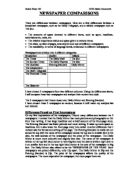
Collection, selection, presentation, analysis and interpretation and evaluation of data
Question 1:
To make the calculations accurate enough to draw a valid conclusion twenty sets of data from each paper was collected. As each page has approximately three articles on it and both newspapers have roughly thirty pages as systematic sample of every 4 pages was used to provide enough data to support any conclusion. As with all continuous data the column length will have a maximum and minimum error which will mean that errors in the data are possible, however these errors will not noticeably affect any of the statistical calculations.
THE TIMES THE TELEGRAPH
Font Size Column Length (cm) Font Size Column Length (cm)
72 57 90 45
36 11 48 20
24 16 36 17
48 59 48 20
72 68 72 46
36 20 20 5
28 20 36 30
72 34 72 75
36 14 30 24
80 36 28 16
72 49 48 42
36 21 24 6
28 20 36 22
48 35 72 38
36 18 28 14
90 83 72 34
24 8 90 80
60 46 28 19
36 18 90 104
72 34 72 67
It was found that not every page had 3 articles on it so not as many samples were collected as was hoped, but luckily twenty samples were still collected anyway.
Scatter diagrams
Firstly a scatter diagram was drawn for each of the two sets of data. This consists of laying out each of the measures along one of the axes of the grid, then considering each item in turn. The two measures for that item act exactly like an ordered pair and thus like coordinates of a point on the grid. Each item considered is thereby linked to one point on the grid and that point can be plotted in the normal way. From the scatter of points that is built up a pattern can be identified, a line of best fit simplifies this trend. To plot this line a special point was plotted, (Average of Font Size, Average of Column Length). These were then compared.
Spearmans Rank Correlation Coefficient
Another method of finding the relationship between two sets of data is to use Spearmans Rank Correlation Coefficient. Each distribution must first be put into an order of merit. Each item being considered has two ranks allocated to it and the difference between these two ranks can be found. If the symbol d is used to represent this difference then the coefficient of rank correlation can be written as:
where n is the number of items in the distribution.
If two or more measures in one distribution are equal it is convenient, though not mathematically justifiable, to allocate them a rank which is the average of the ranks which they would have occupied if they had been different. For example, if the third and fourth measures in a distribution are equal they would both be allocated the rank 3.5 or if the fifth, sixth, and seventh are equal they would be allocated the rank 6.
The easiest way to represent this data and to calculate ...
This is a preview of the whole essay
where n is the number of items in the distribution.
If two or more measures in one distribution are equal it is convenient, though not mathematically justifiable, to allocate them a rank which is the average of the ranks which they would have occupied if they had been different. For example, if the third and fourth measures in a distribution are equal they would both be allocated the rank 3.5 or if the fifth, sixth, and seventh are equal they would be allocated the rank 6.
The easiest way to represent this data and to calculate the correlation is to put the data in a tabular form.
The Times
Font Size Column Length (cm) RankFont Size Rank Column Length d
72 57 5 4 1 1
36 11 13.5 19 -5.5 30.25
24 16 19.5 17 2.5 6.25
48 59 9.5 3 -7.5 56.25
72 68 5 2 3 9
36 20 13.5 13 0.5 0.25
28 20 17.5 13 4.5 20.52
72 34 5 9.5 -4.5 20.25
36 14 13.5 18 -4.5 20.25
80 36 2 7 -5 25
72 49 5 5 0 0
36 21 13.5 11 2.5 6.25
28 20 17.5 13 4.5 20.25
48 35 9.5 8 1.5 2.25
36 18 13.5 15.5 -2 4
90 83 1 1 0 0
24 8 19.5 20 -0.5 0.25
60 46 8 6 2 4
36 18 13.5 15.5 -2 4
72 34 5 9.5 -4.5 20.25
n=20 å = 250
By applying the above equation the following calculations provide a measurement of the relationship between the two distributions:
The Telegraph
Font Size Column Length (cm) RankFont Size Rank Column Length d
90 45 2 6 -4 16
48 20 9 13.5 -4.5 20.25
36 17 13 16 -3 9
48 20 9 13.5 -4.5 20.25
72 46 6 5 1 1
20 5 20 20 0 0
36 30 13 10 3 9
72 75 6 3 3 9
30 24 15 11 4 16
28 16 17 17 0 0
48 42 9 7 2 4
24 6 19 19 0 0
36 22 13 12 1 1
72 38 6 8 -2 4
28 14 17 18 -1 1
72 34 6 9 -3 9
90 80 2 2 0 0
28 19 17 15 2 4
90 104 2 1 1 1
72 67 6 4 2 4
n=20 å = 128.5
By applying the above equation the following calculations provide a measurement of the relationship between the two distributions:
Interpretation and evaluation:
Scatter diagrams:
On the scatter diagrams a line of best fit was drawn, passing through
The distribution of the points plotted on the scatter diagrams can give an indication of the relation between the two characteristics being measured. The lines of best fit both follows a straight line and this shows that that the measures are directly proportional. The lines on both diagrams both have similar angles, roughly 45°, this shows that the relationship between headline size and article length is very strong in both newspapers. Despite the good lines of best fit, on both diagrams as the headline size and article length increase the points deviate further from the line of best fit. This may be show that, although the article length does increase as the headline size increases, as the values get higher there is less of a strong relationship between the two measures as there is when both of them are small. This means that as one value increases so does the other but it may increases by more or less proportionally to its original size.
Spearmans Rank Correlation Coefficient:
Despite knowing that both diagrams reveal a strong correlation there is no easy way of knowing which one has the strongest correlation, nor does it provide a measurement of how closely these measures approximate to the lines of best fit. The type of measure that is used for this purpose is called the coefficient of correlation and it is assessed on a scale which runs from +1 through zero to -1. A coefficient of correlation of +1 means that the two distributions match each other perfectly and this would correspond to a scatter diagram where all of the points plotted lie along the leading diagonal of the grid. A coefficient of correlation of -1 would correspond to a pair of distributions where the measures are in completely the opposite order, that is, the first in one distribution is last in the other and so on.
As with the scatter diagrams Spearmans Rank shows that both newspapers have a strong relationship between headline size and article length. But it reveals that this relationship is stronger in The Telegraph than it is in The Times. However Spearmans Rank can be deceptive as it only considers the rank of the distributions not the actual value that the scatter diagram does.
To conclude, both measures show that there is a strong relationship between the size of the font of the headline text and the length of the article. This makes logical sense and would reasonably be expected in both newspapers. However there is no particular reason that The Telegraph should have a stronger relationship than The Times and this may be just what the papers were like on that specific day.
Question 2:
To make any calculations accurate enough to draw a valid conclusion at least twenty sets of data from each paper was needed. The only fair way to do this was to collect data from the whole of both papers, as this gives a much better picture of how much advert space there is and provides at least twenty sets of data from each paper.
The Times The Telegraph
Advert Type Area ( ) Advert Type Area ( )
Holiday 442 Holiday 170
Computer 468 Holiday 400
Alcohol 493 Holiday 425
Car 2088 Phone 672
Computer 775 Bank/Insurance/ Money 250
Bank/Insurance/ Money 408 Holiday 250
Holiday 12 Computer 858
Bank/Insurance/ Money 170 Car 2088
Car 988 Bank/Insurance/ Money 1015
Holiday 544 Electrical Appliances 2088
Fashion 918 Car 950
Electrical Appliances 825 Education 160
Phone 116 Furniture 2088
Car 2088 Computer 2052
Electrical Appliances 825 Car 540
Car 900 Holiday 168
Computer 2088 Computer 832
Car 412.5 Holiday 544
Car 928 Car 2088
Books 400 Bank/Insurance/ Money 450
Computer 400 Bank/Insurance/ Money 450
Holiday 425 Computer 881
Cinema 912.5 Education 425
Bank/Insurance/ Money 280 Phone 180
Car 240
Computer 693
Bank/Insurance/ Money 476
Bank/Insurance/ Money 425
Both newspapers had more than enough adverts within them to support any valid conclusions. Despite the fact that The Telegraph has four more adverts in it than The Times this will not affect any statistical calculations.
Firstly two tables were drawn up, one to show the frequency of the type of adverts and the other to show the area devoted to each specific type of advert. From these two tables two sets of comparative pie charts were drawn. One comparing the type of adverts in The Times and The Telegraph and the other comparing the area devoted to each of these type of adverts in The Times and The Telegraph.
Comparative pie charts allow you to compare not only the percentage components but also the totals of the components, the areas of the pie charts must be proportional to the totals of the components.
Type of Advert
Advert Frequency
Type Times ( ) Telegraph ( )
Holiday 4 6
Computer 4 5
Car 6 5
Bank/Insurance/Money 3 6
Phone 1 2
Alcohol 1 0
Fashion 1 0
Electrical Appliances 2 1
Book 1 0
Cinema 1 0
Education 0 2
Furniture 0 1
å=24 å =28
Letting , be the radii of the pie charts to represent The Times and The Telegraph, then if equals 4cm then:
=
The angles in the pie chart that will represent each type of advert can be calculated by:
Dividing n by ån and multiplying by 360°
e.g. "Holiday" in The Times -
Area devoted to each advert type
Advert Area ( )
Type Times ( ) Telegraph ( )
Holiday 1423 1957
Computer 3731 5316
Car 6476.5 5906
Bank/Insurance/Money 858 3066
Phone 116 852
Alcohol 493 0
Fashion 918 0
Electrical Appliances 1650 2088
Book 400 0
Cinema 912.5 0
Education 0 585
Furniture 0 2088
å =16978 å =21858
Letting , be the radii of the pie charts to represent The Times and The Telegraph, then if equals 4cm then:
=
The angles in the pie chart that will represent each type of advert can be calculated by:
Dividing n by ån and multiplying by 360°
e.g. "Car" in The Telegraph -
Interpretation and evaluation:
Type
It can clearly be seen from the data that The Telegraph has four more adverts than The Times. In The Times it can be seen that the adverts for 'cars' are the most frequent, whereas in The Telegraph adverts for 'holidays' and for 'bank/insurance/money' are the most common. Holiday, computer, car and bank/insurance/money adverts are the four most common type of adverts in both papers, with the other categories only occurring once or twice. This could be expected, considering the type of newspapers that are being sampled. The Times and The Telegraph have a certain type of reader and these adverts are obviously aimed specifically at these readers. Also the four most common adverts are advertising products/services that involve the most amount of money, therefore it is plausible that it is more profitable for the paper to advertise these type of adverts as competition will rise the price of advertising.
What the comparative pie charts allow you to do is to compare the percentage of the total adverts each advert type represents. The charts show that if a certain advert has an equal frequency in The Times and The Telegraph it has a higher percentage of the total in The Times than The Telegraph. This is shown clearly by the fact that the car adverts in The Times take up a higher percentage of the total adverts than the holiday and bank/insurance/money adverts do in The Telegraph despite them having the same frequency. It is also worth noticing that The Times has a wider range of adverts than The Telegraph. In both cases the four most common adverts take up roughly three quarters of the chart which again shows the readers the papers are aimed at and that the size of the market for these adverts is larger than the rest.
The less frequent adverts can be affected by the contents of the newspapers on that day, which may explain why adverts in one paper do not occur in the other. It is also possible that these adverts may not have such a large market with the readers or that large amounts of advertising is not economically viable.
Area
Looking at the comparative pie charts for the area of the adverts for each type it reveals that despite certain advert types occurring frequently they do not necessarily cover a large area. This is shown by the 'holiday' and 'electrical appliances' categories in The Telegraph 'holiday' represents 21.4% of the type of adverts whilst only covering 9% of the total area devoted to adverts, whereas 'electrical appliances' represents only 3.6% of the type of adverts whilst it covers 9.6% of the total area devoted to adverts. This may be that certain types of adverts do not occur frequently but require more space while some frequent adverts don't need a lot of spaces. The 'car' category covers the largest area in both The Times and The Telegraph, this is because car adverts often take up either a whole or half a page at a time as car companies have a large advertising budget. For the less frequent adverts the area that they cover is less predicable as there may be one advert type that has only one advert but it takes up a lot of space or may only have a very small advert hidden in a corner.
Question 3:
To make any calculations accurate enough to draw a valid conclusion at least twenty sets of data from each paper were needed. Therefore to collect the right amount of data fifty samples in total over the two papers was taken in the style of a stratified random sample. The stratified random sample is made up of random samples from each section or stratum of a population.
Therefore if a total of fifty random samples are needed then the following equations need to be done:
The Times has 30 pages and The Telegraph has 34 pages, therefore:
The Times:
The Telegraph:
The random sampling was done by allotting a numbered card to each page number. These cards were mixed thoroughly and picked at random providing a page number to sample.
Counting every word and it's characters on each page and is impractical and unnecessary, therefore the first sentence of the first article on each page was sampled as this gives a good enough indication.
The data is most easily represented in a grouped frequency table:
The Times The Telegraph
Number of Words Frequency ( ) Number of Words Frequency ( )
0-4 0 0-4 0
5-9 0 5-9 0
0-14 1 10-14 1
5-19 2 15-19 1
20-24 5 20-24 3
25-29 6 25-29 4
30-34 3 30-34 7
35-39 2 35-39 4
40-44 1 40-44 3
45-49 2 45-49 2
50-54 0 50-54 1
55-59 1 55-59 1
This data can be compared in many ways:
. Comparing Standard Deviation
2. Comparing the Three Averages (mean, mode, median)
3. Comparing Histograms and Frequency Polygons
4. Comparing Cumulative Frequency Curves (Skew, Quartile ranges etc.)
Comparing Standard Deviation
Standard Deviation is a measure of the spread of individual items for data from the mean of the set of items. The deviation (difference) of each data item from the mean is found and their values squared. The mean value of these squares is then calculated. The standard deviation is the square root of this mean.
If is the number of items of data, is the value of each item, and is the mean value, the standard deviation ( ) may be given by the formula:
But as the data is in a grouped frequency table, where is equal to the frequency and is equal to the mid-point of each of the groups (as this provides an estimation), the following changes need to be made to the equation:
Standard deviation is the most satisfactory measure of dispersion, since it makes use of all the scores in the distribution and is also quite acceptable mathematically.
A table showing the stages of the calculation is the best way to calculate the standard deviation.
The Times:
Words Mid-point ( )
0-4 2 0 -27.6 761.76 0
5-9 7 0 -22.6 510.76 0
0-14 12 1 -17.6 309.76 309.76
5-19 17 2 -12.6 158.76 317.52
20-24 22 5 -7.6 57.76 288.8
25-29 27 6 -2.6 6.76 40.56
30-34 32 3 2.4 5.76 17.28
35-39 37 2 7.4 54.76 109.52
40-44 42 1 12.4 153.76 153.76
45-49 47 2 17.4 302.76 605.52
50-54 52 0 22.4 501.76 0
55-59 57 1 27.4 750.76 750.76
From this data the equation is applied:
The Telegraph:
Words Mid-point ( )
0-4 2 0 -31.5 992.25 0
5-9 7 0 -26.5 600.25 0
0-14 12 1 -21.5 462.25 462.25
5-19 17 1 -16.5 272.25 272.25
20-24 22 3 -11.5 132.25 396.25
25-29 27 4 -6.5 42.25 169
30-34 32 7 -1.5 2.25 15.75
35-39 37 4 3.5 12.25 49
40-44 42 3 8.5 72.25 216.75
45-49 47 2 13.5 182.25 364.5
50-54 52 1 18.5 342.25 342.5
55-59 57 1 23.5 552.25 552.25
From this data the equation is applied:
Interpretation and evaluation:
Standard deviation provides a way of comparing the dispersion of two sets of data with each other. Both newspapers have a similar deviation of the number of words and this is shown in the standard deviation measures. However The Telegraph has a smaller standard deviation of 10.257337(FCD) whilst The Times has a standard deviation of 10.618851(FCD). This means that in The Telegraph the values of the numbers of words are more close together deviating a smaller amount from the mean than in The Times where the values are slightly only more spread out. This shows that there is no great difference between the two papers deviations of the number of words in the first sentence of each page.
Comparing the Three Averages (mean, mode, median)
Mean:
The mean can be calculated exactly, it makes use of all the data and can be used in further statistical calculations, but it can be very misleading if there is an abnormally high or low value.
As the data is in a grouped frequency table the mean is calculated using the mid-points of the groups.
The Times:
Words Mid-point(x)
0-4 2 0 0
5-9 7 0 0
0-14 12 1 12
5-19 17 2 34
20-24 22 5 110
25-29 27 6 162
30-34 32 3 96
35-39 37 2 74
40-44 42 1 42
45-49 47 2 94
50-54 52 0 0
55-59 57 1 57
This means that the mean is:
The Telegraph:
Words Mid-point(x)
0-4 2 0 0
5-9 7 0 0
0-14 12 1 12
5-19 17 1 17
20-24 22 3 66
25-29 27 4 108
30-34 32 7 224
35-39 37 4 148
40-44 42 3 126
45-49 47 2 94
50-54 52 1 52
55-59 57 1 57
This means that the mean is:
The Median:
When a number of scores are arranged in numerical order, the median score is the 'middle' score having the same number of numbers above it as below. When there is an odd number of scores this is easy as there is a 'middle' score but when there is an even number of scores there is no single 'middle' score and the median is defined as halfway between the two 'middle' scores.
The median is simple to understand, it is unaffected by abnormally high or low values but it can only be estimated in grouped distributions.
The median can be estimated from a cumulative frequency distribution by calculation. The middle value of the frequency should taken (b) and the groups between which it lies are recorded (d) & (e). It is then calculated how far (b) lies into the cumulative frequencies either side of it (c) & (a) this is then divided by the distance between (a) & (c). This is then multiplied by the distance between the groups either side of (b), (d) & (e), then the value of the lowest group adjacent to (b), (d), is added to everything. This can be shown in the equation below:
The Times:
Words Cumulative Frequency
<4.5 0
<9.5 0
<14.5 1
<19.5 3
<24.5 8
<29.5 14
<34.5 17
<39.5 19
<44.5 20
<49.5 22
<54.5 22
<59.5 23
By applying the equation the median can be calculated:
The Telegraph:
Words Cumulative Frequency
<4.5 0
<9.5 0
<14.5 1
<19.5 2
<24.5 5
<29.5 9
<34.5 16
<39.5 20
<44.5 23
<49.5 25
<54.5 26
<59.5 27
By applying the equation the median can be calculated:
The Mode:
The mode is the score which occurs most frequently. It cannot be determined exactly in a distribution where the data is grouped.
A simple estimation was made taking the mid-value of the group with the highest frequency as the mode.
The Times:
The group with the highest frequency is 25-29, therefore the mode is the mid-point:
27
The Telegraph:
The group with the highest frequency is 30-34, therefore the mode is the mid-point:
32
Interpretation and evaluation:
It is clear from the grouped frequency tables and all the averages that The Telegraph has, on average, more words in the first sentence of each article than The Times. Throughout all the averages The Telegraph gives the number of words in the low thirties while The Times gives the number of words in the high twenties. All three of the averages have their advantages and disadvantages and are calculated in different ways but they all take into account all the data in the distribution. As all the data was in a grouped frequency table all the averages are actually calculated estimations and are not exact answers. However this will make little difference in comparing the averages as they have all been subjected to the same estimations.
There are a number of possible reasons for the fact that articles in The Telegraph have more words in the first sentence than The Times, possible reasons are that: The Telegraph has more long winded reporters, it may discuss the subject of the article in more detail and depth than The Times, or it may need to explain in an easier to understand way for its readers.
Comparing Histograms and Frequency Polygons:
One of the best ways to represent a frequency distribution graphically is by means of a histogram. A histogram is similar to a bar chart but the area of each column must be proportional to the frequency of the corresponding class. The columns can be drawn without leaving space between them because there is a regular scale along the horizontal axis. The values of the variable are always shown on the horizontal axis and the frequencies on the vertical axis.
Another way of representing a frequency distribution graphically is by means of a line called a frequency polygon. A frequency polygon is drawn by joining, with straight lines, the mid-points of the tops of the columns of the histograms.
One histogram has been drawn with its frequency polygon superimposed upon it for each of the two newspapers. These can then be compared.
Interpretation and evaluation:
Both Histograms and frequency polygons reveal that both newspapers have a normal distribution of the values. They both peak towards the middle of the range and have lower frequencies at the extremes of the ranges. The Times peaks over the 24-29 group whereas The Telegraph peaks over the 29-34 group. This again shows that The Telegraph on average has more words in the first sentence of each article than The Times. The Telegraph peaks higher and has a more balanced incline to the peak and decline from it than The Times which has an irregular decline from the peak as values after decreasing often increase again. This shows that The Telegraph has a more regular distribution of the number of words than The Times.
Comparing Cumulative Frequency Curves
A graph can be drawn of the cumulative frequency distribution, a curve can be obtained which has a characteristic shape. This curve is called a cumulative frequency curve.
From a cumulative frequency curve it is possible to find whether the data is of a 'normal distribution', 'negatively skewed', or 'positively skewed'
Box and Whisker diagrams can be drawn as well as calculating the inter-quartile range, to figure out the spread of the data and the range it covers. The quartiles from a frequency distribution are estimated from the cumulative frequency curve of the distribution. The Lower Quartile corresponds to, where n is equal to the frequency:
and the Upper Quartile corresponds to:
These then correspond to the data on the x-axis and the difference between these two values is the inter-quartile range.
The Times:
Words Cumulative Frequency
<4.5 0
<9.5 0
<14.5 1
<19.5 3
<24.5 8
<29.5 14
<34.5 17
<39.5 19
<44.5 20
<49.5 22
<54.5 22
<59.5 23
The Telegraph:
Words Cumulative Frequency
<4.5 0
<9.5 0
<14.5 1
<19.5 2
<24.5 5
<29.5 9
<34.5 16
<39.5 20
<44.5 23
<49.5 25
<54.5 26
<59.5 27
Interpretation and evaluation:
Both curves have a similar shape, this shape is the shape of values that are in a 'normal distribution'. This means that the data if put on a frequency curve would have symmetrical curve peaking at the middle. The cumulative frequency curve for The Telegraph has a slightly steeper incline and the median is further along the x-axis than the cumulative frequency curve for The Times. This shows that The Telegraph has more of a 'normal distribution' than The Times does and that the values in The Telegraph are on average higher than The Times. The curve for The Telegraph is smother towards the end than The Times. This again shows that the decline from the peak is more regular in The Telegraph than in The Times.
The Box & Whisker diagrams show the inter-quartile ranges, ranges and median values of the distributions. The inter-quartile range is a range that discards any higher or lower value and concentrates on the middle values, this shows how spread out the main part of the data is. The inter-quartile ranges of both papers only differ by 0.25, but The Telegraph's inter-quartile range is over a higher set of values than The Times. This shows again that The Telegraph on average has more words than The Times. The Telegraph's box & whisker diagram backs up the fact that it is a normal distribution of data by the fact that the median lies in the middle of the inter-quartile range which in turn is in the middle of the range. From The Times diagram it can be seen that the data is slightly on a positive skew as the median lies to the left of the inter-quartile range which in turn lies slightly to the left of middle in the range.
Limitations and problems encountered
Throughout the project all continuos data has been subjected to estimations. As this data, i.e. Article length, is obtained by measurement, it is important to consider how accurate the information is and, based on this information, how accurate any further calculations will be.
In measuring anything we are limited in our accuracy by the equipment available and our own human limitations. It is important that we are aware of what error is implied by our measurements and what the maximum possible error is likely to be.
For example in Question 1 the continuous data representing the article length was measured using a ruler only accurate to the nearest centimeter. This therefore means that the maximum error then is 0.5cm above the nominal value and 0.5 cm below it. This is called the absolute error. The absolute error is useful but it is more useful to find the relative error. This is found by considering the absolute error in relation to the measurement itself.
If this applied to one of the smaller measurements obtained for Question 1 then it can be seen how significant this estimation can be.
This is often expressed as a percentage:
By increasing the measurement to millimeters a lot of difference can be made, the absolute error drops to 0.05cm and the percentage error becomes:
This then increases the accuracy of any further calculations using that data.
This increase in accuracy would help the accuracy of the Spearmans Rank calculations, as many value that had a tied rank would maybe have a separate ranks which would make the value given much more reliable.
It was found that there is also limitations on the number of statistical methods and calculations that can be applied to non-quantitative data. This limited the length and depth of the answer in Question 2. The representation of data was limited and it didn't allow for many calculations.
It is justifiable to say that to improve the results of all the questions a simple method could be employed. The accuracy and reliability of any conclusions would be helped if more data was collected from the papers. This would support more valid conclusions.