The average result, for the total number of students including boys and girls, shows that the majority of students got level 4. The next highest category achieved was level 3 with 13 students.
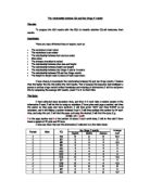
Grouped Data (IQ)
The following charts show grouped data of the IQ. It shows the IQ that each student has. This chart will shows the average intelligence of each student.
Boys IQ
The IQ levels tell me that the IQ of boys in the investigation varies but most students have IQ’s of between 81 and 90. This was closely followed by students who have an IQ of between 91-100.
Stem and leaf graph
The stem and leaf diagram is another way of showing the average IQ results of the students. The diagram is shown below -
7 - 4
8 - 0, 4, 4, 7, 9
9 - 0, 0, 1, 4, 8
10 - 0, 0, 2, 3, 3, 4
11 - 0, 6
12 - 2
The stem and leaf diagram shows me that the IQ’s in the 100 column occurs most often and therefore most students have an IQ in the hundreds.
The graph below is a cumulative frequency graph for the boys as it shows me that the relationship of IQ and the key stage 2 results -
I then calculated the median, lower quartile range, upper quartile, minimum and maximum. The results are as followers -
Median = 94
Lower Quartile = 85
Upper Quartile = 106
Minimum = 80
Maximum = 130
Box and whiskers diagram
I then used a box and whiskers diagram to show the range of results. The graph is as follows -
The diagram shows me the upper and lower quartile as well as the median. The box and whiskers diagram is an easy way of finding the median of data. The median in this case is an IQ of 94
Girls IQ
The IQ level of the girls in the investigation shows me that most the girls have IQ’s between 91 and 110. The other two students have a higher IQ between 111 and 120. There are no girls in the level between 71-90 and 121-130.
Stem and leaf graph
The stem and leaf diagram is another way of showing the average results of the students. The diagram below shows the IQ levels of the girls. The diagram is shown below -
7 -
8 -
9 - 2, 2, 4, 6, 7
10 -0, 0, 0, 2, 2, 2, 3, 4, 4, 5, 5, 6, 9
11 - 2, 7
12 -
The stem and leaf diagram shows that most students have a IQ of about 100 to 109. The table also shows that the other students achieved an IQ between 90-99 and 110-119. The graph also shows that no students have IQ’s of between 70-80 or 120-129.
The graph below is a cumulative frequency graph for the girls. It shows that the average relationship of IQ and the key stage 2 results -
I then calculated the median, lower quartile range, upper quartile, minimum and maximum. The results are as follows -
Median = 102
Lower Quartile = 97
Upper Quartile = 106
Minimum = 91
Maximum =120
Box and whiskers diagram
I then used a box and whiskers diagram to show the range of results. The graph is as follows -
The diagram shows the upper and lower quartile as well as the median. The box and whiskers diagram is an easy way of finding the median of data. The median in this case is an IQ of 102.
Joint Boys and Girls IQ
This tally chart shows the IQ levels of each student. However, the chart shows the joint IQ’s of both female and male genders.
The IQ level of the girls and boys shows that most students have an IQ level of between 81 and 110. The other students have an IQ between 111-130 and 71-80.
Stem and leaf graph
The stem and leaf diagram is another way of showing the average results of the students. The diagram below shows the IQ levels of the girls. The diagram is shown below -
7 - 4
8 - 0, 4, 4, 7, 9
9 - 0, 0, 1, 2, 2, 4, 4, 6, 7, 8
10 -0, 0, 0, 0, 0, 2, 2, 2, 3, 3, 3, 4, 4, 4, 5, 5, 6, 9
11 - 0, 2, 6, 7
12 - 2
This stem and leaf diagram for the boys and girls shows that the average IQ of boys and girls is between 100 and 109. This is the same as when graphs were made separately of boys and girls. However, this stem and leaf diagram also shows that many students also got an IQ of between 90-99. This was also true with the previous diagrams.
The graph below is a cumulative frequency graph for the boys. It shows the average relationship of IQ and the key stage 2 results -
I then calculated the median, lower quartile range, upper quartile, minimum and maximum. The results are as followers -
Median = 93
Lower Quartile = 84
Upper Quartile = 99
Minimum = 70
Maximum =99
From these results, I then formed a Box and whisker diagram. The graph is shown below -
The diagram shows me the upper and lower quartile as well as the median. The box and whiskers diagram is an easy way of finding the median of data. The median in this case is an IQ of 93. The graph above also shows me that the upper quartile is 84 and the lower quartile is 99.
Bar Charts
English
The bar graph is an easy way to show what the 20 students achieved in their key stage 2 results. The following graph shows the levels each student achieved in English -
This graph shows me that there is a big gap between any other levels and level 4. This shows that most students achieved level 4.
Bar charts
Maths levels
The following graph shows the levels what each student achieved in Maths -
The above graph shows me that the majority of students achieved level 4 in Maths. This shows that most students could have achieved level 3 or 4.
Bar charts
Science levels
The following graph shows the levels that each student achieved in Science: -
The above graph shows me that the majority of students got a level 4 in science followed by level 3. I have seen this pattern in the last result and I conclude that the average result for these subjects is level 4.
Bar charts
Average levels
The following graph shows the average levels achieved by the students in English, Maths and Science -
The above graph shows me that the majority of students got a average level 4 in the three subjects followed by level 3. These averages are further evidence of the conclusion made previously.
English Results
I calculated the mean of all the students as stated earlier in the investigation. I also calculated the mean for each separate subject. I did this first with boys then the girls and finally a fixed proportion of the boys and girls. I did this because it gave me an average.
Mean- the average value
When calculating all the results that the students were achieving I found the mean, range, mode and median of all data.
3.8 is the mean for the boys
4.2 is the mean for the girls
This shows me that the girls on average got better results.
Mode - the value that occurs most
Level 4 is the mode for the boys. This is the result that occurs most out of the students I examined.
Level 4 is the mode for the girls.
The mode shows me that the both genders achieved roughly at the same level 4. This means that both genders achieve roughly the same level.
Median - the middle value
The median for the boys is level 4.0
The median for the girls is level 4.5
The median shows that the middle level out of all the levels achieved by the students. The median result shows that the girls have achieved a broader range of results.
Range - the value in between the highest and the lowest
The range for the boys is level 2 to level 6
The range for the girls level 3 to level 6
The range shows that the boys achieved a wider range of results. This
is bad because it shows that the boys achieved a low level 2.
Maths
Mean - the average value
The mean for the boys is 3.8
The mean for the girls is 4.3
This mean is also the same as the mean in English. It shows that the girls achieved a better grade than the boys on average.
Mode - The value that occurs most
The mode for the boys is level 4
The mode for the girls is level 4
The mode for the maths test results shows that more girls achieved a higher level than the boys in the exam. This is because most boys achieved level 3 and most girls achieved level 4.
Median - the middle value
The median for the boys is level 4
The median for the girls is level 4.5
This is the same median results as the English results so I would make the same conclusion as the median shows that the girls achieved a wider range of results.
Range - The value in between the highest and the lowest
The range for the girls is level 3 to level 6
The range for the boys is level 2 to level 6
The range shows me that the boys got a wider range of levels than the girls who achieved between level 3-6.
Science
Mean - The average value
The mean for the boys is 4.6
The mean for the girls is 4.8
This mean also shows that girls on average got better results but boys also performed well at an average level of 4.6
Mode - The value that occurs most
The mode for the Boys is level 4
The mode for the Girls is level 4
The mode for the science levels shows me that both genders performed well and therefore most students achieved the same level 4.
Median- The middle value
The median for the boys is level 4
The median for the girls is level 4.5
This is the same median results as the Maths results so I would make the same conclusion as the median shows that the girls achieved a wider range of results than the boys.
Range - The value in between the highest value and the lowest
The range for the girls is level 3 to level 6
The range for the boys is level 2 to level 6
The range shows me that the girls got a wider range of results but the boys only achieved one level 2 from one student.
IQ Data
Mean
The mean IQ for the girls is 97.8
The mean IQ for the boys is 96.1
This shows me that average girl has a higher IQ than the IQ of a boy. This is shown in the IQ results because the difference in the IQ’s is 1.7 in
This means overall, at this point in the investigation I have found out that there is a relationship between the IQ and test results. This is because when the IQ is higher for the girls than boys, and the test results are higher for the girls than boys. It shows that the girls achieve a high level when they have a high IQ.
Mode
The mode for the girls is 100
The mode for the boys is 103, 90, 100
This shows me that most girls have a very average IQ. However, most boys have a average IQ which is 100 or 103 and 90. This shows me that the range of results that the boys gets is very broad.
Median
The median for the girls is 102
The median for the boys is 101
This median shows me that the girls have a wider range of results. This is
shown because of the higher median for the girls.
Range
The range of IQ’s for the boys is between 74 and 122
The range of IQ’s for the girls is between 92 and 117
The range shows me that the boys IQ is more varied. However, the girls range of IQ is much tighter and most students have around the same IQ level.
Histograms
Histograms are used to display data that is grouped and is continuous. The data in histograms looks like a bar chart but the data is continuous.
The below histogram shows the IQ variation for the boys that I examined-
This graph shows me that the IQ’s between 80 and 90 is the main IQ band, which most students achieved. The next IQ bands, 90-100 and 100-110 featured high in the number of students who achieved this IQ.
Histograms
Girls
The graph below shows the number of girls that have different levels of IQ.
The graph above shows me that most students have a IQ between 100- 110. The other students have a IQ of between 90-100.
Histograms
Boys and girls
The graph below shows me the number of students, boys and girls who achieved the set IQ level -
The above graph shows me that most students achieved and IQ between 100-110 closely followed by an IQ of between 90-100.
Frequency Polygons
Frequency polygons use the mid-points of the Histograms charts. The Frequency polygon shows the trends and patterns of the class intervals in IQ.
The Frequency Polygon below shows me the trends of the IQ between the male and female students -
From the graph below, it shows me that the girls and boys have different peak IQ levels. For the boys, the peak IQ level is between 80 and 100. For the girls, the peak IQ level is between 100 and 110.
Scatter Graphs
Boys
I will now use line graphs to further investigate the relationship between IQ and key stage 2 results. The graph below shows me the relationship between the boys -
The graph above shows me the average key stage 2 results and IQ for the boys. This graph shows me that the correlation between the IQ and average key stage result has a strong positive correlation. The graph shows me this because the points around the line of best fit are close to the line. Therefore, the graph has a strong positive correlation.
Scatter graph
Girls
The below graph shows me the relationship between the IQ and average key stage 2 result for the girls -
The graph for the girls above shows a strong positive correlation. However, this relationship is weaker than it was for the boys.
Scatter Graph
Boys and girls
The next scatter graph shows me the relationship between the IQ an average key stage 2 results for the boys and girls -
The graph above shows me a positive correlation. However, this is not a very high positive correlation. The correlation is not a very high correlation because the points are more scattered around the line of best fit.
The scatter graph overleaf showed me a pattern when I go along the line of best fit I can find out -
90 IQ data = should get level 3.2 or rounded to level 3
100 IQ data = should get level 4
110 IQ data = should get level 4.7 or rounded to level 5
To examine this further I picked one student from each gender with each of these IQ’s to see if the rule works -
90 IQ
Daniel Fisher - 90 - 3-3-3 - 3
Tanya Peterson - 90 - 3-3-3 - 3
100 IQ
Donna Johnson - 100 - 4-4-4 - 4
Malcolm Heath - 100 - 4-4-4 - 4
110 IQ
Sarah Kelly - 110 - 4-4-4 - 4
Joseph King - 110 - 4-5-5 - 5
The rule is true for the 90 and 100 IQ. However, the 110 IQ is only true for one student I examined. The other student achieved a level 4 instead of level 5.
Equations
I also calculated a formula using the scatter graph on the previous page.
The formula was following the formula Y = MX + C
To calculate this formula I used the following calculation -
Change in Y-Axis
Change in X-Axis
By using all this information, I drew a line from the Y-Axis to the line of best fit and I drew a line from the X-Axis to the line of best fit. I drew these lines on the scatter graph on the previous page in red.
The next step was to work out the change in the Y-Axis and the change in the X-Axis. This worked out the ‘M’ in the formula -
113 - 80 = 33 = 13.2
2.5 - 5 2.5
The next step was to find the ‘C’ part of the formula. To this I stated the furthest point at which the line of best fit touched the Y-Axis. In this case it was 59.
This gave me the full formula of Y = 13.2x + 59
To prove this formula I put key stage level 3 in to the formula -
This gave Y = 13.2 x 3 + 59
The answer to this was 88.6
I then put this into the scatter graph, by going up the X-Axis up to the line of best fit and I found that the Y-Axis showed me that the answer was 87.6. This was very close to my initial prediction.
Summary of line of enquiry
In my investigation, I tried to find the relationship between the IQ of a student and the test results the student achieved.
In respect of prediction (1) the students with a high IQ would achieve a high mark in their key stage 2 results. I found out that this hypothesis was true.
In respect of prediction (2) that students with a low IQ would get a low mark in their key stage 2 results. I found out that this hypothesis was also true.
In respect of prediction (3) that girls would overall achieve a higher key stage result than the boys. I found out that this hypothesis was also true.
`Finally, in respect of prediction (4) that the girls would on average achieve a higher IQ level than the boys. I found out that this hypothesis was also true.
Conclusion
I conclude that all my predictions were correct. To prove this fact I will analyse all the data and explain what it means.
- The average IQ result showed me that the girls have a higher IQ level than the boys.
- The average key stage 2 results showed me that the girls achieve a higher IQ result than the boys.
These facts already prove hypothesis 2 and 3 that the girls achieved a higher IQ level and key stage 2 result.
- The tally chart and the line graph of the students average key stage 2 results showed that the boys achieved a wider range of results. However, the girls tally chart showed that most girls achieved the average result of
level 4. This was not true with the boys results as 8 students achieved a level 3 compared with only 3 of the girls.
- The boys IQ results were conclusive. The results from the stem and leaf diagram and the tally chart showed that most boys had achieved an IQ of between 100-110.
- The girls IQ results were also conclusive. The results showed that most girls achieved an IQ of between 100-110. This was the same as the boys. However, only 6 boys achieved this IQ compared with 10 girls who achieved this result.
- This further backed up prediction 3 and 4 because although both genders achieved an IQ of between 100-110, 4 more students from the girls achieved these levels than the boys.
- The bar chart for English showed me that most students achieved a level 4 in their exams for English.
- The bar chart for Maths again showed that most students achieved a level 4 in these exams.
- The bar chart for science again showed that most students achieved a level 4 in these exams.
- The bar chart for the average levels showed me that most students achieved level 4 in their exams.
- All the bar graphs for the separate subjects and the average levels showed me that most students achieved level 4 in their exams.
- The next part of my investigation showed me the median, mode, mean and range. These results gave a broader understanding of what the students results.
- The results for all three subjects English, Maths and Science were the same. All the results showed that the girls achieved a higher mean than the boys and that the mode was the same for all the subjects. The mode further enhanced my theory that most students achieve a level 4. The median for the subjects was also the same as it showed that the girls got a higher median result. The range showed me that the boys achieved a wider range of results.
- I also did the mean, median, mode and range for the IQ levels of the students. The results also showed the same theory as the previous results. This was shown in the way that the girls got better results for the mean and median.
- The next part of my investigation was the histograms. The histograms were used to show continuous data. The graphs I drew for the boys and girls all gave me the same result. All the histograms showed me the same results as the stem and leaf diagram. The results were that most students achieved an IQ of between 100 and 110.
- From drawing a histogram. I then drew a frequency polygon for the boys and girls. The results showed me that the boys achieved a wide range of results. The graph then showed me that the girls achieved a lower range of results but more students obtained a high mark in the exams.
- The scatter graphs were the most conclusive evidence that there was a relationship between the IQ and the key stage 2 results. The scatter graph for the boys showed that there is a strong positive correlation between the relationships.
- The graph for the girls also showed the same result. It also showed a strong positive correlation between the points. However, this relationship was a little weaker as some of the points were more scattered on the graph.
- My final scatter graph showed me a positive correlation. This correlation was also not very strong. This was because the points were scattered around the line of best fit.
- The scatter graphs showed that there was a strong relationship between the IQ and the key stage 2 results. The scatter graphs for the boys and girls proved the prediction of hypothesis 1 and 2. The prediction stated that the higher the IQ the higher the key stage 2 result. The scatter graph proved this by looking at the points.
To prove this I randomly picked 6 students, 3 boys and 3 girls. The students are shown below -
Girls
Samantha Dean - 112 - 5-5-5 - 5
Sara Slater - 96 - 3-3-3 - 3
Jo Hamilton - 105 - 5-5-4 - 5
Boys
Matt Hawk - 74 - 2-2-2 - 2
Stuart Gilroy - 110 - 5-5-5 - 5
James Mcdonald - 122 - 5-5-5 - 5
- The girls relationship was true for this rule as when Sara got a level 3 the line of best fit showed she should get an IQ of 96. This was also true with the other two students as Samantha and Jo both got level 5. The line of best fit showed me that at level 5 they should have an IQ of 110.
- This rule was also true for the boys, as Matt who got a low level 2 and therefore should have an IQ of about 70. This rule was also true for both Stuart and James. Both of these students achieved level 5, but they had a very different IQ level. The graph shows me that at a result of level 5 they should have had an IQ of 113. This shows me that James has a very high IQ level.
This proves that there is a positive relationship between the IQ and key stage 2 results.
Bibliography
For this report, I used various sources of information. I used the following to help me prepare this report.
Text Books
GCSE Mathematics – written by A Greer
GCSE Bitesize revision mathematics
People
Mr G Singh - this person helped me with the report
Miss T Thanawala - this person helped me with some of the graphs.
Electronic
Electronic services also helped me with my report. This included the use of the internet. The websites used to get the information included: -
-www.edcel.co.uk
-www.mathsrevision.com
-www.bbc.co.uk/education
In this report, I also used e-mail and fax services to help with my project.
And thanks to WWW.COURSEWORK.INFO.COM
Deepak Tailor
11GS
Beal High School