Plan
I am going to collect my data by gathering ten articles from each type of newspaper. To ensure that my results are unbiased I intend to use the most popular (or best circulated) newspapers of each type. Then I intend to use systematic sampling to collect the first 10 articles from each paper, this is fair because the first ten articles are likely to be of comparative content and importance.
So to collect data I shall count the words from the headlines to obtain my results.
Results
Number of words in a headline
From these results I could use my data to calculate
Average: Added together the number of words in each newspaper category, and divided by 10
Range: took the lowest number in each column from the highest in each column.
Median: wrote out all of the numbers in a column and picked the middle/average of the two middle.
I decided that a bar chart would be the best method to represent this data because it gives you a clear view of the range of the results.
This graph shows us that all the different newspapers headlines are about the same length, but the first article in the Sun obviously stands out as it is considerably longer than any of the others.
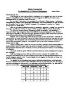
Stem and leaf diagram.
The Independent
0 6 6 8 9
1 0 1 1 2 4
2
3 0
The Sun
0 3 3 3 4 4 5
1 0 3 8
2
3
4
5
6
7 8
The Daily Mail
0 5 6 9
1 0 0 0 3 3 6 8
This bar chart shows the average, range and median obtained
My results overall were very reliable however the only issue with them was the first Sun article which seems too large. This is still accurate, it can be accounted for because the article it was taken from was particularly large it was several pages long and had numerous sub headings.
Conclusion
My hypothesis was incorrect, I know this because my diagrams show that the highest average from the 3 newspapers was the Sun, not the Independent as I first hypothesised. The range was also higher so I believe that the average was not higher because the headlines were constantly longer, but because one or more headlines were abnormally long. To prove this I have made a new bar chart excluding the Suns outlier result.
This chart still does not prove that the Independent has longer headlines the daily mail does, but it does prove that the Independent is more consistent in headline length.
Given more time I could have collected more data, or data from only the front pages of the papers to consolidate these findings.
Hypothesis 2
I think that articles (including pictures and headlines) will be larger (in mm2) in The Independent (a broadsheet).
Trial plan
I am going to collect my data by getting ten papers of each type and then I intend to use systematic sampling to measure the front page article only, measuring the article (in mm2) to obtain my data.
Trial Results
Because of limited time I decided that using only one paper a day for 10 days would take too long so I shall instead use the first ten articles of each paper, for one days papers.
Plan
I am going to collect my data by getting ten articles from each newspaper and then I intend to use systematic sampling, measuring each article (in mm2) to obtain my data.
Results
Size of article mm2
From these results I could calculate
Average: Added together the number of words in each newspaper category, and divided by 10
Range: took the lowest number in each column from the highest in each column.
Median: wrote out all of the numbers in a column and picked the middle/average of the two middle.
I decided that a bar chart would be the best method to represent this data because it gives you a clear view of the range of the results.
This graph shows us that the different articles are of varied sizes, but the first article in the Sun obviously stands out as it is considerably larger than any of the others.
Because of the size of the numbers I am dealing with in my data, a stem and leaf diagram is inappropriate to represent this data.
This bar chart shows the average, range and median obtained
My results overall were very reliable however the only issue with them was the first Sun article which seems too large. This is still accurate, it can be accounted for because the article it was taken from was particularly large it was several pages long and had numerous pictures.
Conclusion
My hypothesis was incorrect again, the Sun had larger articles on average and was very close to the Daily Mail. The Independent had the smallest articles on average, I believe that this is because the content of the Independent is mainly text whereas the Sun is mainly pictorial which takes up more space.
In my first bar graph I noticed a definite trend, the articles in the Independent got smaller further into the newspaper as did those of the Daily Mail. However, the Sun’s articles were varied in size all the way through.
For both my hypotheses now, the Daily Mail has been the most consistent as far as range average and median are concerned.
Given more time I could have collected more data, or data from only the first article of the papers to consolidate these findings.
Extension
It would be interesting to measure the area of just the text of each article in order to analyse the content and style of a broadsheet, quality and tabloid paper. This way I may be able to prove my 2nd hypothesis that a broadsheet will have a larger article size than either a tabloid or a quality paper.