Following the separation of the year groups and gender into different spreadsheets I will create a new column that will be called ‘Random’.
In the first cell of the column I will enter the formula ‘=rand()’ this will generate random numbers. The random column will then be copied and pasted for all the students in the new spreadsheets created. I then use the ‘special paste’ to change the generated numbers into values. The values make sure the generated numbers do not change. Finally I pick the amount of male and female students I need form each year, which has to total to 80 using the random sampling.
Diagrams
The diagrams I will intend to use are Box Plots and Scatter Diagrams. This will help me to obtain the accuracy of my data, and help me form a strong conclusion to relate to my Hypothesis.
It will also show me the averages of heights and weights of females and males of the school Mayfield high school.
1. I will plot the heights and weights of the 60 students on a scatter graph, and if my hypothesis is correct, then I should see a strong positive correlation.
2. I will use box and whisker diagrams for each year and compare them, if height and weight does increase with age, we should see it moving across.
3. I can group them and use histograms to present the data.
Calculations
The calculations I will be doing all consisted when choosing my random stratified samples of 80 students. To do this calculation I needed to find the number of people in each year group then divide it by the total number of people in the school, after you have done this you need to multiply it by the size of your stratified sample. So if the amount of year 7 boys was ‘151’ I would divide the number 151 by 1183 (the schools population) and multiply by 80 (my chosen stratified random amount). As this will be a decimal answer I will have to round it off to the nearest whole number.
I did the same calculation with all the males and females of the years 7 – 11 each time rounding off the decimal point to the nearest whole number.
Here are the calculations for all my stratified samples: -
Yr 7 boys = 151 (151/1183) x 80 = 10
10 yr 7 boys will be taken
Yr 7 girls = 131 (131/1183) x 80 = 9
9 yr 7 girls will be taken
Yr 8 boys = 145 (145/1183) x 80 = 10
10 yr 8 boys will be taken
Yr 8 girls = 125 (125/1183) x 80 = 8
8 yr 8 girls will be taken
Yr 9 boys = 118 (118/1183) x 80 = 8
8 yr 9 boys will be taken
Yr 9 girls = 143 (143/1183) x 80 = 10
10 yr 9 girls will be taken
Yr 10 boys = 106 (106/1183) x 80 = 7
7 yr 10 boys will be taken
Yr 10 girls = 94 (94/1183) x 80 = 6
6 yr 10 girls will be taken
Yr 11 boys = 84 (84/1183) x 80 = 6
6 yr 11 boys will be taken
Yr 11 girls = 86 (86/1183) x 80 = 6
6 yr 11 girls will be taken
(These are rounded to the nearest whole)
From now I will work on these samples because from my pre test I learnt that the smaller the sample the less accurate the result. Therefore all my analysis will be based on this stratified sample, which I will pick the amount of 80, then plotted all my samples in one graph and explain if the graph has a positive or negative correlation.
To check that the sample size is correct I must add the totals:
10 + 9 + 10 + 8 + 8 + 10 + 7 + 6 + 6 + 6 = 80
This shows me the amount of males and females I have to pick from each year. Doing that for all the males and females of all years it will then eventually add up to my chosen stratified random amount which is 80.
I then will pick my samples and use the samples for my investigation that I will carry out and create diagrams to analyse my data.
This my overall plan and intend to use my plan within my analysis of my work.
Analysing data
GCSE maths coursework
Interpreting Data
Before I continue my analysis I have decided to work out the outliers for the stratified sample of the whole school using the inter quartile range for a much more accurate and reliable result. Another method of replacing outliers can be from using interpolation.
Scatter Graph for all students
The scatter graph for all students picked through my stratified sampling shows me that the correlation is positive, that means my hypotheses will be correct and shows that the weight of the students increases as the height increases.
The line if best fit is put in the graph so that I can predict the height or weight. This is a way for me to find out the height or weight of a student if I knew the height or weight of a student.
I have also put the formula into the graph this is because if I was trying to find the weight and I had the height I can use the formula. Here is an example of me using the formula: if I had the height of a student at 5 and I was trying to find the weight I would do: - W= 52.597 5 – 35.126 = 17.471. This is the equation and if I were to find out the answer of a height or weight, I will inevitably use the formula to find out the height or weight which has to be rounded to the nearest whole.
Scatter Graph for all male students
The scatter graph for all male students picked through my stratified sampling shows me that the correlation is also positive. That means my hypotheses again is correct and shows that the weight of male students increases as the height increases.
The line of best fit is the same as the above explanation. It is a way for me to predict the height or weight of a male student.
The formula is also shown in the graph however the formula is different. The formula is as follows: - W= 57.858h – 43.326 = 14.532. This is the equation and if I were to find out the answer of a height or weight, I will inevitably use the formula to find out the height or weight which has to be rounded to the nearest whole.
Scatter Graph for all female students
The scatter graph for all female students picked through my stratified sampling shows me that the correlation is also positive. That means my hypotheses again is correct and shows that the weight of female students increases as the height increases.
The line of best fit is the same as the above explanation. It is a way for me to predict the height or weight of a female student.
The formula is also shown in the graph however the formula is different. The formula is as follows: - W=26.431 h + 6.3752 = 32.8026. This is the equation and if I were to find out the answer of a height or weight, I will inevitably use the formula to find out the height or weight which has to be rounded to the nearest whole.
Box Plots
The box plots I have created are for all male and female student’s heights and weights picked through my stratified sampling as well. To work out the weight of females and males within a box plot I will use Inter Quartile range (IQ), median and skewness.
Here are descriptions of IQ, median and skewness.
The Inter Quartile range is the difference between the upper quartile and the lower quartile. In this example, the Inter Quartile range is 11 - 4 = 7.
The median is Relating to or constituting the middle value in a distribution.
The Skewness is a lack of balance in a distribution. Data from a positively skewed (skewed to the right) distribution has values that are bunched together below the mean, but have a long tail above the mean. (Distributions that are forced to be positive tend to be skewed to the right.) Data from a negatively skewed (skewed to the left) distribution has values that are bunched together above the mean, but have a long tail below the mean. Box plots may be useful in detecting skewness to the right or to the left; normal probability plots may also be useful in detecting skewness to the right or to the left.
These are the description of my box plots.
The weight box plots show that the male box is spread showing that their weight is higher than females. The IQ range of the male box plot is more spread out showing that the majority of the weights are spread out where as the females is more confined meaning that they do not weigh as much as the males.
The skewness of the male weights is balanced and this shows that their weights are evenly distributed meaning that there are equally the same amount of boys who have more weight and boys who do not. While on the other hand the female weights are positive showing that their weight is not average and they do not have that much weight.
The box plots for the heights both have a rather small inter-quartile range, which shows that the majority of the boys and girls have a similar height to each other. The males IQ range is again bigger which shows that the majority of the males will have a more varied height then the majority of females and the median is much higher. The skewness of the male heights is positive and this shows that height is not average and they are not that tall. Female heights are also positively skewed showing that they are also not that tall.
These are the explanations of the diagrams I have made.
Conclusion
Throughout this coursework I have made many relationships between the height and weight of males and females of the school Mayfield high. I have tested the theory that the taller the students will be the heavier they will become in contrast to shorter students, which I believe will weigh less, I also believe that males will be taller than females. My theory is correct through my coursework showing that the taller students get the heavier they get and that males are taller than females.
The modifications I could have made to the original plan or made further developments from my original aim all consisted of what my hypothesis could have included. I could have produced information to see who were more intelligent males and females, and more expansion on the wider areas of the coursework.
The problems I had with the practicals of my work all are based on making the graphs such as the scatter and box plots. I had problems in inserting the data from another source and interpreting the data to graphs.
Eventually I overcame the problems figuring out what I had to do.
Overall this coursework has inspired me that there is more to explaining and showing the difference between height and weights between students, which are relevant for future references.
Appendix
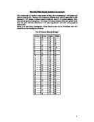
My appendix will consist of raw data such as my calculations and my stratified samples.
The table shows my calculations. The calculations are all for my stratified samples using proportions to calculate the amount of samples I picked.
This can be described as raw data as the calculations is data which I needed to pick my samples and it is raw because the calculations were rounded to the nearest ten and used the numbers to pick my samples.