Source: secondary data
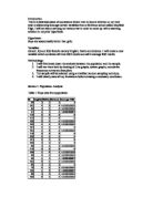
Table 2: Girls population data
Source: secondary data
Line Graph
I will use line graphs in order to track the pattern of the data. This is done in order to pick up abnormal points. These points may affect my eventual results hence the reason why I will remove them before sampling.
Figure 1:
This graph shows a very low female IQ value which I will remove from the data set before sampling.
Figure 2:
\
This distribution shows no significant abnormal values.
Figure 3:
This shows a very low male IQ result.
Figure 4:
This distribution shows no significant abnormal points.
Scatter Graphs:
I will use scatter graphs to investigate if there exist a connection between IQ and the Average KS3 results. In other words I am trying to find out if KS3 performance is linked to IQ.
Figure 5:
The curve seems to better fit the data than the line. From figure 5 it would seem to suggest that 75% of the variation in the average KS2 results is captured by the variation in female Iq’s, all things being equal.
Figure 6:
The curve is a better fit of the data than the line. This seem to suggest that 77% of the variation in the average KS2 results is explained by their IQ, all things being equal.
From the above figures it would seem to suggest that is a stronger connection between boys iq and their average ks2 results relative to girls. However, this does not suggest that boys are brighter. It only suggest that their iqs are better able to give an indication of what their ks2 results would look like.
Cumulative Frequency Curve:
This curve gives a series of running totals. It tells me what the breakdown of the distribution is into quartiles. This is useful as it gives me an indication of what the data looks like in smaller spreads.
Figure 6:
Figure 7:
Figure 8:
Figure 9:
Population Statistics:
Table 3: Male Population Data
Table 4: Female Population Data
Analysis:
The average iq for boys is marginally higher than girls. However, their average ks2 results are more or less the same. The modal iq and average ks2 results are the same for both gender groups.
The lower the spread the more consistent is the data. The males seem to have a higher spread relative to females. This suggests that there are far more extreme values in the data distribution of males relative to females.
At the quartiles boys are out performing girls. Up to the first 25% of the data boys iq and average ks2 results are higher. This is also consistent for the last 25% of the data.
The middle 25% and 50% of the data spread shows that females have a lower spread relative to males. Which is consistent with the findings from the range.
The standard deviation is the crucial statistic here as it tells me how reliable is my mean. The lower the standard deviation the better will my average used to draw conclusion. From the results given, the standard deviation is relatively low. Thus I can rely on my average to talk about the population.
The skewness is used to show the distortion of a given distribution. The iqs seems to be more distorted relative to all others for both gender groups. The abnormal values which were identified from the line graphs will be removed before sampling and this will then minimise the skewness levels.
Conclusion:
From my analysis of the population it would appear as though males are academically better than females. However, to further investigate this I will look at the sample having taken out the abnormal values from the data set. In addition I will use a full set of data.
Section 2:
This section will now look at my sample analysis. I will use a stratified random sampling technique to select 100 members from the population. I have chosen this technique as it shows the proportionate distribution in the population data. This reduces the presence of bias in my sample and therefore minimises the extent to which my statistics are misleading.
\
Female total : 179
Male Total : 189
Sample size of 100
Male: 189/368*100 = 51 pupils
Female: 179/368*100 = 49 pupils
Table 5:
Sample Data
IQ ENG MATH SCI AVGKS3
Table 6: Female sample