Using the unique pupil number and a random generator I used a procedure to collect a random sample with no repetition. This gave me the whole database in a random order. This was to ensure that my results would differ from other people doing the same investigation. I decided to make the data random rather then systematic because this ensures that there will be no bias in my results and if any anomalous results are to occur it will be easier for me to highlight them.
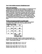
I then went on to stratify this data. I could not analyse all the pupils in the school, as I did not have enough time. Therefore, I decided that 20% is a sensible proportion to stratify from my raw data. Looking at the number of pupils of each sex in each year, 10% would be more than adequate for year 7 but not for year 8 so therefore wouldn’t be enough however any more than 20% may be too much.
My stratified data can be seen below:
Plan
I am going to use a variety of methods to prove my hypotheses. To represent the relationship between 2 pieces of continuous data I will use scatter diagrams. I will use them to compare heights and weights against each other. Because by looking at a scatter diagram I can see whether there is any correlation between the two sets of data. If there is correlation between two sets of data, it means that they are connected in some way. If the results are approximately in a straight line with a positive gradient it has a positive correlation. If the line has a negative gradient it is a negative correlation. However in some cases It is obvious that there is no connection between the values, this means that there is no correlation. I will demonstrate the correlation co-efficient by drawing a line of best fit. This is drawn so that the points are evenly distributed on either side of the line.
I will also be using box and whiskers diagrams to show my data. A box and whisker diagram illustrates the spread of a set of data. It also displays the upper quartile, lower quartile and interquartile range of the data set.The median is the middle value: half of the data set is below and half is above.The upper quartile is the value which is above. It can be considered as the median of the upper half of the values in the set. The lower quartile is the value which are above. It can be considered as the median of the lower half of all the values in the set. The interquartile range is the difference in value between the upper quartile and the lower quartile values.
I worked out the correlation co-efficent, mean, quartiles and interquartile range before starting to investigate my hypotheises. I worked it out using microsoft excel which was less time consuming than doing it myself. My results can be seen below:
I can now use these results to make the box and whiskers diagrams.
Errors
Because I am using secondary data I need check if I have any errors or in the results. By this I mean the odd results that don’t fit the pattern; these are usually down to someone making a mistake when collecting the data. To decide whether I have any errors I will draw a graph to show the relationship between height and weight for the whole of my sample. By drawing a line of best fit I will be able to decide whether any of the data looks unrealistic and therefore can be seen as errors.
I can see for the graph that there is a positive correlation that tells me that the more you weigh the taller you are. Most of my results look correct however 3 of the results appear to be extreme errors as they are too far away from the line of best fit. I have circled these results.
However I can correct these results by taking an estimate of what height they really should be for their weight. I can do this by finding their height on the line of best fit and following it along to find the height. I will mark this on the graph using a dotted line.
Hypothesis 1
- Females in year 7 are taller and heavier than males in year 7.
I believe this hypothesis will be correct as females begin adolescence before males and therefore will be taller and heavier in year 7 however, I need to prove this. After looking at this hypothesis I have decided the best method of testing this sample will be to work out the average height of both males and females through finding the upper and lower quartiles and putting them into tables for comparison. I have previously worked out the quartiles and mean through using a programme on Microsoft excel, this was less time consuming and more efficient than working it out myself.
From looking at this table I can see the mean height for year 7 girls is 1.58cm, this is above the mean for all of year 7. The weight is also above the mean for all of the year as it is 55.2kg.
I can also look at my scatter diagrams to prove my hypothesis to be correct as seen below:
Through comparing the 2 graphs with the same scales. I can see that the majority of females are both taller and heavier than the males. Therefore, I can say that I have proved my second hypothesis to be correct.
Hypothesis 2
- The correlation co-efficient is smaller for year 7 males than it is for year 11 males.
The correlation co-efficient is a measure of the distance of each point on a graph to the line of best fit. I believe this hypothesis to be correct as; as the year increases there will be a bigger range of heights and weights. However I need to prove this, the best way to test this hypothesis will be through looking at my scatter graphs for year 7 and 11 males and working out the correlation co-efficient.
Scatter diagram for year 7 males:
Scatter diagram for year 11 males:
It is clear that it would be extremely time consuming for me to measure all the points on each graph to the lines of best fit, therefore I will use a programme on Microsoft excel to help me work it out.
My results show that the correlation co-efficient for the year 7 males is 0.69895926 and the correlation co-efficient for the year 11 males is 0.72240081. This means the correlation co-efficient is smaller for year 7 males than it is for year 11 males.
Therefore, it is clear I have proved my hypothesis to be correct.
Hypothesis 3
- As the year increases the heights and weights of both the males and females increases.
I believe this hypothesis will be correct as, as you get older you get taller and heavier, however I need to prove this. The best way to test this hypothesis will be through using box and whiskers diagrams to compare the heights and weights for each year. This way I will clearly be able to see the increase of both height and weight between years. To investigate this hypothesis I will use data from years 7, 9 and 11.
This graph shows that the median height increases every time the year gets higher.
This graph shows that the median weight increases every time the year gets higher.
Therefore, I can see that again, I have proved my hypothesis to be correct.
Conclusion
Through looking at all the data collected I have been successful in proofing that all my hypotheses were correct. I did this through using a variety of methods. These included scatter and box and whisker diagrams as well as working out the means and correlation co-efficient. I proved all 3 hypothesis to be correct however, as I preceded my investigation there were some problems, these were that I found I had some errors that could have altered my results. If I were to do the investigation again I would eliminate the errors before including them in graphs and results tables, as this would make my results overall more reliable. I could have also increased the reliability through increasing the sample size. By increasing the sample size my results would be more varied and therefore more accurate. If I wanted to extend my investigation I could look at other schools and see how they compare to Mayfield High School. I could then establish whether or not my results can be applied to a wider population.