Once I have all the data I need on a separate spreadsheet, I can begin to use it to form graphs and tables etc. to help me investigate the differences in height of the different years and genders.
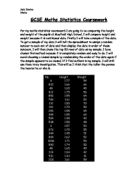
Raw Data: (averages of heights in metres)
(I have taken the modal class interval rather than just the mode value as the data is continuous) (All to 2 d.p)
(Values in italics = without the 2 anomalous values)
- The smallest value in my random sample for the girls is 1.03m. Even though this height is possible, it does not fit into the pattern of heights for the rest of the sample, so I am inclined to think that there has been some error when typing the database. This outliner affects the rest of the results, especially the range. This is why I have chosen to do the averages again without this and one other anomaly for the girls in year 11-
From this preliminary data I can see that in year 7, the boys heights are more tightly bunched than the girls heights (the range for the boys is smaller.) This is as I expected- the boy’s heights are more similar since they have not started their growth spurts. By contrast, some girls will be growing faster than others, hence the larger range of heights. Also from this data I can see that the mean height for the boys is slightly larger (by 5 cm) showing that the boys on average are slightly taller than the girls, which I did not expect. However, since this is only a relatively small sample, it by no means 100% correct, and does not represent the case for the whole of that age group. The median heights for each sex only differ by less than 1cm, which is again slightly surprising as I expected the girls to be slightly taller, though it is the other way around. The modal class interval for each sex is the same, which I expected; even though I predicted that the girls would be the tallest on average, I didn’t expect it to be a large margin.
The data for year 11 depends upon whether you look at the data with or without the anomalies. For the purposes of the analysis I will be looking at the values in italics, without the anomalies, as this is a fairer comparison. From this data I can see that the girls’ heights are much more tightly bunched than the boys, which is the opposite of year 7. I expected the girl’s heights to be more similar than those of the boys in year 11, so this evidence backs up my hypothesis so far. The modal class range is again the same for each sex, which was to be expected. There is a difference of 9cm between the boys and girls. This is more consistent with what I expected, as is the median. The median value for the girls is 8cm beneath the boys’ value.
Comparing the data for Years 7 and 11, it is clear that the boys have increased in height more than the girls. I expected them to start behind the girls in terms of height, then catch up and overtake them. This is not the case, as this data suggest that the boys both started and finished taller than the girls.
Prelim Scatter Graphs:
For ease and fairness of comparison, I have made the axes on these graphs the same. From this data plotted on the graphs, I can tell that the girl’s heights for year 7 are spread over a wider range, and they show a relatively high positive correlation. In comparison, the boys graph shows the data points to be much more closely grouped, which tells us that the boys heights are in general much more closely grouped. Their graph also shows a strong positive correlation between height and weight.
For each the boys and the girls in year 11 there seem to be 2 pieces of anomalous data. For the boys, there is one student with such a low weight that it must be a typing error; 5kg for a boy of 1.69m is physically impossible. The other possible anomaly has a higher weight than the rest of the data- this could be a true value, and if so it is an exception in that the student must be obese. Though, at the same time, it could be another typing error.
The data for the girls clearly shows the anomalous pieces of data to be significantly different from the rest, along with one more value significantly lower than average in height. Almost all the girl’s heights are grouped around the 1.6 metre mark, and the scatter graph shows a strong grouping. For the boys, their data points are still clearly all in the same region, though are less strongly grouped than the girls. I did expect the heights to be spread over a slightly larger range, though my data has so far suggested that I was wrong.
Another thing that can be found out from the scatter graphs for each sex is the gradient of the line of best fit. The equation for the gradient of a line can be calculated either by using the equation y = mx + c, or by using th following formula:
Change in y (vertical change)
Change in x (horizontal change)
Having the gradient of the line would enable us to predict the height or weight of someone, if we already have one piece of data. An extension of this can be used to determine the probability of a person’s weight (from the sample) lying in a certain range. The equations for each line on the scatter graph are:
Year 7 Boys: y = 93.573x – 97.245
Girls: y = 64.033x – 52.732
Year 11 Boys: y = 33.38x – 2.2796
Girls: y = 13.096x + 29.873
(without 2 anomalies, y = 55.6x – 39.7674)
Cumulative Frequency:
The cumulative frequency is the running total of frequency at the end of each class interval, and is useful when comparing continuous data; it is possible to read off the median, lower and upper quartiles and the interquartile range from the curve, which will be essential for graphs later on in my project. Also from a cumulative frequency curve, it is possible to predict the percentage of people who have a height within a given range. This can be extended (like with the scatter graphs) to give the probability of a boy (from the data range) being within a certain range of heights.
Cumulative frequencies of height for Year 7 (m)
Girls Boys Mixed
Cumulative frequencies of height for Year 11 (m)
Girls Boys Mixed
From this data I can now plot my cumulative frequency graphs:
(The x axis on both the cumulative frequency graphs says, for example 1.2 - - This does not mean 1.2, but less that or equal to 1.2)
The scales on both graphs are the same to enable easy and fair comparison between the year groups. From the graph for year 7 it is easy to see that the curve for the boys is steeper between the heights of 1.4-1.6m than the girls curve. This tells us that the boys have a greater increase in height in that range. Also, from 1.6m onwards- the curves are almost exactly the same (ignoring the difference in sample size which is the vertical gap between them).
The cumulative frequency curve for girls in year 11 (and therefore the mixed curve) is affected by the anomaly in the girl’s data discussed earlier. This means that the comparison can only have limited value, and
Comparing the graphs for the 2 years, the curves for the pupils in year 11 are significantly more skewed to the right, showing their heights to be larger on average, which is to be expected since there is a 5-year difference between samples. The curves are closer together for year 7 meaning that the heights are more similar, which goes against what I said in my hypothesis. There is a larger difference in heights between sexes for the students in year 11, as by this time almost all students would have had their growth spurts. The difference in height for year 11 is illustrated on the graph by the fact that the girl’s curve peaks earlier than the boy’s, showing they are not as tall. Also, we can tell that the boy’s heights have not changed as much as the girl’s heights have over the 5 years, as their lines on each graph, are more similar in placing and shape. The curve for the girls in Year 7 is much smoother in comparison to the one for Year 11.
Whilst in general the boys in year 7are taller, my evidence shows that the median for the girls is 1cm higher than that for the boys. On the other hand, in year 11, my data suggests that 15% of have a height greater than the median
height for the boys.
Calculation:
4 x 100 = 15%
26
(there are 4 girls with a height higher then 1.7m in year 11)
Histograms:
I have recorded the height frequencies in a histogram because it is the best method of comparing continuous data. The histogram will clearly show the difference in height frequencies for both sexes, and also both year groups. It will also show the frequency from a different perspective
From the histogram for year 7 it is easy to see that in the height range of 1.4-1.5 there are 4 times as many girls as there are boys. The boys’ heights peak in the range of 1.5-1.6 whereas the girls’ peak at 1.4-1.5, and this shows that there are more boys with taller heights, and this fact contradicts my hypothesis. This contradiction will be further explained in the conclusion.
The histogram for year 11 had to be changed slightly. My anomaly- a girl with a height of 1.03m- would have thrown the whole scale of the histogram thus making it difficult to compare the 2 years. I therefore decided to leave her out. This means that my graph is not quite accurate, though I did leave in my other possible anomaly.
Ignoring that- the rest of my graph for year 11 seems to show that the girl’s heights are more bunched up than the boys, which I anticipated as the main anomaly was not incorporated into my graph. The boys half of the graph, though, is not quite as I expected. I expected the heights to peak (which they did in the range 1.6-1.7 which incidentally is the same for the girls unlike the year before), and then begin to tail off. Though this does not seem to be the case. The frequency starts to diminish between 1.7-1.8, but then goes up again for the next frequency range, 1.8-1.9. This was not what I expected, though it is not necessarily bad- it just shows that there are not as many boys in the height range of 1.7-1.8.
Box and Whisker Diagrams:
It is much easier to represent the values for Q1 (25th percentile), Q2 (50th percentile or median) and Q3 (75th percentile) on a box and whisker diagram, as it is easily apparent how the data is placed, and whether it is skewed and how the interquartile range is placed etc. It represents the central 50% of the data compared to the overall spread of data (the whiskers extend to the lowest and highest values.) I drew these by hand as there is no function on the computer that would make the right type of graph.
(These values were read off my graph, and therefore are not 100% correct. I had to estimate as best as I could, and I am confident that these values are correct to 1 decimal place. However, there could conceivably be errors)
On looking at these diagrams, I can immediately see that the whiskers on the all 3 diagrams for year 11 are much shorter compared to the whiskers on the diagram from year 7. This again shows that the range of heights in year 11 is smaller than the range in year 7.
The diagrams for year 7 show that the boy’s box is slightly positively skewed, and the girl’s box is quite strongly skewed to the right. This tells me that there are more taller people in that sample, as the area between Q2 and Q3 is smaller. The girls however have a larger interquartile range, showing their larger range of heights.
The data for year 11 suggests that their range of heights is much smaller, as the whiskers extending from the boxes are much shorter compared to year 7. The diagram for the boys shows a very strong negative skew- towards the left. The box for the girls is also skewed to the left. This is interesting in that it is the exact opposite to the data for year 7. The negative skew indicates more of the middle 50% of people are placed towards the shorter end of the scale.
Standard Deviation:
The standard deviation shows the average variation from the mean line, for whole range of data. For example, if the standard deviation were 0.23, that would mean the total average of all the data points would be 0.23 points away from the mean data line. I used the function on the excel database to calculate the standard deviation, both to save time and to ensure that I got the calculations right.
From this data I can see that my hypothesis was only partly right- my prediction of the standard deviation being larger for the girls in year 7 compared to the boys was right. The second half of my statement though was not right- the girls again had a larger standard deviation than the boys.
Conclusion:
In my hypothesis I stated that expected the average (mean) height of the boys in year 7 to be smaller than the mean height of the girls in year 7. This was disproved, as the mean for the boys was 1.56m compared to 1.51m for the girls. I then went on to say that I believed the opposite would be true though in year 11; that the boys would be taller than the girls on average. This turned out to be right- the boy’s mean height was 1.72m and the girls (without anomalies) was 1.63m. As you can see from this data, the margin by which boys are taller than girls has also increased, from 5cm to 9cm over the 5 years, and this is as I expected. I also said that I expected the standard deviation for the heights of girls in year 7 to be larger than the standard deviation for the boys. This turned out to be true- the girls standard deviation is bigger by 0.056. Though for year 11, I expected the standard deviation for the boys to be larger than that of the girls, however this is not the case- the girl’s standard deviation is again bigger by 0.039. I thought that the girl’s deviation would decrease between years 7 and 11, and again I was wrong- it has increased by 0.016.
All in all, it seems that I have been wrong in most of my expectations. This however does not mean that if I took a completely new sample that the same hypothesis would not work. Since this is only a comparatively small sample, I don’t really have enough evidence to back-up my findings definitely.
Summary:
- Boys have a larger mean by 5cm.
- The girls have a larger median (1.55m for the boys compared to 1.56m for the girls.)
- The girls have the largest range of 0.55, compared to the boys 0.3
- The modal class interval was 1.5-1.6 for both sexes.
- The cumulative frequency curves for both boys and girls are very similar.
- The Box and Whisker diagrams show that the boys interquartile is almost half that for the girls, and that both Q2 lines are skewed to the right showing there to be more taller people.
- The standard deviation was bigger for the girls than for the boys.
- The boys have the larger mean by 9cm (increased the margin by which they’re bigger from year 7)
- The median for the girls is 8cm underneath the median for the boys (1.62m compared to 1.7m)
- The range for the girls range is smaller than they boys by 0.11- the girls having a range of 0.23 and the boys 0.34.
- The modal class interval is 1.6-1.7 for each sex.
- The cumulative frequency curves show the girls heights peaking earlier compared the boys.
- The Box and Whisker diagrams show both the boys and the girls diagrams to be negatively skewed, to the left. They also show the fact that the ranges in year 11 are significantly smaller than in year 11.
- The standard deviation was again bigger for the girls (0.104 compared to 0.143) representing the girl’s larger range.
Appendix:
If I had had more time, I would have also liked to have looked into these following aspects of data sampling:
- Predictions of height and weight using the information from my sampling.
- Probability of a pupil’s height lying within a given range.
- An investigation into body mass index and/or weight as well.
- A further investigation into height, and maybe use exact age as opposed to year group. I could take a larger sample of students, and take more exact calculations etc.