BMI is going to help me decide which students fit in which category. It will also cut down the amount of students I’ll need to focus on. The BMI will also help me reveal that my hypothesis is right, which means I’m successful.
To prove that this hypothesis is right, I will need to do a lot of work, as this is a hard prediction to work on. For this I will need to make graphs and tables. To achieve my hypothesis I have decided to use a Polygon Graph and a Line graph.
I am hoping to achieve my goal with only these two types of graphs.
Results
Before I begin to make my graphs, I will need to start off with the basics. I will first need to make a stem and leaf table of my BMI results. The BMI results have a lot of decimal numbers after it so I am going to round each number off to the whole number, because it will be easier to work with whole number.
These are my BMI results rounded off;
18 19 21 21 15 24 19 26 17 17 17 21 22 18 21 18 21 19 16 22 18 18 21 21 17 24 20 26 20 15 17 21 20 21 16 18 21 22 18 21 17 17 18 18 18 17 18 20 20 19 22 20 17 22 22 19 22 20 20.
Now I need to make the stem and leaf table, so for these results. I’ll need a table with 2 factors.
1 8 9 5 9 7 7 7 8 8 9 6 8 8 7 5 7 6 8 8 7 7 8 8 8 7 8 9 9 7 9
2 1 1 4 6 1 2 1 1 2 1 1 4 0 6 0 1 0 1 2 1 0 0 2 0 2 2 2 0 0
Now I need to set it up in order to make it easier to work things out for this information.
1 5 5 6 6 7 7 7 7 7 7 7 7 7 8 8 8 8 8 8 8 8 8 8 8 9 9 9 9 9 9
2 0 0 0 0 0 0 0 0 1 1 1 1 1 1 1 1 1 1 1 2 2 2 2 2 2 2 4 4 6 6
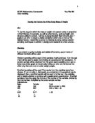
Now that they are set up in order, I can now start making my Frequency table.
From my Tally Chart (Frequency Table), I can answer a few Questions, such as;
Mean: 20 (19.8)
Mode: 18 and 21
Median: 19.5
Range: 11
Here is a polygon graph, showing the BMI of all 60 students (boys and girls).
Here is also a line graph with a box plot underneath it. The line graph is showing the means of travel for all 60 students
Conclusion
If you look at my line graph, then you can see that out of 60 students, only 1 person rides their bike to school every morning, there was also a fact that only 16 people walked to school. So that proves that not a lot of people do any exercise on their way to school. That also means that majority of the people are over weight or in high normal weight, according to my hypothesis.
If you notice, you can also see that 37 people use some mean of transport to travel to school ever morning, that is over half of the students I am forcing on.
Over all, from my line graph, you can relate to my hypothesis and say that most of the people I am focusing on are over weight. That is sported by my hypothesis.
Now, if you view my polygon graph, then you can see that there are only 4 people that are over weight, which the total opposite of what I predicted.
Plus, 43 students fit in to the normal category and 13 people are under weight.
Over all for my polygon graph, you can see that more then half of the students are normal or under weight, only 4 people are over weight.
That proves my hypothesis to be WRONG. The reason being is proved above.
Evaluation
As you can see from my results my hypothesis was absolutely wrong. The reason why is because my graphs prove that my prediction to be wrong.
Whilst doing this investigation, was really stuck. I really didn’t know what I was
doing, so I had to ask my friends for help. The reason why I didn’t know what I was doing was because I wasn’t in school most of the days and I didn’t really bother to ask the teacher for help.
But in the holidays my friends helped me and I finished it off.
Plus, I had a lot of problems making the polygon graph. Every time I made the polygon graph, I kept on forgetting to make the bar on the graph. So I had to make 2 and both of them were wrong and then my friend helped me and showed me how to do it.
I also had a problem when I was doing my line graph. The problem was that I didn’t know what the quartiles were for. So I had to ask my friends for help, one of my friends showed me how to do.
Next time when I do this type of investigation, I will try and use other ways of presenting my data. I.e. I will use graphs like, bar charts and dot-to-dot graphs (don’t know the real name). Maybe then I might be able to get a higher grade.
I also feel that the area I was working on was a tuff area, in the sense that it was hard to produce the data on that topic. I feel in future I should do topic like, the relationship between height and shoe size and the relationship between height and weight. These topics are much more easier to work on and its easier to produce data on them.