Year 8 Science Results
Year 9 Maths Results
Year 9 Science Results
Year 10 Maths Results
Year 10 Science Results
I decided to use scatter graphs because they are the easiest diagrams to draw when comparing the Maths and Science results.
I have drawn a line of best fit because it allows me to predict a mark if a student misses a test.
Example:
A student in year 10 scored 60 in a recent maths test, but he/she missed a science test the day after. I predict that the student would score 63 in his/her science test if he/she were there.
I do this my going to the maths scores for Year 10 in my scatter graph and going to 60 and would then go up in a line and I would hit the line of best fit and go across and the mark is 63.
After looking at the graph for Year 8, I found that their marks were tightly packed together, which shows strong positive correlation.
After looking at the Year 9 and 10, I found that both their marks were tightly packed together, which again shows strong positive correlation.
I am going to examine each year group in turn and draw frequency tables for each year group and subject.
Smallest and Largest values
My results so far have confirmed my first hypothesis, which is that Maths and Science are closely linked.
Second hypothesis
I will now investigate the differences in gender may effect the marks in a particular subject like Maths.
Again to further my investigate, I am going to use Stem and Leaf diagrams to compare female marks with male marks. A Stem and Leaf diagram consists of numbers, which themselves made up the bars, like in a bar chart. I have already systemically chosen a sample of 30 students from each year group, again 15 females and 15 males.
By doing this it avoids bias and will represent the complete data given. A Stem and Leaf diagram is used to display data in order of size. It can also be used to find the mode, median, lower quartile, upper quartile and interquartile range.
Year 8 Maths
Stem and Leaf
From this set of results I have noticed that the boys in Year 8 are better than the girls at Maths. For example the boys scored a mode of 68 where as the girls scored a mode of 52.
Year 9 Maths
Stem and Leaf
Again, I have noticed that the boys in year 9 are better than the girls at Maths. For example the boys scored a mode of 63, 72 and the girls mode was 42. The boys also managed to score a higher median and mean then the girls.
Year 10 Maths
Stem and Leaf
From this set of results I have noticed tat the girls in year 10 are better than the boys at Maths. For example the girls have achieved a higher mode, which is 45, 70 and the boys mode was 48, 57. They also had a higher mean and median.
I am now going to construct Box and Whisker diagrams, these will show the distribution of data.
First of all I will find the biggest and smallest values. Then I will put Year 8, 9 and 10 Maths and Science marks in order of size, starting from the smallest to the biggest, from here I will need to obtain each year groups median and lower and upper quartiles.
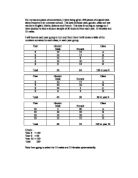
This box shows the Mean for each year group.
From the results in the table above I can see that the means are quite close together.
Year 8
Year 9
Year 10
From the box plots I can see that Year 8 are slightly better at maths and science than Year 9 and 10.
From the results above