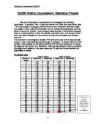
ANALYSIS ON SCATTER GRAPH
SCATTER GRAPH FOR BOTH MALES AND FEMALES
This scatter graph is showing the heights and weights for both the males and females.
You can see that the majority of the points on the graph are situated very close to each other and this shows that females and males from years 10 and 11 are very similar to each other in respect of height. You can also see some others who are placed away from the line of best fit and I have not included these particular points in my correlation. I have just used the points which are realistic.
I then draw one straight line graph using the straight line.
The 45 on the bottom is representing the difference in height from the point of the line to the other.
The 32 on the vertical line is representing the difference when I took the lowest weight which is 25 and the highest point which is 57 and then I got 32. Then I divided the weight and the height together to get 0.71 which is the slope.
Then I calculated an equation which can be used to work out the estimated weight.
This equation is:
W=0.71h+32
When I have collected together all my data, I am going to transfer this information on to a Scatter graph. I am going to do 3 Scatter graphs. One will be for the mix, one for the females and one for the males. I am using a Scatter graph because it is easy to show the where the pupils lye in the scatter graph in relation to who has got the taller pupils in the year groups and who is heavier out of the goys. It also shows if there is a negative or positive correlation . It shows where most of the majority are and sometimes you get outliers, which are at the bottom or the top of the graph.
I will find the equation of the line of best fit. This will enable me to estimate the weight.
I will then measure the bottom line of the triangle, which is representing the difference in height from one point to another. I will then measure the vertical line and that will represent the difference in the lowest point of the line to the top and that is the weight. I will then divide the height and weight together to get my slope.
I will also draw up 3 cumulative frequency tables using the information from the previously tables drawn up.. When I have got a cumulative frequency for each table, I will plot them on graph paper. From these results I should be able to place these findings on the curve on the graph. I will then be able to find the median, lower quartile, upper quartile and the inter quartile from the available data.
When I have been able to obtain the median, lower, upper and inter quartiles, I will illustrate these results in to Box plots. The box plots will be drawn on the same scale for all 3 box plots. I will do one for the mix, one for females and one for males. These will indicate any difference in height between the males and females and will also show if there is a higher median or lower median between the sexes.
CUMULATIVE FREQUENCY FOR BOYS
I used the data from the cumulative frequency table and transferred the results on to a cumulative frequency curve graph.
By selecting the middle value of the weight, and drawling a line to the curve of the graph, I was able to calculate the median, which was 1.60m.
I calculated the lower quartile for the boys and it was 1.54.
Then I found out the upper quartile and it 1.66
To find the inter quartile I had to calculate the difference between the lower and upper quartile, which was 0.12m.
When I have collated all the data on this graph, I will then put the measurements for the median, upper and lower quartiles into a box plot to show the differences in height between the boys and girls.
CUMULATIVE FREQUENCY FOR GIRLS
Once again, as in the research for the cumulative frequency for the boys, I used the data from the cumulative frequency table and transferred the results on to a cumulative frequency curve graph.
By selecting the middle value of the weight, and drawling a line to the curve of the graph, I was able to calculate the median, which was 1.56m
I found the lower quartile for the girls by using the same way as I found for the mix selection. The lower quartile was 1.50.
I then found the upper quartile, which was 1.60.
To find the inter quartile I had to calculate the difference between the lower and upper quartile, which was 0.10m.
As in my findings for the boys, when I have collated all the data on this graph, I will then put the measurements for the median, upper and lower quartiles into a box plot to show the differences in height between the boys and girls.
CUMULATIVE FREQUENCY FOR BOYS AND GIRLS
The total of the frequencies up to a particular value is called the cumulative frequency. In this case we are using the data from the frequency tables for both the boys and girls in order to calculate the cumulative frequency. These values, when plotted and joined, form a cumulative frequency curve, sometimes called an S-shaped curve.
To calculate the median for both the boys and girls I selected the middle value of the weight, and drawling a line to the curve of the graph, I was able to calculate the median, which was 1.59m. Then in order to calculate the lower quartile, I divided the total weight for the boys and girls by and this was 1.49m. Once this has been discovered, I then had to divide the total combined weight by , in order to find the upper quartile, which equalled 1.63m.
To find the inter quartile I had to calculate the difference between the lower and upper quartile, which was 0.14m.
When I have collated this information I will then plot the data on a Box Plot to show the relationship between the height for the boys and girls.
ANALYSIS OF SCATTER GRAPH
This graph shows 30 plots in relation to height against weight for the boys. You can see from the graph that the plots for the boys are more widespread, over heights and weights. This may be due to the fact that some boys are growing faster than others and when they grow, they may gain more weight.
There are two outliers, which represent boys who fall outside the normal scale, and I have chosen not to include them in my correlation, as I feel they do not impact on the overall result.
I drew a triangle on the line of best fit in order to ascertain the slope on the line of best fit so that I can calculate an equation to help estimate the weight of the group. I calculate that the equation W=0.78h+35, based on these findings.
ANALYSIS OF SCATTER GRAPH
This graph is showing 30 plots in relation to height against weight for the girls.
You can see that most of the girls are approximately the same height and weight. There were some outliers but again I did not include these in my correlation, as they did not impact on the overall result.
I drew a triangle on the line of best fit in order to ascertain the slope on the line of best fit so that I can calculate an equation to help estimate the weight of the group. I calculate that the equation W=0.78h+35, based on these findings.