Alternatively I could use Stratified sampling. For instance if I have a population divided into groups that are of different size I could get samples from each group proportional to each other (depending on the size of the group to another and my max sample size). But since my population has groups of the same size I need not use this.
Lastly is Systematic sampling. This is done by taking regular intervals done a list for the total amount of people you want.
*p = total amount of people
n = person- e.g 7th person down a list ; n = 7
s = sample size
person n’s place = (p : s) × n
Since my population I’m measuring has groups of the same size with no obvious differences I choose Systematic Sampling.
I will collect my data from each year group of boys and girls (20 samples) from Year 7 and year 8 using Systematic Sampling as it is by far the easiest to do.
I will make estimates by collecting data from each class around the school. I will use this data to produce averages, estimates and plot on graphs to make deductions.
I will get 20 boys and 20 girls from Year 7, and 20 boys and 20 girls from Year 8. This will make my data more stratified and lessen anomalies (because the data for girls may follow a different pattern, to the data for boys).
I will place 4 questionnaires (2 for boys and 2 for girls) in each of the 5 registers for the teachers to hand to 2 of their girl pupils
I think this is a reasonable sample size because it gives me a good range of results to look at.
My secondary data is going to be about obesity. I will get some data off government web sites. The problem with this is that it isn’t as accurate as primary data which I get myself as it could be outdated, set in different and/or in wider geographic areas, the source could be unreliable or just simply not what I want. But the good thing about secondary data is that it is cheap and easy to obtain.
I am using a questionnaire to collect my primary data because it is able to target my sample questionees directly and truthfully because only they know about themselves best (as records of them may be wrong or outdated).
In my Questionnaire, I did ask Years old, Months old but because I already had a question asking what year the person was in, I took out the question that took longer to answer (Years old and Months old). Also I took out the question asking peoples forenames as I thought some people may want to stay anonymous. I also wanted something on a smaller scale, so I added the brothers/ sisters question.
I tested my Questionnaire with a pilot survey and found that I needed to cut my question’s shorter as 1 of the testee’s was trying to answer in long sentences, so I realized that the questions could be cut down. Apart from that, there no other problems with my questionnaire.
I am trying avoiding bias in my questionnaire by making my questions as sort as possible and using no verbs.
e.g “I hate Ice Cream. Do you?” would be implying influence on the questionee (as it’s a well known fact that other peoples tastes influence others).
A better way to phrase it would be to say “Do you like Ice Cream”. This has no emotions, and no descriptive words, and is ultimately uninfluential.
Also “Most normal people watch lots of TV. Do you?” would be implying that the person is not normal (something wrong with them) if they do not watch lots of TV and so people may quickly change their mind and think that they do watch lots of TV. Also how much is ‘Lots’? This can be ambiguous as it can be interpreted as different amounts.
Another better way to phrase it would be to say “Do you watch more than 2 hours of TV?” (or whatever amount of TV you want to find out).
Of course it is impossible to eliminate entirely because people will not always admit the truth (e.g they are too overweight, smoke too much, being unreliable, watching too much tv).
They are easily understood by being short, snappy questions that go straight to the point.
e.g “Are you as tall as most people?” is not easily understood because there is no definite value for ‘most people’, and the questionee might have been living around smaller people all her life and she thinks normal height is a bit smaller than it actually is.
None of my questions have 2 or more meanings (or ambiguous), are easy to understand, are uninfluentual by being short, unemotive and using no verbs.
Also I try to use tick boxes instead of text boxes so answers are definite, but I use text boxes to collect continuous data.
I also added some text at the beginning of my questionnaire thanking them for filling it out and saying its confidential.
I got my results back now.
I would’ve liked perhaps a bigger sample size (which wasn’t possible because I didn’t have enough time to send and collect that many questionnaires) but overall, I am happy with the results I have obtained.
On 1 of the questions asking the persons IQ, the person left it empty. Prehaps they didn’t know their IQ. I also left out 3 sets of figures, for year 7 girls (140, 110, 110). These are the ones crossed out. I left them out because they were too overly large and inconsistent, they were most likely an error.
Prehaps the questionnees thought they were being asked pounds or didn’t know their weight in kg and converted their weights incorrectly. Because of my big sample size It allowed me to simply leave mistakes out while still producing a good set of results/graph.
I am going to investigate the relationship between the height of a person and their weight. Initially I am going to use a scatter diagram for Year 7 girls and boys, Year 8 girls and boys. But if the results show a positive correlation (or negative), then I will also plot lines of best fit and find the equations of them it as this will be beneficial in predicting the supposed weight of certain heights of people and vice versa.
Also I will find out the average so I can see how much most people weigh by checking the standard deviation.
To work out the average-
_ Σfx
x = ⎯⎯⎯
Σx
e.g Σx = 10 and Σfx = 200
_
x = 200 : 10
= 20
To work out the standard deviation-
_
s.d = √ [ ∑ (x- x)2 ]
⎯⎯⎯⎯
n
_
e.g ∑ (x – x)2 = 4 and n = 1
σ = √ (4 / 1)
= √ 4
= ± 2
Results
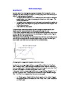
If you look at the graph where I plotted the anonymous points (Year 7 Female) you can see how it affects the average greatly dragging it away from most of the points.
I predicted that average sized people weigh the least, followed by smaller people who I said will weigh slightly more followed by taller people who weigh the most. In fact the smaller people weigh the least on average, which is contradicts what I said. Also average people don’t weigh the least as I said, but as I did say, taller people do weigh the most.
I have come to the conclusion that generally a taller height means a heavier weight. We can see this on most graphs where the trend seems to point to this, eventhough the correlation isn’t good enough to draw a line of best fit (Except on Year 8 Males which pointed this out to me in the first place).
There is an interrelationship between height and weight. Taller people weigh more than smaller people because of the more bodily mass they get from being taller, and vice versa.
In my aim I stated to look at the effect of height on weight. I have achieved my aim by showing a good relationship between the comparisons showing that it is a valid relationship to investigate.
My strategy was not very effective in the fact that people live in different geographic areas and so are varied also by other factors. Also some questionnaires were late which slowed my progress down.
If I did do this again I think I could have asked on the questionnaires for them to be handed in by a date (which would have encouraged people to hand it in faster). Also I would put spare questionnaires in the register for teachers to hand to pupils just in case, and I would do this over a longer period.
My investigation is limited in the fact that I cannot ask a wider range of people as it would take too much time. Also every person I ask takes time, which is not what I have a lot of.
A way to improve my investigation would be if I did again to get some extra hands to help with getting in all the results and compiling them into a spreadsheet.
For my Secondary data I will get some results off the internet on percentage of overweight people, obese people and lower than overweight people.
The secondary data I have is on percentage of normal weight, overweight and obese weight from the US national census.
Q: How many adults are a healthy weight?
A: Less than half of U.S. adults are a healthy weight (BMI 19 to < 25).
All adults (20+ years old): 73.2 million (41.4 percent)
Women (20+ years old): 40.3 million (43.6 percent)
Men (20+ years old): 32.9 million (39.0 percent)
Q: How many adults are overweight?
A: More than half of U.S. adults are overweight (BMI 25, which includes those who are obese).
All adults (20+ years old): 97.1 million (54.9 percent)
Women (20+ years old): 46.9 million (50.7 percent)
Men (20+ years old): 50.2 million (59.4 percent)
Q: How many adults are obese?
A: Nearly one-quarter of U.S. adults are obese (BMI 30).
All adults (20+ years old): 39.8 million (22.3 percent)
Women (20+ years old): 23 million (25 percent)
Men (20+ years old): 16.8 million (19.5 percent)
On my table with my secondary data alongside my primary data I had to minus obese percentage from overweight percentage as overweight percentage includes obese people. Also this data does not include underweight people which I had to add myself (by adding up all previous percentages and minusing from 100%).
overweight = BMI 25 to < 30 ; obesity = BMI 30
the BMI is the body mass index. The body mass index is an approximate way of seeing if a person’s weight is in proportion with their height.
Body Mass Index = Weight (kg) : Height (m)2
Although it doesn’t take into account muscular and big build people it is a good on-the-fly method of comparing people’s actual body fat as it is faster than having to compare lots of results on a growth chart.
For instance my body weight is 65kg and my height is 165cm.
BMI = 65 : 1.652
= 23.875114…
I will compare BMI against grouped frequency on a histogram with a frequency polygon with my secondary data. I will see if they follow they same sort of pattern. I group the BMI of my primary data into 4 groups the same used above(to stay in line with my secondary data). I shall do group all my results from my primary data together (as that’s what’s been done above and because of age differences I can only compare one graph of both male and female of any age group).
My groups (which are optimised from above)are-
{G1 < 9 ≥ G2 < 15 ≥ G3 < 20 ≥ G4 < 25 ≥ G5} where the numbers refer to Body Mass Index.
The reason I didn’t put labels on them (such as overweight .etc) was because it is a well known fact that the smaller your age the smaller your weight and height, and so a younger person just because they don’t weigh as much as a normal weight person doesn’t mean they are underweight.
I also had to modify them and minus 10 from group boundaries because of age difference (I think of it like the children being 12 years old, add another 10 years and they are adults- although I know it doesn’t work like that). I then find the frequency of the group.
Also the data that I got from a 3rd party (secondary) did not have an upper boundary so I couldn’t give it a class width.
∴ I took the 2 most like class widths (5 and 6) and gave it a class width of 5.5
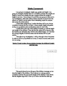
Now lets look at our frequencies. They both seem to follow the same basic pattern. Therefore in conclusion I can say with definance that more height means a heavier weight generally. This can vary with age- the older you are the taller you are and therefore the more you weigh. I can also deduce from the graph that weight is usually just about more than half the height-
*This is a generalization
*W = Weight (kg)
H = Height (cm)
A = Age
X = Unknown variable
Y = Unknown variable
W = ΔH /2
W = A(ΔX)
H = A(ΔY)
A(ΔX) = {Δ[A(ΔY)]} /2
ΔAX = ΔAY /2
------------------------------------DOES THIS ONE BE BETTER??????!!!!----------------------------------------------
which shows us that X must be half of Y which again shows us that weight is roughly half height. It also attributes SOME identity to X and Y.
--------------------------------SHIT NEEDS TO GO HERE!!!!!!!!!-------------------------------------------------------
-------------------------------END OF SHIT NEEDS TO GO HERE- BEGININNING OF I LIKE--------------------------
Also interesting was that more women were underweight than men that were underweight. Yet there were also more women overweight than in men. The frequency of men tended to stay more within the average than in women.
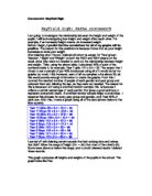
We can see this in the graph, but since the last class width wasn’t accurate (because it was based on other class widths) it is better to look at the table-
Here if we look we can see that more women are underweight than men and also more women are overweight than in men. The frequency of weights in women is more evenly distributed, which suggests that females must have an overtly different range of lifestyles than men (based on what we can see here). Also more women may be underweight than men because of the image to conform to skinny models(which also might have an effect on them being overweight as well), and/or it could be that men also have an image to conform to healthy fit males and so it has effected them.
Another reason could be biological differences in bodies. But this reason is disproved because the frequency of weights in females isn’t concentrated on less weight but more evenly distributed than men.
Prehaps the best reason of all could be that a lot of the overweight women are mothers, and the women who weigh less aren’t mothers yet (because you’ve given birth you put on weight).