I will be using Mayfield High data provided by the exam board. This has data from students between the ages of 11 and 16. I have chosen to use this data, as my hypothesis requires the use of males of which there are none at my school and although this data is not primary, I believe it to be a more reliable source than my own data.
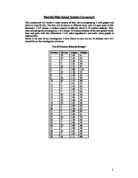
The total population of the data is 1187, which is too large to manage so I will take a sample size of 75 which should be enough to get accurate results but still be manageable. I will split the data into year groups and then into gender. This will make it easier to handle the data and to make stratified sample.
From this data I will only use;
- Year Group
- Gender
- Favourite subject
- Average number of hours of TV watched per week
I decided to use a stratified sample as it the best way to collect a proportionally fair sample from a very large range of data. I believe this is the most suitable way over Simple Random Sampling and Systematic Sampling. These are very hard to collect with no bias and so I might create bias which will affect the outcome of my investigation.
Number of Values in Group Required
Total Number of Values Sample Size
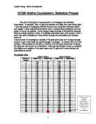
The results of my sample are shown in the table below.
Presentation of Data
Females
Males
As we can see there are a few anomalies in this data (highlighted yellow), which I replaced with more suitable data. I decided that the maximum someone could spend watching television per week was only 58 hours assuming that someone spent at least ten hours taking part in essential daily needs a day and spent five days at school (lasting eight hours including travelling time).
24 x 7 = 168
168 – (10x7) = 98
98 – (5x8)
After claiming this, I reduced each of these data points by ten until it reached a suitable number of hours.
I also only wanted integers so I rounded decimals up or down appropriately.
If we take all the pink highlighted subjects as logical subjects (PE, Maths, RE, Science, ICT and History) and the purple highlighted as creative (English, DT, Art, Music, Food Tech and Drama), we can already see that there are more creative subjects in females and more logical subjects in males.
This data can be seen in the frequency tables.
I used a frequency table as it easily and clearly shows the data, which makes it easier to manipulate further.
As the data is catagoric, it restricts my methods of proving my hypothesis. However I can use comparative pie charts to compare the data. The areas of the circles are in proportion to the two total frequencies.
I drew a comparative pie chart to show whether males or females had a higher frequency of creative subjects.
The formula I used was
πr2 = 32 x π
32 x π ÷35
= 0.8078
38 x 32 x π ÷35
r = √ (area / π)
r = √ 38 x 32 x π ÷35 / π
r = √ 38 x 9 / 35
r = 3.126
I used comparative pie charts because they give an indication of the sample size through the radius of the pie chart and give an easy to visualise representation of the data in that sample and it gives a good graphical indication of the size of the sample used and the frequency distribution within that sample set.
We can see from these charts that although the difference between sample size was very small, the data in almost completely opposite, showing diversity.
I also drew cumulative frequency diagrams to show the gender separation on both logical and creative subjects. The cumulative frequency polygon graphs appear to support the hypothesis by showing that male students appear to favour logical subjects, and females students appear to favour creative subjects. However, this representation of the data does not give any indication of the relative sizes of the data sets (male vs. female)
For the data about hours spent watching TV, I drew a histogram. For this I needed the formula
Frequency density = frequency ÷ class width
In brief the histogram shows us that males watch more television than females.
The mean number of hours watched for males was
Ʃ of hours watched ÷ total number of data points = 17.7
And the mean for females was
Ʃ of hours watched ÷ total number of data points = 17.5
They show that males watch more television than females and this is supported by the calculation of the man numbers of hours watched. The histograms showed than in extreme cases, where in a sample size of 38 males, an unlikely number (4) of males watched over 40 hours a week, whereas no females did.
From the sample taken, we can see that females favour creative subjects over logical ones, and males favour logical subjects. The difference between males and females is quite conclusive however the sample taken from the data is quite small which may lead to bias. Also because students were only asked to name their favourite subjects, this may not accurately reflect their subject choices. The students preferred subjects may not necessarily be their strongest academically and the results will not come through with this investigation.
The sample taken was relatively small compared to the total population of the school, being only 6.25% of the data. This is a limitation of the investigation as it could create bias between the groups, as they are of different sizes.
Another limitation is the fact that the data was catagoric, putting a restraint of the methods of data manipulation that could be used. This puts a limit on how I could prove my hypothesis, which may of lead to inaccurate results.
In total I conclude that my hypothesis was correct, however the likelyness of all the students in the school or even in the UK fitting this pattern is minimal. The best way to see if it fit the whole pattern would be to take a bigger sample from a wider range and spend longer on the different calculations.
Rebecca Millhouse
E10JM