To choose which of the pupils were more able and which were less, I took the top six sets and counted them as more able, then I took the bottom six sets and counted them as less able. I was then left with one in the middle. For this one, I split the set in two and used one boy and one girl to be more-able and the other two to be less.
Plan: To investigate and prove my hypothesis I plan to:
- Use the decimalised levels as my data source because they give a fair representation of improvement because if you use the level by itself it may look as if the person has improved by a whole level when actually they may have got 5.9 and then 6.1. This is a lot less than one level.
- Use scatter graphs to see whether there is any correlation between the two key stages. I expect to see strong positive correlation here as I believe that if you do well in Key Stage Two you do well in Key Stage Three.
- Use Spearman’s Rank Co-efficient to see what kind of correlation there is between the Key Stage 2 and 3 SAT’s results. I expect to see strong positive correlation.
- Use box and whisker plots to compare the improvement between more able and less able pupils in both Key Stages. I expect to see that the more able pupils’ improvement is higher up my scale and closer together because I believe they have improved more than less able pupils and have all improved around the same amount. On the other hand I expect to see the less able pupils’ box and whisker plot to be lower on my scale and a lot more spread out as they will have not improved much according to my hypothesis. Also they will have very varied improvements as some will have tried harder than others.
- Use grouped averages to compare the two improvements of less and more able pupils. I expect the less able pupils’ mean improvement to be lower than the more able pupils’ as more able pupils will have improved more.
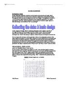
Scatter Diagram
- My scatter graph shows that there is strong positive correlation. Therefore if you get a good mark at Key Stage 2, you are very likely to get a good mark at Key Stage 3.
- There are some out lies to this rule but is mainly correct. This is evidence to suggest that my first hypothesis is correct.
- Most of the data is clustered around the line of best fit. You can also tell clearly where the 4 bands are except the second band are half in the first cluster and half in the second
- This shows that there is a clear divide between the bands and the results that they achieve. This therefore shows that the school does set correctly.
Spearman’s Rank Co-efficient
I have used Spearman’s Rank Co-efficient to back up the scatter graph. It shows the correlation between two sets of data.
Values that lie close to -1 are strong negative correlation
Values that lie close to +1 are strong positive correlation#
Values that lie close to 0 are no correlation.
- The results that I have got from this show the same. This is evidence to suggest that my first hypothesis is correct.
Box and Whisker Plot
- My prediction for what the box and whisker plots look like was correct.
- The more able pupil’s box and whisker plot is higher up the scale and closer together whereas the less able pupils’ one is lower down the scale and more spread out. This is because the more able pupils have improved more than less able pupils and they have all improved around the same amount. The less able pupils’ box and whisker plot is lower on my scale and a lot more spread out as they have not improved much as my hypothesis says Also they have very varied improvements as some will have tried harder than others.
- The upper quartile on the less able pupils plot is less than the lowest mark on the more able pupils plot. This shows that the more able pupils have all improved a lot more than 75% of the less able.
- The highest mark on the less able pupils plot is the same as the median mark on the more able pupils plot. Therefore there is very varied improvement in the less able pupils or there is an anomaly in the less able pupils.
- Altogether all my conclusions about the box and whisker plots show evidence to suggest that my second hypothesis is correct.
Grouped Averages
I have done the grouped averages in bands so that we can get an even better idea of the improvement between different ability pupils assuming that the school set correctly.
- From the averages we can see that there is a clear distinction between the bands.
- In the mean, median and mode the averages go down as I expected. This shows that the less able you are the less you will improve.
- In the case of range the band four range is a lot bigger than the band 1 range. This is expected as there will be a large amount of variation on the improvement as some will be prepared to work more than others.
- This is evidence to suggest that my second hypothesis is correct.
Conclusion and Evaluation.
My hypotheses were: If you do well in Key Stage 2, you do well in Key Stage 3.
More able pupils improve more than less able.
Using my data I used a number of statistical techniques to try and prove my hypotheses true. I feel I have enough evidence to suggest that my hypotheses are correct. Here are some of the important conclusions which show this:
- My scatter graph shows that there is strong positive correlation. Therefore if you get a good mark at Key Stage 2, you are very likely to get a good mark at Key Stage 3.
- The more able pupil’s box and whisker plot is higher up the scale and closer together whereas the less able pupils’ one is lower down the scale and more spread out. This is because the more able pupils have improved more than less able pupils and they have all improved around the same amount. The less able pupils’ box and whisker plot is lower on my scale and a lot more spread out as they have not improved much as my hypothesis says Also they have very varied improvements as some will have tried harder than others.
- In the mean, median and mode the averages go down as I expected. This shows that the less able you are the less you will improve.
- In the case of range the band four range is a lot bigger than the band 1 range. This is expected as there will be a large amount of variation on the improvement as some will be prepared to work more than others.
Limitations and Improvements
One of the limitations of my investigation was that my sample was not big enough. I think a better sample would be 60 pupils or more as this would have made my investigation more accurate and would be a better representation of the year group as altogether there is a total of 408. Therefore a sample of 52 isn’t that representative.
Another limitation is that I only investigated one school which means that my investigation isn’t really fair. It may not be correct either, as the information will vary from school to school and maybe from county to county.
The final limitation is that I have only investigated one year group and this may only be the case for this year group whereas all the other years may be completely different. Therefore my investigation may not be very accurate and miss-leading.