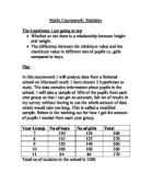
Another sampling method that I could have used was stratified sampling. This is made up of different ‘layers’ of the population. Samples are than taken from each group. So for example in year seven there is 200 pupils out of 1000 therefore 200/1000 of the sample should be from year 7. This is done for each year group. 200/1000 *25 must be done in order to find out how many people exactly should be done for each year group, 25 being the total sample size needed. Within each year group random sampling must be done to get that required total of pupils.
I did not use stratified sampling because I wanted to compare for each hypothesis, boys versus girls. Hence it was appropriate to have the same number of boys and girls.
I could have used other sampling method such and convenience sampling which is where people were asked to give their details. The problem with this type of sampling is that people who are comfortable with giving their weight and height would give the information. Also people could lie about their height and weight
However they could have been problems with the way the data was collected such as:
- People lying about their weight and height
- The weighing scale being misread
- Didn’t use the same bathroom scale therefore not being calibrated the same
- Some of the pupils would have worn their blazers and shoes whilst weighing themselves which would increase the weight whereas others wouldn’t have worn them.
Attached with this report are:
- The data of the sample of each subset. (The same data will be used for all three hypothesis)
- The Data for the Spearmen’s coefficient rank of correlation
- Many graphs and tables that will mathematically prove my hypothesis correct.
- Evidence of random sampling. (Data for year 7 Boys) ( see appendix)
- A Sheet with average height of children in 1837 (see Appendix)
For correlation, I am going to compare the height and weight of Year 7 and Year 11 Girls and Boys. My hypothesis is:
Height and Weight has a fairly strong positive correlation because, generally the taller you get the more you weigh.
To see if this is true I will need the following sets of data:
Heights and weight of a sample (25) of year 7 boys, year 7 girls, year 11 boys and year 11 girls.
I will draw a scatter graph as it is a suitable way of presenting this data. This is because we can easily see whether there is no correlation, positive or negative correlation of the height and weight of the selected sample of each subset. I will also draw a line of best fit, if appropriate to show this data. The line of best fit will show the outliers, give an estimate of how strong the correlation is and can be used to predict height and weights.
An example of a scatter graph showing positive, negative and no correlation is shown below. A line of best fit is only appropriate with a scatter graph showing negative and positive correlation.
To show how exactly how strongly correlated the data is I will use the Spearman’s coefficient rank of correlation again for the height and weight of year 7 boys and girls and yr 11 boys and girls.
You can compare two sets of ranking using Spearman’s efficient of rank correlation.
For Spearmen’s rank of correlation I ordered the heights of the data for the sample of 25 from each subset. I then had to rank these data from 1 to 25 in ascending order. If the heights were the same than it would be a tied rank. After this procedure I highlighted the data and than ordered the weights from lowest to highest and than ranked them. d, d2 and Σd2 (the definition of the symbols are shown below). These calculations will allow me to Work through the formula which is also shown below.
The formula is
d = the difference in the rank of the values of each matched pair
n = the number of pairs
Σ = the sum of
The value of P will always be between -1 and 1. A negative answer indicates a negative correlation. -1 is a perfect negative correlation, 0 is no correlation and 1 is perfect positive correlation.
For the line of best of fit, as it was appropriate to draw, I had to work out a simple calculation as this would help me draw my line of best fit. This was the mean, with this I could work out the mid-point and draw my line of best through the centre of this point.
With this line of best, as seen on the graph, I made predictions. They were:
- An average year 7 girl with a height of 1.68 m will weigh 60 kg
- An average year 7 boy with a weight of 80 kg should be about 1.72 m tall.
- An average year 11 girl with a height of 1.8 m will way around 88 kg and
- A normal year 11 boy will weigh 100 kg if he was 20 m tall.
Conclusions
From the Scatter Graph I came to a conclusion that height and weight have a positive correlation. This was similar to the predictions I made in the hypothesis except I predicted height and weight would have a strong positive correlation.
Therefore I calculated the Spearman’s coefficient rank of correlation which gave me an exact value of how strong or weak the correlation was. The Spearman’s rank for Year 7 boy’s weight and height is a strong positive correlation with the value being 0.83 on the scale. Spearman’s rank for year 7 girls is 0.58 which a fairly strong positive correlation
Therefore in year 7 boys’ height and weight are more positively correlated than girls’ height in year 7. This is because a this stage the girls are going through puberty so the main factor that affects their weight is not their height but rather the changes in their body whereas only a few of the year 7 boys
The Spearman’s rank for year 11 boys is 0.42 which is a weak positive correlation and the year 11 girls’ Spearman’s rank being 0.56 which is a fairly strong positive correlation. This is because; now the year 11 boys will be growing through puberty in contrast to year 7 where the girls were going through puberty. Most of the year 11 girls should have gone through puberty at this stage with very few having to go through it. Therefore the changes in the body affect the weight of the year 11 boys than they affect the weigh of the year 11 girls
To compare Boys with Girls I am going to compare the Age and Height of Boys and girls from Year 7 and Year 11. My hypothesis is:
I predict that the year 7 girls will be taller than the year 7 boys. This is due to the girls starting puberty earlier therefore having a growth spur. The boys will start puberty later, with a few having gone through it or growing through it.
By year 11 the boys will be taller due to having already going through the stage of puberty. Most of the girls would have gone through puberty, therefore remaining a similar height as they were in year 7 whereas a few boys will still have to go through puberty.
To see if this is true I will need the following sets of data:
Heights of a sample (25) of year 7 boys, year 7 girls, year 11 boys and year 11 girls.
I will draw a stem and leaf diagram which will allow me to see the data clearly and see which data stands out. With this stem and leaf diagram I will be able to work the lower quartile, the upper quartile and the median. These will allow me to see the average heights. These calculations will allow me to draw a box-plot graph which will then allow me to compare the average height and look at the spread of data it will also analyse the shape of the data.
For the box plot I will use the same scale between the age groups so that I may compare between boys and girls more easily.
A example of a stem and leaf diagram is
I worked out the median and the quartiles as this would allow me to draw it on the box plot graph and allow me to see the average heights. I worked this out by underlining the median which is the middle value. The quartiles are than half way between the median on either sides. I had 25 data as mentioned above for each set. Therefore the median is 25+1/2 which is the 13th value. After the median was calculated I could tell that there were 12 values on either side of the median. The LQ (lower quartile) is calculated by doing the following calculation: 12+1/2 which is the 6.5th value and to work out the UQ (upper quartile) by finding the 6.5th value on the upper half of the median.
Conclusions
In year 7 it is difficult to ascertain who is taller; boys or girls. The modal group for both boys and girls is 1.50≤h<1.60. However, the spread of heights for girls is much closer together than the boys.
In year 11 it is easy to tell that the boys are taller than the girls. The modal group for the year 11 boys is 1.80≤h<1.90 and the modal group of the girls is 1.60≤h<1.70. There is more variation in the heights of year 11 boys than year 11 girls.
For distribution I am going to use the height and gender of year 7 girls and boys and year 11. My hypothesis is:
The boy’s height in year 7 will be normally distributed as only a few of them would have gone through puberty leaving the majority of them having to go through it.
The girls’ height in year 7 will be positively skewed as most of the girls having gone through puberty with a few of them having to go through it.
In year 11 both girls and boys height will be normally distributed as all the girls and most of the boys should have gone through puberty.
To see if this is true I will need the following sets of data:
Heights of a sample (25) of year 7 boys, year 7 girls, year 11 boys and year 11 girls.
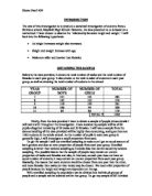
I will draw a histogram as this is the easiest way to see distribution. From the histogram I will be able to see how the data for year 7 boys and girls and year 11 girls and boys are distributed and whether they are normally distributed, positively skewed or negatively skewed. Before drawing the histogram I need to calculate many things. I have to draw a table in which the heights are put into groups; the frequency is worked out as well as the class width and the frequency density. In this case I have decided to plot frequency density against heights and decided to use an unequal width histogram.
As mentioned above a table was to be drawn in order to draw the histogram. Firstly the heights had to be put in suitable groups with the certain groups split in two so that it may be classed as an unequal width histogram. The frequency then had to be written into the corresponding heights group on the table. The class width was worked. This was the range between the groups e.g. group 1 = 1.30≤x<1.40. The class width is the difference between 1.30 and 1.40 which is 10. From the above information which was placed in the table the frequency density was worked out through a simple calculation which was then plotted on the histogram e.g. frequency/class width.
The information in the table than had to be transferred onto the histogram. The Heights were drawn on the horizontal axis whilst the frequency density was drawn on the vertical axis. The histogram is drawn similar to a bar chart except there are no spaces in between the bars. This is because it is used to represent continuous data.
I decided to use unequal width histograms as it allows me to analyse the histogram with more detail. I grouped some of the data together as they wasn’t much people in that group and split others up as they were to many people in that group.
A histogram is analysed by describing the distribution. There are many different types of distribution as shown below:
Normal distribution is symmetrical about the mean which means that it has similar scores on either side of the mean.
Negatively skewed is where the data is skewed away from the y-axis.
Positively skewed is where the data is skewed towards the y-axis as shown above.
I will also calculate the standard deviation as this will help measure the spread of the data around the mean. Also, using standard deviation I could see whether the distributions for the histograms were normal.
The formula for standard deviation is:
Σ = the sum of
x = Height
x = Mean
n = the total values (in this case 25)
The standard deviation than needs to be worked out using the simple calculations above. The calculations for the standard deviation; such as the mean, the height etc. is found in the data spreadsheet which is found at the in the appendix.
Any value that is more than 2 standard deviation away from the mean is considered an outlier therefore I will have to work out the mean plus and minus 1 and 2 standard deviations. I will have to work out what percentage of my data is within 1 and 2 standard deviation of the mean. This will allow me to see whether my data is normally distributed. A normally distributed data has 68% of its data within 1 S.D. (standard Deviation) of the mean. It also has 95% of its data within 2 S.D. of the mean.
Conclusion
Both histograms; year 7 boys and year 7 girls and normally distributed with the data being symmetrical around the mean. Using standard deviation I worked out that for year 7 boys 76% of all data is within 1 S.D of the mean and 96% of all its data is within 2 S.D of the mean. This shows that it is normally distributed because the data is distributed similar to that of normally distributed data. Normally distributed data has 68% of all data within 1 S.D and 95% of all data within 2 S.D of the mean.
The data of year 7 girls is distributed the same to that of year 7 boys with 76% of all data within 1 S.D and 96% of all data within 2 S.D of the mean.
Again both year 11 boys and girls histograms are normally distributed. However the histogram for tear 11 girls seems more normally distributed. To work out how distributed the data is standard deviation is used. It showed that 52% of all data was within 1 S.D of the mean and 100% of all its data was within 2 S.D of the mean.
The data for the year 11 girls was 60% of all its data is within 1 S.D of the mean and 96% of all its data is within 96% of the mean which shows it is slightly more normally distributed compared to that of year 11 boys.
Overall the distribution of all the subsets is normally distributed which shows that their height and the frequency density are normally distributed.
I will now justify whether the predictions I made in the hypothesis and the reasoning behind them are actually valid. The three hypotheses are as follows:
- Height and Weight has a fairly strong positive correlation because, generally the taller you get the more you weigh. I would expect the year 7’s to have a stronger correlation compared to the year 11’s.
- The year 7 girls will be taller than the year 7 boys. This is due to the girls starting puberty earlier therefore having a growth spur. The boys will start puberty later, with a few having gone through it or growing through it.
By year 11 the boys will be taller due to having already going through the stage of puberty. Most of the girls would have gone through puberty, therefore remaining a similar height as they were in year 7 whereas a few boys will still have to go through puberty.
- Boy’s height in year 7 will be normally distributed as only a few of them would have gone through puberty leaving the majority of them having to go through it.
Girls’ height in year 7 will be positively skewed as most of the girls having gone through puberty with a few of them having to go through it.
In year 11 both girls and boys height will be normally distributed as all the girls and most of the boys should have gone through puberty.
From hypotheses 1 I have gained evidence to suggest that weight and height is strongly correlated and this was as I predicted in the hypothesis.
As predicted the year 11 boys are taller than the girls however it is not easy to see who is taller in year 7 and therefore the first part of my hypotheses which comments on year 7 girls being taller is not true. This could be due to the set of data I collected.
The data for both year 7’s and year 11’s are normally distributed and this was not as I predicted in the hypothesis. In the hypothesis I mentioned that the girls height in year 7 will be positively skewed which it wasn’t.
From results of height and weight of children in 1837 I have come to a conclusion that the children nowadays are a lot taller than they used to be. The girl’s heights throughout the different ages in 1837 are similar to that of boys. The sheet with these data can be found in the Appendix.
This shows that British teenagers are taller than they used to be due to the luxurious living conditions.
As mentioned at the beginning of the report my results are reliable because I used a non-biased method of sampling which gave everyone the equal chance of being selected.
I did not encounter any problems throughout this investigation and therefore I am happy with the way I carried it out and would not change the way I would do things.