Median – The Broadsheet has a larger median at 19, which is very distant to the tabloid, which is at 16. Again I don’t this particular average is suitable for this data.
Mean – The Broadsheet has a larger mean. I don’t think the mean is a suitable source of average in this project.
Standard deviation – The Broadsheet has a larger standard deviation whereas the Tabloid has a smaller standard deviation, which means it was closer to the answer.
The broadsheet had larger words and longer sentences compared to the tabloid. Surprisingly the tabloid was quite close to the broadsheet.
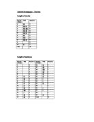
Length of words
Tabloid – The Sun
Median = n + 1 = 50 + 1 = 25.5 = 4 2 2
Lower quartile = n + 1 = 50 + 1 = 25.5 = 2.6 4 4
Upper quartile = n + 1 x3 = 50 + 1 x3 = 38.25 = 6.4
4 4
Inter quartile range = upper quartile – lower quartile
= 6.4 – 2.6
= 3.8
Broadsheet – The Times
Median = n + 1 = 50 + 1 = 25.5 = 4.4 2 2
Lower quartile = n + 1 = 50 + 1 = 25.5 = 2.8 4 4
Upper quartile = n + 1 x3 = 50 + 1 x3 = 38.25 = 5.8
4 4
Inter quartile range = upper quartile – lower quartile
= 5.8 – 2.8
= 3
Length of sentence
Tabloid – The sun
Median = n + 1 = 50 + 1 = 25.5 = 16 2 2
Lower quartile = n + 1 = 50 + 1 = 25.5 = 9.3 4 4
Upper quartile = n + 1 x3 = 50 + 1 x3 = 38.25 = 19
4 4
Inter quartile range = upper quartile – lower quartile
= 19 – 9.3
= 9.7
Broadsheet – The Times
Median = n + 1 = 50 + 1 = 25.5 = 18 2 2
Lower quartile = n + 1 = 50 + 1 = 25.5 = 11.5 4 4
Upper quartile = n + 1 x3 = 50 + 1 x3 = 38.25 = 26
4 4
Inter quartile range = upper quartile – lower quartile
= 26 – 11.5
= 14.5
Front page
Areas of each category from the front page
The sun
The Times
Radius (r 1) = 4cm
R1 =√f1
R2 =√f2
4 =√919
R2 =√1990
4 x √1990 = R2 x √919
178.43 = R2 x 30.31
178.43 = 5.8
30.31
Train crash story page
Areas of each category from the train crash story page
The sun
The Times
Radius (r 1) = 4cm
R1 =√f1
R2 =√f2
4 =√871
R2 =√1725
4 x √1725 = R2 x √871
166.1 = R2 x 29.5
166.1 = 5.6
29.5
Comparative pie charts conclusion
I compared the front pages from both newspapers. I used the information, which I collected earlier of the different percentages. On the front page the broadsheet clearly has more news followed by pictures. Although with the tabloid it is not that clear that there is also the most news, not as much as the broadsheet. The news is followed closely by pictures. There is roughly the same amount of news and pictures in the tabloid although it is very obvious that there is more news in the broadsheet section. When comparing the train crash story I found the areas of the story itself in both newspapers and then the area of information around it. I can just about see that the Broadsheet covers more of the story. The sun covers roughly the same amount although the broadsheet shows very clearly that it covers more.
Introduction
I am going to compare two types of newspapers, a tabloid and a broadsheet. The data I will be collecting will be primary data meaning I shall collect it my self. I have chosen two very popular newspapers, ‘The sun’, a tabloid and ‘the Times’, a broadsheet. I will compare the length of sentences and the length of words. I will collect a sample of at least 50. To do this I will choose an article that appears in both newspapers. I will be looking at the percentages of adverts, pictures, news, sport and other information from both newspapers. I will also consider other peoples opinions on these newspapers by organising a survey. I will then transfer the data onto graphs and pie charts. I will also calculate the reading ages for both newspapers.
The Sun
The Sun has been a leading newspaper in the media industry. From the period of 1953 on, Osborn and Don Soldwedel served as co-publishers and owners With Osborn being the editor and Solwedel being the business manager. In the early 1980s the Osborns and Soldwedels sold their half ownerships of The Sun. Briefly, the newspaper was jointly owned by Donrey Newspapers and Cox Newspapers Inc. but in a short time full ownership was acquired by Cox and continued until Dec. 16, 1996 when Thomson Newspapers purchased the paper.
Thomson Newspapers owned The sun through 1999 and in early 2000 it was announced by the Thomson Corporation that they intended on selling off their entire newspaper chain. On August 3, 2000, Freedom Communications, Inc. purchased The Yuma Daily Sun and its products. On July 30, 2001, The Yuma Daily Sun went back to its roots and again changed its name to The Sun and went back to being a morning paper seven days a week.
The Times
The Times has always been aimed at a higher age group. It has been around for quite a while, being a leading newspaper in world of business updating us with daily information on stocks and shares, or giving us specific details on places. The beginnings of the Times Publishing Company were humble. Nine printers involved in a labour dispute with the Evening Herald, one of five newspapers that existed in Erie in 1888, decided to pool their resources and start their own publishing company.
After looking at the two chosen newspapers I have come up with two hypotheses.
The Times newspaper will have longer words and longer sentences resulting it to have a higher reading age.
The Sun will have more pictures and adverts, whereas the Times will have more text so the sun will have a larger audience.
The newspapers
Tabloid – The sun
The sun is a very popular newspaper. I believe it has a mixed aged audience.
The paper has a 20-paged separate sports section, which comes within the paper.
In total there were 64 pages.
Area of one page = length x width
= 36.6 x 29 = 1061.4cm
Area of newspaper = area of one side x number of pages
= 1061.4 x 64
= 67929.6cm
Cost per page = cost / number of pages
= 20p / 64
= 0.3125
Cost per 1 cm = cost / total area
= 20p / 67929.6
= 0.000294422
Broadsheet – The Times
The Times is known to be a ‘business’ paper. It is fairly large. Along with the newspaper, there are many other extras. The main newspaper is of a different size to the extra newspapers apart from the business newspaper.
Area of one main paper = length x width
= 57.9 x 36.9
= 2136.51
Area of one page of business paper = 57.9 x 36.9
= 2136.51
Area of one page ‘The Game’ paper = 36.4 x 29.1
= 1059.24
Area of one page of ‘T2’ paper = 36.4 x 29.1
= 1059.24
Area of one page ‘MBA’ paper = 36.4 x 29.1
= 1059.24
Area of the whole newspaper = 2136.51 x 20 = 42730.2
= 2136.51 x 20 = 42730.2
= 1059.24 x 24 = 25420.76
= 1059.24 x 24 = 25420.76
= 1059.24 x 16 = 16947.84
Total = 153249.76cm
Cost per 1 cm = cost / total area
= 45p / 153249.76
= 0.000293638
It was not possible to calculate the cost per page as the pages were of different sizes.
The different categories found in the newspapers
I calculated the areas of news (writing, including heading), pictures, sport, adverts and any other information that may not fall into the previous categories. I calculated the areas of the first 5 pages from each section. From the Sun, I calculated the first 5 pages of the main and sports section. From the Times I calculated the first 5 pages from Main, Business, T2, Game, and MBA section.
News
Looking at my data there was a fair amount of writing (news) in both papers. Most of the time, the broadsheet had more writing compared to the tabloid. I looked through some of the stories in both newspapers and it was quite clear that the tabloid had exaggerated particular stories. They didn’t have enough focus on the main stories such as the train crash story. They focused more on show biz and sport. Although the Broadsheet had a fair amount of sports and showbiz but the amount of writing and factual information that was presented did make it quite equal.
Pictures
To my surprise the broadsheet had more pictures or larger pictures compared to the tabloid. The tabloid also had a fair amount of pictures as well.
Sport
The Broadsheet had an on going amount of information on sport, which was very surprising. The Broadsheet covered a huge variety of sports such as tennis, formula one racing, rugby, football, swimming, cricket, and boxing whereas the tabloid covered very little on other sports apart from football. The tabloid covered mainly football and some other sports such as tennis, boxing, horse racing, rugby and of course football which I will prove later. The tabloid seemed to extend or add to the stories to make the reader read on. This could be a reason why the tabloid is supposedly more popular. Tabloid covers more football than broadsheet.
Adverts
The Broadsheet has more adverts compared to the tabloid, which is also quite surprising. The adverts in the broadsheet newspaper are fairly large and some of them cover up to half of the page. The tabloid is quite similar as well. Some of the adverts can be a whole page full.
Other
Looking at both newspapers there wasn’t that much other information. Although if I were to annotate the data I collected it does seem quite obvious that the Broadsheet has more other information.
Conclusion
Looking and comparing the two newspapers was quite interesting. The broadsheet definitely surprised me. I didn’t realise that it covered as much sport. It was quite obvious that the length of words and length of sentences would be longer than the tabloid, which I proved in my project. Looking at the different graphs I experimented with I would say the cumulative frequency graphs show the length of words and length of sentences the best. The Sun did have more pictures covering a large area of the newspaper. The Times had more adverts and more text.
I have come to a conclusion about my hypotheses.
The Times newspaper will have longer words and longer sentences resulting it to have a higher reading age.
I proved this in my research. The Times does have longer words and longer sentences and it also has a higher reading age.
The Sun will have more pictures and adverts, whereas the Times will have more text so the sun will have a larger audience.
The sun did have more pictures but the times had more adverts proving that part of the hypothesis incorrect. The Sun does have a larger audience as this was proved in the questionnaire.
I think most of the data was collected relatively well. The size of the sample was satisfactory.
If I were to carry out this investigation again I would compare a newspaper that does not come under either a broadsheet or tabloid. I would go into more detail in the sports section and consider other topics such as showbiz.
Reading age
I used a formula called SMOG to calculate the reading age. I used the train crash stories for newspapers to work out the reading ages. I counted off 10 consecutive sentences near the beginning, in the middle, and near the end. It was not possible to do this with the sun, as the story was too short so I just counted 30 consecutive sentences. I counted the number of words containing 3 or more syllables, including repetitions of the same word.
I used the SMOG conversion table below to look up the approximate grade level.
The sun
The approximate grade level for the sun is 10 meaning a reading age of 10.
The Times
The approximate grade level for the sun is 12 meaning a reading age of 12.
The relationship between pictures and news – The sun
I have constructed a scatter graph for the Sun showing the correlation between the percentages of pictures against the percentage of news for the first five pages.
Below is a table showing how I calculated the area and percentages of pictures and news in The Sun. I have taken this information from the previous calculations I have made of the areas and percentages.
Mean of pictures = 29.2 + 22.1 + 59.8 + 20 + 45.8 = 177.2 = 35.44
- 5
Mean of news = 31.3 + 61.6 + 24.2 +50.8 + 29.9 = 197.5 = 39.56
- 5
The graph shows a weak negative correlation showing that as the percentage of pictures increases, the percentage of news decreases just as I had expected. This proves that there are more pictures. The points are well spread from the line of best fit.
The relationship between pictures and news – The Times
I have constructed a scatter graph for The Times showing the correlation between the percentages of pictures against the percentage of news for the first five pages.
Below is a table showing how I calculated the area and percentages of pictures and news in The Times. I have taken this information from the previous calculations I have made of the areas and percentages.
Mean of pictures = 19.3 + 1.2 + 27.4 + 19.9 + 14.5 = 82.3 = 16.46
- 5
Mean of news = 58.02 + 61.03 + 37.3 + 44.5 + 35.2 = 236.05 = 47.21
- 5
The graph shows a very weak negative correlation showing that there are signs that as the percentage of pictures increases, the percentage of news decreases which I did not expect. This shows that there may be more pictures on the odd page. The points are well spread from the line of best fit.
The relationship between Headings in both newspapers
I have constructed a scatter graph where I plotted the percentage of headings of The Sun against the percentage of headings for The Times for the first five pages.
Below is a table showing how I calculated the area and percentages of headings in each newspaper.
Mean of The Sun = 29.06 + 16.4 + 2.1 + 23.5 + 15.8 = 86.86 = 17.3
- 5
Mean of The Times = 6.3 + 4.9 + 2.2 + 6.9 + 4.6 = 24.9 = 4.98
- 5
There is a relatively strong positive correlation which shows that as the percentage of headings increases in the Times, so does the percentage of headings in the Sun. Looking at the table there is a larger percent of headings in The Sun.
The relationship between adverts in both newspapers
I have constructed a scatter graph where I plotted the percentage of adverts of The Sun against the percentage of adverts for The Times for the first five pages.
Below is a table showing how I calculated the area and percentages of adverts in each newspaper.
Mean of The Sun = 4.1 + 2.6 + 0 + 8.1 7.0 = 21.8 = 4.36
- 5
Mean of The Times = 8.07 + 20.1 + 19.5 + 19.8 + 34.5 = 101.97 = 20.39
- 5
There is a very weak positive correlation which shows that there are signs that as the percentage of adverts increases in the Times, so does the percentage of adverts in the Sun. This shows that there is a larger percent of adverts in The Times.
The Sun – Percentages of categories on each page
The Times – Percentages of categories on each page _
The percentages do not add up 100% because the rest of the percentage is of blank space in each page so I categorised it as ‘blank’ in the table.
Histograms showing the length of words in both newspapers
The Sun
From the data I collected on the length of words for The Sun, I created a histogram. I had to group the word lengths together to adapt it to a typical graph.
From the graph, I found out there is a mode of 3.65 which is 3 ≤ l • 4
I can also see there is a positive skew.
The Times
From the data I collected on the length of words for The Times, I created a histogram. I had to group the word lengths together to adapt it to a typical graph.
From the graph, I found out there is a mode of 5.25 which is 5 ≤ l • 6
I can also see there is a positive skew.
The distributions of both graphs show there are no axis of symmetry. It shows a lean to the left side showing a positive skew. The Times has a larger mode.
The relationship between both newspapers showing the length of words
I created a population pyramid to compare the length of words in both in newspapers. I had to group the data to adapt it to a typical population pyramid.
The population pyramid shows there is the largest frequency at the group 4-6, whereas the largest frequency is at the group 1-3. This proves the Times has longer words.
The relationship between both newspapers showing the length of sentences
I created a population pyramid to compare the length of sentences in both in newspapers. I had to group the data to adapt it to a typical population pyramid.
The population pyramid shows there is the largest frequency is at the group 16-20 for both newspapers. It shows that The Times has longer sentences.
The graph for the length of words shows there is roughly the same length of words. The graph for the length of sentences shows The Times has longer sentences.
Cumulative frequency graphs
Length of words
The sun – I used the graph to find the median and quartiles.
Median – 4
Upper quartile - 6.4
Lower quartile – 2.6
I used the graph to find the 10th percentile giving information on the spread.
10th percentile = total cumulative frequency = 50
= 10% of 50 = 5
= 10th percentile (1st decile) = 1.6
The Times - I used the graph to find the median and quartiles.
Median – 4.4
Upper quartile - 5.8
Lower quartile – 2.8
I used the graph to find the 10th percentile giving information on the spread.
10th percentile = total cumulative frequency = 50
= 10% of 50 = 5
= 10th percentile (1st decile) = 1.8
Length of sentences
The sun – I used the graph to find the median and quartiles.
Median – 16
Upper quartile - 19
Lower quartile – 9.3
I used the graph to find the 10th percentile giving information on the spread.
10th percentile = total cumulative frequency = 50
= 10% of 50 = 5
= 10th percentile (1st decile) = 6.5
The Times - I used the graph to find the median and quartiles.
Median – 18
Upper quartile - 26
Lower quartile – 11.5
I used the graph to find the 10th percentile giving information on the spread.
10th percentile = total cumulative frequency = 50
= 10% of 50 = 5
= 10th percentile (1st decile) = 8
Box and whisker
Length of words – The sun shows a positive skew, as it is closer to the lower quartile. The Times shows there is almost a symmetrical diagram where the median is almost at the centre. Surprisingly the highest word length is in the Sun whereas the lowest word length is in the Times.
Length of sentences – The sun shows a negative skew, as it is closer to the upper quartile. Again The Times shows there is almost a symmetrical distribution. The Times has the highest and lowest sentence length.
The different types of sports
I calculated the areas of the different types of sports over 8 pages for both the Sun and the times which I am going to transfer onto a pie chart. I found the sports section in the Times at the back of the business paper and the sun at the back of the main section.
The Times
Total of sport = 7914.5cm²
The sun
Total of spot = 6116.9cm²
I have clearly proved that the sun covers less sport and more football whereas The Times covers a large variety of sports which was quite surprising. Also the times covers more sport which could due to the size of the newspaper.
The different types of sports
I have created two composite bar charts to show the percentage of each category on the front page for both newspapers. Both the ‘sports section’ from the sun and ‘ the game’ from the times are purely on football. I had to round up each of the percentages to create an accurate chart. The length of the bar chart is 15cm.
The sun (sports section)
The Times (The game)
The composite bar charts show that the sun has a larger percent of pictures than the sun, although the Sun has more sport (text). The graphs also show that the sun has a small percent of adverts whereas the times have no adverts. The sun shows that there was more blank space, meaning that it has wasted space.
The other papers in the Times
I looked through all the extra sections with the times newspapers. The ‘business’ and ‘MBA’ sections stood out as they are both related to business affairs. I have constructed vertical line graphs for both papers showing the percentages of different categories on the front pages.
The business paper
The MBA paper
The business paper seems to have a large amount of text just as I had expected focusing on more important information. The MBA paper seems to have a large amount of pictures maybe more appealing.
The T2 paper
While scanning through the paper, I noticed there was a fair amount of pictures in the T2 section from the Times newspaper. To show the data I constructed a pictogram showing the percentage of pictures over the first five pages. I rounded up each percentage.
The pictogram does show there is quite large percent of pictures on the first couple of pages.
The number of pictures
The table below shows the number of pictures on each page for the main section of the sun and the Times. I counted any pictures found, including pictures found in adverts and icons.
I have constructed a composite bar chart graph to show this data of pages 11 - 20
The graph shows the sun has more pictures
For each newspaper I have found the mode, Mean, and median of the number of pictures on each page.
The Sun
2 5 3 6 1 2 4 2 5 6 5 4 7 1 3 3 4 3 6 3
Mode = 3
Mean = 75 =3.75
20
Median = 1 1 2 2 2 3 3 3 3 3 4 4 4 5 5 5 6 6 6 7
20 + 1 = 21 = 10.5 = 3.5
2 2
The averages show that there is an average of roughly 3 to 4 pictures.
The Times
4 3 3 3 3 3 3 1 3 3 3 2 3 2 3 2 2 5 1 1
Mode = 3
Mean = 53 = 2.65
20
Median = 1 1 1 2 2 2 2 3 3 3 3 3 3 3 3 3 3 3 4 5
20 + 1 = 21 = 10.5 = 3
2 2
The averages show that there is an average of roughly 2 to 3 pictures.
Spearman’s coefficient of rank correlation
I am going to compare the number of pictures in the sun and the times using spearman’s coefficient. I have ranked both sets of data.
n = 20
∑d²= 196 + 4 + 64 + 1 + 256 + 169 + 25 + 4 + 4 + 1 + 4 + 36 + 4 + 25 + 64 + 9 + 36 + 100 + 256 +49 = 1307
ρ = 1 - 6∑d² = 1 - 6 x 1307 = 1 – 7842 = 1 – 7842 = 1 – 0.9 = 0.1
n(n² - 1) 20(400 – 1) 20 x 399 7980
A value of 0.1 means there is almost no correlation between the number of pictures of the Sun and the Times meaning there is no relationship between the two.
I have put the data collected from the survey into tables.