The above scatter graph shows the KS2 English results for both girls and boys in years 10 and 11. I added in a tread line for both the results of boys and the results of girls. Now that I have added in the line of best fit, u can clearly see that the line for boys is steeper than the one for girls and has a stronger positive correlation, in effect proof that boys on average are smarter than girls in English (in the years selected within Mayfield High school).
I will now move on to expressing my data and back up my hypothesis further using a method called standard deviation. The symbol used for standard deviation is (a Greek symbol pronounced sigma). “Standard deviation is the statistical measure of the amount by which a set of values differs from the arithmetical mean, equal to the square root of the mean of the differences’ squares.”
This is a calculation allowing me to show how the data is spread around the mean, and in this case, for the results in KS2 for girls and boys in both years.
Standard deviation is found by using the formula shown below:
In this formula stands for the sum of , while stands for the items of data.
Stands for the mean of all the data and is the number of terms.
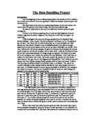
I will begin by using the formula to calculate the English result standard deviation for boys in Year 10. Firstly, I will have to make a table similar to the one below, which is the basis for working out standard deviation:
Below is the table needed for standard deviation, which I made by taking the levels achieved by boys in Year 10 for English and subtracting them from the mean (3.78), then squaring this answer.
By following the formula of standard deviation I know that I need to add the sums of the answers in the final column ( ) ², which will give me I will then need to divide that answer by the amount of terms, known in the formula as n.
So…
= 0.61+0.61+0.61+0.61+0.61+0.61+0.05 +0.05 +0.05 +0.05 +0.05 +1.5+1.5+1.5 = 8.41
So = 0.761 to three decimal places
Now that I have used standard deviation for the English results for boys in year 10 I will do the same for the boys in Year 11, because I am going to use a slightly different use of standard deviation for the girls. For them I will show that I also know how to use standard deviation for a frequency graph, which will allow me to easily calculate the standard deviation for girls throughout both years. I will then add the means and standard deviations of the boys in years 10 and 11, which will then give me a chance to compare boys to girls on the whole.
I will go out using the same process in which I calculated the standard deviation for boys in year 10. Below is the table needed for standard deviation, which I made by now taking the levels achieved by boys in Year 11 for English and subtracting them from the mean (4.64) then squaring this answer.
= 0.41+0.41+0.41+0.41+0.41+0.13+0.13+0.13+0.13+0.13+1.85
= 4.55
So = 0.640 to three decimal places
Comparing the standard deviation of boys in year 10 to boys in year 11 you can see that the year 11 seem to have been slightly smarter, with their result being slightly more concentrated around the mean.
Year 11 = 0.640
Year 10 = 0.761
I will be using these sorts of comparisons once I have finished with the calculations for the girls, to compare the standard deviations and see who is smarter generally.
As I said earlier, for girls I am going to use a slightly different method of standard deviation, which will involve me making a slightly different table. This frequency table will allow me to easily put all results for girls of both years in one table, and will get the standard deviation for girls in general.
The frequency table has two extra columns, as shown in the example below:
Below is the table needed for standard deviation using a frequency table, which I made by taking the levels achieved by girls in both years for English and subtracting them from the mean (3.78), then squaring this answer.
What is added is a column with the frequency, (calculated by stating the sum of the amount of times each number appears in a set of data) and another column that is, frequency times (the level achieved subtracted by the mean) squared:
= 5.12+0.56+4.32 = 10
So = 0.632 to three decimal places
The above standard deviation accounts for girls in both year 10 and 11. Due to the fact that I did the boys in years 10 and 11 separately, I will now add their standard deviations to make the ratio fair, as there are 25 girls altogether in my investigation and 25 boys.
The standard deviation for boys in year 10 was 0.761, and the standard deviation for boys in year 11 was 0.640. If I add these two I get the answer 1.401.
This sum of the boys in both years compared to the sum of 0.632 for girls in both years is solid proof that within my investigation, boys are generally smarter than girls as their standard deviation is higher …
(Explain why the standard deviation for boys is evidence that they are generally smarter…the higher the standard deviation, the better the results achieved etc…)
I have concluded the investigation of my first hypothesis, and will move onto my second one.
For the second hypothesis in my analysis I have predicted that students who do well in Maths will also do well in Science. I will not present this evidence in terms of years however, but will still do boys and girls separately so I will be able to analyse the data in more depth. For example, my statement could be true of girls in general but untrue for boys.
I will start this time with girls, examining the results for Maths and Science.
The above scatter graph shows the Maths and Science results for boys in years 10 and 11. They both have a weak positive correlation, although they differ slightly.
It cannot be said however, that students who do well in Maths will do well in Science because there are a number of points on the graph where the level for Maths is different for Science, whether it be slightly lower or slightly higher.
Also, the correlation within the graph is only weak and there is no generality, as the results are scattered and don’t follow a pattern suggesting the two subjects have definite correlation.
This graph suggests that for at least boys, my hypothesis is not correct.
The above scatter graph shows the Maths and Science results for girls in years 10 and 11. They have an even weaker positive correlation weak that those of the boys, but the results differ just as much.
For girls also it cannot be said that students who do well in Maths will do well in Science because there are again a number of points on the graph where the level for Maths is different for Science, whether it be slightly lower or slightly higher. Also like in the graph for boys it seems there is little likeness between the results and they are quite large spread.
This graph gives the same evidence of the first, and it can therefore be stated that there is no support or indication that my second hypothesis is correct.
But I do not intend to stop at this. I will explain further and provide more solid evidence that my hypothesis isn’t correct, and give a justified reason why.
I will produce four bar charts showing each student’s result in Maths compared to their one in Science; one graph each for boys in both years and the same for the girls.
The above graph is of Maths and Science results for boys in Year 10. There are 3 exceptions such as Jason, Tony and Jeff, who achieved well in both Maths and Science. For the others however there is a number of differences, with them either achieving well in Maths but not so well in Science (David and Kevin), or students who achieve the same in both subjects but just not so well (Sania, George and Michael). From researching further though I can gather that students who do well (level 5) will generally do well in both, and the general assumption is that the majority will get the same grade for both, whether it is good or not so good.
At the bottom of the previous page are the Maths and Science results for girls in Year 10. There are 2 exceptions such as Holly and Attoosa who achieved well in both Maths and Science. For the others however there is a number of differences, but slightly different to the boys. There are none out of this graph that achieve highly in Maths (Level 5) but not so well in Science, as the majority achieve level 4 in both subjects. There is some diversity though as there is a student (Jenny) who achieves Level 2 in Maths but Level 4 in Science, bringing down the average of the girls in Maths altogether.
The above graph is of Maths and Science results for boys in Year 11. There are 5 exceptions such as Simon, Stephen, Brett, Alan and Henry who achieved highly in both Maths and Science. Although there are still a number of students achieving less, (Fredrick and Keith for example) they have an average much higher than any other group in Year 10 and only have 3 Level 3s out of a possible 22, compared with 9 for Year 10 boys. This is one group that actually does agree with my hypotheses in a degree, because in general the students who do well in Maths do well in Science and there is enough of them to make an effect/majority. This is good because by furthering my investigation even though the hypothesis was wrong overall I have discovered something new.
The above graph is my fourth and final one, the Maths and Science KS2 results for girls in Year 11. These results are relatively similar to the girls in Year 10, with only 2 students achieving highly in both Maths and Science.
But what can’t be said in general is that students who achieve highly in Maths do the same for Science (e.g. Hannah).
Looking at the results of all four graphs and the comparisons I have made, I have discovered that my hypothesis is correct for boys in Year 10 at least. Also I have seen that altogether, out of the 16 students that got Level 5 (or higher) in either Maths or Science, 12 of them achieved the same grade in Science. So in that sense also my hypothesis is correct.
I have concluded the investigation of my second hypothesis, and will move onto my third and final one.
I will now make a statement for my third hypothesis, “How does the IQ of the students affect their results?” For this I am predicting that in general, the higher the IQ of the student, the higher their KS2 results as an average. I have come to believe this because the higher someone’s IQ, the more intelligent they are. Therefore I feel that it is these people who will achieve the higher grades, in this case Key Stage 2 results.
I will go about investigating this by using scatter graphs to compare the IQ of the students to the mean level achieved in KS2 (adding the results of Maths, English and Science and diving the sum by 3. Then round up the sum if needed).
I will again divide the students, and analyse first the boys and then the girls.
In then intend in using other methods to solidify my evidence for whether my hypothesis is correct or not. For my third and final prediction I will use first custom type column area graphs to compare the data, which are focused on showing visually an increase or decrease of data. I will make a standard column graph to go with it, showing the mean KS2 result. I will then analyse my findings. I will then move on to use the method of box and whisker, discovering the lower, higher and interquartile range for boys and girls of both years, when IQ and KS2 results are concerned. This will be the more mathematical based part of my investigation into this 3rd hypothesis and will build on the foundation set by the graphs, proving whether my prediction is correct or not.
I will also extend my research in terms of making my results as reliable as possible. I will use the method of quota sampling at the end to test the results of a balanced sample, i.e. a balanced number of girls and boys from both years, and to prove that my hypothesis is still correct/ incorrect, regardless of how much of the population is used.
To start by comparing the IQ to the KS2 result of the students on average, I will have to find the mean results for the students in both years…
The table above shows all the data I will need to see if there is a positive correlation between the IQ of the boys in Years 10 and 11 and their mean KS2 result. I can now go on to producing my graphs showing this correlation.
The graph shows the IQ of the boys in Years 10 and 11. It cannot be said that the data is skewed, as it is relatively balanced across the graph. It is noticeably visible that pupils such as Donald, Simon and Jeff have the three highest IQ of the group data (119,116,113), and students such as Ryan and Thomas have the lowest (78,84). But to give mathematical evidence for a positive correlation between the IQ and KS2 results however I will use the method of box and whisker. I will move on to this method after I have looked at the mean KS2 results and IQ results for girls of both year groups.
The table above shows all the data I will need to see if there is a positive correlation between the IQ of the girls in Years 10 and 11 and their mean KS2 result. I can now go on to produce the same graph I did for the boys, showing this relationship.
The graph on the previous page shows the IQ of the girls in Years 10 and 11.The data is slightly not skewed, but there is quite a big contrast across the graph. It is noticeably visible that pupils such as Kayleigh, Adili and Holly have the three highest IQ of the group data (127,120,119), and students such as Jenny and Debi have the lowest (89,90). I will now use the method of box and whisker to give mathematical evidence for a positive correlation between the IQ and KS2 results.
Box and Whisker within my 3rd and final hypothesis will provide similar evident that standard deviation does, but it is a visual representation of the dispersion of data whereas standard deviation is more numerical based.
The above graph compares the IQ data for girls and boys for both years. From this it is evident that girls are leading slightly in all aspects when IQ is concerned, they have generally higher values, making their minimum and maximum slightly higher than that of boys. I used the quartile function on Microsoft Excel to construct this graph, which uses the same values for box and whisker.
I will now go on to show two box plots, one that compares the IQ for boys and girls, and the other that compares their mean Ks2 results.
On the previous page, the first box plot represents the IQ, and the second represents the mean KS2 results. It is displayed from these two graphs that girls clearly have a better mean IQ and have the higher maximum IQ. My hypothesis is fulfilled by the second box plot showing that girls also have a higher median and maximum grade in Key Stage 2 results than boys. Unlike in the box plot for IQ where this is not the case, their results are much more dispersed and less concentrated. This is shown by the fact that while boys have results from level 3 to 5, girls have a range of 3 to 6. But this however does not affect the fact that as my prediction says, “the higher the IQ the higher the KS2 result”.
The above table is the data I used to make the box plots and is the numerical evidence that my third hypothesis is correct. There are different variables that affect this statement.
The fact that the girl’s minimum value for IQ is 11 points ahead of the boys, in correlation to the fact that their mean KS2 results are higher than boys in 3 out of the 5 possibilities, is evidence that higher IQ is having a positive affect on grades, in this case for girls.
But it cannot be ruled out that boys also reflect their IQ by their KS2 result, as the medians for girls and boys only differentiate by two IQ points, both leveling at an average of level 4 for Key Stage 2 results.
Quota sampling is where a sample reflects the whole population as far as possible. It is a method often used by market research companies, where the interviewer will normally be given some instructions (e.g. ask approximately the same number of males and females between the ages of 20 and 60), but they will then be left to choose the interviewees themselves.
The sample method I have used in this coursework has already reflected the whole population, as the amount of boys and girl’s chosen was calculated by the overall amount, but reduced to a sample size of 50. For quota sample however I will randomly pick an even smaller amount from the already selected pupils, but an even amount from each year and sex. I will then compare theses students KS2 results to their IQ and see if the relationship is still similar.
Using the random key I used to select the 50 pupils at the start, I have chosen 5 male/female pupils from Years 10 and 11. Seeming that I will be using an even smaller sample size, I will compare the boys of both years together, and the same with the girls. Their names, IQ and mean KS2 results are shown in the tables below:
Evaluation
Now that I have interpreted my findings I can now discuss my results. The calculations that I used have helped me state that from the first hypothesis, boys on average have better KS2 results and are in effect smarter than girls in English (within my investigation). Using scatters graphs and standard deviation I was able to show that my original statement was correct, because the mean level for boys in English was higher than for girls. Also within the scatter graph, this was visually backed up by the line of best fit I inserted, as the positive correlation for boys was much steeper than for the girls. Also for the first hypothesis, boys had a higher standard deviation, and I used mathematical terms and understanding to further prove my statement was correct.
I went about a similar process for my other two hypotheses, although my second one was not correct. I had predicted that students who do well in Maths will also do well in
Science, but after an extent of analytical depth I could clearly see and prove that I was not right.
I am happy with the two out of three correct hypotheses and content that they are reliable as the methods I used showed both mathematical and visual proof that they were correct. Also by the analysing of girls and boys separately within the investigation I was able to see a clear difference between the two genders and if for example my second hypothesis, “Students who do well in Maths will also do well in Science” was true for one but not for the other, I would have been able to recognise this, in effect strengthening my investigation.
I am glad that one of my hypotheses was incorrect in a sense, because it proves that my methods were reliable, as I was able to see evidently that it was wrong and therefore able to justify why.
If I were to do this investigation again there would be more I could do to improve it however. I could extend my research by using other methods such as box and whisker, along side standard deviation as justification of correct statements. I could also have included other variables from the given handout, as there were several I left out in my investigation, as they were not need. I could have included things like the amount of TV watched, and compared it to the students IQ, seeing if there was any correlation.