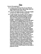
Scatter graph: for this I will take a systematic sample of each of the second hand values: 67% between 0-5k, 24% 5-10k, 6% 10-15k, 3% over 15k. I am going to use an over all sample of 30 sets of data to work out the proportion of them that should be between 0-5k I times 30 by 0.67 for 5-10 by 0.24 etc. This works out 67% of 30 and 24% of 30 therefore giving me a stratified sample adding up to 30. I will use a random sample of 20 values between 0-5. 7 values between 5-10. 2 values between 10-15 and 1 values more than 15. I will then group all the sets of data together and put it into a table from that table I will transfer the data to a scatter graph with the percentage change in value along the X axis and the mileage up the Y axis. From this I will calculate the mean point and draw the line of best fit through it. Also the least squares regression line will be worked out using the formula:
The least square regression line is used to work out the equation of the line of best fit in the form of y=mx+c where m is the gradient and c is the y intercept. I will draw on the graph the line of best fit free hand and the caluculate the LSRL using the formula and rearanging it in to the form y=mx+c will then also draw this on my graph. This line should be similarly placed to my line of best fit however it will be far more accurate and can be used to estimate the mileage the car has completed if the percentage value decrease is known. I will work out the % value decrease of a car whose data is not used on my graph I will then use my line of best fit to estimate the mileage the car has completed. I will then repeat this for a number of values to see how accurate my line of best fit is.
The product moment correlation coefficient will be worked out using the formula:
The product moment correlation coefficient is a measurement of the degree of scatter. It is usually denoted by r and r can be any value between -1 and 1.
The product moment correlation coefficient can be used to tell us how strong the correlation between two variables is.
A positive value indicates a positive correlation and the higher the value, the stronger the correlation. Similarly, a negative value indicates a negative correlation and the lower the value the stronger the correlation.
If there is a perfect positive correlation (in other words the points all lie on a straight line that goes up from left to right), then r = 1.
If there is a perfect negative correlation, then r = -1.
If there is no correlation, then r = 0. r would also be equal to zero if the variables were related in a non-linear way (they might lie on a quadratic curve rather than a straight line, for example). I will use the PMCC to tell my how correlated my variables are this value will be calculated and recorded in my results. Once all this is done I will draw conclusions from the data and graphs.
Prediction cumulative frequency
I predict that the older the car the bigger the value decrease will be this is because generally the older the car is the more run down it will be and therefore the bigger the value decrease.
The box and whisker diagrams also tell us about the median. The median is estimated by interpopulation i.e. were most of the percentage of values are if you lay them out in order. That is exactly what a cumulative frequency curve is doing. The upper and lower quartiles show you how the data is spaced out around the median. The inter quartile range tell us how far the upper is from the lower and is worked out by taking the lower quartile from the upper one. So in a box plot you have an accurate recording of the spread of data from the middle 50% as well as the highest and lowest value in the data.
I think that the cumulative frequency curves will show me that the values between 0-3 years old will have the broadest inter quartile range because second hand cars 0-3 years are likely not to be too run down. So the reasons for sale could be faults or simply the owners need the money so the price value changes are likely to be wide spread and smaller than the Age groups in excess of 3 years. As the age values get larger I predict the data spread will be less and the inter quartile range will be less. This is because as cars get older they inevitably reduce in value will very few factors keeping their price up so the depreciation in price will be larger with fewer exceptions.
Prediction scatter graph.
I predict that the more mileage the car does the bigger the value decrease is this is because the more miles a car does the more worn out it becomes. There are few exemptions to this rules but some cars wear better than others and some cars retain there value for example expensive big name cars like Bentleys don’t lose to much value even if they have traveled many thousands of miles.
I think that the data will be fairly well correlated and my spearmans rank will give a fairly high reading certainly positive probably 0.6 - 0.8. I think this because although the cars will be more worn as they get older the values could still be higher because they wear well are In demand or are built well. The line of best fit will be fairly steeply positive for the same reasons. I think that the PM.C.C will be fairly near 1 as the mileage does generally affect a cars value in a minor way the P.M.C.C is similar to spearmans rank its just more accurate. The product moment correlation coefficient (PMCC) is likely to be around the 0.8 mark as I think that the data will have a strong positive correlation but not perfect +1 correlation, because there will be some exceptions to this as previously stated. They will reduce the PMCC also the values will probably not all lie on the line of best fit but will be situated close by this too will prevent the data gaining a perfect +1 correlation.
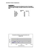
Results scatter graph to show the link between mileage and value decrease.
Analysis of my graph and data to show the link between mileage and % value decrease.
The product moment correlation coefficient is +0.859 (3dp) the working out is on the hand written sheet, which follows.
This tells us that the 2 variables have a strong positive correlation +1 is a perfect positive correlation and all the points will lie on the line of best fit. If this is the case as my graph shows many of the points lie near the line of best fit but few are actually on the line. This is because my data is not perfectly correlated. This is because not all cars decrease in value by the same amount after travelling the same amount of miles. Some cars retain their value longer than others and some lose their value after only a few miles. This could be because some cars wear better or there is more of a demand for that particular make or model. My graph has a fairly steep line of best-fit going upwards and to the right this tells us that the data is positively correlated. The fact that the line of best fit is a straight line tells us that the link between mileage and value decrease is constant i.e. it doesn’t curve down towards the end which would indicate extreme changes in value decrease after 80 000 miles.
The least squares regression equation has shown that the equation for the line of best fit is y= 1207x-30581 my working out follows.
The line is similar to my hand drawn line of best fit but it is slightly steeper this tells me that it is difficult to draw lines of best fit accurately by hand. The line of best fit constructed using the equation y= 1207x-30157 tells me pretty much the same as my hand drawn line of best fit told me. Except I now know the gradient of the line of best fit is 1206 before I estimated it at about 1545 I got this value by taking 2 points lying on my hand drawn line of best fit and using the formula change in y/change in x. Full working out follows.
Cumulative frequency Results
A cumulative frequency table for cars between 0 and 3 years old.
A cumulative frequency table for cars between 3 and 6 years old.
A cumulative frequency table for cars between 6 and 9 years old.
Cumulative frequency analysis
My cumulative frequency curve for 0-3 years old has a broad spread of % decrease values from 10%-70%. This tells me that the age does effect the value of a car but it doesn’t always follow that a car that is 0-3 years old will have a percentage decrease value near the median this is because newer cars are sold off for different reasons. They may be run down this would dramatically reduce the price or they may not be needed or the owner needs the money this would only slightly reduce the value for this reason we have a broad spread. this is because in generally follows that a newer car 0-3 years old will have reduced little in value because it has not had time to sustain a great deal of wear and tear. My cumulative frequency curves show me that as a car gets older the spread of % value decrease is smaller this is because that there are less factors affecting the sale of an old car. It is old so therefore it sells at a big % value decrease and most old cars will have a similarly high % value decrease. The Box and whisker diagrams show me how the data is spread the box plot for 0-3 years old has its values before the median close together and values after it spaced out. This tells us that values before the median are grouped together and the lower quartile is densely populated with data values. Were as the upper quartile is sparsely populated. The box and whisker diagram for the cars aged between 3-6 years old tells me that the data is split almost 50-50 about the median showing that the data is evenly distributed. The age group 6-9 shows us that the lower quartile is slightly more densely populated than the upper quartile. As I predicted the inter quartile ranges show us that the older the car the smaller the spread of data. Cars 0-3 years old have an inter quartile range of 14 cars 3-6 years old have an inter quartile range of 13.4 and cars 6-9 years old have an inter quartile range of 12.
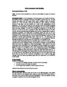
Plan
I am going to compare how different makes of car differ in value decrease. To do this I will choose the 3 makes will the most sets of data these are ford Vauxhall and Rover. I will use 10 sets of data for each make then I will establish a mean value decrease for each one and the standard deviation for each make.
Prediction
I predict that Rover will have the largest average value decrease as it has a lot of old cars on the road which are out dated and are cheep as a result. Rover cars are reliable so last a very long time. Their starting value starts very high so they have a bigger capacity for decrease e.g. if an average Rover starts at 17000 if it decreases 70% it is still worth 5100 which is still quite a lot of money for the average person to pay for a car. Where as a Vauxhall starts at around 7000 if it decreases by 70% also it is worth a mere 2100 not much to pay for a car at all and for most dealers not worth the effort. So Rovers stay on the market for longer as a result and I predict that there average value decrease is likely to be around the 80% mark. Ford is likely to have a fairly high average for its value decrease, as there are not many newer ford cars about so the older ones. Which there are an abundance of cars in excess of 5 years old. This inevitably means they are worn to an extent and are likely to decrease in value as a result probably 65% or more. Vauxhall cars are likely to have similar average value decreases because Vauxhall have had a constant stream of cars on the market for the last 10 years so, and therefore have both newer cars with small average decreases and older ones with large ones. This should balance out giving a mean similar to that of ford who have less of a range but still around the 65% mark. Newer cars are present which will have not had time for wear and will still be fairly near the original value. However older cars are still present and the spread of data is likely to be big the standard deviation for Vauxhall cars is likely to be the highest. I think around 15% or more. Were as Rover have consistently larger value decreases and the standard deviation will be nearer 5%. Ford cars will have a standard deviation between the two as some cars will have big decreases and some only mild ones so the standard deviation is likely to be around 10%.
Ford
Mean 60.3 Standard deviation 12.6
Vauxhall
Mean 62.1 Standard deviation 17.1
Rover
Mean 78.9 Standard deviation 7.9
Analysis
As I predicted Rover had the biggest % value decrease mean this is because Rover cars are reliable so last a very long time. Their starting value starts very high so they have a bigger capacity for decrease as a result they say on the market for a long time and many old rovers with big % value decreases are on the roads. Rover also had the smallest standard deviation this tells us that most of the % value decreases for rover cars are near the mean value. The spread is small this tells us that the data is well correlated and it follows quite well that a rover will have a price value decrease around 78.9%. Vauxhall had a large standard deviation this is because there are a lot of Vauxhall cars on the market at varying degrees of damage and wear and tear. This is because Vauxhall have been a popular choice for the last 10 years so quite a few run down old Vauxhalls are around with high % Value decrease as well as some new ones with very little value decrease. Ford and Vauxhall have very similar mean % value decreases because they are in similar situations in terms of popularity and reliability.
Evaluation
I have found that all the variables I chose to use affected the % value decrease to varying degrees my scatter graph showed me that mileage and % value decrease correlate strongly and positively getting a value of +0.859. my cumulative frequency showed me that the older a car gets the cheaper it becomes it is not quite as strongly correlated as the scatter graph but there Is a definite link between age and % value decrease. To obtain better results I would like to use a bigger sample of data this decreases the chance of inaccuracies occurring due to freak sets of data or anomalous results. Also there are other factors that need to be considered the state of the economy would affect the amount people can afford to pay for cars this could change the starting value of a car. Meaning the second hand value of a car is distorted the war on Iraq which is currently in progress has shown that people are worried about the state of the economy and are spending less. Things like this can mean that there are good and bad years for car sales and a car 10 years old may have a smaller % value decrease than a much younger one.