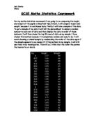
To work out the mean I divided the fx value by the frequency, 2595/50 which gave me 51.9kg. To find the median class I found which group contained the 25½th frequency. This was 50<55kg. The modal class can simply be found by seeing which group has the largest frequency, which is obviously 45<50kg with 13. I had to work out the mode and median as classes because the data is continuous, therefore I cannot just find one number for these values. The range of this data shows how much they are spread, as it is the difference between the lowest and highest value. For the weights this is 41kg. By finding out the range I can see how varied this data is, because it is of the whole school. When I look into the data in separate years and ages, I hope to find that the range is smaller, showing that the data has become more similar.
I also worked out, that the mean weight of the pupil’s in this sample rounds down to 51kg. I worked this out by adding up all the weights then dividing the total by 50, the number of pupils. Also I found, by sorting the weights into ascending order, and finding the 25th weight, that the median is 49kg.
Using tally charts I also decided I would work out the mean, mode and median of the heights of the pupils using the same strategies. These turned out to be:
mean=1.5892 m
modes were 1.55m and 1.58m with 4 each. (1.6m to 2significant figures or 156.5 as the number inbetween)
median =1.58m
I also changed the tally chart into a bar chart, using grouped frequencies.
The range of my data should help me to see how spread out my data is:
The difference between my lowest and highest height is 0.6m (6oocm)
The difference between my lowest and highest weight is 41kg
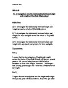
Also using this sample I also decided to plot a scatter graph, to see if there was an overall correlation between height and weight. Firstly, I used Data Sort on Excel to arrange my information starting with the lowest height, and working up to the highest, so that when I plotted my graph, it would be in the correct order to see if there was any correlation.
Here is my scatter graph;
The circled crosses represent data, which occurred twice, for example
From this scatter graph it seems that there is quite poor correlation, but definitely some, as roughly the crosses do go from left to right, bottom to top. However,
it seems that this random mixed sample is not the best way to work out the relationship between the height and weight of the pupils in Mayfield High.
To try and see why this did not work out the amount of male/female pupils, and the number of pupils from each year within my sample to check its correspondence with the data on a whole.
This means my random sample does not reflect the true data of the school, as there should be more boys than girls, whereas in my sample, it is the other way round. Also the amounts from each year have similar faults, for example in the school there are less pupils in year 9 than in year 8, but in my sample there are a lot more pupils from year 9 that from year 8, making my sample incorrect in analysing the height/weight relationship of the whole school.
Therefore rather than continuing to work on this data, I will try to come across these limitations by splitting the Mayfield High information into categories which will enable a fairer, truer look at the correlation between height and weight.
So seeing as there was basically no correlation when I took a random sample of the whole year, I will now split the genders, to see if there is higher correlation. To do this I will need to get two new samples, one of boys and one of girls. I think that this will show a stronger relationship between height and weight than before, however I think there will be a big
difference between the results I get for the girls, and that I get for the boys.
Samples: FEMALE
This is my female random sample. In order to collect this data, I sorted the original information into descending order which then meant that all the females where at the top, and the male- at the bottom of the worksheet. I then used the random number generating equation
=INT(RAND()*(1183-1)+1)
again in order to select the pupils I would use. However this time it was more difficult, and more time consuming because a lot of the numbers generated did not belong to female pupils. I tried to think of a way to get around this, but when I tried, it involved only sorting the data by the gender column and not expand this change to the rest of the data. This meant I could use the formula =INT(RAND()*(579-1)), in order to only generate females, however I ended up with the data of males just under the female category, which would seriously mix up my investigation into separate gender height/weight correlation because I wouldn’t really have separated the genders at all. For example:
If I hadn’t of checked that this separation worked, I would have ended up using data such as this, which is really supposed to belong to my male sample. Therefore, I simply had to go through it all the long way, to make sure my data was correct.
I have decided to analyse this data like I did before, in order to see whether, like I assumed in my hypothesis, there is stronger correlation now between height and weight because I have made this gender split. In order to do this I will hopefully work out the mean, median, mode and ranges of this data and plot some graphs, to try and find out the relationship between height and weight.
MEAN, MEDIAN AND MODE.
After analysing the female data I plan to do the same for the male, so I can see if there is much similarity between the two. I am hoping that there will be noticeable difference between the two genders, in order for there to show some sign of a difference when I plot some graphs based on my male/ female samples to see if separating the two causes more correlation to become apparent.
Male data
This is the data I collected from the excel Mayfield High School statistics, I did this in the same way as I selected the female data. I split the whole school into male/female by using the “data sort” button on Excel, but making sure that the change included all of the information and not just the gender column, otherwise, like I showed in my female section, the data ends up getting mixed up and simply having numbers 1-576 all female, which would therefore make my investigation incorrect.
In order to work out the mean, median and modes of this information I went about it in the same way as with my female sample. My results were as follows:
Proof of modes:
Heights:
Weights:
It is apparent that in the table containing the means, medians and modes, the boys are a lot more similar to one another than the girls I made previously, especially for heights., which are all 1.62m. This makes the average height, overall, for boys in Mayfield High School 1.62m. Comparing this to the girls data I get 1.61m to 3sf (1.606666667). This shows that the averages of boys and girls only disagree by about 0.01m. I would now like to work out the overall averages for boys and girls weights, so I can compare these to the height averages and try and find some differences between male and female’s height/weight correlation.
This brings me on to my next part of the investigation nicely, splitting up the year groups. This way I can see if boys weighing more and being generally a similar height to the girls differs when the year groups are split up. Firstly I will do more investigation into the gender split.
To try and see whether my hypothesis about the line of best fits for boys/girls I will plot some scatter graphs using Microsoft Excel and then analyse these.
I added a line of best fit using Microsoft Excel’s “Chart Wizard”, using this on a scatter for boys and girls will help me to see whether my hypothesis was correct.
My hypothesis about these scatter graphs was:
This shows that boys weigh much more on average than girls do, which means that on a scatter graph, girls data should (if height is marked on the x axis) rise less than boys, showing hopefully a less-steep line of best fit than boys. It is interesting that boys, who are roughly the same height as the girls throughout the school, generally weigh more
This is clearly shown on the scatter graphs; the boys’ trend line is much steeper than the girls’.
To analyse in greater detail the difference between the correlation of the height and weight of the male and female students of Mayfield High, I am going to make quite a few more graphs and charts.
I am hoping to find out that in general, the height and weight of boys in more related than that of girls. I think this from the results of my scatter graphs, as I am assuming because the boys’ line of best fit was steeper, this shows that the relationship between height/weight is more structured.
Firstly I created a new worksheet called “GENDER COMPARISON”. This contains the data shown above. This will be the basis of all my charts/graphs that I will make to compare the results of boys and girls. To begin with I will have to put information into a frequency table.
I then created a dual bar chart in order to easily compare the difference between the gender’s height and weight frequencies.
This bar chart shows that boys weights have a larger range and are more spread, as there are lots of similar sized bars. It also shows that there are large groups of girls weighing around the same, but then many anomalies of weight, for example in this sample there are 10 girls (1/3) weighing between 45-49kg. This shows that boys’ weight is steadier throughout the school.
I am now going to make a frequency chart for boys’ and girls’ height. This time I will make two pie charts comparing the frequencies of the heights.
These two pie charts show the percentages of the 30 boys/ 30 girls who are certain heights (shown in the box at the side). Each height group is associated with a certain colour, which makes it easy to compare the heights of boys and girls. For example 27% of the boys are between 1.60-1.64m tall and 23% of the girls are.
This information can be shown together on a graph like the one above. Here you can see how the frequency of the boys’ and girls’ height varies.
Here is the information in a stem and leaf diagram:
Female (height)
Male (height)
The modal class intervals of these heights are:
Girls → 1.65-1.69
Boys → 1.60-1.64
As my scatter graphs showed before there is better correlation when the genders are split. They also show that the correlation for boys between height and weight is greater than that for girls.
Now I have worked this out, I would like to find out whether it is the same throughout the whole school. I hope to discover that in at least 1 year of the school the correlation is greater for the girls. To do this I will split the gender even further, into years. I think that this will show the most correlation, more than simply splitting up the genders.
I think that the greatest correlation will be found in year 10-11 boys. I think that the boys and girls of 7 and 8 will have somewhat similar heights and weights, and they will be more varied. I think by years 9, 10 and 11 that there will be more correlation but also many more anomalies.
In order to make this split, I will use stratified sampling to firstly split the years. I will make some graphs just based on the age, and then finally split this sample into the two genders. However, I think that my results for year 7 and 8 will be similar, and year 9 will be similar to year 10. So, to save time, I will only take samples from years 7,9 and 11.
Stratified sampling means that I will select a percentage, say about 6%, and take this number of the amount of pupils from these years. If I don’t get a whole number, I will round it up or down to decide how many pupils to pick from 7, 9 and 11. This means that sample will genuinely reflect the amount of pupils from these years in the whole school. After I have decided how many to take I will use random sampling in the same way as before in order to select my sample.
TABLE FOR STRATIFIED SAMPLING
I changed the equation for random sampling to =INT(RAND()*(262-1)+1) for pupils in year 7.
These were the random numbers I got for students in year 7.
…year 9
Students from year 11
This scatter graph shows the correlation between the height and weight of the selection of year 7’s.
These show the heights and weights of year 9’s and secondly year 11’s plotted against each other. There is a very steep line of best fit for the year 11’s. Steeper than both of the other years, showing there is more correlation here.
This shows, that as I thought, the older year has a stronger relationship between height and weight. However, there are not considerably more anomalies than on the other two scatter graphs, so I was wrong here. Now that I know which year (11) has the greatest correlation, instead of my previous plan of splitting all the 3 years into the two genders, I think it would be interesting to simply split this year into boys and girls. I think when this year and gender split is taken into consideration the correlation between height and weight will be better than simply mixed, simply gender, or simply age.
Firstly I will take a new sample from year 11, of about 15 girls and 15 boys. I know that the larger the sample, the more information I can get, and the more reliable my outcome would be. However, this is a limitation which I cannot work on, as I need small numbers in order to make clearer graphs and to get results quicker.
My Split Gender Year 11 Sample
To take this I used random sampling, but this was difficult because after sorting the year 11 sample into male/female, the numbers are all mixed up. Therefore you cannot simply select random numbers from and up to a certain number, where for example the female section starts and ends. Instead you just have to search to see if that number is female or male. If not you just have to generate a different number. This is also why I wanted a smaller number of pupils to have to select.
FEMALE
MALE
I am going to plot a cumulative frequency graph, of the height of year 11 boys and one of year 11 girls, to compare the averages of this data.
Cumulative Frequency Table (girls)
Boys:
Before making the cumulative frequency graphs I can work out the mean and modal class just from these tables.
For girls: mean →1.565 m
Modal class →1.60-1.69
For boys: mean →1.598333333 m
Modal class → 150-159m
This shows that in general boys are taller, as there are more boys between 1.50- 1.79m however, there are more girls of the height 1.60-1.69m, meaning that lots of the girls are taller than some of the boys, but on the whole boys are taller (on average).
To make a cumulative frequency curve I take the mid-point of the heights and the cumulative frequency and plot them against each other. After making these, I will find the inter-quartile range, the lower and upper quartiles and the median.
I will present the results from this on a box and whisker diagram, which shows the value of the upper quartile, lower quartile and the median. I will then also work out the inter-quartile range.
The shape of a cumulative frequency curve can tell you how spread out the data values are. This curved line shows very tight distribution around the median, which means it is very consistent. A tighter distribution also means the inter-quartile range should be small.
This cumulative frequency curve is more widely spread, and should have a larger inter-quartile range.
I am going to have 2 box and whisker diagrams on the same plot so it is easier to compare them.
This box-and-whisker diagram also shows that girl’s heights are more consistent than boys, but boys are generally taller. The lower quartile of boys is less than that of girls, but both the median and upper quartile are higher.
Inter-quartile ranges:
Boys→ 0.18m
Girls→ 0.11m
This is the distance between the lower and upper quartile on the bottom scale.
Finally, I am going to plot 2 scatter graphs to compare the correlation of year 11 boys/girls height to their weight. This will decide my conclusion, as this is the evidence I have decided to base my main answer on.
In this chart there is an anomaly, where one girl is only 1.06m, which is a lot less than all of the other girls. However if you look at the majority of the scatter graph, and the majority of the points, there is some relationship between height and weight.