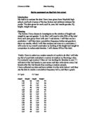
I have created the cumulative frequency chart and graph for the height of yr 7 girls from the chart below.
From this I was able to construct a cumulative frequency graph to help me to look at the range of different heights over this particular year group.
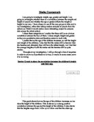
Now to look at the chart for the boys from yr 7 we will use both graphs to compare the boys and girls heights and come to a conclusion of who’s taller. And how we can interpret this.
This shows that on average the boys in yr 7 are fractionally taller than the girls. The most common heights in boys was 1.5 > 1.55 and in the girls it was 1.45 > 1.5. We can see from the graph below that the heights are very similar between the boys and girls in Yr 7.
Pupil height graph evaluation
This is probably because the pupils are of a young age and have a similar growth rate I think in year 11 the boys will be considerably taller than the girls as by that time they will almost be fully developed adults and men are usually taller than women. I will now look at the weights of the pupils in year 7 but I will add them to a cumulative frequency graph instead of doing two separate graphs then one comparison.
Prediction
I predict that the boys and girls will have a similar weight in yr 7 as they are still young and grow at the same rate as each other.
This shows that the boys in yr 7 are heavier than the girls. But again it’s still very close to each other. As they are still young. I will now look at comparing with yr 11 to find out if there are any differences between the heights and weights of the pupils.
Prediction
I think that the boys in yr 11 will be taller and heavier than the girls due to the fact that yr 11 are much older than the yr 11 and they are almost fully grown adults and if that’s correct the man should be heavier and slightly taller than the women. So over all I think boys in yr 11 will be much heavier and taller than the girls.
The cumulative frequency graphs for height and weight below are for comparison firstly against boys and girls then to look at the differences between the two-year groups.
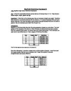
Data table for yr 11 heights
Data table for yr 11 weights
Graph of yr 11 heights
graph representing weights of yr 11 pupils
Conclusion
I have come to conclusion to prove my hypothesis to be correct.
I chose to do 50% students as my sample because I believed it was a manageable amount of numbers to use and it wasn’t too small of a number that I wouldn’t find any patterns or changes to prove my hypothesis to be correct.
When it came down to the averages, the mean was literally in between of the median value. This was proven to be true because on pages 5 and 6 it shows the mean and median to be very close in numbers. The averages showed me how all the data was connected and how close they were together. It showed similarities and some differences. The ranges differed, from 30 to 40.
The scatter graph for male height and weight showed weak positive correlation. It was very difficult to draw a meaningful lone of best fit. However, my eye could see that generally taller boys were heavier than shorter ones. Both the weight and height of the boys seemed evenly spread over a larger range.
The scatter graph for female height and weight also showed weak positive correlation, however the line of best fit was almost vertical. The range of female height was weak. However the range of female weight was narrow and clustered around 50kg. The unexpected result was that females of year 10 and 11 appear similar in weight irrespective of their height.
The cumulative frequency curve for male height is almost a straight line. The one for female is different. It rises steeply through the first three quartiles and then the upper quartile flattens off towards the horizontal.
I did histograms with the bars but I also did the frequency polygon graph to show a more accurate finding. I found that in the histograms, the female height showed me that the heights were deep, from a low to a straight high point to back to a low position. The points showed that females height were not all around the same frequency. However on the male’s histogram showing height, the points against frequency are relatively in the same area. The frequency polygon graph is done with both female and male height on it; I did this to compare the two findings. There were 4 points that were the same for both male and female, but then again there were some that weren’t so close together. The female line was jumping very high up, then coming back to low; the male line was at a steady and didn’t vary as much as the female line.
The histogram showing female weight showed a definite pattern. From a low point to rising to 11 then finishing at the frequency of 1, then there was a slight jump, but not to such a drastic point. However the males line showing weight rose then came back down and rose again and started to decrease downwards. The frequency polygon that I did to compare the both showed me that the females weight tend to rise because of the different number as where the males line had similar number, meaning the line wouldn’t jump so far and come back down.
In total over view, this piece of coursework was very exciting to do. Collecting the data and arranging them into tables and finding out the averages was my main highlight of the piece. However my worst was doing the scatter graphs. The scatter graphs were very complicated and confusing. To find the best fit line was a struggle, to be precise and accurate was very hard; only the eye could tell were the best fit line lied.
The few changes that I would have made if would have been to do my graphs in a way that would help me to find what I am looking for. The graphs needed a lot of attention for them to be correct, which meant I didn’t really look out for what was going on behind.
In my hypothesis I stated that has your height rose so will your weight, and in conclusion all the graphs showed me that the weight did rise as the height rose. There were some points that were not exactly reassuring, but to the eye the points plotted in the scatter graph showed the best fit line rising, even if it was weak, the line still rose which left my hypothesis to be approved.
Evaluation
After doing my research and plotting my information I found similar findings. As my hypothesis stated that weight went up as their height went up as well. The graphs all proved that as the height went up majority of peoples weight went up too. From looking at the polygon graphs the female’s height and weight tend to be taller and heavier than the males. From general knowledge boys tend to grow taller at a later age than to girls. This could be one of the reasons why the female’s height and weight was bigger than the males because of simple genetics. From my scatter graphs it simply showed me that both females and males weight went up as their height went up, which my hypothesis yet again is proved. My cumulative graphs and box plots showed me that both the females and males height was rising the weight went up as well as the height. My hypothesis is proved again stating that the weight of males and females both went up as the height went up.
The limitations and improvements in this investigation would have to be the main thing is that to have the same amount of males and females. I could have segregated the males and females from the beginning so that I could have got a fair and accurate amount of people. A limitation in this investigation was being able to get the real information. I didn’t know any background into this school and the data that I got which led me to use data that I hadn’t checked and could have given me wrong number which could have given me a false view on trying to prove my hypothesis.