Histograms
As both sets of data collected for both height and weight are continuous, we can also record it on a histogram.
Stem and Leaf
As the data is grouped into class intervals, it makes sense to record it in stem and leaf diagrams. This will make it easier to read the median values, and calculate the other averages.
Boys Height
Boys Weight
Girls Height
Girls Weight
Mean, Median, Mode and Range
To help support the simple analysis from the previous section, comparing the mean, median, mode and ranges of the data collected will help give us more evidence.
Height
Mean: This can be calculated easily from the frequency tables.
Boys: 1.69m
Girls: 1.65m
Mode: We can read the modes of the height from stem diagram
Boys: 1.62m
Girls: 1.60m
Median: There are 30 people in each sample, so the median will be half way between the 15th and 16th values.
Boys: 1.69m
Girls: 1,63m
Range: The range will show us how spread the data is.
Boys: 0.68m
Girls: 0.31m
Weight
Mean: This can be calculated easily from the frequency tables.
Boys: 60.23kg
Girls: 50.5kg
Mode: We can read the modes of the height of the bar chart
Boys: 50kg
Girls: 48kg
Median: There are 30 people in each sample, so the median will be half way between the 15th and 16th values.
Boys: 60kg
Girls: 50kg
Range: The range will show us how spread the data is.
Boys: 57kg
Girls: 27kg
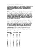
Table Summary
We can summarise this data found for both height and weight in a simple table format, to help with other statistical investigation still to be carried out.
From these averages we can comment on a number of things about the Height of boys and girls:
- All three measures of averages in the sample for height were higher for boys than for girls.
- The sample for boys was more spread out for boys with a range of 0.68 compared to 0.31 for girls.
- The evidence from the sample suggests that 12/30 or 40% of boys have a height between 160 – 170, whilst 13/30 or 43% of girls have a height between 160-170. This is quite unusual as I wouldn’t expect boys to have the same modal class as girls. Id expect the boys to be taller. To have a higher percentage of girls between 160 – 170 is quite unusual.
- The Frequency polygons show us that there are more boys with heights greater than 170m than girls.
From these averages we can also comment on a number of things about the Weight of boys and girls:
- All three measures of averages in the sample for weight were higher for boys than for girls.
- The sample for boys was more spread out for boys with a range of 57 compared to 27 for girls.
- The evidence from the sample suggests that 9/30 or 30% of boys have a weight between 50 – 60, whilst 11/30 or 36% of girls have a weight between 50-60. This again I think is quite unusual as id expect boys to weigh more than girls. Although this may be the case I feel the results are quite consistent, as id expect the taller you are the more you weigh. As we found the girls to have a higher modal class percentage for height you would expect them to have a higher modal class percentage for weight as well, which we have found to be true.
We need to note that all these findings and conclusions are based on a sample of only 30 boys and 30 girls. To get more relationships between the height and weight of both boys and girls, and more realistic results it would be better to extend the sample of results.
Rather than increase the sample I have decided to extend the investigation in a different way to support my statements.
Extending the Investigation
Giving myself a hypothesis to test I can extend the line of enquiry which I am investigating. A hypothesis
Is a statement which can either be true or false, and some how shows some sort of relationship or correlation between some data.
The hypothesis I plan to test and investigate to extend the investigation is as follows:
“In general the taller the person, the more they weigh”
To test this hypothesis we need a new random sample of 30 students of any gender as shown below:
The most sensible way to compare this data is to draw a scatter diagram, as shown below:
Looking at the graph we can make some simple comments:
- There is a positive correlation between weight and height, suggesting that the taller the person the more they weigh.
- Using the line of best fit we are then able to make predictions on the relationship between height and weight. For example we could predict that a person that weighs 60 kg may be about 160cm in height.
Further Investigation
In the early part of the investigation we found evidence to suggest that the height and weight are both also affected by gender. To extend the line of enquiry more, the nest step would be to see how the correlation between height and weight is affected by gender.
The hypothesis to test will be as follow:
“There will be a better correlation between height and weight if we consider boys and girls separately”
We already have a random sample of 30 boys and 30 girls collected earlier. We will use that data collected to test the hypothesis above. I will plot separate scatter diagrams for the boys and girls and another with the whole sample, and then analyse them to see what they suggest.
Blue = boys
Girls = yellow
The evidence by producing the above diagrams supports our hypothesis.
- There is a stronger correlation between weight and height if boys and girls are considered separately.
The line of best fit on each graph can be used to make predictions:
- The lines of best fit o my graphs predict that a girl of height 1.5m weighs about 35k, and a boy of the same height weighs about 45kg. These values are simply read of the graph.
We know that every straight line has an equation in the form of y = mx + c. We can find the equations of our lines of best fit by finding their gradients and looking at the point they intercept the vertical axis.
If y represents the height in m and x represents the weight in kg, the equations of lines of best fit for our data are:
Boys only:
Girls Only:
Combined sample:
These equations can be used to make predictions of weight when we know the height and vice versa. For example: To predict the weight of a boy who is 1.70m tall we do the following:
Limitations of Line of best fit.
Although the line of best fit is very helpful to us, in allowing us to make general predications about the trends o data we collect, there are some limitations in using it. There are exceptional values in my data such as the boy with weight 55kg who has a height of 1.4m, which falls outside the general, tend. The line of best fits shows a continuous relationship, though weight is a discrete value. Rounding weight to the nearest whole number makes my prediction less accurate.
Cumulative Frequency
To over come the limitations of the line of best fit, and the accuracy of results, we can use the cumulative frequency graph. Cumulative frequency can be a powerful tool when comparing different sets of data. The table below shows the cumulative frequency for weight for boys and girls and the mixed sample.
Cumulative frequency for weight of boys and girls
The best way to represent this information on a diagram is to draw a cumulative frequency curve. If the curves are all drawn on the same axis it is easier to compare the results.
Yellow = mixed population
Pink = girls
Blue = boys
The curves clearly show the trends towards larger weights amongst boys and girls.
Cumulative frequency curves for height of boys and girls.
Yellow = mixed population
Pink = girls
Blue = boys
As height is a continuous variable we can use the cumulative curve to easily read off the median, upper quartile, lower quartile, and interquartile range, as shown below:
Box and whisker diagrams
Refer to the graph paper to see the diagrams drawn to represent the data above. These diagrams provide a clear comparison between the different sets of data.
For example we could say the diagrams show that the girls inter quartile range is -----cm less that the boys. This suggests the boys heights were more spread out than the girls.
We can also use the cumulative frequency graphs to comment on the relationships between the data for boys and the data for girls. The median height for boys is ----. The cumulative frequency curve for girls tells us that ---- girls in the sample had height less than ----.
So, although in general boys are taller than girls, ---- girls have a height greater than the median height of boys.
Summery of Results… Conclusion
In general if we were to summarise our findings, we would have learnt the following:
- There is a positive correlation between height and weight. In general the taller the person the more they weight. A taller person would weigh more than a shorter person.
- The points on the scatter diagram for boys are less dispersed about the line of best fit, than those of girls. This suggests that the correlation is better for boys than for girls, and boy’s heights are less predictable.
- The point on the scatter diagram for boys and girls are less dispersed than the points on the scatter diagram for mixed population. This suggests that the correlation between show size and height is between when boy and girls are considered separately.
- The points on the scatter diagram for the mixed sample of boys and girls shows an overall linear relationship, as there does not seem to be any type of curve in the results.
- The scatter graphs can be used to give reasonable estimates of height and weight. This can be done by either reading from the graphs or using the line of best fits.
- Cumulative frequency curves confirm that boys are taller and weigh more than girls.
- The median height for boys is higher than the median height for girls.
- The box and whisker graphs conclude that in general boys are taller than girls.
Although we were able to analyse all the above points, there are still limitations in our findings:
- We could have had a better sample, and analyse of results of we were to have taken the age of each student as well.
- Also out predications are based on general trends observed in the data. In both samples there were still individuals whose results were outside the general trend.
There was more time available it would be an idea to further the investigation by finding h=out how the relationship between height and weight differs when the age of the students is taken into account as well.
We could test a hypothesis that;
“When age is taken into consideration, the correlation between height and weight will be better than when age is not taken in consideration.”
Due to limitations in time I was unable to further the investigation, but based on the hypothesis, and the results gained from the analysis already carried out I would predict that considering the age would produce a more realistic analysis of the relationship between height and weight. I think we would also lose the exceptional results which fall outside the general trend area, as results would now be more consistent and reliable, as there would be a more larger sample used.