"The taller the pupil, the heavier they will weigh."
Introduction
Mayfield School is a secondary school of 1183 pupils aged 11-16 years of age. For my data handling coursework I have got to investigate a line of enquiry from the pupils' data. Some of the options include; relationship between IQ and Key Stage 3 results, comparing hair colour and eye colour, but I have chosen to investigate the relationship between height and weight. One of the main reasons being that this line of enquiry means that my data will be numerical, allowing me to produce a more detailed analysis rather than eye or hair colour where I would be quite limited as to what I can do.
If I were to make an original prediction of my results, my hypothesis would be;
"The taller the pupil, the heavier they will weigh."
In this project I will consider the link between height and weight and will eventually be able to state whether my original hypothesis is in fact correct. Other factors I am going to consider when performing this investigation, is the effect of age and gender in my results and I will make further hypothesize when I reach that stage in my project.
Collecting Data
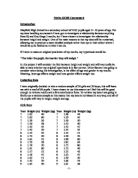
I have originally decided to take a random sample of 30 girls and 30 boys; this will leave me with a total of 60 pupils. I have chosen to use this amount as I feel this will be an adequate amount to retrieve results and conclusions from, although on the other hand it is not too many which would make my graph work far more difficult and in some cases harder to work with. To retrieve my data I am going to firstly use a random sample as this means that my data is not biased in any way, and all of the pupils will vary in height, weight and age - although I will have an equal gender ratio. To obtain this sample, I could have written the numbers of all 580 girls in one hat, and 603 boys in the other, then selected 30 bits of paper from either hat and look up their details from the number they are in the register. Although I though an easier way of performing this task is by using the 'Rand' button on my calculator. To retrieve 30 random numbers I would have to input; Int, Rand, 1(580,30) for the girls and change the 580 to 603 for the boys. This then means that the calculator will give me 30 whole numbers within the range of 1-580 or 1-603. This is the random sample that I obtained;
Girls Boys
Year
Height (m)
Weight (kg)
Year
Height (m)
Weight (kg)
7
.62
40
7
.48
44
7
.63
60
7
.59
45
7
.30
36
7
.50
50
7
.20
38
7
.53
40
7
.43
45
7
.52
47
7
.42
29
7
.55
45
8
.55
42
8
.55
51
8
.72
50
8
.50
32
8
.61
52
8
.90
60
8
.59
38
8
.82
64
8
.70
50
8
.75
80
8
.61
60
8
.72
46
8
.57
52
8
.52
43
8
.56
47
8
.32
47
8
.62
51
8
.50
39
8
.42
29
9
.66
54
9
.65
49
9
.61
38
9
.62
45
9
.54
60
9
.67
51
9
.53
45
9
.54
45
9
.65
48
9
.59
45
9
.80
70
9
.68
47
9
.62
52
0
.73
51
9
.80
51
0
.70
60
0
.66
70
0
.63
48
0
.60
47
0
.62
42
0
.80
54
0
.58
45
0
.63
50
0
.60
50
1
.91
82
1
.55
36
1
.8
60
1
.68
48
1
.86
80
I need a more useful representive of the data shown above, so I have decided to sort my data out and put it into height and weight frequency tables. As I will be able to see the data far more clearly and it will allow me to plot graphs from the data with less difficulty.
Weight Frequency Tables
Girls Boys
Weight, w (kg)
Frequency
Weight, w (kg)
Frequency
20 ? w < 30
2
20 ? w < 30
0
30 ? w < 40
4
30 ? w < 40
3
40 ? w < 50
3
40 ? w < 50
1
50 ? w < 60
8
50 ? w < 60
7
60 ? w < 70
3
60 ? w < 70
4
70 ? w < 80
0
70 ? w < 80
2
80 ? w < 90
0
80 ? w < 90
3
Height Frequency Tables
Girls Boys
Height, h(cm)
Frequency
Height, h(cm)
Frequency
20 ? h < 130
20 ? h < 130
0
30 ? h < 140
30 ? h < 140
40 ? h < 150
3
40 ? h < 150
50 ? h < 160
8
50 ? h < 160
1
60 ? h < 170
3
60 ? h < 170
7
70 ? h < 180
4
70 ? h < 180
2
80 ? h < 190
0
80 ? h < 190
6
90 ? h < 200
0
90 ? h < 200
2
Because both height and weight are continuous data, I have chosen to group the data in class intervals of tens as this allows me to handle large sets of data more easily and will be easier to use when plotting graphs. In both the height and weight column, '120 ? h < 130', this means '120 up to but not including 130', any value greater than or equal to 120 but less than 130 would go in this interval. I feel I am now at the stage where I can go on to record my results in graph form. This will then allow me to analyse my data and compare the results for the differing genders, which I am unable to do with the tables above.
Weight
As I mentioned earlier both height and weight are continuous data so I cannot use bar graphs to represent it, instead I will have to use histograms as this is a suitable form of graph to record grouped continuous data. Before I produce the graph I am going to make another hypothesize that;
"Boys will generally weigh more than girls."
Histogram of boys' weights
Histogram of girls' weights
Obviously by looking at the two graphs I can tell there is a contrast between the girls' and boys' weights, but to make a proper comparison I will need to plot both sets of data on the same graph. Plotting two histograms on the same page would not give a very clear graph, which is why I feel by using a frequency polygon it will make the comparison a lot clearer.
Frequency polygons for boys' and girls' weights
This graph does support my hypothesis, as it shows there were boys that weighed between 80kg and 90 kg, where as there were no girls that weighed past the 60kg-70kg group. Similarly there were girls that weighed between 20kg and 30kg were as the boys weights started in the 30kg-40kg interval. Although by looking at my graph I am able to work out the modal group, but it is not as easy to work out the mean, range and median also. To do this I have decided to produce some stem and leaf diagrams as this will make it very clear what each aspect is, for the main reason I will be able to read each individual weight - rather than look at grouped weights. Stem and leaf diagrams show a very clear way of the individual weights of the pupils rather than just a frequency for the group-which can be quite inaccurate.
Girls Boys
Stem
Leaf
Frequency
Stem
Leaf
Frequency
20 kg
9,9
2
20 kg
0
30 kg
6,6,8,8
4
30 kg
2,8,9
3
40 kg
0,2,2,5,5,5,5,5,7,7,8,8,9
3
40 kg
0,3,4,5,5,5,6,7,7,7,8
1
50 kg
0,0,0,1,1,1,2,2
8
50 kg
0,0,1,1,2,4,4
7
60 kg
0,0,0
3
60 kg
0,0,0,4
4
70 kg
0
70 kg
0,0
2
80 kg
0
80 kg
0,0,2
3
From this table I am now able to work out the mean, median, modal group (rather than mode because I have grouped data) and range of results. This is a table showing the results for boys and girls;
Weights (kg)
Mean
Modal Class
Median
Range
Boys
50 kg
40-50 kg
50 kg
50 kg
Girls
46 kg
40-50 kg
47 kg
31 kg
(NB. The values for the mean and median have been rounded to the nearest whole number.)
Despite both boys and girls having the majority of their weights in the 40-50kg interval, 13 out of 30 girls (43%) fitted into this category where as only 11 out of 30 (37%) boys did which is easily seen upon my frequency polygon. I could not really include that in supporting my hypothesis as the other aspects do. My evidence shows that the average boy is 4kg heavier than that of the average girl, and also that the median weight for the boys are 3kg above the girls. Another factor my sample would suggest is that the boys' weights were more spread out with a range of 50kg rather than 31kg as the girls results showed. The difference in range is also shown on my frequency polygon where the girls weights are present in 5 class intervals, where as the boys' weights occurred in 6 of them.
Height
I am now going to use the height frequency tables to produce similar graphs and tables as I have done with the weight. Obviously as height is continuous data, as mentioned already, I am going to use histograms to show both boys and girls weights. I am also going to make another hypothesis that;
"In general the boys will be of a greater height than the girls."
Histogram of boys' heights
Histogram of girls' heights
Similarly as with the weight, I can see the obvious contrasts between the boys' and girls' heights, ...
This is a preview of the whole essay
Height
I am now going to use the height frequency tables to produce similar graphs and tables as I have done with the weight. Obviously as height is continuous data, as mentioned already, I am going to use histograms to show both boys and girls weights. I am also going to make another hypothesis that;
"In general the boys will be of a greater height than the girls."
Histogram of boys' heights
Histogram of girls' heights
Similarly as with the weight, I can see the obvious contrasts between the boys' and girls' heights, but the data is not presented in a practical way to perform a comparison, that is why I am going to put the two data sets on a frequency polygon.
Frequency Polygon of Boys' and Girls' Heights
This graph does support my hypothesis as the boys' heights reach up to the 190-200cm interval, where as the girls' heights only have data up to the 170-180 cm group. Similarly there were girls that fitted into the 120-130cm category where as the boys' heights started at 130-140cm. As this data is presented in
Girls Boys
Stem
Leaf
Frequency
Stem
Leaf
Frequency
20 cm
0
20 cm
0
30 cm
0
30 cm
2
40 cm
2,2,3
3
40 cm
8
50 cm
4,5,5,6,7,8,9,9
8
50 cm
0,0,0,2,2,3,3,4,5,5,9
1
60 cm
0,1,1,2,2,2,2,3,3,5,7,8,8
3
60 cm
0,1,2,3,5,6,6
7
70 cm
0,0,2,3
4
70 cm
2,5
2
80 cm
0
80 cm
0,0,0,0,2,6
6
90 cm
0
90 cm
0,1
2
With these more detailed results, I can now see the exact frequency of each group and what exact heights fitted into each groups, as you cannot tell where the heights stand with the grouped graphs. For all I know all of the points in the group 140 ? h < 150 could be at 140cm, which is why I feel it is a sensible idea to see exactly what data points you are dealing with. I can also now work out the mean, median and range or the data, these are the results I worked out;
Heights (cm)
Mean
Modal Class
Median
Range
Boys
64 cm
50-160 cm
62 cm
59 cm
Girls
58 cm
60-170 cm
61 cm
53 cm
Differing from the results from my weight evidence, the heights' modal classes for boys and girls differ, and much to my surprise the girls' modal class is in fact one group higher than the boys. This is very visible on my frequency polygon as the girls data line reaches higher than that of the boys. This doesn't exactly undermine my hypothesis however as the modal class only means the group in which had the highest frequency, not which group has a greater height. On the other hand the average height supports my prediction as the boys average height is 6 cm above the girls. The median height had slightly less of a difference than the weight as there was only one centimetre between the two, although again it was the boys' median that was higher. When it comes to the range of results, similarly to the weight the boys range was vaster than the girls, although there was no where near as greater contrast in the two with a difference of only 6 cm between the two. With all of the work I have done so far, my conclusions are only based on a random sample of 30 boys and girls so they are not necessarily 100% accurate, and therefore I will extend my sample later on in the project. Before I go on to further my investigation, I feel that it is necessary for me to work out the quartiles and medians of both data sets, as this allows me to work with grouped data rather than individual points as in my stem and leaf diagrams. To do this I am going to produce cumulative frequency graphs as this is a very powerful tool when comparing grouped continuous data sets and will allow me to produce a further conclusion when comparing height and weight separately. I am also going to produce box and whisker diagrams for each data set on the same axis as the curves for this allows me to find the median and lower, upper and interquartile ranges very simply (I have attached a small sheet explaining how I can find these results from the graphs I am going to produce). I am firstly going to look at weight, and to produce the best comparison possible I am going to plot boys, girls and mixed population on one graph.
Cumulative frequency curves for weight
All three of my curves clearly show the trend towards greater weights amongst boys and girls. From looking at my box and whisker diagrams I have obtained the following evidence:
Weight (kg)
Median
Lower Quartile
Upper Quartile
Interquartile Range
Mean
Mixed
49
43
58
5
51
Boys
51
44
64
20
55
Girls
47
41
54
3
47
These results continue to agree with my prediction made earlier that the boys will be of a heavier weight than the girls. I can see this as the lower quartile, upper quartile and mean are all of lower values than the boys, but also the boys' range of weights is shown to be greater from these results as their interquartile range is two kg higher than the girls.
Cumulative frequency for heights
These results also show the trend towards a greater height amongst the boys and girls. Similarly as done with my weight diagram, I have obtained the following evidence;
Height (cm)
Median
Lower Quartile
Upper Quartile
Interquartile Range
Mean
Mixed
62
54
70
6
63
Boys
63
55
81
26
66
Girls
62
53
67
4
59
Similarly as with the weight results, these results continue to further my prediction that the boys would be of a greater height than the girls. As with the weight results this can be seen from the lower quartile, upper quartile and mean points which in the girls' case are all of a value smaller than the boys.
From all of the graphs and tables I have produced so far, I can fairly confidently say that the boys weights' and heights' are higher than the girls but none of my evidence collected so far helps me conclude my original hypothesis made; "The taller the pupil, the heavier they will weigh."
Although when looking at my cumulative frequency graphs of height and weight, I could make the statement that both diagrams appear to be very similar from appearance although I cannot make any form of relationship between the height and weight. I am now going to extend my investigation and see how height and weight can be related, and to do this the most effective way is by producing scatter diagrams. I will plot boys and girls on separate graphs as I feel the results will produce a stronger correlation when done this way and also to continue with the style I have begun with. Using scatter diagrams allows me to compare the correlations of the two graphs, and the equations of the lines of best fit (best estimation of relationship between height and weight) of each gender.
Boys' Scatter diagram of height and weight
This graph shows a positive correlation between height and weight, and all of the datum points seem to fit reasonably close to the line of best fit. There are a few points that I have circled which do not really fit in with the line of best fit - these are called anomalous points, it means that they do not fit in with the trend of the results.
Girls' Scatter diagram of height and weight
This graph similarly shows a positive correlation, although the correlation is stronger than the boys as the spread is greater on the boys graph than on the girls. The datum points on this graph are quite closely bunched together in the middle where as on the boys graph there is a wider spread of results - which would agree with the conclusion made earlier that the boys' heights and weights are of a larger range than the girls. I have again circled the anomalous points on this graph to show which data did not fit in with the trend of results. As both of my lines of best fit are completely straight, I would assume that the equation of the line would be in the form of;
y = mx + c. When y represents height in cm, and x represents weight in kg, the equations of the lines of best fit for my data set are (I obtained these equations from my graphs in autograph as an exact result was available, however if I were to find the results myself I would do so by finding the gradients and looking at the point where they intercept the y axis, NB. attached is a small diagram of how I would do so):
Boys: y = 0.8004x + 121.6 Girls: y = 0.7539x + 123.6
These equations can be used to make prediction of either weight when you know the height or vice versa. For example, if I were to predict the weight of a girl who is 165 cm tall this is what I'd do:
y = 0.7539x + 123.6 so, x = y - 123.6
0.7539
If y = 165 cm then x = 165 - 123.6 = 55.91
0.7539
Therefore I would predict a girl of 165 cm would weight 56 kg (rounding up to a whole number as used on my graphs and data tables) when using the equations from my lines of best fit. I have checked this, by lightly drawing a pencil line on my graph across from 165 cm up to where it meets on the line of best fit and then dragging it down to the x axis, and after doing so the line met the x axis at around 56 kg.
I have now reached a point in my investigation where my random sample of 30 boys and girls is not necessary anymore. There have definitely been some clear conclusions made from my graphs and tables already, which have all in fact fitted in with my predictions made. However my predictions are only based on general trends observed in my data, and in both the girls and boys samples there were individuals whose results did not fit in with the general trend. I cannot have complete confidence in my results so far due to the fact this is only a random sample of 30 girls and boys and age has not been considered which I now feel is a necessary factor. I have spent a good amount of time considering different genders but now I am going to look at age differences. It is only common sense that age is going to affect your height and weight, for you would think a year 7 pupil would be smaller and lighter than a pupil in year 11. As Mayfield is a growing school there would be more pupils in year 7 than in year 11, therefore my random sample was likely to contain more year 7 pupils than year 11 - this is biased and unfair. To ensure that I obtain a data set with an accurate representation of the whole school, I am going to have to take a stratified sample. Stratified sample means that you sample a certain amount from a particular group to proportion that group's size within the whole population, i.e. pupils within year 8, within the whole school.
This is a table showing the number of girls and boys in each year at Mayfield:
Girls
Boys
Total
% of Whole School
Year 7
31
51
282
24%
Year 8
25
45
270
23%
Year 9
43
18
263
22%
Year 10
94
06
200
7%
Year 11
86
84
70
4%
I have decided to continue with a sample of 60 pupils, 30 girls and 30 boys, as I feel from my random sample this amount of data was easy to work with and produced some sufficient results. I have now got to work out how many girls and boys I will need from each year to make sure that my sample is a good representation of the whole school. To do this, I must consider the boys and girls separately as there are 580 girls in the school and 603 boys. When working out the year 7 sample this is what I'd do;
Take the total number of year 7 girls - 131, and divide that by the total number of girls in the school, 580 ...
31/580 = 0.22586207 ... I then have to multiply that number by 30 as that is the total number of girls data I wish to obtain ... 0.22586207 X 30 = 6.7758621 ... if I then round that number up to one whole number it means that I need 7 girls from year 7 in my stratified sample.
This is the calculations performed to retrieve my stratified sample numbers;
Year 7 - Girls - 131/580 = 0.22586207 X 30 = 6.7758621 = 7
Year 7 - Boys - 151/603 = 0.25041459 X 30 = 7.5124377 = 8
Year 8 - Girls - 125/580 = 0.21551724 X 30 = 6.4655172 = 6
Year 8 - Boys - 145/603 = 0.24046434 X 30 = 7.2139302 = 7
Year 9 - Girls - 143/580 = 0.24655172 X 30 = 7.3965516 = 7
Year 9 - Boys - 118/603 = 0.19568823 X 30 = 5.8706469 = 6
Year 10 - Girls - 94/580 = 0.16206897 X 30 = 4.8620691 = 5
Year 10 - Boys - 106/603 = 0.17578773 X 30 = 5.2736319 = 5
Year 11 - Girls - 86/580 = 0.14827586 X 30 = 4.4482758 = 5
Year 11 - Boys - 84/603 = 0.13930348 X 30 = 4.1791044 = 4
Despite my new sample of 60 being stratified, to obtain the particular number of girls and boys from each year, I am going to select them randomly so again no biased is shown. I selected my random pupils using my calculator by performing; (year 7 girls) SHIFT RAN# X 131, I'd repeat this 7 times until I had 7 sets of data. This was obviously repeated for all years but changing the number it was multiplied by depending on how many pupils there were in each group.
Using my new stratified sample, I produced a scatter graph for each age and alternate gender, i.e. a boys and girls scatter graph for year 7,8,9,10,11. I am going to maintain the same hypothesis of "the greater the height, the greater the weight, but I can also comment on the older the pupil the greater the height or weight."
Year 7
Boys
Girls
For the year 7 graphs, the lines of best fit appear to be at a similar slope to one another although the boys begin at a higher point on the y axis than the girls - which would determine that the boys were taller. The boy's points appear more spread out but closer to the line of best fit, where as the girls are more sparsely distributed but are situated quite closely together on the line area. Both lines have a positive correlation which would agree with the taller the person the heavier they weigh.
Year 8
Boys
Girls
Differing from the year 8 graphs the lines of best fit are at quite different gradients. These graphs show that the boys in year 8 follow a strong pattern, of the taller you are the heavier you weigh - shown by the positive correlation of the line. However the girls graph differs and has a very slight correlation which could be for many reasons - one being that girls watch their weight slightly more. The points on both of these graph are more sparsely distributed around the lines of best fit, where as the year 7 points were more closely grouped together. This could be for the reason that your body starts to change in many different ways as you grow older.
Year 9
Boys
Girls
The Year 9 graphs show greater contrast again, although of a similar pattern to the year 8 ones. The boys shows an even steeper positive correlation showing the heavier you weigh the taller you are, and similarly the girls show the line of best fit almost positioned horizontally across the page. Both of these graphs have points positioned very closely to the line of best fit, although that could just be coincidence.
Year 10
Boys
Girls
The year 10 graphs show a complete change with both of the graphs consisting of a practically horizontal line of best fit, the girls could be explained due to this gender caring about their appearance more, but the boys change I cannot explain. This could just be a fluke, as there are only 5 points on the graph anyway - which is a small percentage of all the year 10 boys.
Year 11
Boys
Girls
The small amount of data points on these graphs is barely enough for me to make a conclusion, however the boys graphs shows again the positive correlation as before. But the girls' graphs differ again and now create a negative correlation which would predict that the taller you are the less you weigh.
Although these graphs have given me some points to consider, one being why the girls graphs tend not to consist of "the taller you are the heavier you weigh" as the age increases. I have come to the conclusion that because as girls reach puberty and start developing they become more aware of their appearance and therefore try to watch their weight a bit more. Although, I only had a small stratified sample to represent the whole school, so it would not be an accurate source of information to draw an efficient conclusion from. However I did produce this table from all of my data points to see whether a further pattern occurred:
Year 7
Year 8
Year 9
Year 10
Year 11
Girls
Boys
Girls
Boys
Girls
Boys
Girls
Boys
Girls
Boys
Median height (cm)
51
56
57
65
65
66
56
66
65
69
Mean height (cm)
50
55
54
68
64
65
58
68
64
70
Range of heights (cm)
8
5
20
14
2
25
4
25
4
20
Median weight (kg)
41
47
44
51
50
48
60
56
54
56
Mean weight (kg)
44
48
47
49
49
48
54
56
56
55
Range of weights (kg)
4
25
51
34
7
7
29
25
6
30
The only part of the table that I can assume a conclusion from is the mean as, when the age increases the weight and height does so to. Apart from a couple of irregular points further up the school there is a slight trend in the average heights and weights.
Seeing as I didn't have a big enough sample to make any meaningful statements within the data, I have decided to further my investigation again and to look in more detail at just one year group to see whether I can draw a better conclusion from these results. I have decided to look at each year group in more detail, however I am only going to write up an example using year 9 girls as I do not feel it is necessary for me to show each one in full. I am going to extract a random sample which will add up to 10% of the total girls in year 9. As there are 143 girls in year 9 at Mayfield High School, I will need a total of 14 pupils; this is the random sample I extracted;
Height (cm)
52
62
80
63
53
55
50
57
70
65
64
78
61
62
Weight (kg)
45
52
60
47
52
66
45
62
48
72
40
59
52
58
I can create a brief summary of the heights and weights in a table, as I have done with the majority of my other samples although I also used graphs with these, these is my summary;
Median Weight (kg)
52
Mean Weight (kg)
54
Range of Weights (kg)
32
Median Height (kg)
62
Mean Height (kg)
62
Range of Heights (kg)
30
From this data, although I have considered the range of results there is another measure of spread which I have not yet considered in my project is standard deviation. This is the measure of the scatter of the values about the mean value also thought of as a measure of consistency. Standard deviation uses the square of the deviation from the mean, therefore the bigger the standard deviation the more spread out the data is. I am firstly going to work out the standard deviation of the year 9 girl's heights' where 'x' represents the heights. To find the standard deviation using the equation;
we need to first work out the mean value, then square each value and
these squares. I have put my values in a table as it is easier to keep track
of them then.
x (cm)
x² (cm²)
152
23104
62
26244
80
32400
63
26569
53
23409
55
24025
50
22500
57
24649
70
28900
65
27225
64
26896
78
31684
61
25921
62
26244
?x=2272
?x²=369'770
I am also going to work out the standard deviation of the girl's weights, I am going to use the same method, and the only difference being that 'x' now represents weight rather than height.
x (kg)
x² (kg²)
45
2025
52
2704
60
3600
47
2209
52
2704
66
4356
45
2025
62
3844
48
2304
72
5184
40
600
59
3481
52
2704
58
3364
?x=758
?x²=42'104
These are the results I obtained for the standard deviation for each year group - boys and girls separately;
Year
Gender
Mean height (cm)
S.D for height (cm)
Mean weight (kg)
S.D for weight (kg)
7
Boys
Girls
54
47
2
5
47
43
9
7
8
Boys
Girls
63
55
9
3
49
45
5
7
9
Boys
Girls
68
62
7
3
52
54
6
0
0
Boys
Girls
69
63
31
1
59
51
6
5
1
Boys
Girls
76
64
2
2
64
55
2
9
From looking at the mean averages for each separate gender set, the boys' height and weight increase as the age increases. The biggest increase for the boys' height was from year 7-8 where the average height increased 9cm, from 154cm up to 163cm. Although when looking at the weight increases, it appears there is a slightly more even increase however the biggest jump is 7kg from year 9-10. The girls results' generally appears to increase as their age increases, although there is one fault in the weight section. The girls' heights increase most rapidly from years 7-9 where the height increases 15cm on average (147cm-162cm); although from years 9-11 there is only a minute increase of 2 cm, a centimetre for each year. This could be because girls develop earlier than the boys and therefore grow faster when they are younger, and slow down when they become older. However, when looking at the weight there is one decrease in the average weight as the age increases, from year 9-10 there is a deduction of 3kg, from 54kg-51kg. This could be because this is the prime age when girls start to become far more concerned about their appearance and therefore watch their weight. Despite this one fault, these results would agree with my hypothesis made earlier that the older you are the heavier/taller you will be. When looking at the boys and girls results' together, in each case apart from one, the boys' average height/weight is higher than that of the girls. There is only one point that undermines this pattern, and that is for the weight of the year 9 pupils, where the girls average weight is 2 kg more than the boys.
When looking at the standard deviation it shows that the year 11 pupils' heights on whole has the highest level of consistency, with an equal 12 cm deviation for both sexes. Although when looking at the weight the boys in year 11 maintained a deviation of 12 kg for their weight, however the girls' weights proved to be more consistent with a deviation of 9 kg. In general with the weight, the boys' standard deviation is higher than the girls with an average of 3.5 kg difference above them. The only year which differs from this is again the year 9 group - where the girls standard deviation is 4 kg above the boys, this could be related to the girls average weight being heavier than the boys in this section also. I could now say that the girls' weights' are in general more consistent and therefore the data points have a smaller measure of spread.
The heights standard deviation does not show much of a pattern, however in years 8,9,10 the standard deviation is higher for the boys than it is for the girls with an average increase of 10 cm difference above the girls. This great difference could be because of the irregular high value of 31cm standard deviation for the year 10 boys, where as the girls only had 11cm. This high value means that the heights for the boys in this year group are quite irregular, and there is a vast measure of spread - I can not see a reason for this however I have to keep in mind this is only a 10% sample of the whole year group therefore it could be that the values selected were just coincidentally a large range of heights. When looking to see if there was any pattern in the standard deviations as the age differs, the girls proved to consist of a slight pattern. From year 7-11 the standard deviation values consisted of; 15cm, 13cm, 13cm, 11cm, 12cm - which shows a general decrease as the pupils grow older, despite the one centimetre increase from year 10-11. All of these values are all very close to each other (within 4 cm of one another), where as the boys values differ slightly more with 12cm, 19cm, 17cm, 31cm, and 12cm (year 7-11). The only conclusion I can draw from this is that the girls heights are overall far more consistent than the boys, and it could be that as the girls increase in age the standard deviation becomes less (more consistent), and the spread of the data points become closer.
Before making a final summary of my findings throughout this investigation, I am going to briefly look at one more factor to compare height and weight to, and that is the 'Body Mass Index'. A body mass index defines whether you are underweight, healthy, overweight or obese by calculating; kg/m² = BMI.
You can tell whether you are underweight, normal, overweight or obese from the number these are the categories ; Under 17 = underweight
7-25 = normal (between 17 and 22 you are expected to live a longer life)
25-29.9 = overweight
Over 30 = obese
Using a new random sample of 60 pupils girls and boys, I have worked out the BMI for each of the pupils and produced a graph comparing the BMI and weight, and the BMI and height. One prediction I would make is "The heavier the person, the higher the BMI."
Boys Weight compared to BMI
Boys height compared to BMI
Girls weight compared to BMI
Girls height compared to BMI
From looking at the graphs, it proves to be that weight is the greater factor when considering the BMI. I know this as both of the weight graphs for each sex, show that the data points create a positive correlation which would suggest that the heavier the pupil the higher their body mass index - supporting my prediction made. Despite the differing genders, the slope of the line of best fit appears to be very similar although there are far more anomalous points upon the boys graph rather than the girls. When considering height, there appears to be no relationship between the two factors as the data points are scattered everywhere upon the page. However similar to the weight, the girls data points appear to be more sparsely populated around the line of best fit than the boys. From these graphs you could also say that the girls' heights and weights are more consistent than the boys.
Additionally I'm going to obtain 10 pupils heights and weight from each year - 5 boys and 5 girls, then I will work out each of their BMI and come up with an average BMI for each separate sex in each year group. I am going to work out one of the pupils just to explain how you work it out. Take for example a boy from year 7, he weighs 47 kg and is 149 cm tall, therefore the calculation for his BMI would be;
47 ÷ 1.49² = 21.2 ... therefore this boy is in the normal range
This is a table showing the average BMI for each year group (boys and girls);
Boys average BMI
Girls average BMI
Year 7
20.0
8.9
Year 8
21.2
20.6
Year 9
22.1
20.8
Year 10
22.4
21.4
Year 11
23.1
22.0
As you can the average BMI for each gender and age group is in the normal/healthy range. The BMI doesn't in fact say, the heavier you are the more your BMI will be, all it states is when you compare your height and weight whether you are normal, underweight, overweight or obese. However there is a pattern occurring within these results, that being that all of the boys BMI's are higher than the girls and also the older that both sexes get, the higher the BMI increases. This would not necessarily happen in all cases, as you could have 5 obese year sevens' in one group and 5 underweight pupils in another group, but coincidentally it has proved to be as your age increase the BMI does also. This could be because you do tend to gain weight far easier as you get older, also because you are growing until around approximately 16-18 years. Knowing that all of these average body mass index results are in the healthy range it would suggest that Mayfield High School is in a good area and the children that attend the school live in reasonable conditions. However if all of the results were either underweight or obese, I could suggest that the school may be situated in a deprived area - and children are either not fed properly or over eat from depression or boredom. This is only a very rough suggestion but it could be a possible outcome.
Throughout this project I have made many hypothesise including;
) The heavier the pupil, the taller they will be
2) In general boys will weigh more than girls
3) In general boys will be of a greater height than girls
4) The older the pupil the greater the height/weight
5) The heavier the pupil the higher the BMI will be
I have answered all of these predictions throughout the project with either graphs or text, and it is proved that all of my hypothesise made have been in general correct. There have been some slight points which undermine the predictions, but all over they have been successful. My original task was to compare height and weight, although I have not only considered height and weight but including biased factors such as gender and age. Additionally to this, I have also introduced another factor - being the body mass index to see whether height and weight have any relationship to the BMI values of students. As mentioned above, my graphs show that weight does have a relationship with the BMI, where as height does not appear to.
When considering age as a biased factor, I produced a stratified sample trying to create a suitable representation of the school on a smaller scale. Using the data for this stratified sample my results proved that in general the older you are the heavier/taller you are, however there was a group of pupils in year 9 which undermined this prediction. These results are however not 100% effective due to there only being a very minimal amount of data for each year group and gender.
Despite considering the age factor, I also spent a great deal of time looking at the differing genders to see whether that affected the height and weight of pupils at all. When looking at this I produced histograms, frequency polygons, cumulative frequency graphs and box & whisker diagrams, stem & leaf diagrams and scatter diagrams. The overall conclusion was that boys in general are of greater height and weight - mainly defined by the mean values which were higher than that of the girls.
However, all of these hypothesise were all as a part of my main prediction; "The taller the pupil the heavier they will weigh", and from answering all of these other predictions I can confidently say that it is true. I have come to this conclusion based on all of the graphs, diagrams, tables and statements made. On the other hand there were cases where certain data undermined this prediction but that could have been because of the small samples I had allocated myself to obtain. When producing the random sample of 60, I felt that was a satisfactory amount to work with as picking up an analysis and producing graphs from this data was simple and done efficiently. Although when it came to the stratified sample, and I was looking at the different age groups using again a sample of 60 trying to represent the school on a smaller scale - I do not feel it was as successful. If I were to repeat or further this investigation - I would definitely use a larger number of pupils for the stratified sample as when the numbers of the school pupils were put on a smaller scale, I only ended up in some cases with a scatter graph with only 4 datum points upon for the year 11 students. To retrieve accurate results from this method of sampling, I feel it is necessary to use a sample of at least 100. Additionally to the stratified work, if I had a larger sample - I would also produce additional graphs, i.e. cumulative frequency/ box and whisker, as I feel that I could draw a better result from these as I felt the scatter diagrams I produced were rather pointless.
I feel my overall strategy for handling the investigation was satisfactory, if I had given myself more time to plan what I was going to do I think I would have come up with a better method and possibly more successful project. One of the positive points about my strategy is that because I used a range of samples it meant that I was not using the same students' data throughout - I instead used a range of data therefore maintaining a better representative of Mayfied school on a whole. There is definitely room for improvements for my investigation - if I were to do it again I would spend a lot more time planning what I was going to do instead of starting the investigation in a hurry. Despite that I feel my investigation was successful as it did allow me to pull out conclusions and summaries from the data used.
Data Handling Coursework Hannah Phillips