I have plotted a Scatter graph for mileage against the second-hand price of the Ford cars. I have decided to do the graphs using Microsoft excel instead of a hand drawn one because this coursework mainly tests some one’s ability to use ICT skills.
The line of the best fit for this scatter graph represents a negative correlation. The negative correlation shows that when there is an increase in mileage there is a gradual decrease in the price of the cars. This too has provided a supportive evidence to prove that my hypothesis is correct. So the price of a car would decrease if its mileage is proven to be longer.
Now that my pilot survey is a positive point to my course work, I can now carry out the full investigation knowing that it will indeed produce an accurate result when compared to my hypothesis.
Plan of action: - Processing and representing Data
As soon as I collected my thirty random sample cars, I will draw out a tally chart of the `makes’ of the cars. Then I will use displays such as bar chart, pie chart, cumulative frequency, box and whisker diagram (box plot), scatter graph, moving average graph, histogram and etc, to illustrate the data of age, mileage and make. Thereby I can demonstrate how age, make and mileage of any kinds of car influence its second hand value.
The statistical calculations I intend to carry out using the data are thing such as: spearman’s rank, averages, standard deviation and moving averages. I am also going to make a table for percentage depreciation and use it to get a better correlation of age. Due to the time consumption of this project I cannot guarantee which calculations will be done for each of my hypothesis. However, I can ensure that all the listed calculations and the illustrations will be used according to their needs.
Most of the calculations and the presentation of the data are going to be conducted using ICT skills as required for this project. To show my knowledge and understanding of graphs and complex calculations I will draw out all the histogram, moving average graph, cumulative frequency and box plot will be hand drawn on graph papers. As for the statistical calculation I’m determine to do carry out the spearman’s rank using my brain and then the results will be typed out.
Although I have collected my thirty samples of cars through the process of random sampling, I have forgotten to take a closer look at stratified sample. It might seem bizarre at the time of this stage but because I want to make sure that I have not missed out any possibility of gaining a better sample than the one I already poses. So I have spent a little time trying to get a stratified sample of 30 cars. The results are followed.
To obtain a stratified sample of 3o cars, first I need to make a tally chart of all the make of the cars.
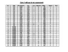
Total 100
I now have to decide how many cars from each make should be included in the stratified sample of 30 used cars out of 100.
As you can see from the grid that certain make of the cars have value of 0. So I can only conclude the following make of the cars in the shown quantities.
Although I have obtained my stratified number of the sample, now I have to select through random sampling the quantity of the car(s) from the selected make.
So as you can see that some cars are not even included in the stratified sample due to their appearance only once in the data. At the end you have to go through random sampling to choose the number of cars from each selected make. Besides random sampling is the quickest process too. Therefore, I have come to the conclusion that random sampling method is the best one out of the listed five sampling method in the introduction. Thereby I will not take into any account of this sampling to further my investigation.
*Due to the fact that the pilot survey was successful, I have decided not include or exclude any things to precede my actual investigation.
Data processing:
Main work
Age: I have isolated the all the 30 cars and their age and placed them in a tally chart according to their age.
Using this information I have formed a bar chart to show the age of the cars.
The bar chart clearly shows that every one who buys a second hand car is most interested in the car being years between 1 to 4. The bar graph also show that 63.333333 percentages of the people likes to buys car between ages 1 to 5. This is half of the population of the age value shown in the graph. This shows that majority of cars are only bought when the car’s age is between middle age is around 1 to 5 or the new the better.
Averages:
I have found out averages for the age of the cars. They are as follows…
Mean= 1+4+4+4+2+6+8+2+8+8+7+7+6+3+3+8+4+3+3+1+2+2+6+2+4+4+10+5+5+6
10
= 4.333333333333333333
= 4.33 (to 3 s.f)
Median= 1,1,2,2,2,2,2,3,3,3,4,4,4,4,4,4,5,5,6,6,6,6,7,7,8,8,8,8,10
= 4
Mode= 4
Range= 10-1
= 9
The mean, median and mode are nearer to the age of 4, which shows that the average of the cars is still 4 years of age.
Next I have plotted a scatter graph between the age of the cars and their second hand price.
The scatter graph on the previous page shows that as age increases the value of its second hand decreases except for one or two cars. This is obviously caused by their price when new. The graph also seems to produce a poor correlation due to the same reason. This graph also seems to produce the same result as the graph obtains through pilot survey.
There is a stronger negative correlation between the age and second-hand price when considered together. Here it is proved that my hypotheses were correct the age of the car does affect the price of the car and its price decreases with more aged car. To find the value of the correlation I have conducted spearman’s rank.
Spearman’s rank:
Formula = _ 6∑ d²
n(n²-1)
= _ 6*4284.20
30 (900- 1)
= _25704
26970
= 1- 0.953058956
= 0.046941045
= 0.05 (2 d.p)
You can compare two sets of ranking using Spearman’s coefficient of rank correlation.
You use the formula ρ= _ 6∑ d²
n (n²-1)
d is the difference between the two rankings of one item of data. n is the number of items of data.
ρ is Spearman’s coefficient of rank correlation.
The value of ρ will always be between -1 and +1.
-1 0 +1
ranking in weak negative no Weak positive same ranking
reverse order correlation correlation correlation strong positive
strong negative correlation
correlation
The spearman rank for the data is 0.05, which shows that there is almost no correlation between the age of the car and the second hand price of the car. This seems to contradict my hypothesis. However, I do feel that this is influenced by some of the cars brand new prices.
Display: Cumulative frequency
In this cumulative frequency table the data shows that the model is 4. This supports my averages calculation. Therefore people prefer buying a second hand car at its least low age. The cumulative diagram shows how the cumulative frequency changes as the data value increases. The cumulative frequency is shown on the vertical axis and the data is shown on the horizontal axis on continuous scale. I have drawn the cumulative frequency curve on the next page on a graph paper.
I have used the cumulative frequency to find upper quartile, median, lower quartile and inter quartile to draw box and whisker diagram.
Display: Box and whisker diagram
To get an estimate of the median:
- Divide the total cumulative frequency by 2.
- Find this point on the cumulative frequency axis.
- Draw a line across to the curve and down to the horizontal axis.
- Read off the estimate of the median.
To get an estimate of the lower quartile:
- Divide the total cumulative frequency by 4.
- Find this point on the cumulative frequency axis.
- Draw a line across to the curve and down to the horizontal axis.
- Read off the lower quartile.
To get an estimate of the upper quartile:
- Divide the total cumulative frequency by 4 and multiply by 3.
- Find this point on the cumulative frequency axis.
- Draw a line across to the curve and down to the horizontal axis.
- Read off the lower quartile.
Inter quartile is upper quartile minus the lower quartile.
The box plot shows the median, lower quartile, upper quartile and the inter quartile, found out using the cumulative frequency curve for the age of the selected cars.
The median is nearly same as the median gained in the averages calculation. The inter quartile is the same value as the median. The box and whisker diagram also known as the box plot diagram is drawn at the back of the cumulative curve.
The box and whisker diagram has a positive skew. The median is not in the middle of the diagram. It is closer to the lower quartile.
Median- Lower Quartile < Upper Quartile- Median
M - LQ < UQ - M
Percentage depreciation:
I have found out the percentage depreciation of the car by:
Percentage depreciation= Price when new- Second hand price
Price when new
This will help me to clarify the relationship between depreciation of price and age of the car.
Using the percentage depreciation I have calculated the four point moving averages for this data.
The results are followed…
Moving Averages
45.44443818
50.47506767
55.00137465
58.73888522
59.96283519
69.55045127
69.19378704 *The graph is drawn on the next page on a graph paper.
70.10549723
77.98209262
77.14881065
72.95333343
68.6310289
68.77233767
64.83231259
66.00101936
59.2671203
44.27916948
41.94395545
35.75439036
40.72385315
41.03409348
41.72303793
50.18162054
43.97569235
57.86662432
67.859666
Moving averages are averages worked out for a given number of items of data as you work through the data.
A three- point moving average uses three items of data at a time.
A four- point moving averages uses four items of data and so on.
I have decided to do four point moving averages.
The moving averages show that the results are random. The trend line suggests that it has a negative trend. This shows that there would be a decrease in frequency with an increase in age.
Standard deviation:
The standard deviation, s, of a set of data is given by the formula:
The higher the standard deviation, the more spread out the data is. The above formula gives the same results as the other formula but is much easier to work with, especially when the mean is not a whole number.
The other formula is:
I have decided to find out the standard deviation of the age of my 30 cars.
Mean= fx = 138
x , 30 = 4.6
The formula s= becomes
Standard deviation= 2.339515619
= 2.34 (3 s.f)
The mean of the age of the second hand cars is 4.6 and the standard deviation is 2.34. This indicates that the age is bigger spread.
I have conducted spearman’s rank to find out whether if there is relationship between the percentage depreciation and the second hand price of the cars.
Spearman’s rank:
_ 6∑ d²
n(n²-1)
= _ 6*1183
30 (900- 1)
= _ 7098
26970
= 1- 0.263181312
= 0.736818687
= 0.737 (3 s.f)
The spearman rank result shows that there is a positive correlation between the percentage depreciation and the second hand price. Therefore it shows that as the age increases the the price of the car depreciates more and more.
Display: Scatter graph
The above scatter graph of percentage depreciation against age. I have also drawn the line of best fit The line of best fit shows that there is a positive correlation between the percentage depreciation and the age of the cars. It shows that as the age of the cars increases the price of the cars depreciates continuously. Therefore, this proves my hypothesis is right.
I have listed the second hand cars’ prices and their age to find out an average price of a car for each age. This is a great way to find out how much the price of the car depreciates by each other.
Average price of car with age 1 year
= 7999+ 1995
2
= 4997
Average price of car with age 2 year
= 2300+ 3200+ 2300+ 4295+ 5480
5
= 3515
Average price of car with age 3 year
= 3995+ 1050+ 1595+ 1495
4
= 2034
Average price of car with age 4 year
= 1595+ 1495+ 1995+ 7999+ 8800+ 8250
6
= 5022.333333
Average price of car age 5 year
= 7995+ 1664
2
= 4829.5
Average price of car age 6 year
= 4295+ 1664+ 4700+ 3995
4
= 3663.5
Average price of car age7 year
= 3495+ 7995
2
= 5745
Average price of car age 8 year
= 4700+ 8800+ 8250+ 2995
4
= 6186.25
I do not need to fins out the average price of car age 10 because there is only one present in my sample. Therefore, the average price of car aged 10 would be 3495.
I have listed the average price according to their age.
I was trying to prove that as the age increases the second hand price decreases.
However, the results are not help full to show that my hypothesis is correct. I can justify that that the average price of the car aged 1 is higher than that of the car aged 10. So there is a very little prove that my hypothesis is correct.
Display: Line graph
The graph shows how some cars aged really old have an average price higher than few cars aged less influenced by their price value when new. The points plotted random as each cars value are different when they were new. But because we can see that the car which is ten years old has a lower price than the cars aged 1, 2, and 4 and so on.
To make sure that I get an accurate figure of how the price depreciates per year, I have found out the percentage depreciation. Age depreciation per year= Price when new- Second hand price
Age of the car
Average depreciation of cars with age 1 years=
23.75043328+ 17.80821918
2
= 20.77932623
Average depreciation of cars with age 2 years=
43.87640449+ 45.68884058+ 53.79278446+ 33.77483444+ 34.41250349
5
= 42.30898654
Average depreciation of cars with age 3 years=
53.85826772+ 64.57731959+ 58.533309481+ 37.64172336
4
= 53.65260137
Average depreciation of cars with age 4 years=
53.96160558+ 63.26965467+ 40.79200592+ 63.13364055+ 55.03374578+ 36.53061224
6
= 52.12021079
Average depreciation of cars with age 5 years=
46.11940299+ 74.06686141
2
= 60.0929822
Average depreciation of cars with age 6 years=
72.06683351+ 78.8937409+ 40.9152902+ 76.50277897
4
= 67.0946609
Average depreciation of cars with age 7 years=
967.4286+ 77.19478738
2
= 79.53066255
Average depreciation of cars with age 8 years=
78.21969697+ 82.22686879+ 70.6401766+ 77.76002248
4
= 77.21169121
Average depreciation of cars with age 10 years= 74.74962064
I have listed the average percentage depreciation of cars according to their age.
You can clearly see in the previous table that the average depreciation increases as the age increases too. The car with the less age has the less average percentage depreciation when the car with older age has the highest percentage depreciation. Therefore, it helps to prove that my hypothesis is correct. Because the statement is obvious I have decided to demonstrate the result using bar chart.
Display: Bar chart
The bar chart shows that apart from some miner problem when coming to say that as the age increases the average depreciation increases. Due to some age like 3, 7 and 10 having smaller average depreciation than the age next to them. Thereby, this is a valid evidence to ensure that the second hand price of a car decreases as its age increases.
Display: Cumulative frequency
I have grouped the data as it will be easy for me to understand the information and draw out the cumulative frequency curve. With this cumulative frequency graph, I have drawn my cumulative frequency curve. This is in the next page displayed in a graph paper.
Box Plot
The box plot shows the median, lower quartile, upper quartile and the inter quartile, found out using the cumulative frequency curve for the second hand price of the selected cars.
The box and whisker diagram has a positive skew. The median is not in the middle of the diagram. It is closer to the lower quartile.
Median- Lower Quartile < Upper Quartile- Median
M - LQ < UQ - M
As this has a positive skew it emphasises my prediction. There are some outliers in my data as some cars have a very high price due to their make. From this I learnt that the cars value does decrease as it ages but can only prove strongly if they are compared with the same make or cars that have the same value range. Therefore, I now conclude that the as the age of the car increases the second hand price will decrease continuously.
Mileage:
I have displayed the mileage of the cars against their second hand value in a scatter graph to illustrate the data.
The scatter graph shows that as the mileage increases the price of the second hand car decreases. This shows that the cars with less mileage are more expensive than the cars with mileage. Just like I’ve mentioned in my hypothesis. Although the line of beat fit shows that it is a negative correlation, due to the make of some cars their second hand price is higher even though they have more mileage. The graph shows that most of the value rest under the value of 5000 due to the influence of their mileage. Therefore, I can say that the mileage is one of the most factors that affect the rate of the second hand prices.
I have calculated the spearman’s rank of the mileage against the second hand price to see whether if I achieve the same negative correlation. Thereby, with strong valid evidence I can prove that my theory of the second hand price of the cars being cheaper due to their higher rate of mileage.
Calculation: Spearman’s rank
_ 6∑ d²
n(n²-1)
= _ 39495
216970
= 1- 1.464404894
= -0.464404894
= -0.446 (3 s.f)
Spearman’s rank result shows that it is a weak negative correlation. Therefore, it helps me to back up my point of argument. The relationship between the mileage of the car and its second hand price shows that the higher rate of mileage affects the second hand price.
Now I’m going to see how spread the data is, through calculating the standard deviation.
Calculation: Standard Deviation
x= 1130000
30 = 37666.66667
s= 42845625000 _ 1130000 ²
30 30
s= 1428187500- 1418777778
= 9409722.22
= 3607.527053
= 3607.53 (2 d.p)
The mean of the mileage of the second hand car is 41214.28571 and the standard deviation is 3607.527053. The standard deviation shows how wide spread the mileage is. The mileage has a bigger spread than the price or the age of the car. I will compare and conclude with the help of my box and whisker diagram.
Cumulative frequency:
The box plot
The box plot shows the median, lower quartile, upper quartile and the inter quartile, found out using the cumulative frequency curve for the mileage of the 30 cars.
The cumulative frequency diagram shows that the mileage has the greatest spread than any factors like price or age of the used car.
The box plot or even the box and whisker diagram shows that there is a positive skew.
The box and whisker diagram has a positive skew. The median is not in the middle of the diagram. It is closer to the lower quartile.
Median- Lower Quartile < Upper Quartile- Median
M - LQ < UQ - M
I have also drawn histogram; it too has a positive skew as the distribution has no axis of symmetry. It shows a lean to the left hand side. For skewed distribution the median is a suitable average as the mean would be affected by the skewed value. This proves that my hypothesis about the second hand price being low due to the mileage being high.
I am going to find out an average second hand car price each make in my chosen random sample
Average second hand price for:
Mercedes= 10999+ 17500+ 11750
5
= 13416.33333
Vauxhall= 6595+ 7499+ 4995+ 2900+ 4976
5
= 5393
Renault= 4999+ 1995+ 2748
3
=3247.333333
Rover= 3795+ 1700
2
= 2747.5
Fiat= 1495+ 1500+ 4995
3
= 2663.333333
Toyota= 7495
Ford= 1995+ 4295+ 3200+ 8250+ 7995+ 1664+ 3995
7
= 4484.857143
Daewoo= 4395
Bentley= 37995
Peugot= 5795+ 7500
2
= 6647.5
Porche= 19495
Volkswagen= 4693
Make:
A pie chart had drawn using the frequency table above.
Here, we can see that the Ford make is the popular one among the given population. It is also fairly cheaper to buy this show that the people prefer buying a second hand car when its value id cheaper than other second hand cars. We can notice that makes such as Porche, Bentley are not best selling due to their make. They have a higher price than any other make included in this data. Si this suggests that the better the make higher its’ second hand price, proving that my hypothesis is correct.
Display: Bar chart
Like I mentioned before the price of a second hand car is also affected by its original price when new. A car which is expensive when bought will still be expensive after years and years when compared to a local make. Thus, proving my hypothesis.
I will find out the average percentage depreciation in price for each of the make.
I have used this data to produce a line graph which shows that the make with the highest second hand price and the make with the lowest price. As you can see that Bentley has the highest average price among other make. We all know that among middle class people Bentley would be seen rarely due to its price. Therefore, I conclude that the make of the car does affect its second hand price. Better the make better its second hand price.
Now I’ll find average percentage depreciation of each make and later display it on bar chart.
Average percentage depreciation of Mercedes=
30.64592374
Average percentage depreciation of Vauxhall=
57.67953232
Average percentage depreciation of Renault=
72.32240701
Average percentage depreciation of Rover=
77.14685115
Average percentage depreciation of Fiat=
53.79278446
Average percentage depreciation of Toyota=
45.6884058
Average percentage depreciation of Ford=
63.77109981
Average percentage depreciation of Daewoo=
53.85826772
Average percentage depreciation of Bentley=
77.76002248
Average percentage depreciation of Peugot=
38.170657
Average percentage depreciation of Porche=
40.9152902
Average percentage depreciation of Volkswagen=
46.11940299
The bar chart represents the average percentage depreciation for each make. Bentley has the highest depreciation and Mercedes has the highest depreciation. This shows that the average percentage depreciation of all cars is different depending on their make. Therefore, my hypothesis has been proven to be correct. Due to the time consumption of this project I cannot precede my investigation longer so I have decided to end my experiment here.
Interpretation and conclusion:
This coursework was a bit complex and confusing but overall it went fairly well. I have used bar chart, pie chart, histogram, cumulative frequency curve, scatter graph, moving averages, line graph and box and whisker diagram to represent my data and calculations. I have used standard deviation, averages, spearman’s rank, moving averages, cumulative frequency, percentage depreciation and average percentage depreciation to calculate my data.
Although each calculation and tabulation provided a slight different answer to each other I was able to prove that my hypothesises were correct indeed. I had difficulties doing moving averages. I couldn’t exactly prove what it had emphasised. My overall calculations support my original calculation. I was certain it would prove my hypotheses are correct after demonstrating the pilot survey.
Like I mentioned in my introduction I do believe that my sample was large enough to represent the population fairly. The price of the car would decrease with increases in mileage and vice versa. The reputed and posh the make of the car more expensive it is. I have proven very clearly that the older the age less the value of its second hand price and lower the mileage higher the second hand car’s value.
If someone else carried out the same way investigation the chance of his or her findings matching my result is about 50 to 60 percent. This is due to the consideration of other factors, such the size of the sample, sampling method, the hypothesis, time provided and etc.
If I were to do the investigation again, the things I would prefer doing differently are:
- The hypothesis: I would try and link the second hand price of the car with other factors.
- The data: I might decide to collect the data myself.
- I would also test the other sampling and link each of the findings.
- Test each make separately.
I would also analyse my results with my sallow students to see whether id there is any match.
I think if someone else were to read my report it would be fairly easier to understand as I have shown all the calculations step by step and given brief description of all. I have repeated my hypothesis again and again and explained my graphs and what they show.
I don not think I have not concluded any irrelevant statistical calculations or irrelevant statistical diagrams or any inappropriate conclusions, Therefore, any one reading my course work would not find any misleading information.