Average: ~ a result obtained by adding several amounts together and then dividing the number of different amounts, but on excel you have simple procedures to follow to allow you to calculate this by simply typing in a formula. =AVERAGE (B2:B11)
Highest: ~The highest number in which you need to calculate by formulas to give you the correct answer that you are looking for. =MAX (B2:B11)
Lowest: ~ The lowest number is found by typing in a simple formula, which Excel can carry out, without asking questions. =MIN (B2:B11)
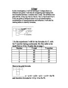
Before starting the list of names you had to think about using a heading for each specific section of the chart. You could use any style of font or colour scheme. This would be my example:
After completing that task, you move onto thinking about which ten names you would want to include onto your chart. You can make them up or use names from your class, teachers or family. These are the names I chose to include:
After completing the names you had to think about the list of the ages for each of them, now these, you can make up.
For the last section you needed to include a range of shoe sizes (you can repeat them), they can range from size 10-9 or whichever individuals decided to choose.
Where there is an area underneath each of the three columns, in the names column you put Total, Average, Highest and lowest this will help you when you come to type up the formula so that you won’t confuse yourself.
In the age and shoe size column you type in a specific and detailed formulas for each of the above.
AGE
=SUM (B2:B11)
=AVERAGE(B2:B11)
=MAX(B2:B11)
=MIN(B2:B11)
SHOE SIZE
=SUM(C2:C11)
=AVERAGE(C2:C11)
=MAX(C2:C11)
=MIN(C2:C11)
For my total of each were as follows:
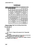
When I had completed the task of typing formulas and finishing off the chart, we were given another duty to complete. This was to do a series of graphs to show our results. You need to highlight the specific section you want to do a graph about and move your curser to a pictured button, showing a graph and follow through and complete the tasks it was set out for you to do.
These were the two graphs in which I completed from my answers:
A)
The graph icon shows you which cells you have highlighted, when you’ve done this it shows you a serious of graphs including bar charts, line graphs and pie charts…You click on which graph you think would fit your information, But be careful that you choose a graph that you know of and don’t choose one that you don’t know how to read off, and you chose it just because it looks technical. It then moves onto the next stage, which then asks you to name your axis, X and Y, with either names or numbers. Click on finish and it should come up with a graph with your information and the information you typed in.
If you want to change the colours of your bars double click on to it and it should come up with a table of colours, choose which one you want. You can also change font, font size and the colour of your writing. When completed if you need to o another graph just follow these simple steps and you should archive your task.
B)
This graph tells me the numbers even before scanning across to find them for myself. This is another objective you can do because there are other buttons on the graph that you can move across to and add the numbers on top.
I completed these tables because I wanted to describe my information into another form.