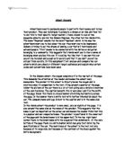
Above the image, right at the top of the page, there is the name of the sofa collection, “simple stylish,” and a brief note about the collection. The name “simply stylish” is an example of sibilance; sibilance in the name makes it more catchy and almost rhythmical so a reader will probably remember it. “Save in style with the new Linda Barker Collection.” This note is right in the top left corner of the page. It is here because it is the first place a reader will look, and the first word they will read is “save;” seeing the word “save” will catch the reader’s attention and make them want to read on because people always like the idea of saving money. “Save in style” is another example of sibilance and although it is not really there to make the reader remember it, it will still catch the reader’s attention if it is the only three words the reader sees to start off with. “Linda Barker” is in big, bold letters and will catch the reader’s eye and people associate Linda Barker with interior design so just seeing the name may make them want to read the rest of the advert, and the other techniques used will make the reader remember the advert when they decide they want to buy a new sofa.
Below the image there is more information about the product and the blurb. It says “special introductory price £698;” the fact that it is a special introductory price makes the reader think that the price will not be that low for very long and this is a good chance to get a high quality sofa, cheap. DFS will probably not even change the price of the sofa but because of what it says, people will think that they may have to pay a few hundred pounds more for the same sofa in a few months so going out and buying it as soon as possible is a good idea.
In the blurb there is a lot of adjectives, such as “exciting new sofa collection, fantastic new range, stunning soft leathers…” Repeating words like this when describing the sofa gets it into the reader’s head that this is a really excellent sofa that is worth buying. It also says “exclusive to DFS,” this gives the idea that this is a special sofa collection and cannot be found anywhere else; readers may think that Linda Barker has designed this sofa collection especially for DFS because is the only sofa store good enough. “…but hurry, they won’t be around for long” is also written in the blurb. This, again, makes the reader think they should go and buy the sofa as soon as possible because sofas from this collection are in high demand and if they leave it for a few months there may not be any sofas available.
“4 years free credit and nothing to pay for a year” is written in big, bold type at the bottom of the page. Many readers may be thinking that they do not have the money right now to buy a new sofa, and giving readers the option to pay nothing for a whole year will draw in even this category of people.
The second advert I am analysing is an Orange advert advertising a new service they are providing to customers; this advert is quite different to the DFS advert. This advert is a lot smaller than the DFS advert, it has a solid black background; no images; a number written in big, colourful text taking up half of the advert and the blurb written in white text. I think that there is no picture on this advert because it is advertising a service so there is not really any picture which would have a big effect on the way the advert came across. A picture of a mobile phone could be put in the advert but there would be no real reason for it being there so there is no point.
The main part of this advert is the number “66” written in huge, orange, yellow and red text taking up most of the advert. Being bright orange, this advert is bound to catch the attention of readers who are just flicking through the newspaper even if they are not really interested in the adverts. As soon as the “66” has caught the reader’s eye they are going to think, “66 what?” making them go on to reading the blurb of the advert to find out what it is about.
The blurb is written in quite large, white text and this stands out because the background of the advert is solid black; this makes it hard to miss, whereas if the text was blue with a black background it would be difficult to read and it is likely that the reader would not bother. The first part of the blurb is written so it just carries on from the “66,” as if it has all been read together.
In the first part of the blurb it says “The length of an Orange minute when…” Calling it an “Orange minute” gives a feeling of possession, making the reader think that it is not just any ordinary “minute”, it is an “Orange minute” and it is special. Obviously, a minute is 60 seconds but when people see that Orange are offering a minute containing 66 seconds they are attracted to it because it is something unusual; because the minute is longer than a normal one they realise they will be saving money if they take advantage of this offer.
The second part of the blurb is in smaller white text because the advertisers want it to not be read because it is just explaining what is required to have 66 seconds in a minute and it makes clear that only certain people can take part in this offer.
The Orange logo is in the bottom right corner of the advert. It is put here because it will be the last thing you see before you turn over the page and it should stick in your mind; so if you happen to see a shop with that same logo outside you will remember the advert in which you saw that logo and it will tempt you to go inside and have a look.
After analysing the two adverts it is obvious that the DFS advert uses many more advertising techniques, such as celebrity endorsement, size and positioning of text etc, to catch the reader’s eye and draw them in to the advert. I think that the DFS advert is a better advert in the way it uses advertising techniques, but, I think the Orange advert would be more successful because it is something different that other services cannot offer, whereas sofas can be found in many, many different stores and people can look around to try and find better sofas at better prices.