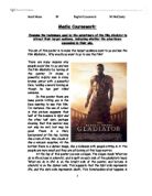
Firstly I shall analyse the Calvin Klein advert and techniques used to make the advert successful. The advert is in black and white, showing a woman laughing. She is portrayed as being happy, relaxed and at ease. She is standing in a relaxed pose as if the perfume’s making her this way. The main theme of the advert is ‘Contradiction’- the name of the perfume. Clever devices have been used to point across the idea of opposing and contrasting ideas to go with the idea of contradiction.
The main colours of the advert are black and white to give the advert a more mature and sophisticated image. However there is a clear, distinctive picture of the perfume bottle present. This empathises the strength of the perfume, making it look appealing and easier to identify. The colour of the perfume opposes that of the advert. This picture is juxtaposed to the rest of the advert. It is noticeable and recognisable; the fact that the perfume is shown highlights the significance of the perfume.
The main focus is on the woman who is standing in a relaxed manner. The framing is slightly to the side at an angle being at a slight distance ending at her thighs. She shows to be restful, casual and joyous, maybe encoding that the perfume will make you feel like this.
The model is seen as being successful, strong and powerful which is how the present stereotypical role of a woman in the 90s is seen. She is perceived as having control and wanting to look good. She is shown to look independent and dominant and have status.
I believe the target audience is for women aged between 15-35 years of age. I’ve acknowledged this because it was placed in a woman’s magazine based for women around this age group. The sexual connotation could be devoted towards men considering purchasing the product as a gift admiring the model.
There are sexual connotations within the subliminal messages of the advert. The woman is shown to be wearing an elegant suit opposed to nothing underneath exposing her cleavage only to be hidden by a shadow. This could appeal to the opposite sexes who are looking for a gift for a lady friend. The positioning of her body is to a slight angle and she is standing in a sexual pose. There is no eye contact by the woman, she looking in the other direction. This all contributes to the sexual manner and as a whole is seductive. It could be possible that she is wearing red lipstick, I have imposed on this idea as the lipstick had to be fairly bright and fulfilling to be able to stand out in a black and white advert. The red lipstick connotes sexual attributes being in a provocative manner. The suit is also fashionable which famous, idolised people have often seen wearing. The suit is a modern suit as with the perfume made by a modern designer. She is dressed in a black, formal suit associated with success and going to work giving the product essences of being up class.
Calvin Klein is a recognised designer, making products for both men and women. It is unisex and known also to project a number of items including aftershave, jewellery, clothes and underwear. We could question whether the suit she is wearing, is designed by Calvin Klein. CK is a well-known brand and is trusted and known to be successful, and we predict the perfume is therefore too. CK is known for its good quality and popularity. The name of the advert is enough to catch our attention and could probably sell the product itself. The famous name has a huge identity and is worn by famous, idolised people, this therefore signals magical property. The subliminal messages are sent out without the reader even knowing, and that is the power of the designer name.
There is little typography in black writing against a white background enabling the writing to stand out and be more noticeable. The background connotes purity and innocence opposed to the dark black suit being worn shown to be formal and smart.
There is language present to the top of the advert indicating that the woman ‘is always but never the same’. This itself is a contradiction saying that she is natural but also unnatural. The phrase is going against itself saying two different things. She is different everyday and therefore never the same. The message that is being conveyed is that if you wear the perfume you will stand out and be different from others. Here is very little typography proving the fact that as an audience we are a media dominated age and look for visual images rather than text. There is no scientific jargon used in this advert, as it is quite basic and to the point.
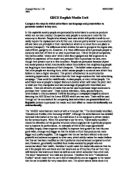
The second advert is ‘Gucci Rush 2’ obviously by Gucci. This advert uses many different techniques compared to the last advert to get the idea and promoting of the product across. However there are many similarities also present. This too is a new fragrance for women by a designer brand. The fact that it is the second in the series may attract users of the first perfume produced. Being a new fragrance urges people to try it. It is very visual and stands out in a magazine and from other adverts.
The typography provided is minimal, the text is in white against a pink background, which is very stylistic and enables the text to stand out and clearly be seen. The users will firstly be attracted to the name of the perfume, there is no slogan unlike the other advert but this is because the name ‘Gucci’ sells the product itself. Our prior knowledge is that Gucci is a very known and famous brand. Also magical property is developed as famous idolised people wear Gucci. It is fashionable and upmarket. Gucci reputation suggests high quality.
The first thing that caught my attention when I saw this advert was the very bright, eye catching and vibrant colour. It is a very exciting pink that shows to be new and challenging. It also has a woman present to advertise the perfume; it is quite a close up of the woman where you can clearly see her face and body. She is twisting her face and upper body to face the audience. As she is acting in a challenging way and encourages the audience to compete.
The shades of pink are created in rectangular boxes that look as if they are moving. They empathise the fact of the fast moving connotations within the name of the advert being ‘rush’. Themes are being portrayed of excitement and fast movement. The pink connotes clear, radiant, eye-catching and alive signals. The colour helps the woman to indicate the sexually provocative and enticing idea trying to sell the advert. Pink is a stereotypically a very feminine colour and I believe the colour used in this advert is much more effective than the colour use in the ‘Contradiction’ advert. The shades contrast the natural looking model into a vibrant, modern looking woman. Its almost as if she was naked before she put the perfume on, then as soon as she put it on she was given an identity, and is now more full of life and vivid. The rectangular boxes represent the perfume covering her and give her an identity.
Activity is going on that if you wear the perfume then you will be transformed and you will stand out from everyone else just like the colour on the page does. The stereotype of a 90s woman that is being displayed, is that the woman is dominant, strong and powerful. The subliminal message is that if you wear the perfume then you will be stronger and have status. If you wear the perfume you will then be part of the stereotype that has been created.
Although the perfume is still it almost looks as if its fast moving and this has been done by the methods used by the advertiser. I predict the target audience is to women of the same background as the last advert, around the age of 15-35 years old.
My overall conclusion is that I have studied two different adverts and they both are fairly similar to each other, as the advertisers have implied similar techniques. They are both effective in their own way attracting the audience similarly.
It is clear that poetry and writing encode similar techniques to adverts even though adverts have been visually put together. I have deconstructed the adverts in order to read the pictures; I have picked out specific things, like unwrapping it. Advertisers construct adverts by using a number of physical codes. These codes empathise specific points to the target audience. These two adverts proved that to be effective they did need to use the same techniques to advertise similar products. They both used sexual connotations; this is very popular in this day and age as sex sells products. The connotations behind words create images when reading stories. Just as an advert create images as well as words when looking at it. I have noticed that there has been no intertextuality used in either adverts. There are many meanings and implications in the two advert hidden by subliminal messages symbolising sex, success and independence.