Lottie Jenner
An analysis of three different brands of lipstick
Advertising is important in Britain because it is such an advanced consumer society. Adverts are used to influence people in a positive way to introduce and explain new concepts as well as promoting a brand name. Trickery is used to make us desire things were do not really need. Make-up adverts are a good example of the illusion formed when adverts are read, as they are not only selling a product but a life style and an image.
I have chosen three lipstick adverts all with different qualities from the same issue of Cosmopolitan. This is a magazine aimed at women aged 20-35. I chose these lipstick adverts so I could analyse them in greater details to see if they have the traditional qualities of an advert which makes them so effective.
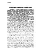
The first advert is for L’Oreal ‘Color Riche.’ A beautiful young woman dominates the front and her wide open mouth is the centre of focus. Her eyes are shut so they do not draw attention to them and away from the mouth with the lipstick. She has an expression of pleasure which illudes you into thinking you will have a good time if you wear the lipstick. The use of attractive models link the lipstick with beauty. The model is not appearing to wear other make-up, which looks natural and emphasises the difference of the face with the lipstick. The model is also wearing matching nail polish to exaggerate the colour. This advert was the first lipstick advert in the magazine which is a negotiated position and usually the most expensive.
There is a large amount of text down the right hand column of the page and provides a good amount of information for the reader. L’Oreal, the brand name is written in large font across the page for more chance of recognition or more chance of remembering the name. The text is all in red, the colour of the lipstick and black which contrasts the white background very well. The different fonts and sizes provide visual interest to the advert. The product name is in French as it is made by L’Oreal but is also easy to translate for the average English person. The name ‘Color Riche’ makes it sound expensive especially as France is known for beauty. Rich is repeated three times in the first paragraph, alliteration to emphasise the word as well as it rhyming when you read it aloud. All these aspects make it psychologically more appealing and the question at the end of the paragraph ‘Is it too much to ask?’ makes you think more about the product and your opinion on the detail it is telling you. ‘New’, ‘important’ and ‘more attractive’ implies superiority over other older competitors and the previous L’Oreal lipstick. The lipstick contains Vitamin E making it more appealing because it can improve the health of your lips. Bullet points in capital letters using short sharp sentences and descriptive adjectives e.g. ‘dazzling’, ‘moisturises’, ‘softens’ is the information to complete the sell. It tells you that the lipstick is long lasting with a non-smudge formula, which are the practical values to the lipstick. Another logo with the brand name therefore repeated with a famous tag line ‘Because I’m worth it’ makes it more memorable. The tag line makes you think you deserve the product.