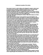
In order to subconsciously and consciously persuade the buyer to buy this product, the layout of images and colours used on them is very important. The main image is the woman’s face but the bottle also stands out due to its rich deep orange colour. The bottle is a simple shape with curved corners and transparent plastic, which enables you to see the actual shampoo and to the see the very attractive flowers on the front of the bottle. This gives the effect of there being herbs and flowers inside the bottle which is very persuasive as having a fragranced and natural shampoo would appeal to many people. The bottle itself looks original and exclusive and is placed in the middle of the page, so it becomes a main focus.
One of the slogans used in the advert is “a totally organic experience”. This was possibly chosen due to its sensational meaning and sexual connotations. The word organic is used to remind us that natural herbs and botanicals are contained inside this shampoo. This is written in a big, bold font, therefore emphasising the importance of it being organic.” Yes! Yes! Yes!” is introduced to try and describe what the user might say whilst washing their hair with this exhilarating shampoo.
There is an organic theme to this advert, as the advertiser will have wanted to keep this natural image throughout this advertisement due to the current trends of the day. At the moment it is “fashionable” to eat organic foods, drink organic drinks and now it is becoming fashionable to wash your hair with organic shampoo.
The name of the product herbal essences suggests that the shampoo contains a lot of natural essences. The lettering is in a simple white font, so it stands out from the page. The name of the shampoo is repeated many times so it remains fixated in your mind.
The phrase “every woman should be this satisfied once a day “has sexual connotations, as it suggests that if you get no pleasure or satisfaction from other means ,then this is the shampoo to use . This shampoo can make you feel contented, very relaxed and almost like a new woman. This thought would appeal to most women.
Additionally, the text is on the top left hand side and on the bottom right hand side as this is the way people in England learn to read.
The second shampoo/hair styling advert I shall analyse and compare with the herbal essences advert is citre shine.
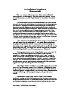
Once again I think this advert is aimed at women in their early 20s and mid forties due to the age of the model. I think the type of woman this advert is trying to attract is a stylish, modern, confident woman or women who wish to be like this. This advert would also be found in a glamour or cosmopolitan magazine.
This advert is very eye-catching due to the bright yellow colour of the background. The whole background of the advert is in two different shades of the one colour. The darker image of the model is placed on the lighter shade of yellow so that she stands out more and the model herself is wearing a very light coloured top so that her hair stands out more. The main model image once again takes up lot of the advert and the eye contact establishes a link between her and the reader which draws the attention of the reader to the rest of the advert. The model has very shiny hair which links in to the name of the product “citre-shine” .the product name also begins with a “c” which has a very specific catchy sound. There is a selection of various bottles of different products manufactured by the company therefore giving it as much recognition as it can.
The main slogan “nothing shines like citre-shine” is placed in the top-third attracting the buyer towards it. It immediately catches your eye as it is in white against a black background. The name is repeated many times in this advert which makes it more memorable. The phrase also suggests that it’s a unique product and no other hair product can match its brilliance.
At the very bottom right hand corner, the text says “available exclusively at most boots stores” this text is placed here intentionally as it’s the last thing the buyer will read and so she would know where to purchase it from. The word “exclusively” makes the buyer thinks that it’s limited and will automatically want to test and use this product to see how good it actually is.
The main piece of text reads “infused with citrus extracts, vitamins and minerals. Each citre shine product is designed to provide shiny healthier looking hair”. Once again the natural theme comes in to play which makes it very appealing to women in their twenties to forties. This phrase also means that as well as making your hair shiny, it will be healthy and healthy looking which appeals to many women. The words “designed to” suggest that the product was made specifically to make your hair shiny and healthy. This would provide the product with a sales advantage as women would rather have a unique product actually made for making your hair shine rather then an ordinary product which would just be used to clean your hair.
There is one major difference in this advert .there is a small image of a man in the top right hand corner. There is also a link with his eyes and the buyer which again draws the buyer towards the rest of the advert. the fact that the model in the top right is a man suggests that after using this product, you will be the envy of all women as men will be queuing up just to look at your beautiful hair and this is what most women at this age want .
finally, I think that the most persuasive and successful advert is the herbal essences advert, as the colours make it more appealing to the eye and the type of model, text and layout definitely make it an attention-grabbing advert.