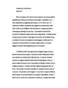
The colours used create an atmosphere which is dark, gloomy and misty but also dangerous because of the fire that the dragons are projecting out of their mouths. I tried to make the fire a vivid illuminated colour that stood out from the wall and jumped into people’s eyes as if it were able to move, this was important because the more it catches the audiences attention, the more successful it would be. I want my advert to change someone’s mood and make them think, give them an adrenaline rush, just from seeing my picture. The font is large and symbolic – reign of fire, which could easily be confused as rain of fire, which is ironic as rain is always water, and water and fire don’t mix, for obvious reasons. There are no words in italics for I thought that none would be necessary, because italics, to me, give the affect of clichés. Although I have used one I thought that putting my cliché in italics would give the impression of a low budget film, with tacky American acting and a pathetic, unbelievable story which most American action flicks have. The text ‘It’ll blow U away’ is aimed more at the younger generations because they are very familiar with this type of slang. ‘U’ is how many young people write in short messages and chat rooms and things. ‘It’ll blow you away’ makes you think along the lines about fire, with explosions ‘blowing’ things apart. It brings another lively image to the reader’s mind, making the audience think about the concept of the film. I have placed the picture on the whole piece of paper to maximise the size in order to catch more people’s attention, which is vital because if the audience totally miss the advert, then there is absolutely no point of it even being there. The words are at the top of the page so that if people like the picture then they can look higher to find the title and because the picture is so incandescent that people will remember it, so naturally the film name will be remembered with the picture. The colour of the writing is far brighter then most of the picture so it will stick out when someone is looking for the name of the film. This is important because if the viewer of the advert can remember the title of the film after looking at the advert then that advert is successful in spreading the image of that film.
The ‘Reign of Fire’ advert is different from other film adverts because of the fact that it is so ‘close to home’ with Big Ben in the background. There are giant dragons in the picture flying round the city of London, capital of one of the best economic countries, England. Most adverts are pictures of clear and stationary objects, whereas my advert is of vividly moving giant monsters with incandescent flames flowing out of their mouths, pouring death and suffering into the life below them. It is a picture that you can let your imagination run away with very easily. It makes you want to press a giant play button to see what will happen next and to see these beasts in motion.