Media Studies Essay – Compare two similar advertisements
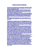
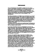
All advertisements essentially have one purpose – to manipulate the way we think in order to persuade us to do something that they promote. In this essay, I will be comparing the way in which two different advertisements, both promoting similar products, do this. The first advertisement is from the ‘Breitling’ company and advertises its brand of watches; the second advertisement however advertises ‘Accutron’ watches.
Firstly, both advertisements are similar in that they both make use of an aeronautical theme to promote their watches. Breitling uses the fact that its hot-air balloon was the first balloon ever to complete a “non-stop round-the-world” flight, to establish to the reader that its products are reliable and to provide an incentive for the reader to buy. Accutron on the other hand uses the fact that NASA chose to utilize its “timekeeping technology for America’s first trip to the moon” as a persuasive factor. In an expedition of such a great scale such as the trip to the moon, only the best, most reliable equipment would be used and so Accutron highlights this in order to emphasise on the quality of its watches.
When looking at both the Breitling and the Accutron adverts it is instantly clear who the advertiser is. The name ‘Breitling’ appears in several places such as the hot-air balloon, the text and the watch itself in the Breitling advert, and there is also a logo, a slogan, a mail address, an e-mail address, a telephone number and a fax number present. As with most Breitling adverts, it also has a distinctive image used only by Breitling. This clearly establishes Breitling’s identity as the advertiser and helps us to remember its name. It is also convenient for the customer if for any reason he/she needed to contact the company. In the Accutron advert it is similar, with the name ‘Accutron’ occurring on the watches and also many times throughout the text. Again there is a logo, which also mentions ‘The Bulova Corporation’, as well as a telephone number, an e-mail address and although there is no address of the actual company, there are the locations of several retail outlets selling their watches.
The layout of both the advertisements are similar to most typical watch advertisements where there is always a dominant, striking image of the watch/watches of a particular brand, which catches the reader’s eye. The Breitling advert is no exception with most of the left side of the page taken up by images of a watch and of a balloon and the remaining right side containing text. I think that yellow is used as the background to the main body of text to contrast against the light, bland silver, white and black colours of the picture, so that the reader is encouraged to read the text once his/her attention has been caught. The bland colours however have a different purpose of making the scenery in the image seem serene, peaceful and calm, therefore making us feel relaxed. In the Accutron advert on the other hand, the colours are very different. Black is the major colour present and is the colour of the background from which the text and images stand out. The advert is also much simpler and has more empty areas, most probably to resemble outer space, which is its main theme. In this advert the colour of the text is white, the opposite colour to the background, so that it stands out and is easier to read. Conversely, the text in the Breitling advert is written is black and because it is on a yellow background, it too stands out. In both the adverts there is also variation in the sizes of different parts of the text. The size of text used most commonly throughout is quite small and neat and this makes the adverts classy because they don’t try to be flashy. Advertisements, which use big, flashy fonts of many different colours, can be seen as cheap and these two adverts are very different. However there are some parts which are larger than the rest, for example the Accutron advert has a phrase saying: “PERHAPS IT’S WORTHY OF YOUR WRIST.” This phrase is written in a font much larger than that of the surrounding text and is also in bold to stand out and to encourage the reader to read it. Similarly, if we imagine the advert as speech, that phrase would be stressed and emphasised so that we take notice of it. In the Breitling advert there are three strings of text that stand out from the rest. The main slogan, “INSTRUMENTS FOR PROFESSIONALS”, is one and the two headings of the two sections of text, “THE SOUL OF FLIGHT” and, “THE ESSENCE OF BREITLING” are the other two. The slogan is important and needs to stand out because it differentiates Breitling from other companies; the two headings however use impact language to capture the reader’s attention.


