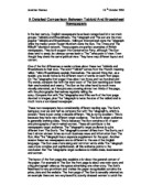
The page design of the Times is very different. It is quiet, tidy and boring but designed to make easy for readers to read long texts. Sarif face dominates the whole paper: headlines and main copies both use Sarif face. A one-line headline is laid across the top of the front page, followed by a subheading. The text of 26 paragraphs gives a detail of the subject. Apart from its five Ws, the article explains why the five men have been in X-Ray Camp, how they have been treated there and what is going to happen after their release. A familiar picture of Camp X-Ray, which has led to an international outcry against ill-treatment of captives by the US government, occupies a quarter of the front page. Unlike, the pictures in the Sun newspaper, the picture of Camp X-Ray is descriptive: manacled and blindfolded captives in orange boiler suits are kneeling in a large cage. There is no manipulation with the photograph, but a plain caption of the photograph reminds us British captives brutalised are still in the camp. An attribute from commentaries on page four is in bold letter on grey background to catch the reader’s eye, which illastrates a certain view on the issue, supporting Tony Blair.
The issue extends to page four, which comprises two commentaries and more details of the five men. A large photograph of the father of one of the five men is placed in the middle of the page. He is longing for the return of his son. His face is peaceful and calm. The image of this photograph is sure to influence how readers read the articles on this page.
Headline and Subheading
Headlines in the Sun are manipulative. The headline of the issue in the front page is in large bold letters all in upper case, which visually gives a strong impact. Its language is simple and suggestive, using the word ‘MUST’. Its subheading pretends to present ‘fact’. However, the vocabulary chosen is not appropriate and misleads readers. (It describes something that hasn’t happened yet as if it was what has happened. The word, ‘Fury’ is duplicated in the subheading and the following stand-first with intensions of creating a predetermined political bias.
The heading in the second page contains dogmatic assumption, which also is designed to mislead readers. The Sun labelled the five men as ‘traitors’ although the US could not find a strong connection between the five men and al-Qa’ida. The word, ‘traitors’ in the heading again repeated in the sub-sub heading, altering to the word, ‘treason’
To the contrary, the headlines in the Times are arbitrated, considerate of how accurately the issue is described in limited words. In the headline of the issue the five men are called ‘Taleban tourists’ in its headline, avoiding the judgement on the five without going through the UK’s legal procedure. Its subheading presents a concise fact, which gives a snap comprehension of the issue.
Page four in the Times contains three related articles with the issue. The titles here show different angles of the issue. The first one applauds Tony Blair’s efforts, the second mentions the justification of no-trial in the UK and the third indicates the five might have fought against the collation.
Text
The Sun describes the issue emotionally in 26 paragraphs of the main text (body?). Each paragraph tends to be short, containing an average of 5 lines and some paragraphs have only 2 or 3 lines. Comments always appear in direct speech and often aggressively agitate, indicating one direction. The text in the eye-witness report describes dramatically how the writer encountered the capture of one of the five men dramatically, but its clichés (e.g. caked in blood) and over-dramatic expression (e.g. I ventured into the corpse-filled bunker) make the text more like fiction.
The time is informative with 26 paragraphs in the main text and lengthy additional articles on a separate page. Each paragraph has much longer sentences than the Sun, an average of 6-8 lines, some exceeding 10 lines. Official announcements tend to be described in reported speech and personal comments tend to be in direct speech. For example, Jack Straw’s announcement of information by the US government is in reported speech, while his opinion is in direct speech. Various quotations from the governors to family members of the five men are presented to construct a perspective of the issue. All of the speeches are made in a restrained manner.
Conclusion
The Sun tends to be aggressive, violent, emotional and sensational. It tends to manipulate readers in a predefined direction, leading to predetermined conclusions. This indicates a predetermined political bias which has far reaching consequences.
The Times language tends to be more informative, more factual, more sophisticated, less dramatic, less emotional and less sensational. It is less likely to lead in a particular direction predetermined conclusions.
