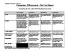
Comparison of Document – Fax Letter Comparison Of Documents – The Final Report Comparing My Fax Letter with Three Real Documents My DocumentDocument 1Document 2Document 3STYLEMy fax has a bold heading which helps it make look clear to see. I have inserted my logo so everyone knows where it is from. My writing is simple to read, I have kept my quote short and easy to understand.This document isn’t presented well. It gets straight to the point and you understand what to do. It has a logo and the text is in bold to grab the reader’s attention.This document is well structured. It is set out clearly and very easy to read. This document is set out well but it is slightly harder to understand. There is writing everywhere and it isn’t spaced out.LAYOUTMy fax has been printed on