The next thing that grabs your attention in both appeals is the telephone number. They are of similar size if you compare them to the size of the whole appeal and are both printed so that it is white text on a black background. This is used to make the text stand out more and so it catches your attention. The telephone number is the most vital part of the appeal, as it is where the reader will ring to donate money. It is done in such large text, so that it cannot be missed, as it is staring you right in the face.
The next thing that caught my attention is the headline. Both of these again are printed so that it is white text on a black background for the same reason that I just explained. Appeal 2 doesn’t actually mention anything to do with Afghanistan in the headline probably because the English community aren’t very fond of the Afghan’s at the moment because of what happened in New York on September 11th. Instead they write ‘Central Asia Emergency’. Even though it was cleverly written, I still do not feel that it has the same impact as the headline and slogan of Appeal 1. The headline does more or less the opposite
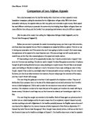
to Appeal 2, clearly stating what they are appealing about, ‘Afghanistan Refugee Crisis’. Although this may turn a few people away, it then has a slogan, written in even larger text next to the picture of the girl, which replies to what probably all the readers were thinking at that moment. With the community feeling very reluctant to helping anyone who had anything to do with the terrible tragedies in New York the appeal writes, ‘They’re innocent. Please don’t let them suffer’. These cleverly chosen words will make the reader stop and think. Their government might be guilty, but the Afghan families are innocent, they haven’t done anything wrong so why should they suffer. The use of the words, ‘Please don’t let them suffer’ are informing the reader, that they can help, and if they don’t do something about it, the Afghan families will suffer.
If the reader has by now been drawn into the appeal, they will then read the text. Neither appeal has a lot of text so that the reader will not get bored, and they both start off in the same manner except Appeal 1 is more factual. The opening phrase of Appeal 1 is, “After twenty years of civil war and three years of devastating drought”. Whilst appeal 2’s opening phrase is, “After years of war and drastic drought”. The use of stating ‘twenty years’ instead of just ‘years’ puts an emphasis on the amount of time Afghanistan has been at war, because twenty years is an awful long time and might make the reader more obliged to help.
Throughout the text, both appeals use emotive language to describe what the families are going through at the moment. By doing this, the reader will be able to compare what is being described to his own life and perhaps be able to picture it in his head which will make him more willing to help.
After the opening phrase, Appeal 2 becomes much more factual, stating many facts about what is needed in Afghanistan, what the company is doing at the moment to help and what your contribution could do to help. Appeal 1 again does the same however becomes less factual and relies more on emotive language. An example of this from appeal 1 is, “Just £15 could help stop even more lives being lost”. The usage of the word ‘even’ in this short extract shows that lives have already been lost and that the money that they donate would help stop losing more. This would make the reader more inclined to help.
Both appeals use words like ‘you’, ‘we’ and ‘us’ to make the appeals more personal and to make the reader feel like the appeal has been written especially aimed at him. The usage of text size and font changes to persuade the reader, are used again throughout both appeals, however more dramatically with Appeal 1.
Within the two appeals there is a sense of urgency, which is shown in such phrases like, “And with winter fast approaching” and “Therapeutic milk, high energy porridge, water tanks and medicines are urgently needed”. This is used as a persuasive technique as it will make the reader feel that he has to act now, and can’t just leave the appeal in a pile to come back to later. It will be no good then.
The telephone number follows the text, which is followed by methods of donating the money. Appeal 1 clearly comes across as the more modern of the two, with the use of a website address rather that a form which has been used in Appeal 2.
Finally at the bottom of the page it has the companies’ logo. It might not seem like it, but the logo actually plays a vital role in the persuasion because if the reader notices that it is a well-known company they may feel willing to donate money, as they will feel that the company is reliable and is not trying to con them. Appeal 1 has been written by ‘Save the Children’, which is a well-known charity, whilst Appeal 2 has been written by ‘Action against Hunger’, which I, and probably many others have not heard of before.
On the whole, I think that I would donate my money to Appeal 1 because it comes across to me much more persuasive and eye-catching. Appeal 2 looks much less interesting and although it has persuasive text I would not feel obliged to give my money to that charity.