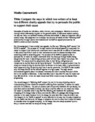
There are 3 images going diagonal down the page and underneath there is a piece of text saying how your £2 pound could help. The first image shows a man and villagers trying to get clean water from the well. Underneath it says £2 a month will help provide enough equipment for villagers to dig a well and give a permanent supply of clean, safe water.
The second image shows a women watering her crops so she can feed her family, underneath it says that by donating £2 a month it will help supply 670 develop every year which will be planted out by local farmers.
The last image is a mother holding her baby and a health worker giving the baby an injection. The text by the side says 'by giving £2 a month it will help pay to train 2 health workers safe guarding hundreds of people.
When the reader looks at these images it should make them realise how lucky their lives are and that the people in these countries are worst off than themselves. If you were, to donate £2 a month it would really help them live a better life so they can provide food and shelter for their family, and so health workers can become fully trained to help others in need.
At the bottom of the leaflet is a perforated slip to be filled in with your name, address, and bank details and how much you are willing to donate. In bold it has asked you to return the form within the next days 10 days. They have also attached a double-sided letter, which is in much more depth than the leaflet. At the beginning of the letter the director of Oxfam (Barbara Stocking) has apologised for writing like this and has asked for just a minute of your time to read this letter.
The letter tells you what diseases people are dying from and how many are dying each year, 'Bangladesh-the world was shocked by the catastrophic cyclone and floods in 1991, in which 140,000 people died. Yet the same numbers of children are killed by poverty in Bangladesh every 2 months. It also says that this is worst than natural calamity. This has been underlined so you realise how badly these people need your donation.
On the back of the letter, it begins to say that your donation will be used to help local people who are contributing their own hard work, their energy and creativity to surmount their difficulties.
Just £2 a month has been repeated several times this shows how desperate they need your donation. At the end of the letter the director (Barbara Stocking) has apologised for if they have sent this to you twice, and if they have could you give it to someone else who might help.
The language they have used on the leaflet is very persuasive, by how they have asked you for your donation of £2 pound.
'These days £2 won't buy very much. But if you give £2 a month to Oxfam, your donation is stretched much further.' This piece of text should persuade the reader to donate just £2 a month.
The language they have used on the letter is soft as this is a compassionate charity and is trying to persuade the reader to donate money to help others in need. 'Could you help some of the poorest people on Earth, by supporting Oxfam with a gift of £2 a month?