The dimensions and dynamics of the front cover are essential when designing and creating a magazine as the cover is the first thing that the buyer/reader will see. The image must be eye-catching or comical or controversial as too catch the buyer’s eye and draw him or her to your magazine, to make it so that they ignore all others and pick up yours first and have that first fleeting glance, which usually leads to them buying it. The cover cannot be too busy, as it may be a turn-off or may distract the buyer when focusing on the central image, if there is too much writing or too many images floating around the magazine may look overworked and tacky. Subtly in colours and amount of text goes a long way in ensuring that the design for the front cover will be successful and manageable.
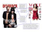
The image on the cover must always relate to the magazine, if a fashion magazine was to be designed and the main image was a guitar the magazine would not appeal to the correct audience at all. The front of the magazine has to reflect the personality, likes and dislikes, and intentions of the audience, such as a magazine with “5 steps to losing a dress size” on the front would appeal to those uneasy about their weight, a magazine with “Metallica release new album in the UK” would appeal to the more music oriented audience, the band Metallica would narrow the audience down, so that somebody who preferred a less hardcore style of music would not mistakenly buy the magazine they were included in. If the magazine was a fashion magazine, it would range either for a wide or small audience, meaning that different magazines would aim to provide information to different ages or mindsets. For example, Vogue is a magazine set for a younger audience, mainly medium-waged 20-30 year olds. As you can see from the cover of Vogue (previous page or above) it offers a variety of methods or competitions to “save your skin” or “how to get red-carpet glamour,” this would appeal to this audience as girls/women of this age aspire to be what they see, this means that when such a person sees a celebrity or higher paid woman they would aspire to be like them, with perfect skin and such like. This is the magazine’s perfect trick, as these methods are used extensively all through the magazine industry to entice readers to purchase a single magazine over a mass of fifty or so.